I like the music and presentation but I had a lot of trouble understanding how to play and then actually executing.
Play game
reflectrix's itch.io pageResults
| Criteria | Rank | Score* | Raw Score |
| Audio | #15 | 3.542 | 3.542 |
| Graphics | #19 | 3.792 | 3.792 |
| Originality | #22 | 3.750 | 3.750 |
| Theme | #37 | 3.750 | 3.750 |
| Overall | #51 | 3.083 | 3.083 |
| Accessibilty | #70 | 2.375 | 2.375 |
| Fun | #73 | 2.417 | 2.417 |
| Controls | #93 | 1.958 | 1.958 |
Ranked from 24 ratings. Score is adjusted from raw score by the median number of ratings per game in the jam.
Godot Version
4.3
Wildcards Used
N/A
Game Description
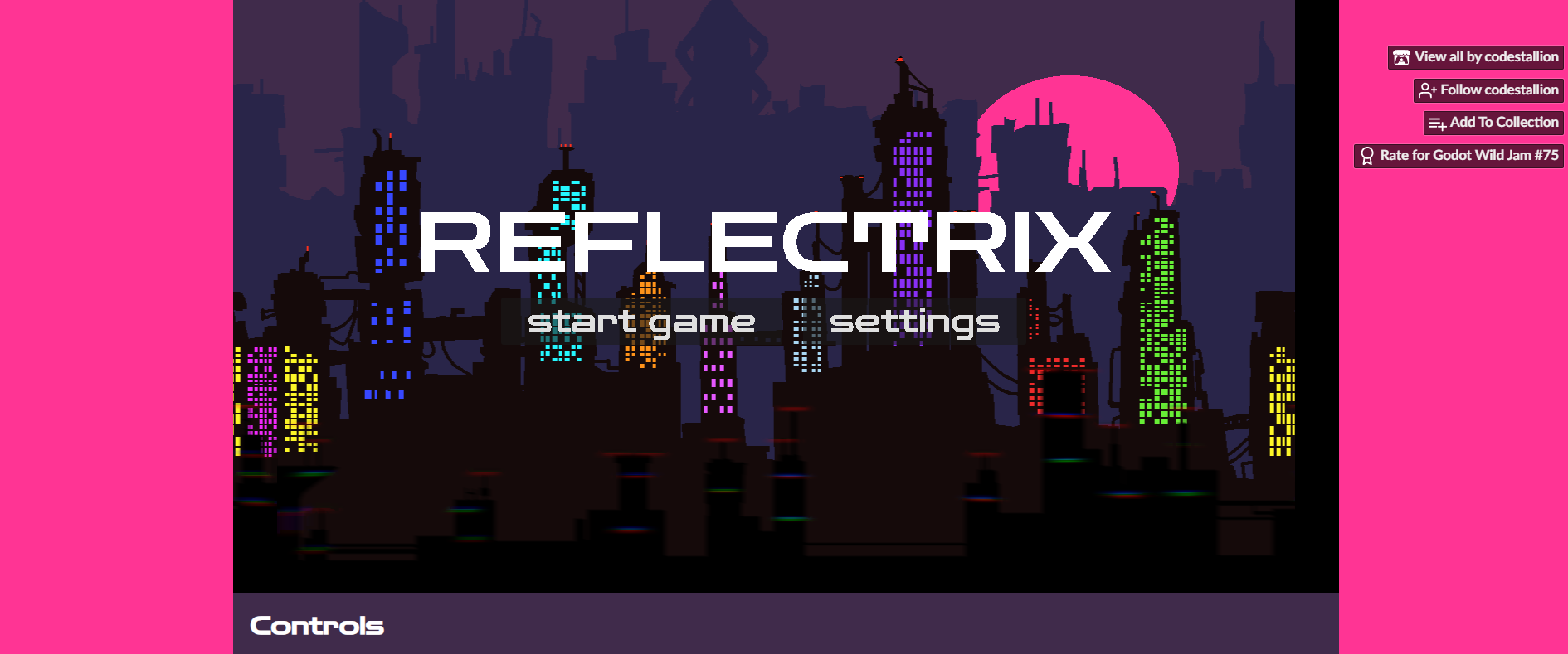
Side-scrolling auto-run platformer where you must reflect to dodge flying cars
How does your game tie into the theme?
The main platforming mechanic revolves around positioning your reflection to move.
Source(s)
N/A
Discord Username(s)
codestallion, ‧₊˚❀༉‧₊˚.buwub.˚₊‧༉❀˚₊‧, andoresu
Participation Level (GWJ Only)
3
Comments
Love the background and the music, the world building is so cool! Was a bit unintuitive and difficult without a tutorial/lower difficulty at the start and the slightly unforgiving collisions, and would be nice to have some breathing room when the "round starts", but really neat idea :)
The presentation is great, I love the art and music. But I had a really hard time with this one. I eventually made it to just before the second yellow pole, but I almost threw in the towel at the first gap. The controls felt particularly finicky any time that the player character was near the top of the screen, it felt like there just wasn't enough space to navigate, and the timing for jumping off of moving cars was very tight; I'd recommend either increasing coyote time or allowing for reflections while falling to help with the latter issue. I think if the size of the window were expanded vertically or the character generally stayed closer to the center of the screen it would feel better, or having the reflection point track the cursor as you mention in the comments. Still a cool concept and cool game though!
P.S. When I saw our games had the same name minus one letter I got concerned that we might have made nearly the same thing, but our games turned out quite different lol
This game has a unique art style. I couldn't figure out the way to play the game. A tutorial could really help the game.
Also noticed that the window in the browser for the game is too big for the game. It shows black bars for me
I'm really bad at your game! ;-;
As some have said already, perhaps an easier start with an increase in difficulty would be better. I loved the style, though. Congrats!
I love the art. Music. And colors. Mechanic was hard. Not sure how you'd make it easier in the beginning and increase the challenge, but that'd make this game great!
I like the vibe a lot - the visuals and music are very retro-cyberpunk-ish. The mechanics is also interesting, but the resulting seems to be broken for MacBook - the image opens in quarter of the screen size, but the mouse seems to work as if it was a full-size, so it was really hard to wield the mouse correctly
I think the issue is that MacBook resolution is double to what it says. So it should be treated not as wh, say, 1080, but as 2160. Better yet is to use viewport/stretch or make relative resizing. We had the same issue and had to make stuff resizeable (and positions adjustable) to the viewport_rect rather than being of a certain size.
It did take me quite a few tries to grasp how the mechanic works and how to proceed. The first gap in particular is pretty tough when you haven't gotten the hang of things yet. I like the theme and the vibe you've created! If it could be a bit more forgiving in terms of speed/difficulty/looking ahead, it would give the player a chance to learn the ropes and see more of the game.
This game has a lot of potential! I love the art style, and the implementation of the theme is quite unique. The game is a little on the difficult side. Giving the player some leeway to convert to the other reflection after falling off a ledge could improve the game's flow. Keeping the reflection character in the same position as the cursor might feel more intuative for the player as well. Enjoyed the game though overall!
Interesting concept - but quite hard to play. The graphics and music are nice.
It took a bit for me to get the hang of the mechanic, but I think it was really unique! I also liked the visuals, the colours were bright and punchy and worked well in favour of the theme your game was going for! I think a little bit of visual tweaking would benefit the game a lot (sometimes I lose track of where the character is because everything is so fast paced).
Well done overall, I can imagine it’s not easy to balance this mechanic in the short time we had for the jam!
I really enjoy the high contrast visual style and the music is nice and catchy. The concept and mechanics are nice and simple, however I found myself struggling a lot with controlling the character. I also found it difficult to keep track of where the character was at any given time - the swap indicator feels very slippery and would constantly be hidden somewhere offscreen. Overall, not a bad game, would definitely play a fully fleshed out version!


Leave a comment
Log in with itch.io to leave a comment.