Play game
Switcharoom's itch.io pageResults
| Criteria | Rank | Score* | Raw Score |
| Aesthetic Flair (Graphics & Sound Presentation) | #10 | 4.431 | 4.431 |
| Relevance (Creative Expression of Theme) | #25 | 4.034 | 4.034 |
| Overall | #34 | 3.711 | 3.711 |
| Technical Excellence (Design & Engineering) | #56 | 3.379 | 3.379 |
| Immersion (Gameplay & Storytelling Engagement) | #83 | 3.000 | 3.000 |
Ranked from 58 ratings. Score is adjusted from raw score by the median number of ratings per game in the jam.
Made by One or Two People
yes this was made by just me / us
All Original Content
yes everything was made during the jam
Leave a comment
Log in with itch.io to leave a comment.


Comments
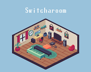
i really love the pixel art in here, its really great and the gameplay, I ussually dont know what i did wrong when i failed, so when game over it might be helpful if its tell u whats wrong. anyway i really like it and its relaxing
Thank you for the kind words! We are glad you got the chill vibes from the game! The feature of showing what items changed after you lose will hopefully make it into the game soon enough!
Wow this is quite hard!
I gotta say, I really like how the game looks. It's just so pretty haha, it's an interesting concept and a pretty solid game
One thing that's in mind though, I would've liked if it showed you how many items changed while playing, not only at the beginning, since at least for me it was easy to forget and I didn't know if I had selected all, although I can also see why this wouldn't be a thing since it can add another layer of difficulty, given this is a memory game. I feel like this is a dumb feature to ask for, but it happened to me a couple times haha
It's not a dumb feature to ask for at all! I've myself forgotten the number of items changed a couple of times while playing, and I don't know how it didn't even cross my mind to put in the number of items changed in the level itself...
Thanks for the constructive criticism, it really helps! We are glad you enjoyed our little lo-fi memory based Dark Souls :)
Solid, but I wish it told you what the right answer was if you got it wrong
Thanks for the feedback! That is a well requested feature that will make it into the game!
Really great concept, and I really liked the art style. Nice work! :)
Thank you a lot for the compliments, we are really glad you like it!
thank you so much!
Nice game. You want too play it more and more to discover all items and go as far as you can. Some changes are hard to see from this distance. It will be nice to have information hom much changes you must discover in main play not only between levels.
Yeah we do plan on adding the counter showing how many items you have selected and how many you have to select in the next update!
Thanks for enjoying the game and thank you for the kind feedback!
I think the game is too brutal. I recommend having less items in the room in the beggining and slowly adding more. I had problems even with screenshot :D But I really love the visuals and soudtrack. Awesome!
That is something we are trying to figure out, the difficulty curve is too steep so it's one of the things at the top of the list that needs fixing.
Thanks for still giving it a try and giving us feedback!
Thank you for your compliments!
I think we learned as more people played it that it is much more difficult for some than it is for others. Vimlark played it on stream and had an incredibly difficult time with it, even with the screenshot. Some people just don't really have a very strong visual memory. Good suggestion though with adjusting the difficulty curve.
Nice idea, like the art and the music
Thanks a lot!
Thank you!!!
Your art and design are graceful. I love the pixel art style, and you made me in love with your game. On the other hand, the 'HELP' guide feels a little hard to read and understand. I suggest that, use the main point to summary your guide to feel more user-friendly. :)
Thank you so much for the kind words! The big block of text is definitely intimidating and feels like a chore to get through so it is one of our things to focus on post jam!
Love the visual, super cute and would love to have those pixel-art skills one day. Great colour palette, too!
Love the idea of the game, though I found it really hard to guess the changed items!
I think it would help if the game showed which items had changed in the level when you loose. It could display both the correct and incorrect version. That way you would know why you lost, and could start memorising the right colours with each loss.
Those are some great suggestions! The idea of showing the changed items is something that will make it into the game some way or another in the future!
Also thanks a lot for the compliments, it means a lot!
This is such a fun game! The only main critique I have is that it might be nice to show the original before each level. Other than that, it's a great game!
Thanks a lot for sharing your thoughts, that is certainly an idea worth considering!
Really cool and creative use of the theme, I liked it!
Thanks a lot, we appreciate the kind words!
cool game, really nice isometric art ! but as some already pointed out, I also missed the room in the menu. For someone who doesn't really know the way it looked originally it's a bit hard to point out the differences.
Really sorry about that, we will make sure to make it clearer in the future! Also thanks a lot for the compliment!
Cool idea! The art and sound design are great! Game is fun and has an interesting concept.
Awesome game, congrats to the developers! :)
Thanks a lot! We are glad you enjoyed the experience :)
Cool game! On my first run, I need to reload since I just realised that I missed the first room that I need to remember. Maybe better if it's mentioned somewhere on the first screen?
Other than that, I really like the art, music and gameplay. Good job!
Thanks a lot! I have to admit that is a fair point. Making the instructions clear is one of the most important things to do when making a game, so it will definitely be worked on!
Chill game, but hard! couldn't pass the 8levels :c Great job !
8 is pretty good! i usually don't make it past 7. thanks for the compliment!
great take on the theme. the gameplay is very akin to "spot the difference" games, which isn't a bad thing. the rules could have been explained better, it took me a while to realize where the original room actually was. once i understood it it got fun, trying to match up what was missing in each level. the art is nice and it lends itself well to this type of game. the music is also pretty relaxing and i thought it fit in really well for the game. the game does suffer from a bit of tedium, as once you memorize the room the game becomes very simple. maybe for a post-jam version you could add random rooms to spice up each run-through of the game.
thank you for the compliments!!!
yeah, i think we realized a bit too late that you sort of have to put the directions directly in the path of the player because most games explain what you do with like a tutorial, so you naturally come to expect it.
good idea with the tedium and repetition . i definitely really like the idea of the ideas randomizing in location around the room, or having a few different predetermined layouts.
Really great entry. 2 things I would change for the future. 1 if player don' t read description, it can be confusing at first sight. Would be cool to have some screen with something like "take a good look at the room ". And 2nd , would be great to have some ending. Even simple "you made it congrats" could make some good satisfaction moment. But both of mentioned thing are nothing serious and your game works great as is! Me and my wife had a blast playing it and trying to beat highest possible level. As I mentioned in comment section, we made it to lvl 14. I would recommend to anyone to try it as the take on theme is very original and the atmosphere of this entry is very pleasing. Great job done!!
thank youuuuuuu : D
good point with having a basic tutorial. i think if you're around the game too much, you forget that the initial experience of the game can be confusing with out a built in explanation. also with the feeling of completion, its definitely a good idea to have an ending or 'high score' as well.
thank you for your kind words! really enjoyed your entry as well!!
You are absolutely right about the description! I can relate to not wanting to read an essay of a game explanation, but that's just how it is sometime, though I'll do my best to make an intuitive tutorial the players will be able to go through! Regarding the ending, that would be tricky game designwise, but would certainly be satisfying, so it's worth considering!
Thank you and thanks to your wife for enjoying out little game :D
Really nice presentation. I love the way the music pans with the UI as well as the way the UI nods and shakes when you are right or wrong. I think the game could have been explained in a couple of sentences instead of the wall of text you currently have. In the text you mention having a screenshot of the original room side-by-side, however it would have been nice if that could have been included in the game.
thank you!! steve did a really good job with the ui and the animations.
good thinking with the wall of text in the help bit, it definitely is a little intimidating. heard from a few other people as well that they would have liked to have screenshots included somewhere in the gameplay loop, so that would probably be a really useful future feature to implement.
thank you for playing and commenting!!!
This was a great relaxing game :D Had a great time with it , the gameplay is very adicting! But the best thing for sure are the visuals, the artwork is amazing! Anyways, great job guys :)
thank you so much!!
Thanks for the kind words, your game is also amazing!
Love the art style, it is a really funny game, great job!
thanks a million :D
Thanks a billion :D