Play game
Gelato Animals's itch.io pageResults
| Criteria | Rank | Score* | Raw Score |
| Quality | #45 | 3.688 | 3.688 |
| Overall | #68 | 3.438 | 3.438 |
| Innovation | #76 | 3.313 | 3.313 |
| Completeness | #103 | 3.313 | 3.313 |
Ranked from 16 ratings. Score is adjusted from raw score by the median number of ratings per game in the jam.
Leave a comment
Log in with itch.io to leave a comment.


Comments
Super ambitious and makes it worth your while to learn it's rules and controls. Feels like you really maximized the use of space, each scene is distinct and interesting. Awesome job!
Thank you very much!
To be honest. I didn't really played your game. I just pass from space to space to enjoy your assets. The animation is very good also. for example, I'm impressed that you succeed to create an animation with turning pages with only so few pixels! 👏 congrats.
Thank you!
the art is very good, and clearly a lot of effort has been put into the management mechanics, like others pointed out the controls are a bit difficult to master.
great job!
Thanks for playing!
God I'm jealous of your art! Seriously, those animals are so well done, extremely cute. And the cash register is amazing, I'm in love with all of it. I will say I struggled with the controls a little bit and could have used some more introduction to them but that might just be on me. Awesome work!!
Thank you very much!
Blown away you managed to make this style game within the limits of the jam. I did struggle a lot with the controls though.
Thank you for playing!
Finally got around to trying this, and enjoyed it!
I definitely love that you use the numpad layout for controls, but I think it could be done a bit smoother - it is a bit confusing that the "continue" button in the customer dialog is the same as the "up" button in movement mode. I think an easy way to fix this would be to scrap the movement mode and instead dedicate two buttons to moving through modes (like 4/6). Then in each view 7/9 could be left/right so that flipping through the index, selecting an ice cream, selecting extras and selecting a price used the same two buttons everywhere, and 5 always meant confirm selection.
I enjoyed your graphics and sound, and applaud that you chose a font that was actually readable!
Thank you for playing and input!
I actually like the controls… They’re clunky but in a good way, and I feel like a stupid kid again trying to figure it out :P I had a lot of fun giggling and absolutely ruining every order. The art and presentation is really nice too, super polished!!
Thank you!
The art is very pretty and the game feels pretty polished, but I feel that there are some problems:
All in all, it's a pretty and relaxing game. Good job
Thank you for playing and the feedback! I'll try to address your points as best I can:
Appreciate the input!
As for the controls, I got the idea of why, and I did like the idea. It's not bad per se. It's just that it's kinda clunky to get used to it. By the way, on the assemble page the button to wipe the ice cream (2) is mapped according to the computer numpad instead of the nokia keypad.
As for the steps to play the game. Ops, it seems I suffer from that condition that keeps people from reading the manual before using a product :P
Dang it, thank you for bringing the 2 to my attention x)
Great art and vibe- well done! Like others, I tripped over the controls a little, but maybe it'll come a bit more easily if I dust off the old numpad
Thank you for playing!
This would be my favorite game of the jam if the control scheme was not complicated as hell. I mean, I understand everything that I had to do but man is it tedious to remember all the buttons and screens and the order of things. Took me a while to figure out how to make an ice cream too. Not entirely sure if the customer was happy with me. And all ice cream I made were free because I could not figure out what to do at the register. And some screens I skipped overall as I was not sure what to do with them.
The graphics are nice, except for the title screen. That has a bit too much going on. I like the sound design and polish of this game. If I had this game in my day, I would have played the living f out of it. Great job!
That's a shame, but valid criticisms. Most of the required inputs are displayed in the game but I chose to display the keys that would have been used on the Nokia keypad and it seems that pretty much everyone is getting confused by it :')
I like the concept of this game and the cute art and dialogue! It's put together fairly well, but the controls are difficult to get adjusted to. To be honest when I first started the game and didn't understand the controls right away I was just going to quit, but I saw your nice art and wanted to see more of the game so I tried again and figured it out. Overall, I like the game and your style. (A bug I found: Selecting a cup with '1' doesn't work on the numberpad, you have to press '1' on the left side of the keyboard instead).
Controls is gonna be a sticking point for my game isn't it ^^ It's completely justified critique of course! As for your cup issue, is it possible that you were pressing '1' on the numpad as opposed to '7' which would be '1' on the nokia keypad? (Yes it is confusing, even for me ^^)
Ahh I didn't realize that the keyboard numpad and nokia numpad were inverted!
Amazing game, with nice art, animations and transitions. I also enjoy the gameplay loop and the different scenes for each task. My only critique is that the controls are contextual based on which scene you are so it can be pretty confusing even looking at them on the game page but it could be a matter of getting used to them.
Thank you very much for playing! You're not wrong about the controls, the original idea was to utilize all of the keypad as much as possible. In the end I tried to keep it somewhat consistent between the views, to use the same keys for left/right inputs at least. As for the other interactions the idea was that using the key in basically the same region on the keypad as the region on screen would be intuitive, but it's a hard nut to crack that one! And you don't have much screen real estate for controls either :P
i feel the dev worked hard on this game specially with the art but i dont seem to understand the controls. they are never told their functions.
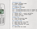
Thank you for playing the game, the controls are explained in the first "screenshot", maybe i should add them to the game page as well, thank you for your input!