Play game
Heart beat's itch.io pageResults
| Criteria | Rank | Score* | Raw Score |
| Simplicity | #358 | 3.658 | 3.658 |
| Creativity | #433 | 3.132 | 3.132 |
| WOWIE! | #528 | 2.763 | 2.763 |
| Topic | #534 | 2.868 | 2.868 |
| Sound | #539 | 2.684 | 2.684 |
| Fun | #620 | 2.579 | 2.579 |
| Visuals | #739 | 2.263 | 2.263 |
Ranked from 38 ratings. Score is adjusted from raw score by the median number of ratings per game in the jam.
Music Source
https//:bensound.com
Leave a comment
Log in with itch.io to leave a comment.


Comments
A really unique concept, it’s very creative. Nice Job!
Thank you!
Good game :)
Thanks!
I really liked this idea and think it's very original but it ended up being a little too passive and easy. I placed 3 turrets on the first few waves and they comfortably kept me at the right health for a very long time. When I eventually needed more towers I had a ridiculous amount of money which didn't feel very balanced. Then the win screen popped up very abruptly which caught me off guard. I think you could have done couple of pretty simple things to make the game feel a little better. First I would put a wave count somewhere so that the player knows it's not just an endless game and then the end wouldn't be so surprising. I would also either give the player much less money or just get rid of the money entirely as I don't think it contributed to the gameplay. Finally I think some simple animations when the turrets fire could have gone a long way to make the game a little more juicy. Overall, the game seems really well made and although I found it too easy, I think you made something really impressive and I love how different your take on the theme was.
Yeah the game was pretty much untested due to time constraints, and I was a little disorganised and chose something to big for a 2 day jam. I am deciding whether to improve it, but if I do I will add all of your ideas. Thanks for the feedback!
I liked the concept and the music. It will be interesting to have the heart live somewhere for information. Good job.
Thank you for the feedback!
Interesting concept!
Thanks!
nice little game, one thing that is when you die you can't restart overall Good work !
What was the issue sorry, was the restart button not working or was it not resetting waves?
When i press the restart button it says game over i think the issue is reseting the health
I will fix this issue, but not sure if this counts as a game-breaking bug so i'll upload after the jam probably
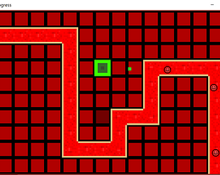
Cool game concept, I also like the redish color palette, though I don't think it fits that well with the neon green. Still great game though! :)
Yeah I'm not great at that sort of thing...Thanks for the feedback!
I like the long-term strategy nature of the game, but it would greatly benefit from either removing turrets or (better still) previewing the next waves and keeping the irreversible turrets
Yes, removing turrets was something I was going to implement, but ran out of time. Thanks for the feedback!
The mechanics is very unique. Overall nice and funny game. :)
Thanks!
The concept is interesting. Unfortunately, I've got a 16:10 screen, and I don't see my health, and just a tiny bit of the possible turrets. Though your idea is simple but very efficient. Great job.
Thanks for the feedback! I'm quite new so I'm not really sure how to fix that but I will have a look
For the Canvas, use a CanvasScaler with "Scale with screen size" UI scale mode (not "Constant pixel size").
For the sprites, a simple solution is to adapt the camera Projection/Size (orthographicSize) to fit the with of the world.
Thanks, I will be sure to use this for next time
I've also made a tower defense game and i know how hard it is to develop in 72 hours. Balancing in particular is a big issue.
However i like the concept of your game, where you have to let enemies through, in order to survive, but just enough that you don't get over 200 lives. This concept opens a whole new strategys to consider.
Unfortunately the UI is a bit small, at first i didn't even see where i can see my money.
All in all this game is very fun, with a simple design. I respect that you managed to make a tower defense game. Great job!
Yes it was quite difficult to make in 72 hours! The UI is pretty bad (due to text.text not working i had to use GUI.label and didn't have time to figure out how to scale it with screen size). Thanks for the feedback!
Funny game! I liked to play it!
Thanks!
Fun casual game concept. the music is really nice too.
Thank you for the feedback!
The concept for this game is very nice.
When I beat it, I didn't really feel like I earned it. This is because it told me that I won at a seemingly random point in time and the game felt a bit easy.
I feel like you didn't need to have a money feature; once you get a nice setup, you never need any more money for turrets and you gain money so fast, you never have to worry about it.
I feel like the music didn't fit the game, and I wish there where some sound effects.
The colours are too bright and don't fit together well. I feel like if you lower their saturation and value, and mess around with their hue, the game will look way better.
I think this is a cool game. You should expand on it.
I'm considering making an update after the jam, with all the suggestions added in. Any and all suggestions are welcomed! A lot of these issues were due to lack of playtesting, as I didn't have time to playtest. Thanks for the feedback!
It felt so weird having to let enemies pass in a TD when i have so much money to spend on turrets 😬That's the spirit of this jam, and it is an intresting twist on TD : aiming for balance instead of domination, great idea, good job !
My intention was to make it more strategic than normal tower defense where you have complete power! Thanks for the feedback!
Nice concept! Cool game!
Also reading the other commands it seems like there is a lot of things you can do with this to make it even better!
Yes, I'm considering updating this after the jam is over. Thanks for the feedback!
I like the concept a lot! It would be cool if there was a visual indicator of the range of the turrets and a way to maybe disable them temporarily for a certain amount of money? I feel like that could then be used to balance when you want to let the enemies through to get back to a higher health total.
Thank you for the feedback! I was going to add more features but my scope was a little too big for a 3 day jam, so I didn't have time to add a lot of the features I wanted.
Great concept, but the fact that you can't sell turrets takes away your control and that is not good, because you can't adjust your firepower acording to how many enemies come and how many lifes you have left.
I was going to implement this but i ran out of time :(. Thanks for the feedback!
The red is bit too hard on the eyes and the text displaying how much money you have is way too small. Other than than it's alright
Yes the colour scheme is a bit bad really! The reason for the tiny text is I had to use GUI.label which isn't adjustable, as text.text wasn't working. Thanks for the feedback!
You nailed the theme, nice job :) I think the UI could use some touches, but nice job!!
Thank you! The UI isn't great, as explained above but thanks for the feedback