
Hey! We'll add 25 more in march! If you'd like you can send me an email to order a print copy as well! We did a run of 50 but they ran out really fast.
A member registered Jan 31, 2021 · View creator page →
Creator of
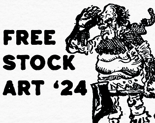
Free art assets for personal and commercial use for RPG, game and book projects.
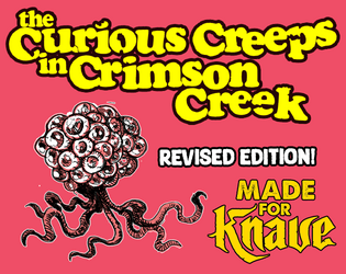
A unnerving hexcrawl, suitable for characters between levels 1-3.
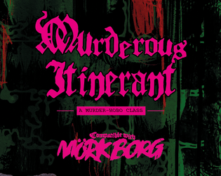
A murder-hobo character class compatible with Mörk Borg.