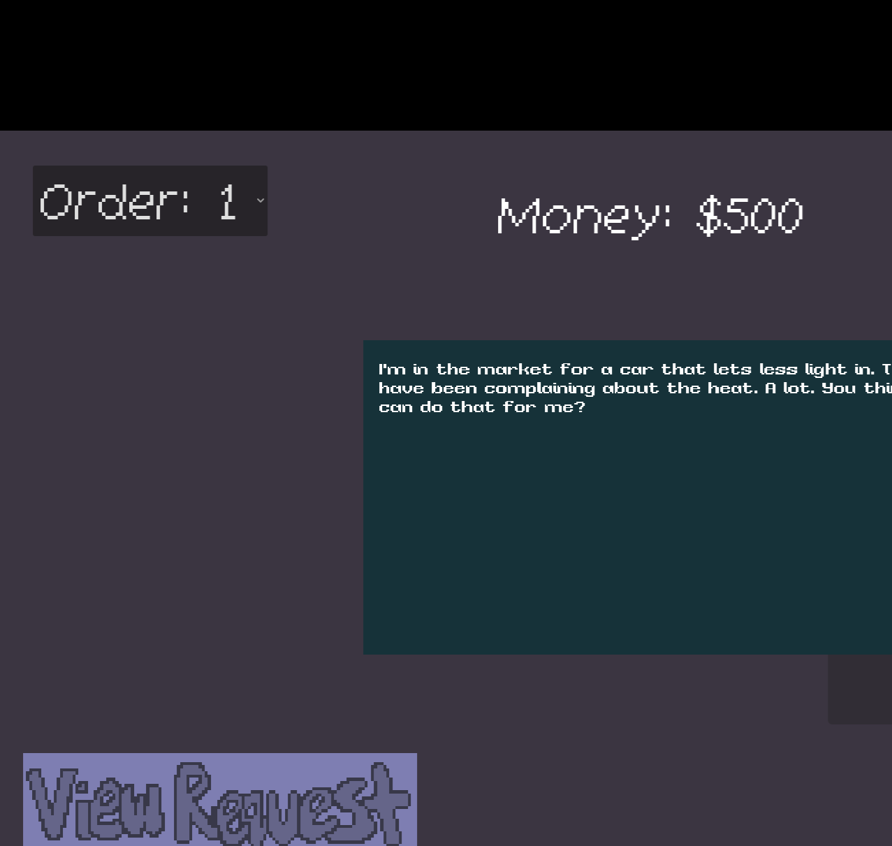
Unfortunately even in full screen it's not scaled right for me, a lot of it doesn't fit on the screen; I've included a screenshot. My resolution is 1280x1024. Car management in 2D sounds like a fun idea though. 🙂

I played 30 minutes and got $2.5m, so it kept my attention a long time. I liked that it was slow paced, no rush to it, nothing bad happening to worry about. Nice relaxing music (I turned it up!). I would have liked to be able to right-click on a trade route and delete it, instead of needing two left-clicks. I could see people playing an expanded version of this game.
Yeah, they can definitely get infuriating after a few items are weighed. You can use objects to keep them corralled, the toilet paper, book, and radio are good for that (if you can keep them upright 😅). I would like to have tuned them a little more, and even introduced some settings for how aggressive they are with their jumping for people who wanted them to be a bit less slippery. I also had lots of ideas for mechanics like cages, leashes, treats, blocks that like other blocks and want to be with them, etc. to get them to stay in place... maybe in an 8-day game jam. ;)
I think it's a great idea. Going up the half loop-de-loop was exciting. I got stuck when there is a gap to jump over, couldn't figur it out, although maybe I should have used the hair dryers! It feels like a complete and polished game, the quests especially make it feel like a real game.
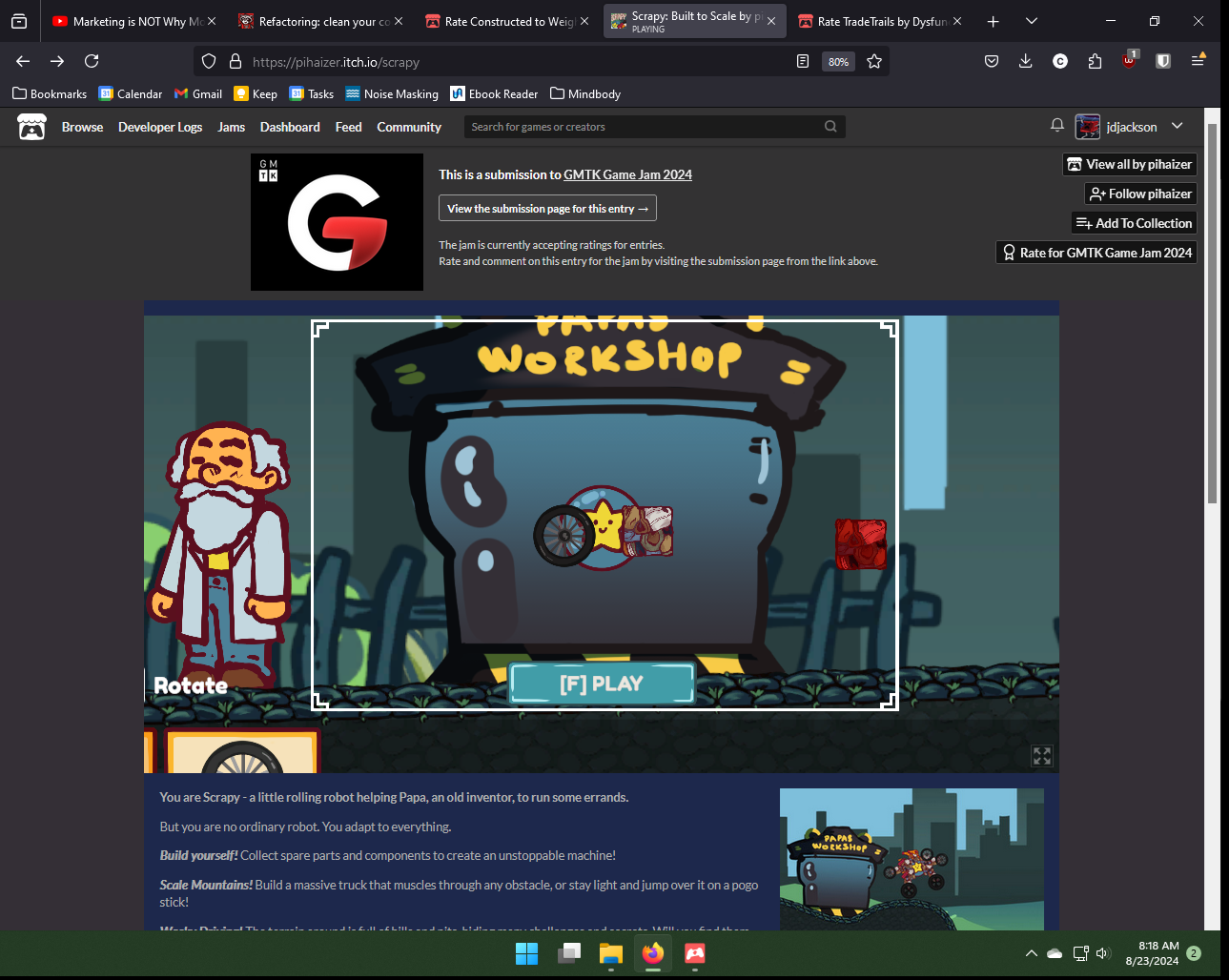
Also, on the web version, I had this problem where the UI wouldn't show properly, so I had to download it:

Really cool idea!
Let down by some bugs, which you know about. My ship seems to just be shooting all the time, and space bar does nothing.
I don't know if the thrusters actually affect my ship, would like something in the background, like some stars, so I know which direction I'm moving in. Some sound effects (even just 'pew pew pew' would also be good. And some art, even really basic textures or color changes so the pieces of the ship look different.
I would play an expanded and improved version of this, with proper art and different ship components like shields, thicker hull, lasers, tractor beams, etc. to pick up that you have to strategize about.
Overall, I think this is an excellent idea. 5 stars for creativity.
Great style, good visuals and music. Concept is clear, it all makes sense. It seemed like option 1 had the best stats, I just kept using that. Occasionally used option 4 if I was overwhelmed with lots of enemies. The spreading of your base slime stuff mainly happend in the front and the sides, I would've liked some to spread at the back as well, it left me feeling exposed at the top of the map. I could see this being expanded into a bigger game, with more enemies, more options, etc.
I loved seeing the little scaly lizard running and jumping and falling. Great animation, great lizard. I would've played more if it was longer. 👍 I didn't really like the music, there was something almost chill about it but instead it was annoying (sorry I'm not a music describy guy). Would love little skittering sounds for the lizard running. 🦎
I finished it, and I enjoyed it. If it was a longer game, I would have played more too. It was great that I could say whatever I wanted to the object, as long as it was the right volume. So I'm here whispering "please stool can you get smaller, smaller, smaller, OH HECK NOW GET BIGGER PLEASE". 😂 The height of the player's view was too low, it made me feel like I was a child walking around, with the table at head height. The walking speed was also a litte slow. It all looked good, impressive that you had a cutscene at the beginning and end.
This is the first card game I've played in the jam, I like the idea that the cards all combine into one Frankenstein card. I like the cards getting bigger as they increase in value. Some more 'juice' would've been nice, like an animation for the cards getting bigger, or the cards sliding over to the left as they combine. It also seemed impossible to lose, like I always had more size points than the opponent. I like the slime art! 🟩
Yes, a good point. Especially as the items get heavier, there is sometimes only a few pixels of difference between the scales that can be really hard to see. Had intended to do fine-tuning of the weights of items so it would be more clear, but for some reason when I changed the weight of the book it then created a bug where you couldn't progress past the book. I spent half an hour trying to figure that one out, then had to admit defeat and upload the older version to the jam. 😅
Whoa, this game is great. Honestly, I'm giving you 5 stars in all categories. I played it several times (never made it to 5 minutes!) I love the concept of going to different areas to gain new skills and upgrades - is that your original idea or are there other games like that?
First time I zoomed out to the skill tree and then zoomed out again to see myself on the skill tree and also saw the skill tree inside myself... 🤯
I think this could be made into a proper game with more depth that people would enjoy. 👍
I enjoy the principle of trying to match the size and rotation of the objects. Not a lot of time to do it in, which made it pretty frantic! I would've liked some visual or audio feedback on if I got the object in the right position, I thought I might have done it a few times but wasn't quite sure. The controls were heckin' hard too, not sure if that was intentional or not. 😅
It's fun just putting stuff together and seeing how it works. I put some rockets on the wheels, not realizing that the wheels actually turned and so the rockets would as well. 😂
My creation often slid slightly to the right for some reason, even on a flat surface. And I'm sure you already know, but the controls were a bit un-intuitive, would be good if the mouse could be used to control the camera as well as select objects. Also an object sometimes wouldn't place, but I had no idea if I was doing something wrong like if there are certain places things can't go or if it was a problem with the game.
I stopped playing it with a smile on my face, and I think that this could be a longer game that people would enjoy.
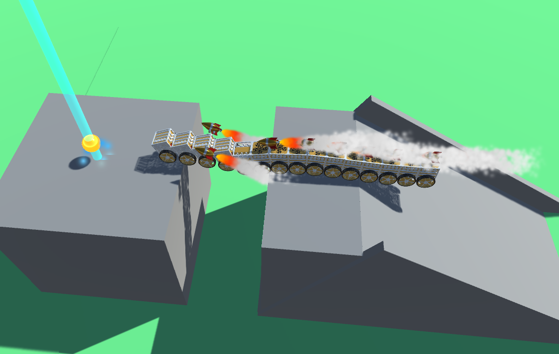
I am very proud of my bridge centipede:

I couldn't get past the first set of spikes, after lots of tries. 😅 I think the scaling mechanic worked well, and I could see how lots of puzzles could be made with it. It was tricky for me to scale up and down using shift and space bar, a lot for me to coordinate with one hand. Having written this, I've realized I could use two hands...