Play game
Let it Grow's itch.io pageResults
| Criteria | Rank | Score* | Raw Score |
| Style | #189 | 4.393 | 4.393 |
| Overall | #387 | 3.946 | 3.946 |
| Enjoyment | #601 | 3.732 | 3.732 |
| Creativity | #1170 | 3.714 | 3.714 |
Ranked from 56 ratings. Score is adjusted from raw score by the median number of ratings per game in the jam.
How does your game fit the theme?
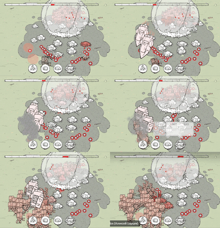
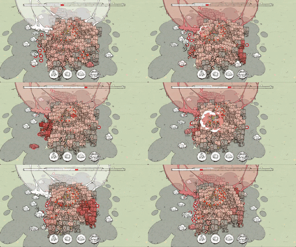
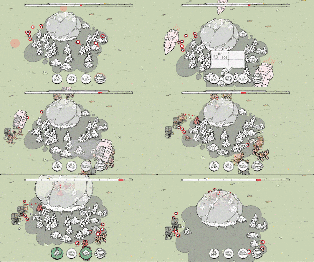
You must protect the embryo so it can grow as much as possible. As the embryo grows, the size of the area where you can build towers increases.
Development Time
96 hours
Leave a comment
Log in with itch.io to leave a comment.



Comments
Really awesome! The art style is very nice, and it's super polished—no complaints at all. It’s a bit of a slow tower defense, but other than that, it's really cool!
5 stars-enjoyment, our carnivorous brother!
Mutually, bro
Really enjoyed this!! maybe a clear outline around the embryo so you know where you cant place things would be nice though
Really cool stuff! I was hoping for a game that was like this! The different tower types, though, it was hard to really tell what they did and why they were different. And the constant killing of all my towers just before a big wave was a bit irritating.
Nice game and great style. I especially liked the music. It worked well with the entire ensemble.
I just personally didn't get what the different tower types were supposed to be.
By only spamming the first I survived easily. Maybe some explanation or gradual addition of different towers might be helpful.
Other than that really great!
If Startcraft II and Don't Starva had a baby it would look something like this. It's a bit hard in the beginning and i don't really get the difference between the two attack towers. But all in all i enjoyed it very much. I felt like a real alien hive mind playing this and i don't think i can ask for more.
Btw can i ask you how you did the "creep" patch on the ground? I would love to kow how to make something like this. (And if you can find the time it would mean a lot if you rated my game)
Hi! We are glad that you like our game.
A creep is a number of textures that replace each other on a ground plane like frames. We also have something like a “build-up map” which is a low resolution grayscale texture where black pixels are free to build up and white pixels are not. It is generated at runtime from the creep textures and the position and size of towers in the game logic, and is used to check when the player wants to build something. This could be implemented in more lightweight way by using a bool[,] map instead of a texture, but Unity has some useful functions for dealing with textures, so we'll use them to speed things up.
Oh, so the creep has a prebaked set of spread states and not generated at runtime in that shape. I see.
Yes, it's prebaked here, but realtime generation is somewhat similar. You can use a shader with a stencil buffer to form the shape of the creep, which will be filled across the ground plane behind it. In this case, the build map will be filled with the shape of this stencil layer instead of textures. It takes some time to create and set up, so we don't use this technique within jam time limits.
Wow! This is a fun game with a fantastic art style. Well done on the animations! I had a lot of fun. Great work!
absolutely love the artstyle!! i didnt find any reason to place anything other than turrets but was fun to play
Satisfying for sure!
Fits the theme pefrectly!
I was spamming 1st tower over and over again and that seemed to be the valid strategy :P
Really nice artwork and a fun game :)
Looks realy cool! Great idea, well done :)
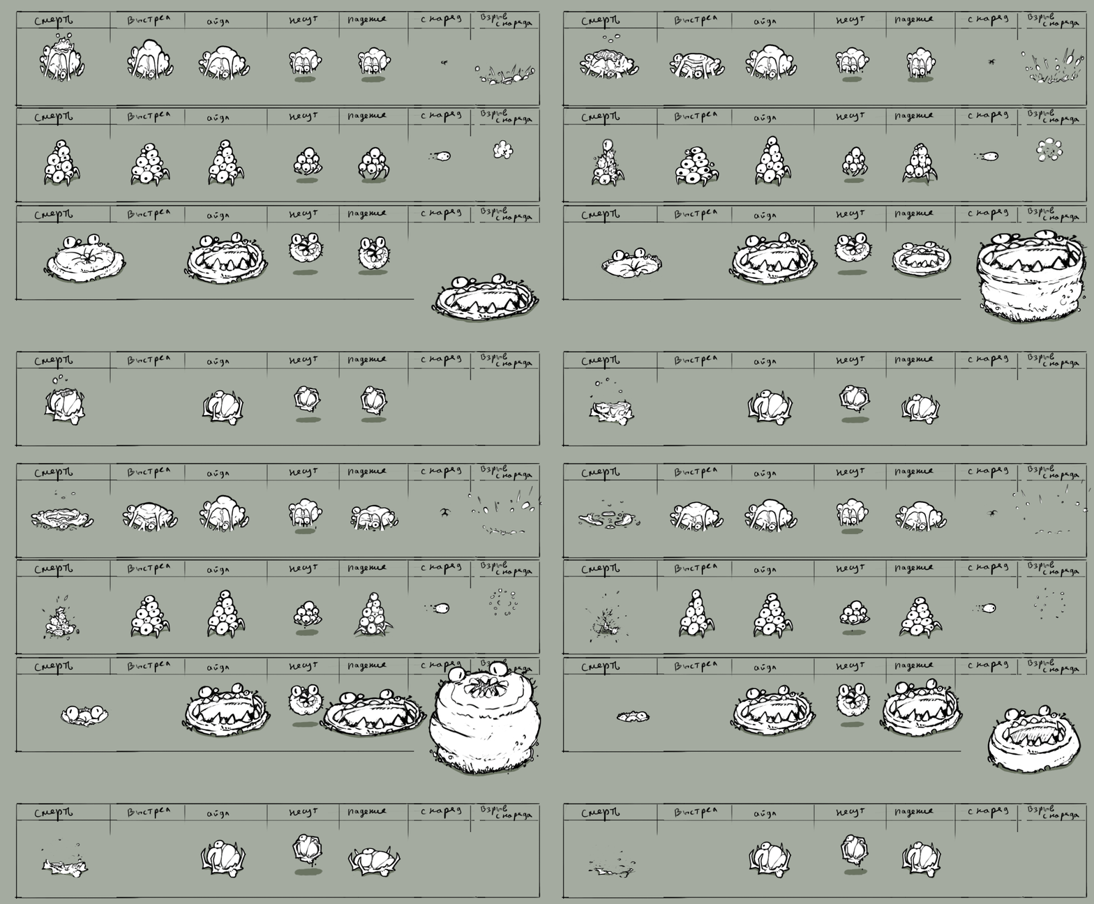
Amazing artstyle and idea. All of these animations and vfx are super polished. Gameplay is neat and very addictie. Concept of growing base that disturbe player in the middle of the fight is SO good. Great work!
This is amazing! The art style is great and this has a large amount of polish.
I like the concept of your base growing larger and larger.
Thank you, we really pushed ourselves to get everything polished in time.
Cool game! Concept is simple and it is easy to understand. Game is polished up and fun. It would be great to have some description of each tower, as I've sticked with first one, which was kinda op ;)
Great style, good visuals and music. Concept is clear, it all makes sense. It seemed like option 1 had the best stats, I just kept using that. Occasionally used option 4 if I was overwhelmed with lots of enemies. The spreading of your base slime stuff mainly happend in the front and the sides, I would've liked some to spread at the back as well, it left me feeling exposed at the top of the map. I could see this being expanded into a bigger game, with more enemies, more options, etc.
Dude, Beautiful game! We went with similar ideas it looks like where you focused on the combat growth and mines more economic, but I love your interpretation, very cool! As the map area grows you really feel like some horrific creature growing and spreading, well done!
wow! animations, art, sound design, they were all amazing! We did a very similar style game and I went in the total opposite direction with music haha. that kind of heavy industrial synth is such a good fit with the "zerg" from Starcraft style growths! It really worked well, I loved the audio so much. Well done on this!
haha now, I should listen to your music version!
I have a love for “modular” synthesizers, and this is very often about space vibes and everything around it)
Thanks for the feedback ;)
Clean animation and style! Felt very satisfying to put things down and watch enemies get blown up. It wasn't quite clear how much of your turrets get cleared when the embryo expands, and sometimes I get caught mid-wave with no turrets -- other than that, great base to build content on! :D
This is fantastic! Very much enjoy the art style and the level of polish - the game feels very complete. Like the commenter below, I found I was mostly spamming the first turret type. The tension that comes with the onslaught of enemy waves could be tempered a little by providing a little break - I found the pairing of a new wave with losing lots of my turrets simultaneously was a little too punishing at time (leading to the spamming of the first turret, and an aversion to experimentation).
Anyway, I think that's pretty minor - this is a very impressive entry and I had lots of fun playing it. Great work!
Thank you so much for the feedback!
You can still try out different turrets, as they all get stronger over time
For example, the maw can devour many enemies at once if you upgrade it :)
Oh cool! Will try again and look out for the upgrades. Particularly the maw, I think that was my favourite turret (even if I didn't use it much)
One of the best games i've played! I love the constant tension and the fast paced nature of it all. Only one criticism is that I would try to add some more variety to the turrets you should use, since i found myself passing all the levels by mostly spamming just the first turret type
Thank you, we know the balance needs some work—we just ran out of time!
We really wanted to polish the visuals and mechanics too :)