Ah! Actually I wasn't expecting being able to erase my word after validating it. And I was simply expecting the game to send me to the next line. So maybe it's just me that did not understood how the game worked. My bad.
And you're welcome!
*smirks* Read the clue carefully. I'm pretty sure you can understand when you will realize what you're facing.
You're not the only one to think the mansion is too dark. Maybe lightening it up a little won't be a bad idea.
About the arrows to indicate the doors, I did that in response to a criticism I faced for my game The Escapists for Driftwood's game jam. Some people didn't understood the rugs were actually indicating doors and a mouse user was confused to not access the room while clicking on it. So, for this game, I decided to show arrows to indicate a teleportation point the player can go through, similarly to Pokémon Fire Red and Leaf Green.
Thank you for the English lesson, I'll hopefully remember it for next time.
Good luck!
Hey!
So, a bit late, but I ended up playing Don't Kill The CEO in the end! It was a neat and funny little game! But now, the gameplay and the universe surrounding is "cartoonishly" funny. But what about... the gameplay?
If there is one critical point I'd make about your game, it would be this:
- Does your choices matter except for the last one? I feel like you can just chose anything you want and still roll with it with little to no impact on the scenario. If that's the case, it would be kind of a shame.
And that's it. I don't know what other critical point about your game. With that said, to people around there interested in playing it, I heavily recommend it. At least for the lolz. This game is making nice use of comedy throughout and if it could have make it in time, it would have been the funniest entry in the game jam, hands down.
Thanks a lot for giving the game a chance and your feedback! I appreciate the encouragement!
I'm sorry. I tried to convey the information to the player by animations. And cursed events are showing some kind of purple aura (the same animation for the last enemy's casting animation). But apparently this wasn't clear enough. This was a massive design flaw on my part for so many players to not figure out the clues.
Again, thank you and have a nice day!
Hello! Thank you for your feedback, it's much appreciated!
I'm impressed you didn't found the Memory card #2, actually. I thought it was one of the easiest to obtain, but this is also one of the hiding place I'm the least proud of. Check the living room for a clue.
Attack skills actually does have an utility... later. I admit it can be confusing considering the kind of game it reveals itself to be, if I do update this game after the jam, this is one of the problems I intend to rectify.
Have fun!
Hello! I'm going to add a bit more context, hopefully so you can understand what I meant a bit better at some points.
- My problem wasn't in your intro, but in the map. I just found it weird to an extend.
- I don't understand why this could not have been a followup to the battle, instead of having to press a button to continue the story.
- When I talk about being teleported, I was talking about, for example: entering/exiting a building, going in/out a certain place on the world map. If I remember correctly, it's in the secret passage the game makes you pass automatically from one map to the other automatically when the player character reaches the border of the map.
- I get the sleeping gas chest was a trap, but I have a problem with the staging of this scene. As soon as you enter, the three others are already shown asleep BEFORE the trapped chest is opened.
- Nah, Albert's appearance is sometimes inconsistent on the overworld (when he is an event outside of the party).
On that day... we're off to a good start.

Now... I did downloaded the fixes... and I could play the game without anymore inconveniences like this.
However, playtesting shouldn't end upon exporting the game! You must make sure the game works properly in its exported form. Even MORE if you decide to let RPG Maker delete game files for you.
Anyway... The game is super short, so I won't have much to say. There is just a few critical points I want to talk about.
- Rosy talks while being supposedly unconscious and somehow had her mind clear enough to talk, remember stuff and learning abilities. All that while still being unconscious mind you. This happened when Rosy took enough damage during the first few turns of the battle.
- I thought the butterfly animation was simple, but wonderful. With that said, it is painfully obvious that both butterflies are part of the same particle image. Maybe it would have been better if both butterflies were independent from one another.
Outside of this, I didn't noticed any major problems. Your game was okay overall. The balancing is... well... the battle is a bit easy to me, but it's neat for what it is. The story was just enough to make me feel concerned about the children to make me involved in the battle. Also, in opposition to most RPGs, this sole battle transpires with life. People are talking, stuff is happening, it's really cool!
Now, I think I've said everything I wanted to say about this game so...
Best of luck for the game jam as well as your projects in general.
Fate of Another is a relatively classic RPG with not much variety in the battles. With that said, the atmosphere was pretty nice. I like how the exploration part is presented.
- You should avoid stuns on small parties. There is a risk the player gets an unfair game over this way.
- "I will make sure you are rewarded for your bravey!", "moment of true!", "Such bravey"


- Can we talk about how the character have no way to restore his MP? Was that an intended design choice?
- Question: why preventing the protagonist to go back in previous areas to prepare? What if the player had some items to get? Or the player wants to explore more of the castle before the battle?
- Wow! The boss was easy. Buffed twice, two Strong Attacks and it is down.
- HEY! Did the game softlocked here? Why? What happened? Tried twice, the game softlocks every time. That's a huge red flag right there.
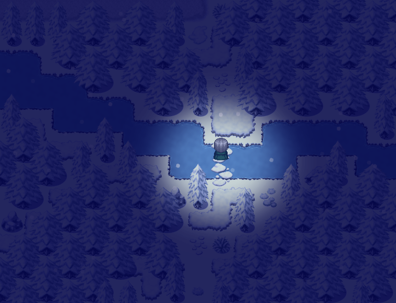
Ok, so it appears this game have an hotfix. So I played it out of curiosity. It's curious how this softlock happened considering the character's route, there shouldn't be any obstacles. It was very weird.
Anyway, this was Fate of Another. Something tells me you're not a native English speaker to end up making these mistakes in the text. The battle was also really weak, it's unbalanced with little thought put into it. Shame, I would have liked more challenging battles. However, it's apparent the focus went to the atmosphere as it is clearly the strong point of this game in my opinion: there is a lot going on, but not too much. The mapping makes sense. The story is cool, nothing super original, but it works.
Verdict, Fate of Another is... decent? It's not good, but I wouldn't call this game terrible either. If anything, I think it would have deserved more time in the oven. Either make the battles matter and balanced or remove them entirely, double check your text and make sure there isn't any game breaking bugs like there is in the original version.
Good luck!
That's quite an original game we have here. I didn't won, but I did gain some points. For those who want to try and win, good luck, this is not obvious.
Personally, I think it is a game that deserves to be checked out. You are quickly brought into the story. There is not that much variety in the story between playthroughs, so you will probably be surprised once and that's it, but it's enjoyable for what it is.
Now, let's go into my critical points.
- Already noticed, but I'm going to say it anyway: the text doesn't have room to breathe here. Beside, they display characteristics that aren't necessary for the game. Why there is a Stamina, Charisma and Anger stat? From what I've seen of the game, nothing would change if this information wasn't displayed at all.

- When entering a door, we can notice the top of the head exceed the door. When I want to do this kind of effect, my way to deal with the problem is to make the character invisible before the door closes so it gives the illusion he is really entering the room.

- The luminosity in the underground is inconsistent.
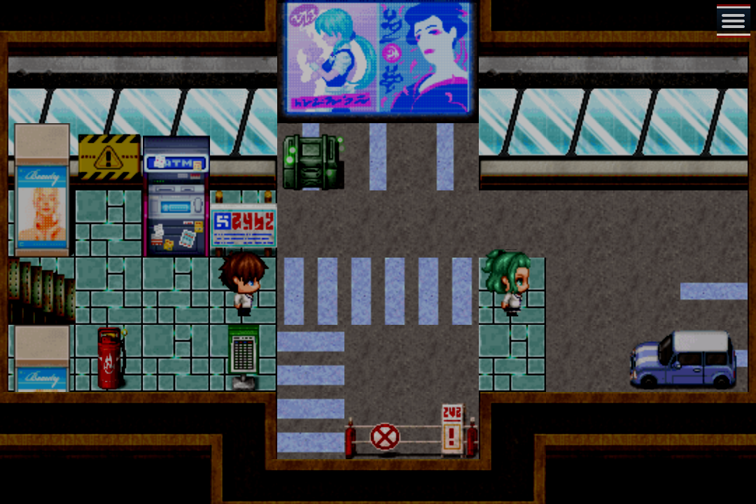
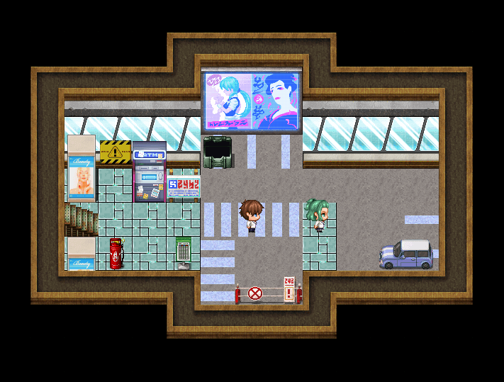
- The text overflows out of the message box when you obtain the document in the library.

- The librarian spilled the beans very easily for her illegal activity. Wouldn't that risk to make her fired and have criminal charges? Why would she trust the player so fast?
- Mister Austere either transforms or down right disappears when I interact with him from a certain angle near the end of the game.
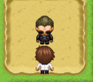
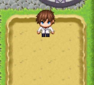
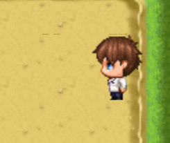
- Speaking for which, this is when I noticed the character sheet doesn't seem to be properly optimized. It looks like there is sometimes a line of pixel messing up (see screenshot above).
And that's it. Except for that, there is no major issues. An original gameplay, an intriguing setting... People will certainly have a good time with this game! ^^
With that said, thank you for this experience. And good luck!
Oh. So, it was A Heart Ever Wandering. A game which is more a linear story than a game. It's basically go there to get X item then once you have every thing follow the line. There is not even any challenge in getting the items, you just go there and get them. If there were at least something that influences the story, a branching path or something, that would have been nice. But everything I saw so far was linear. So I don't want to sound rude, but from what I gathered, A Heart Ever Wandering barely qualifies as a game in my book.
Now gameplay wise, there is no much to say other than that. So what about the story and the graphics? Well... Graphics are a lot of RTP and maybe some custom tilesets. Which aren't bad. RTP are good-looking on their own. However, the mapping is a bit off at times, but I'll get to that. The sound design is also from RPG Maker MZ RTP, but they are overall well used.
As for the story - clearly the main focus of the game, well... I'm not gonna lie, the story is a good little thriller. It's just sad it cuts short so fast. The story is done after mere minutes of playing. This is way way too short for what it is.
Now, let's get into my critical points - which are mostly going to be nitpicks, but nitpicks I think are worth mentioning.
- The mapping: the fact the police station looks so empty, so abandoned with little to no life, cracks and dirt everywhere. Maybe it is to set up an ambiance, maybe this is part of the story, but I don't have context so for me this falls flat. As for the hills, I noticed some little details that looked off.
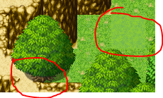
- At one point, the player find a cave in the forest. The problem is this is introduces by a clean opening in the ground where a door could fit. That's just odd. Why this choice?
And that's all I have to say. Verdict: I am a bit disappointed in it. It looks... competent. But it just looks competent. The player influence is so minimal and the challenge so... nonexistent that I doubt A Heart Ever Wandering qualifies as a game at all. Don't get me wrong, though. You don't need both to make a game. You can make a game with branching paths everywhere and little to no challenge. You can also make a linear game which is super challenging, that works too. But the fact it lacks of BOTH, player influence and challenge, is the problem here.
And then there is curious details - nitpick I know. Curious graphical decisions - I'm thinking about the police station here. And the story, the absolute main focus of the game, cut way WAY too short.
This game is a bit symptomatic of the beginner Game Master at a tabletop RPG game which railroad his players for the story to happen like he wants to a T without letting his players influence said story in any way shape or form and forcing wins and loses when the scenario asks for it. This is the kind of thing that drag you out of the experience and doesn't make you take the thing seriously. I see you classified A Heart Ever Wandering as an RPG. The problem is I didn't felt like I was in control of anything. A RPG is actually a game where you play a role, where you play as a character. And by extinction making me feel like the story is targeted to me. But I didn't felt like a player, I felt like a spectator. That's not something that should happen for an RPG, that's not something that should happen for a game even. Even when playing a visual novel, players have some agency over the story or their character. And there is barely any Adventure in there. It's just going from point to point, no questions asked.
There you go. Sorry for the ranting, but I needed to put it out of my chest - so to speak. To end on a positive note, the fact I ask for more out of the story is kind of a compliment in a way. That means the story interested me and from the looks of things, I'm not the only one. Now, what you do with it is up to you, SimProse Studios.
Best of luck for the future!
You're welcome! Something I forgot to mention is: the 1 in parenthesis in the code is the ID of the event. To be, it was 1, because the event of the bed was 1, but don't forget to change the ID for the correct one.
Personally, I don't hesitate to use parallel events whenever I need them. Obviously I'm talking about - in general - a common event running in parallel and maybe one or two on the map depending on the situation.
And again, you're most welcome! If you have questions to ask, don't hesitate to ask me here or on Discord if you have it. ^^
Hero's Way is a story in an universe visibly inspired by titles like Sword Art Online or Code: Lyoko. The story felt confusing to me, I'm not sure I understood everything. It looks like a redemption story. Gameplay wise, it's a relatively simple RPG in its mechanics, nothing groundbreaking. So let's go to the points I think deserve attention.
- The map for the introduction is very strange. It's just a small boxy forest-like map with a trees as parallax. It just looks odd to me. No pun intended.
- After defeating the Treant (very easily by the way for a boss), you must interact manually with it again for the rest of the scene to follow up for some reason.
- The cat man transformed for no reason into someone else. Get back to being a cat man whenever he enters anywhere and even when leaving town. There is even scenes were the cat man talks even when he is not the cat man anymore! When I come back in town from the world map, he doesn't "transform" anymore until I leave a building. Why did he transformed at all?
- Additionally, when you leave town, you are joined by the people you recruited earlier without any explanation or any scene about them joining you.
- The fact of being forced to press a button to get teleported anywhere... Or not... anywhere? Why in some places the game forces you to press a button to teleport where you want to go and not in others?
- Unbalanced encounters early game with monsters that deal a ridiculous amount of damage in one go. I had to grind a bit for experience and items to make sure I was ready for the followup.
- The appearance of the sleeping people you interact with change depending on the orientation you face them.
- Also are the three sleeping supposed to be our party members? How did they instantly fell asleep upon arrival even before the cat man opens the chest?
- "Plants don't sleep." Well... Yes and no. If we can call that sleep. https://www.sleep.org/do-plants-sleep/
- Why Albert keeps changing appearance throughout the game?
- The girl says she is going to heal me, but she never does.
- Static Bolt OP. The final fight is a complete joke thanks to it. It is very abusable and, ho boy, did I abused of it. They could barely do anything.
And that's it. A story that looks good, more polish would have been welcome, a lack of consistency and clearly more balancing wouldn't have hurt the game. You did addressed the lack of balancing in a comment, but the fact you recognized it doesn't mean it is a problem that should be ignored. It's nice though you recognize the problems of your game by yourself. ^^
Additionally, I noticed this game was made with no plugins (or too little to be noticeable) which is a courageous decision on your part as it allowed you to dig into what the editor could do, a respectable way to discover the engine.
Also, even if I admit 2 weeks is very short, I know game jams that happen in the span of 2 days only. So 2 weeks is very welcome compared to this. (With that said, me too, I would have a appreciated a longer time span, that could have save me a lot of stress. XD)
Anyway, congratulations for your participation and good luck for your projects!
A bit complicated, but feasible relatively quickly if the main character is alone or with deactivated followers. What I could suggest is to make the bed and the cover two separated parts. One to go on top of the other. This is how my tileset is setup.
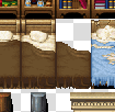


However if the player goes to the tile below her head risks to be cut off.

So what I suggest is for the second part of the bed to actually be an event. It must obviously have the appearance of the bottom part of the cover. And its priority is "Below the characters". If the character goes to the tile below, the event is below the characters. If not, it's above. You want it to be a parallel event imposing a condition. When setting up the condition, go to script and say:
$gamePlayer.y === $gameMap.event(1).y + 1
If will make sure the event triggers if the character is at a position where it can be below the bed. If the condition is filled, I make him set ON a local switch (you can go for a regular switch if you prefer). Copy this page and paste it. In the copied page, make sure it triggers once the switch we set up is ON and it goes above the characters. Once done, go to your condition and instead of "===" type "!==" which should result in:
$gamePlayer.y !== $gameMap.event(1).y + 1
Finally, if the condition if filled, instead of setting the switch ON, set it OFF instead.
Then, it should work like this:
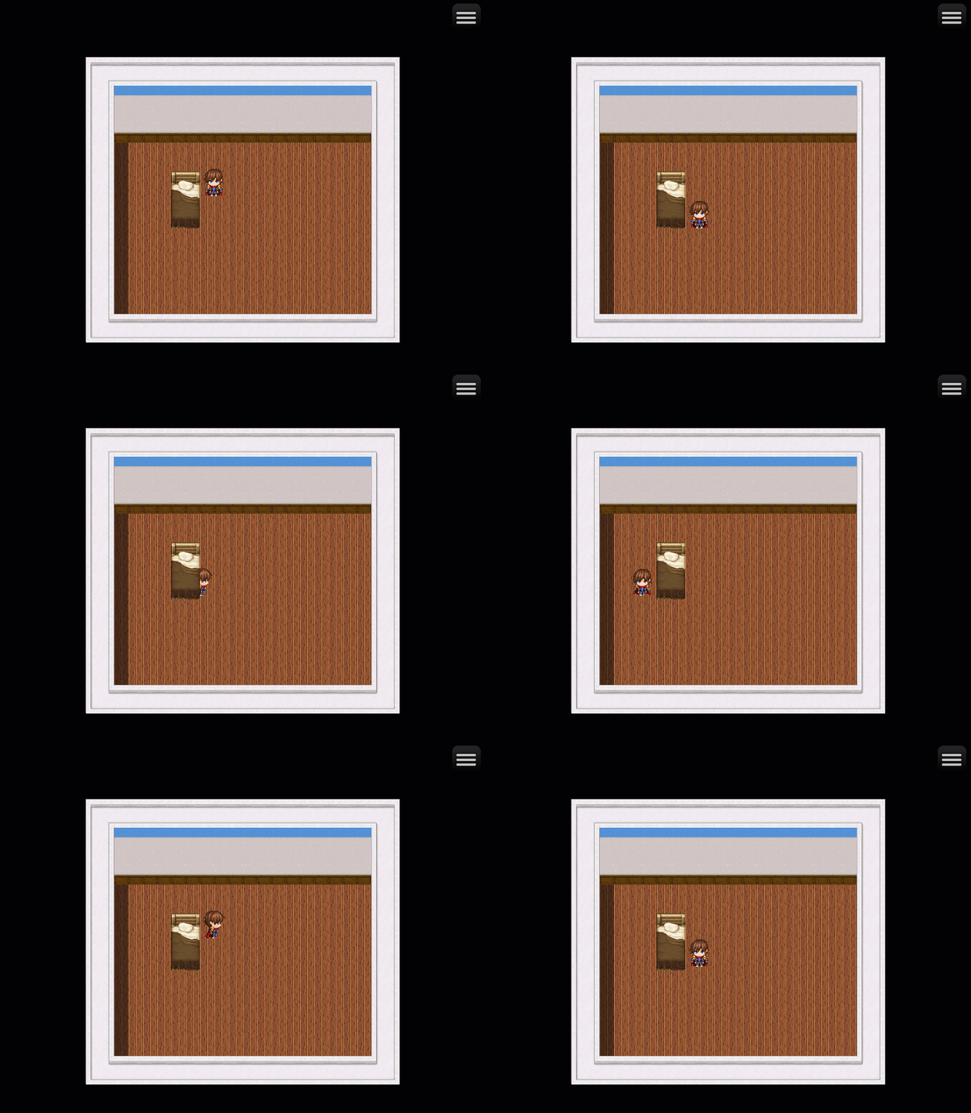
Finally, if you want more info on Script Calls, you can still check these: https://docs.google.com/spreadsheets/d/1-Oa0cRGpjC8L5JO8vdMwOaYMKO75dtfKDOetnvh7...
These are Script Calls for RPG Maker MV, but they still work on RPG Maker MZ so you should have no problem making use of these.
Hope this helps.
KV_Kingdom, developer of Iranor and Power Crystal Crysis, introduces us to Magical Girl Priscilla. A take on the Magical Girl genre featuring the one and only Priscilla in the starring role.
The puzzle parts were really nice. It contrasts with the RPG aspect which is as barebone as it gets.
It was pretty nice all-around. There is just one point I'd like to point out to.
- This.

Other than that... I don't know what else to say. This is a simple game with neat little puzzle sections.
Good luck for the game jam! ^^
... Wow! It looks so professional! No exaggeration, no kidding around! This is hard to imagine that a whole team didn't work on this. And in two weeks no less! Without softlock? No game breaking bugs?This is astounding! This is shocking! This is everything you want ending with -ing! This work... is DIVINE! I have no other words! The world, the characters, the gameplay... Everything works! But not only does they work, but they work really really well! I-I am at a loss of words right now! Really congratulations for pulling this off!
Now the thing is... I did notice some points that were off and I'm going to point them out.
- Josephine disappears after you give her the Anaconda Toxin to recruit her and keeps talking and doing stuff as if she was still there.
- When you advertise a bug when showing off the skill cost is quickly noticeable.

- There is some problems with the text.


- There is some stuff that are off in the some of the maps too.


And that's it. Honestly I have nothing else to say. Again, this is godlike quality work for a two-weeks game jam.
Good luck for the game jam, you have all your chances! And good luck for your projects as well! ^^
You're welcome! Thank you for understanding! :)
About the item issue, I played the browser version. I was trying to use the items, but they wouldn't work. I just tried on the browser, but the items still doesn't work and are just consumed upon "use" without anything else happening.
Thanks a lot for your recommendation. I'll make sure to give it a look after I played the different games of the game jam. I don't mind challenging battles in RPGs at all. Quite the contrary actually, I love tough turn-based RPG battles. ^^
Oh my, oh my... Do I have a MAJOR problem with this game. The sad thing is... it have a lot of good ideas! I love to be able to change forms! I love to be able to live different stories which are somewhat connected! Stephanie is a cool and fun character (at least outside of battles)! And the boss fight in the sci-fi world was competent! But there is something... Something in this game that ruined all the fun I could have from it... One thing I'm going to talk about in my last point. But first...
- In the sci-fi world, there is at one point a rope the player can climb to. But it blends into the background. Honestly, I just discovered this by accident, I thought it was a bug or an oversight at first. You maybe want that rope to stick out of the background so the player can clearly see it.

- The items... they doesn't work! The apple, the oil, the fish... None of them work! They just make you lose a turn in battle! Why?
- Ok, now I'm going to tackle the biggest problem of this game by far: the final boss. I may be exaggerating here, but this is one of the most unfair bullshit in RPG Maker history. Now, people might be saying "he is just hard" and "I haven't tried enough", but no! There is a difference between being hard and being unfair! To tell you how bullshit this boss is here are some quick math! Assuming I did 32 points of damage to the boss which, if you follow the game, is the kind of damage you should deal to him, you deal very little damage to him. Actually I made a screenshot of his life bar so I can use my image manipulation software to calculate how much it was.

Around 3 %. From there I estimate the boss should have around 1066 HP, that's a loose estimate. So with just that it already sucks. But it's not over! Because one of the signature skills of that boss "My Story!" is a healing skill, healing him above 90 HP. Well, that really sucks... But it's not over! Because his second form have ANOTHER healing skill which heals him for above 270 HP! So how do you win against... this thing? Good question! Actually what you have to do is take the right path with some obscure conditions filled. Among these conditions is being in spirit form. A form that you can only achieve by dying. And once you're there. You grind. For hours. Real-life hours. To give you an idea, you're likely to be at level 13 at this point. I had to grind at level 20 to win. Level. 20. How can balancing a boss go THAT wrong is beyond me. The first time I even thought it was an unwinnable battle and losing will lead me to the rest of the game. It didn't. The game expected you to win against him. And the only way to beat him is mandatory real-life hours worth of grinding and make death something you need to accept. This is stupid and unnecessary. The game would have benefited greatly if the final boss was properly balanced.
Now... What made the sci-fi boss work is that you could use good timing in your damages, buffs and heals to maximize your damage and survivability in order to win. The problem is this is something you cannot do against the final boss because he heals and hurts way too much. He have a permanent buff to his Attack and Defense. And there is little to no counter play to that except overpowering him by grinding. It's no longer strategy, it's a numbers game. The one with the biggest numbers win. And that's not a good boss design. And the fact this is all mandatory doesn't make it more fun.
With that said, I like the ideas you had for the game. The major problem comes only at the final boss and once passed, I liked the ending, it made sense and it was impactful. I hope to play more, better games from you. You have potential.
Best of luck! ^^
Receptivity is a short game which is more a story than a game. It's also very linear and there isn't a lot of choices to make.
I don't really know what to say else, so I'll go straight for the points I think deserve attention.
- The title of the game seems to be actually "receptivity" without capital R. Where is the mistake?
- You really want to check the door when the character leaves work.
- So you can take the bus only by interacting with one of the two tiles on which the bus stop is present? At first, I thought it was because you wanted the player to access it by the opening which could have been a nice detail. But it fell flat when I noticed you could also access the bus stop by the side.
- The "It's getting late. I should get a place to stay." event. You can trigger it multiple times by moving up and down at the border. You might want to try avoiding that, this is unnecessary. Maybe every time the player is "trying to leave", but not every time the character makes a step in the wrong direction.
- Speaking of which, there is not this message for the North path? Why? And also some signs can be interacted with and some that are visually identical cannot? Without explanations? That's a clear case of lack of consistency.
- When the character enters the house, the door visually closes in front of her before she gets teleported inside.
- If you insist a bit to go upstairs, the character can basically walk on the ceiling. If you really didn't wanted this to happen, you could have just make the character go back downstairs instead of just turning it away.
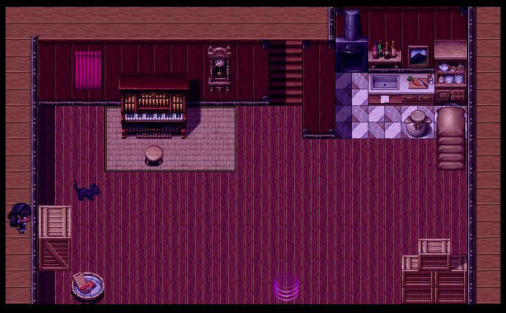
- OMG! I disintegrated her! (The same thing happens if she is interacted with from the left too.)

- Interacting with her from the right and decide to hold her hand, the game softlocks. (The cutscene is a little weird when interacted from the left, but the game doesn't softlock.)
- Something less easy, but if there is no use for save files, you might want to try to get rid of the "Continue" option on the title screen.
- Now I want to know... WHO KILLED THE FIRE? RESPOND!
*hem* Anyway, this is all I have to say. I think it could be nice if there were more polish and maybe an... actual game in all this. Like... I know visual novels are a thing... But even in that domain, Receptivity (or receptivity?) falls flat. On top of that, there is a clear lack of quality check: there is inconsistencies, characters disappear for no reason when interacted with from a certain position and a softlock near the end that could have easily been fixed.
Verdict: Receptivity is very very flawed and would have required a lot more care. Now, don't let this get to you the wrong way. I know I pointed out a lot of negative points, but this is what constructive criticism is made for. Pointing out the wrong so you can eventually get things better. You have a great artist on your side, the artwork she did is splendid. But to me, that's not enough.
I wish you to improve your skills and eventually come back with a better project or maybe an enhanced version of Receptivity/receptivity where it will be... more than it actually is.
Good luck!
MZ Love Story (2 in 1), the game where Reid and Priscilla, fused together, are trying to make out with their respective yandere. In a world where car accidents send you into a fantasy RPG world. (WARNING! THIS DOES NOT WORK IN REAL LIFE! DO NOT ATTEMPT!)
Now to the points I want to raise...
- Priscilla should tell Stephen the dinner is ready... despite it isn't. The table is empty.
- Wait... How long exactly is Stephen/Stephanie aware of Priscilla and Reid being one entity? And how did he guessed? This is not common enough to just randomly guess!
- If you refuse to load a save file when the game proposes you to, it stays on a black screen. The only way out of there is to pass by the main menu to return to the title screen.
- I know there is a download link, but this is a good example why you want to avoid passing by the browser.

And that's all I wanted to say. Outside of that, the map are... meh, but at least you know where to go. The music is well chosen.
This is clearly the kind of game that has been done real quick. If anything, this might be the kind of project you'd end up with if your goal is simply to learn the basis of the engine. There is nothing wrong with that of course, but to me, compared to the other entries I played, it falls short. With that said, the madness of the scenario makes the experience a ride that some people can like to an extend.
I wish you good luck! ^^
So this is Atlantis Lost. Gameplay wise, it's not ground breaking, but in terms of atmosphere, this is one of the most original games of the jam. This game sets itself apart from the other entries in a number of ways. Now, obviously, this game is not perfect and I'm going to get into these points.
- The chests at the beginning of the game doesn't really open. Actually, they more or less open depending on the direction you interact with them.
- There was a point were Scargill was talking about a puzzle, but I didn't knew what he was talking about until I could move. This is hard to understand what the characters are talking about if we, as the player, don't know what they are talking about. A way to solve this would have been to move the camera toward the puzzle to show it to the player.
- Oops.

- Why the Item option is available despite being useless?
- Murda calls himself a whale. Not sure if this is a mistake made on purpose or not. Or he is comparing himself to a whale.
- Prospector Steve is so fragile he doesn't last 1 or 2 turns against bosses.
- I am... doubtful about the utility of levels and experience in this game. Due to having no way to get into battles other than the mandatory ones, it would have maybe been better to not have a level/experience system at all.
Then I wanted to talk about the lack of map which is pretty scary during first person sections, but it's relatively simple other all so it's a minor issue. And it allows to put the player in the characters' shoes so I give it a pass. I understand the decision being made here. ^^
Also, implementing the first person dungeon was pretty ambitious, so kudos for that!
Now with that said, I wish you good luck with the game jam as well as your projects, team... Ah shit! (Language!) Sorry! I meant your team isn't named so... Good luck The LionX, The Human and The Mustelid! ^^;
Hello, I played your game! But to be fair... I don't really know what to say about it after playing. But I'm going to make an effort and come up with a review. So what can be said about it?
The Heist of Cardell Castle is a very simple RPG which have the originality to make us play as a group of thieves. We play as Gil the Bard, Stephen the (Thief) Fighter and Ehly the Sorcerer. These classes make me strangely think of Dungeons & Dragons, is there inspiration from there?
Anyway, let's get over the points that poses me problem.
- Why Stephen's class is the "Thief Fighter" as all of them as thieves? It sounds redundant.
- I see some people encountered a softlock with your game. I was lucky enough to not encounter it myself, but make sure this kind of thing does not happen. For example, in the case of the statue, you could have regroup the party before causing the statue to move. Or check if one of the followers won't be on the way of the statue and prevent the player to activate it explaining the path must be cleared.
- You might want to double check your descriptions.
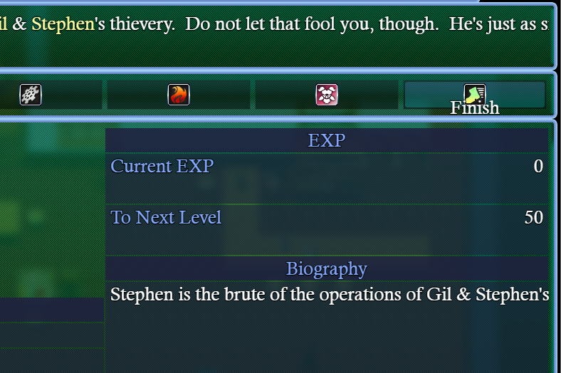
- Also, I didn't understood what being "Careful" meant. When there is a mechanic like that, don't let your players in the dark, explain it right away. It's a way to ensure your game is fair.
- I would have enjoy your boss battles require a bit more strategy to go through.
Other than that, I have nothing much more to say. The mapping isn't stellar, but it's serviceable. I think this is your average RPG game with a bit more polish can make for a better experience.
With that said, I hope my review will help you in the future. Best of luck!
We meet again, Nowis-337! Last time we met, it was for your giant robot simulator! And you're back at it with another tokusatsu-inspired game! And again, I liked it. The custom artworks are great, the sound design is nice and the gameplay is simple yet effective. But like last time, there is a couple things I'd like to point out.
- At the beginning, I was wondering why I didn't had the control of my character. I was looking for a way to move it to no avail as I saw a clear obstacle coming my way. That's only after I realized this was actually a scripted tutorial, but to be honest, at first, it really confused me to not be able to move my character.
- What is really too bad though is that the feeling of speed is clearly lacking during the chase scene. It breaks my idea of the hero going at full speed to chase to chase down the villain. It's to a point I have fun imagining them stopping at every red lights and respect the road signs during the chase. XD
Outside of that, I don't see much more to say, you did a great work! Magnum Rider Z was short and sweet! Best of luck for this game jam! ^^