Play game
Zepher Jump's itch.io pageResults
| Criteria | Rank | Score* | Raw Score |
| Style | #2184 | 3.375 | 3.375 |
| Overall | #3314 | 2.938 | 2.938 |
| Creativity | #3409 | 3.000 | 3.000 |
| Enjoyment | #4341 | 2.438 | 2.438 |
Ranked from 48 ratings. Score is adjusted from raw score by the median number of ratings per game in the jam.
How does your game fit the theme?
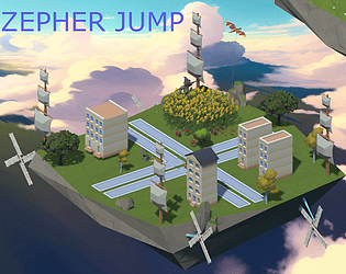
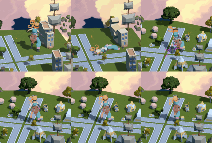
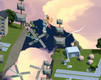
Your character gets larger and you need to navigate a solar-punk town trying to not to knock down too many buildings
Development Time
96 hours
(Optional) Please credit all assets you've used
You can see credits in game
Leave a comment
Log in with itch.io to leave a comment.


Comments
Good concept and vibe! The camera angle is really awkward for WASD controls and the game was a bit choppy for me but I had a good time.
I like that the aim is to avoid knocking stuff down as you move – I feel like that’s not something I really see in platformers. I think the isometric view made it a little difficult to determine where my jumps would land. I like how the music and the art fit well together, but the relaxing atmosphere does feel a bit at odds with the destruction I wreak when I accidentally knock down a building.
Nice entry! Sorry to hear about the file corruption and the blue screen. Must have been discouraging, but glad you still submitted :)
The game has a really nice feel and a relaxing atmosphere. It makes a good first impression. The music, art, and tone fit together well. Would have been nice if I could swivel the camera with the mouse. But I think it's because I found the perspective a bit hard to grasp. The platforms often looked closer than they were, so I ended up landing on unexpected sports.
Also spotted a few grammar/spelling errors. Liked the "embiggner" and "ensmaller" angle haha. Would be great if dialogue boxes were skipped by the player and not timed. Sometimes passed a bit too quickly.
Really liked the world you created here and I think something interesting could come out of this with a bit of workshopping. Great work, glad we had the opportunity to see it :)
this are style is super relaxing and the music fits, but the perspective and the controls are disorientating as they dont exactly match to the screen and your not sure if you are moving towards, away or just falling into the void.
Reminds me of the milkman level in Psychonauts. "I am the milk man".
Dig it!
AMAzing game with beautiful art, showing so many things brand neeew! the ambience got me the first very second!
nice job, the intro cutscene was funny! for me the jumps felt too floaty
The grahics are really nice and the idea of the concept is very cool. Maybe the control of the character could have been a little better but I know how hard it is during a game jam. Don't worry about the end, I had the same problem on my game (I forgot to fix something at the end). Great work btw!
Love the look of this. The camera angle combined with the art initially made me think of something along the lines of Bastion/Hades.
Very neat, would love to have seen more of it but it's shame you ran into the issues you outlined in the description. Good work though!
I am in love with the vibes here. It's such a chill world that you've put together, wonderful job!
The assets look great! Gets a bit tough to aim at the moving platform part, but otherwise I had a lot of fun! Great job!
Easy peasy, until I keep falling at that one moving platform.... Good job, I had a lot of fun!
Beautiful art and character design. Well done.
Visually stunning with unique direction for platforming. Physics is not easy to tweak in this short time and I understand. I only have issues with camera direction, because I can't really aim where to land, but I love destroying houses heheh. Good job for the game!
Great play for the graphics alone, its visually stunning.
I didnt particularly enjoy the movement tho, walking felt floaty (the downloadable version helps with this but not by much) she would rotate before moving in the direction I was telling her so that introduced an even bigger delay, and I'm not sure what's happening to the directions, the platforms are not at all positioned in the direction you walk in, and to make matters worse the jump sometimes would totally go off course, maybe the abbilitty to move while in the air would help a little bit with that.
Other than that I like the concept, lots of potential, just the platforming that needs some work. (oh and can we have skippable dialogs?) Great work tho!
Very unique style of platforming.
isometeric was not the correct style for this game.
Character animations pretty good.
Looks very polished!
I really love the art style and the world you created here! Also a fan of "embigginner" and "ensmaller". The only criticism I have is it can sometimes be hard to understand where you are going to land with the scale, but that is something that can be adjusted with a little more time!
They are perfectly cromulent words :p