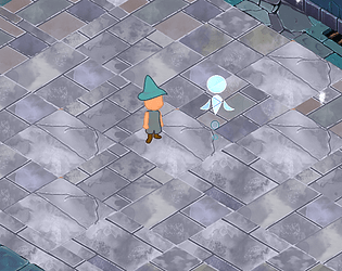
There isn't a lose condition. My intent was just to have the baddies slow you down instead of killing you outright. I would have liked to implement a mechanic where if you took too long you would start losing the fruit you had gained. (The sunlight would set you on fire and then the character would crack open the healing fruit one at a time to keep going. The lose condition then would be if you are still in the sunlight with no more fruit. But due to time constraints, that didn't make it in). Thank you so much for playing and for your quality feedback! I appreciate it.
Soulkeeper10B
Creator of
Recent community posts
I picked up the items, but I could not tell what the man was saying. The whispered "s" sound and the reverb-y echo of the cave drowned out his voice almost entirely. It looks really cool and the concept is very intriguing, but the frustration of straining my ears as hard as I could and knowing I'm missing the explanation of the mechanics anyway, was too much for me.
Very cool experience. I really liked how the point and click with the flashlight on really gave an impression of needing to quietly cover space in each room and only having one hand to mess with items because your other hand is holding tight to the flashlight.
I made it to the 4th room, though room 3 had some unnecessary jank to it (why so many independent steps to get the key? It took me a long time to click the bucket in exactly the right spot too). Unfortunately I couldn't figure out the code and had to just give up. The tenseness of the flashlight mechanic did not go well with needing to trial and error to figure out which of the clues mattered to the lockbox. I only complain because I really did want to finish it so good job on the fun aspect. The art style was very clear and evocative. And the sound did it's job so well. I could tell when the monster was coming in a subtle (but still clear) way. That's impressive to me.
I liked how the art style reminded me of old school tabletop gaming with the drawn in walls and the combat reminded me of Genshin Impact (there's probably lots of games that are a better example of a team with one basic ability that triggers on 'E' and a special on 'Q', but that's my limit I guess.)
I agree about panning the screen by tapping on WASD over and over again instead of holding. And I agree about the ending, but it sounds like you just needed more time with that.
My big struggle was getting the 'E' abilities to actually trigger and switching from a single unit back to the whole team. I kept forgetting which number was which unit too. I wasn't sure if the ability wasn't triggering because I missed right clicking on the hit box or because the unit I was controlling was stuck behind a different unit. Personally, I would have liked to see all the abilities lined up in the UI at all times since there's a hard max of ten and be able to see at a glance when their energy has charged back up again so I could quickly switch over to that unit and use the ability quickly.
I really enjoyed playing. The controls were pretty intuitive overall and I really liked the sound design and background art.
I really liked the atmosphere created with the music, the still images, and the roving flashlights. I found myself wishing that the range of the flashlight was a little wider, but also that would be really cool to see grow over levels as the main character is better able to remember things about their house, I think that might be a neat way to show character development with player progression.
Finding the dishcloth in the toaster felt a little confusing, I think because the main shape of it was hidden so it didn't match the icon at the bottom of the screen very much anymore.
Even though it's not finished, I definitely could tell what the game might be like finished and I liked the experience!
There is something fun about the concept of a character that is a stuck-together ball of people, kind of like an old game of a three-legged race. And there's an interesting idea about having to face away from an enemy to tank an attack, it wasn't needed against these enemies, but the game worked well enough I could see a hypothetical situation where I would need to do that.
My favorite aspects were the characters. You used the simple triangle shapes as a good base to add personality too and I liked how distinct each one felt. Their individual theme songs really went a long way to sell their distinct identities.
I mostly allied unless I thought they would betray me and that got me through many levels, although it left me too low on points to make it all the way through, which felt fair.
The button in the top right to flip over the page took me a while to click and I had no idea it would show a helpful explanation on the back, so using a different system for that or moving that info into the "tutorial" scroll might be a good change. I thought it was some sort of "undo" button.
I like the ideas for the cards affecting, but not overriding, the basic triangle to Rock, Paper, Scissors. I noticed the player and the opponent are given the exact same cards in the same order and that is a pretty important thing to change to simulate card game mechanics. It would be interesting if different characters had different decks later on in development.
I'm glad the starting difficulty was low enough for me to win against the first (and currently only available) opponent on the first try as the frustration of guessing incorrectly is an inherent danger to the concept.