Cool proof of concept, was starteled by the inverted controls initially as I wasnt expecting them and it controls rather well
up2018129(RobertJohnson)
Creator of
Recent community posts
Looks great like how the player moves and rotates to match teh direction you are moving however it is a bit confusing imediately and a litle bit distracting the reticule seems acurate however its a bit dificult to hitt eh enemies as they move too fast and in a diagonal so you have to kind of aim where the will be which is difficult as you can use the reticule to estimate it very well
cool please use point no filter to stop your sprites from being blury and the attack could use with being sped up and the movement could use some slowing down as you can basically miss sections fo teh stage by just moving to the right over platforms and the player gets stuck on the walls (use 2d physics materials on coliders and set teh friction to be lower so they slide off walls insted of gettingg stuck(you can also use moore than one collider on a single game object))
animations on the player would have worked better if you had done teh same thign as the enemies and I noticed that you had the projectile get destroyed upon colidiong with anything including antoher projectile and your jump seems to funciton of OnCollsionEnter2D alowing you to jump on the undersides of platforms and just slide up the sides of them if you are touching them but dont change direction models and 2d looks a bit wierd when the models are just floating on nothing and health pickup is something you can jump off appart from those things its a nice little platformer
is unfortunatley lacking in features such as upgrades or a real reason to continue clicking really and the audio option in teh main menu isnt functional as it lowers the volume in that menu and only that menu so when you click play it is back at full blast also buttons were difficult to differntiate by on the menu itslef
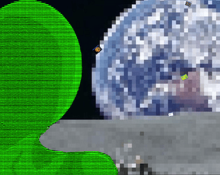
cool aestetic the asteroid like moon moving on and offscreen is a little distracting and off putting and it is a bit of a shame there isn't much visual feed back when you buy an upgrade such as a book for the planets that you own(know its a rather large ask but the art was nice to look at and would have like to see more of it or different planets every so often)
works well however it is not entirely clear what each of the upgrades do like how the cursor changes when you hover over the wheat field as it helps to let you know what to click onto increment the score and that there is a cycle of time as it is a nice ambience along with the hay bales that acumulate in the background
Cool game fits theme however the main menu has a couple of issues where the options button didnt seem to want to open an options menu for me and the quit button crashes the game in the browser liked seeing the sprites change when upgrades were bought as it was good visual feedback also like that you can see how many clicks you average a second
Works rather well stamina for blocks works quite well with the problem that the inputs for the attacks are slightly too fast for the recovering player and there is no pusishment for the attacking player that hits a block so I feel that it is quite likely just a game of who can mash the fastest without activating the block function by registering to key presses in a single frame as I asume that your attack inputs are read through the update method
Cool little project but it is dificult to time when you are supposed to press the spacebar as you cant see where the player character is in trelation to the ground below which isn't helped by the camera as it is always tileted to one side and is not looking down enough to help gauge the playeres position abouve the green stips
Problems with spawn positions and the end of the world, instead of moving the player forward and leaving the rest of the world spawned in the whole time you could have made it so that you left the tops and bottom of the mape still and moved your obstacles from offscreen toward teh player then destroyed them when they were no longer in view and the same goes for the collectables


