Play game
Aberrant Force's itch.io pageResults
| Criteria | Rank | Score* | Raw Score |
| Presentation | #378 | 3.333 | 3.333 |
| Overall | #582 | 2.611 | 2.611 |
| Originality | #637 | 2.500 | 2.500 |
| Gameplay | #676 | 2.000 | 2.000 |
Ranked from 18 ratings. Score is adjusted from raw score by the median number of ratings per game in the jam.
What do you like about your game?
The pixel art monsters and the aberrantion of player movement system it has
Leave a comment
Log in with itch.io to leave a comment.


Comments
The pixel arts and sounds are very good, and I really like the shooting system. I'm not a fan of the controls, which feel a little confusing. My technique was just to hold the forward button and move with the mouse.
The controls are VERY unconventional but it works well. It's not my type of game so I won't judge the gameplay, but the art and ambience are well crafted. I think you forgot to loop the music (if you used Godot, it's in the music's import settings). Also I managed to get into a state where I could only move while aiming, check your logic. Also the cone of vision goes over the HUD, check the order of your nodes.
Thanks for the feedback. It's Unity actually, and yes I didn't click the loop check box sadly.
Interesting control scheme, sort of like silent hill except top down. The graphics and atmosphere are really nice -- you get a good bit of tension from the lighting system. Only thing is -- I didn't realize I was able to shoot at first, and was able to reach the end of the game without shooting any enemies. Not sure that's the intended way to play.
Thanks for the feedback! Well I didn't make it a requirement to kill the monsters to finish it, but I expected that exploring and finding the exit would be too hard if you left them alive, that goes to show the monsters need some fixes to be more dangerous.
Solid entry. As many commenters before me, I didn't like the controls. I know you said you did it to make the player feel less control, but I think there should be an in-game reason for it (the character being disoriented, struck on the head, under the influence of some gas or something else). Without any obvious reason it is just perceived as a badly designed controls system. I liked the art and the ambience sound. Liked the feeling I had while carefully exploring the place, trying ot to get eaten, the tension of the unknown darkness ahead. Good job!
Thank you! you know, I hadn't considered that a narrative explanation might make people accept more the controls being what they are
The pixel art and the concept are very good. Well done! : )
However, I'm not a fan of the tank-like control scheme in this game. I think it would work better with a traditional twin-stick shooter control scheme.
And here's my two cents: I suggest working more on the polish and "juice" (AKA: impact, flash, indicators of damage, contact, actions, etc) next time.
Thanks for the feedback!
Nice pixel art, needs a bit of feedback on the weapon, tracers or projectiles of some kind go a long way to getting more juice in. Nice use of vision cones for tension but the movement being relative to the camera is pretty weird and non standard, most top down games use global directions for each movement key which is a lot less disorientating most of the time.
Funny that our two projects have a lot in common but are totally different genres!
The two games are gameJam-cousins haha
Thanks for the feedback, totally agree with the feedback issue, it was one of the things I was sad I didn't get time to add. The movement being confusing was in a way my take on the theme of aberration, as it wouldn't be what people expect, but I wanted to build on it with a horror theme and maybe helping on making the players feel less powerful or limited in their encounters. But alas I don't think the horror atmosphere goes hard enough to support that idea, first time making something horror so I'm still happy with the result.
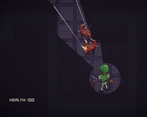
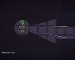
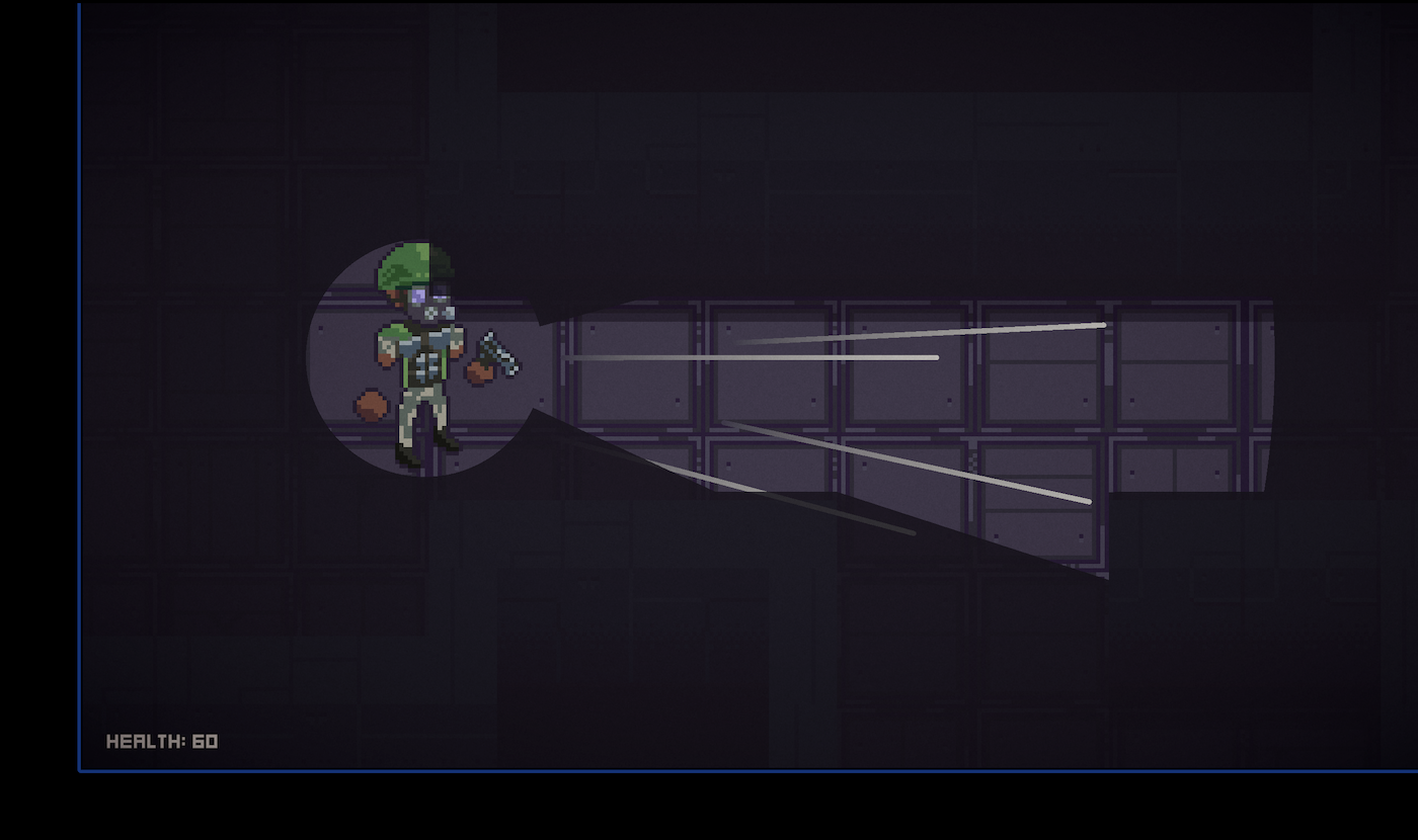
The pixel art is definitely a highlight for me, from the player character to the monsters and even the tileset. You've done a good job with the presentation in that regard. Also I like the idea of showing only what's in your cone of vision, that reminds me of Project Zomboid and I think it's a nice fit here too.
Thank you!!
The art is really good!
I think the game would have benefitted from some amount of feedback when you hit an enemy.
I think enemy pathfinding might be broken? They never really came towards me, and often spun in place really quickly.
I'm not personally a fan of the controls, it mostly just led to me only moving "forward" and aiming into the dark to make sure there wasn't an enemy.
A boss or a second enemy type would have gone a long way.
I think this is a really strong start! Sorry about the negative response you recieved, that's really uncalled for.
Thanks for your comment! I agree on the hit feedback, I added the enemy sound for that but it needed more than that.
On the pathfinding, it's actually my AI that's a bit badly designed, I tried to make them hide in the darkness when seen for the first time and after a few seconds try to approach again and actually attack, but I didn't balance the times and speeds of their movement so they were weirdly passive sometimes or if you gave them enough time then very aggressive.
I knew the controls would be a divisive subject and I understand why many disliked them, in part, I'll keep joking that it goes with the theme by being an aberration of controls 🤣
I wanted to implement more enemies and a more interesting level, but sadly I wasn't as efficient in managing my time for the jam. And don't worry about it, I don't really get stressed about other people's behavior, In the end, they are the ones showing the immaturity in their behavior 🤷🏼♂️so that doesn't concern me in any way
Hi, thank you for the game! The idea of WASD changing their behavior was new to me. Quite mind-blowing, I liked it. Unfortunately, my lifespan was relatively short. It may make sense to have weaker enemies at the start so players can get deeper into the gameplay before facing the real challenge. But it could be the fact that I rarely play shooters. PS: I noticed a bug with aiming guides. A pair of them got stuck on the level for me.
Thank you for the feedback! I indeed left level design for last in the development and it suffered for it, I did want for people to get a bit confused or uncomfortable with the controls but it's true I saw people struggling too much with the first enemies, something to maybe fix in the future.
I saw that bug once but wasn't able to replicate it and fix it😅 Thanks for the screenshot
Here is some aspect of your game you can improve:
I tried to judge your game objectively unlike you did mine.
I'm truly writing this for your benefit so I hope at least some of it gets through to you, Game dev is already hard enough on its own, so we as developers should try to be a community that supports each other and treats each other kindly when we can. Instead through the comments in your game and here too, you have been quite an obtuse ass.
I'm not even going to explain how some of these aspects you mention are not true or how you didn't understand the purpose of them being like that, because I know you're just lashing out, but truly I hope you grow a bit
I really click with these controls, the deliberate. slow movement of the player character as well as movement relative to the look direction. I personally attempted something similar to your vision cone system in my own project though I believe yours came out quite clean, especially with the way shadows are rendered. The vision focusing when you aim is a nice touch as well.
A fine job, I could see a future version of this with more interesting variety and its action made a little more visceral and responsive really working out!
The vision cone was one of the things that ended up taking more time than I thought it would, just trying to figure out how to do it🤣, but I did like the result too.
Thanks for playing and the comment!
The pixel art is really really good! Took me a second to get the hang of the controls. It's like top down tank controls, but not in a bad way! Just a bit different then I'm used to. Shooting also feels nice - great game :)
Thank you! I wanted to make a bit of an aberration with the controls haha, everyone gets a little confused at first
Love the pixel art!
Thank you!