Play game
Abe's itch.io pageResults
| Criteria | Rank | Score* | Raw Score |
| Gameplay | #161 | 3.464 | 3.464 |
| Overall | #387 | 3.167 | 3.167 |
| Presentation | #431 | 3.179 | 3.179 |
| Originality | #519 | 2.857 | 2.857 |
Ranked from 28 ratings. Score is adjusted from raw score by the median number of ratings per game in the jam.
What do you like about your game?
The things I learned
Leave a comment
Log in with itch.io to leave a comment.


Comments
Pretty well made overall (gameplay, art, music), with a few readability issues imo : the text is too small, even on fullscreen (I played in browser), and the shadows casted by the walls feel too opaque : in other games in this genre you can see the difference between walls and shadows, it's not the case in your game and it gave me a weird feeling of claustrophobia.
Can you clarify what you mean by the text being too small? I've set the canvas to stretch, so it should be the same size on all monitors.
Thanks for playing!
Here's an example of text that's too small :
This is an extreme example because the game is not full-screen, but even when full-screen, the text is still flattened for some reason, and the upgrade description text is squished in the other direction, which is quite jarring.
While replaying, I heard that there are sound effects for information that I did not notice before, it's a nice touch.
Okay, I think I see what happened here. Your aspect ratio is significantly different from the one I set it to by default and it stretched the canvas in a weird way. I'll keep this in mind for future projects and maybe add aspect ratio options.
Thank you!
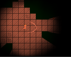
I feel like this is not the only issue, because this does not look right (full screen) :
Oh, that screen just looks bad lol. I ran out of energy to want to make it look better before the end of the jam lol
i liked it. Extremely simplistic, could have used a map or something similar but pretty solid. I couldn't give it many points for originality tough
Pretty neat shadow effect! I think because of it though, the enemies needed some other sort of tell since otherwise you turn the corner and immediately get shot. Maybe like a footstep or other sound? Something that let you know something was there, but not exactly where.
Well, a cactus hiding around the corner ended my run anyway and they don't make sounds lol
Haha, I've gotten so many responses about the cactus. I may have overtuned them slightly!
The shadow effect is great. It seems like the walls are kind of 3D (or are they??). The upgrades are a nice idea as well. Well done!
It's a neat optical illusion created by the lighting. It happened by accident, but I'm not complaining!
I really liked the gameplay though I only reached stage 3, the vision design is awesome.
Cool game, i especially like how you implemented the lighting and the upgrades :)
This reminds me of Ape Out!
I appreciate how visual some of the upgrades are and the music was very on point. I do think the procedural levels felt a bit too maze-y at points with me getting a little lost sometimes but it was still a fun experience.
Nice game! I liked the variety of enemies and upgrades that you included and the look had a very unique camera view! Good work!
This was pretty fun, our games have quite similar design sensibilities! I liked how power ups like the spider legs were shown on the character! Overall, great entry :)
Nice shadow/wall effect, makes you carefully look around the corners. :)
They got me on the second level with ominous music (I think it was the second one after the "cut scene", the one where two big enemies with rapid fire are close to your starting point). Upgrades are nice.
The levels and enemy placements are all procedurally generated! Glad you like it!
Not sure if it was 2D lighting or if it was 3D walls in a 2D space that made it look like shadows but good job, the objective was easy and the upgrades were fun and made the game more enjoyable, maybe work on the maps/level design, the levels felt like a maze and just wasn't the best, but the game fun to play and i like it! good job
The levels are procedurally generated. They sometimes turn out exactly the way I want them, and other times they are sprawling labyrinths unfortunately. I'm still very happy with it most of the time though!
Love the way you used level design with your lighting, really cool feel to walk around.
One thing that I think could be improved on is the size of the levels. It took a long time to wonder around, and much of the map was empty, just reducing it's size to 1/3rd or even 1/2 of it's current size while keeping everything else the same would make the environment feel more full and greatly reduce walking around purposelessly.
Anyway fun game to play, nice submission!
I might toy around with different values in a post jam version. I wanted more things to find in the world, but I just couldn't think of anything.
Really cool, almost every aspect is done really well! I wish the player was faster and that killing enemies would give some reward (like the keycards would drop from the enemies or more upgrades based on how many you killed) but overall its a great game
I wanted more things to find in the world, but I just couldn't think of anything. I might continue this game and add some for a post jam version.
cool shadow effect. i couldn't figure out where to go though. got a bit lost in the maze
You have to find 3 key cards, and then the portal opens up. When it's open it has a sound effect that should help you find it!
Liked the presentation and gameplay. A bit disliked the "shaking effect" and music. Upgrading is fun also
There is an option in the main menu to disable the music, I didn't get around to adding an option to disable screen shake unfortunately though.
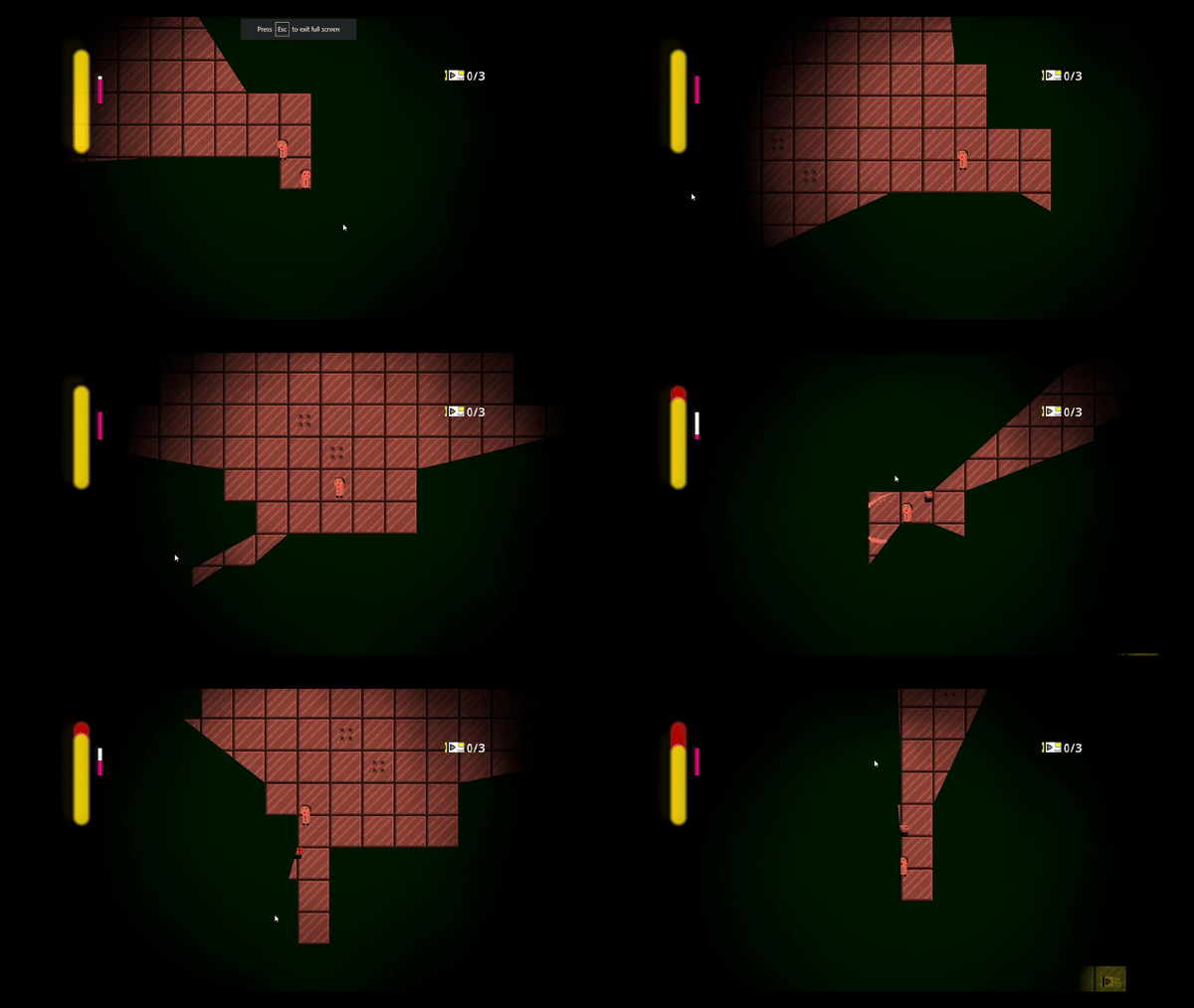
I really enjoy the semi 3d world and the pillars, gives it such a big feeling.
It's a very neat optical illusion that happened by accident! But it certainly works in the games favour!
This game is okay, the gameplay can be super hard or super easy at times, the combat is very barebones but it does open up as you get upgrades. It's pretty decent, and the visuals aren't that bad.
Disclosure, I helped playtest this game during development.
Come for the aesthetic, stay for the fast paced and comprehensive gameplay! As you acquire new abilities the combat gets quite interesting. Your abilities start building up and the rising difficulty of enemies force you to utilize them. Gameplay really picks up really fast and I found I was super into it by stage 2/3.
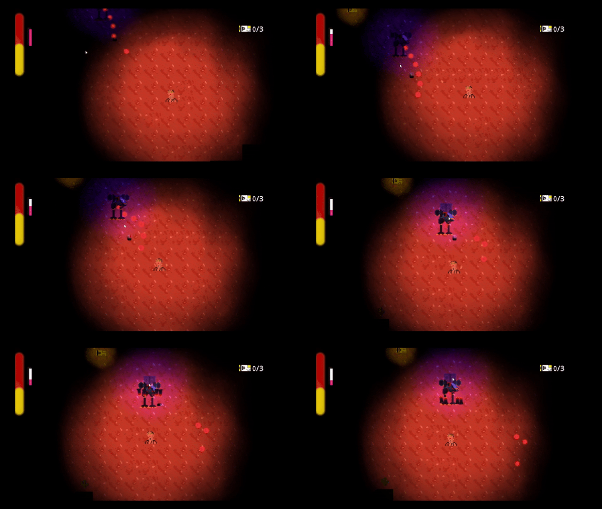
I love the hidden event in the menu screen. Also beware high velocity cacti.
Gameplay is fun and has some good variance when you get upgrades. I liked the bits of lore in each level.
Presentation seems relatively simplistic, although the black pillars/walls and field of vision effects are well done and help sell the aesthetic. The music rocks too!
For improvements, a map you can pull up would be nice, and some visual feedback for when you or enemies take damage would improve the game; sometimes it could be hard to tell when enemies were hit by my attacks.
Solid submission. Well done!
Note to self: Avoid the Cactus
Great fun once you get the right upgrades to play the way you want to play! Nice clean implementation of the theme with the upgrades changing your appearance, too. Killed a few more scientists than I should have, but had a great time with this one.