Play game
Where is the Door?'s itch.io pageResults
| Criteria | Rank | Score* | Raw Score |
| Graphics | #81 | 3.972 | 3.972 |
| Fun | #110 | 3.528 | 3.528 |
| Overall | #111 | 3.505 | 3.505 |
| Theme | #129 | 3.722 | 3.722 |
| Audio | #145 | 3.417 | 3.417 |
| Game Design | #152 | 3.417 | 3.417 |
| Innovation | #246 | 2.972 | 2.972 |
Ranked from 36 ratings. Score is adjusted from raw score by the median number of ratings per game in the jam.
How does your game fit the theme?
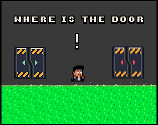
Choose between two doors, each leading to its own set of challenges. Opt for the thrill of danger or play it safe.
Did you write all the code and made all the assets from scratch?
YES!
Leave a comment
Log in with itch.io to leave a comment.


Comments
I had fun with this one! Some of those jumps were really tricky. I did have some difficulty reading the messages in the upper right of the screen, the text was small, and my eyes aren't really drawn to the upper right of the screen. Overall, great plaformer!
Thank you for the feedback. We're glad you liked it!
Great game and great villian, I enjoyed your game a lot!
Glad you enjoyed it :)
Amazing Game. The graphics , the music, and the gameplay was outstanding.
Thanks :)
Great game! I love its visuals and audio, also you nailed the theme!
Jump and movement needs to be tuned a little in my opinion, but this doesn't prevent the game from working well. I enjoyed the platforming, and the difficulty seemed just right to me.
The core idea of the game doesn't entirely convince me. Essentially, the player chooses one level and skip another one each time, and the two paths never intersect. Even though there's the possibility to enter the doors that weren't chosen in the end, I personally was not encouraged to do so. It's a shame, at least from my point of view, to encourage to play only half of all the level design work that has been done.
Overall it's a fun game, very well implemented! Good job! ^^
Thanks a lot for the detailed review and taking the time. Agreed it would have been a great + to add some kind of reward behind the hard way.
Smart use of the theme, I'm also glad you gave the player an opportunity to try the doors they skipped at the very end. The jump for me went way too high and I was constantly bumping my head on the ceiling making it hard to beat certain areas, I imagine its a runtime issue or physics update problem.. idk. Also, the spikes going up and down sort of imply that they have moments of 'safety' but that was not the case.. just something to think about. Great entry!
Heyyoo thanks for the feedback. Yeah basically agree with all the comments (Spikes, physics). We might do a little polish pass after the jam. Glad you liked it!
Like that player can choose which door to go through to differ the experience. Nice game!
Thanks :)
Im not a platformer myself, this was really challenging for me. The graphics are really nice! great jam submission!
Thanks for giving it a try <3. Yeah the game is hard :D. Glad you liked it.
Controls are a *tad* loose but otherwise a neat little platformer!
Thanks :)
The game is fun but had a hard time controlling the jumps, if you polish that you could even sell this, very good work
Yeah it needs a little more improvements on the controls. We have plans to at least do a polish pass on it after the jam.
Nice job with this one! It was challenging and entertaining. Tried all of the different doors at the end. It was pretty fun! It also seemed quite polished, which is always a plus.
Thanks a lot! :)
A very interesting game with an unusual concept and original style. The controls are very comfortable and smooth. the traps are heavy but can be bypassed with a few tries. I enjoyed playing this game!
Heyyoo thank you for the review ;) . Glad you enjoyed it!
Red doors all the way!
It was fun! The character controller was a little unforgiving when jumping on small platforms, other then that solid game.
Thanks a lot for the feedback. Yeah great point I think having it less slippery would have made things easier.
Red doors all the way!
It was fun! The character controller was a little unforgiving when jumping on small platforms, other then that solid game.
Great game, just maybe a bit to hard at some points. Well done
Thank you :)
This looks great and was pretty fun but the controls felt a bit too slippery for the level of precision some of the platforming sections required, if you want to keep the speed you could add a camera deadzone so the player can move a bit before the screen does, which would allow for a bit more accuracy. It's also worth letting player use either arrow keys or WASD if you're not using both, I had a much better time when I moved the keyboard over so I could use my right hand!
Thanks a lot. Noted for the arrow keys it's a great idea for my next jam :D . For the slippery character you can tap quickly the key on the opposite direction to counter the momentum (Same as a counter straff on CS). Lesson learned we should have explained or maybe not needed in this project :) . Glad you had some fun still ;) .
The controls felt a bit too quick, but love the concept, would of loved more risk vs reward
Thanks :) ! Rewards was actually something we wanted for hard ways but didn't have the time to do it. It's a very good point.
I especially loved the sound design! amazing job!!!
Glad to hear! Had a lot of fun with it :)
Very cute game. Loved the professor talking and the challanges were fun. The movement was a bit slippery, but other than that really fun game! Keep up the work!
Thanks! We're happy you found the game fun! You're not the first one to mention the controls so we'll see how we can tweak them after the jam. :)
Cute game, cool artstyle for sure!! Looks like good polished game!
Tho the player and camera movement felt a bit of it was too slidy. I couln't control my movement good enough so I would hit a spike a lot!
But very neat and good game for the jam!
Heyyoo, thanks a lot for playing it and for the feedback!
Yeah the controls would need some tweaking. Will improve those after the jam.
Hey the game is pretty clean, i like the style and it plays well without any issues on my end. the jumps seem a little to intense for the size of the levels but with some fine tuning i can see this being pretty fun. i like the chat boxes for the scientist that pop up and the way you did that, maybe making that a little bigger would help the readablitiy though it was hard for me to see that tiny writing
Heyyoo thanks a lot for the kind words :)
Noted for the scientist. Will see what we can do.
Thank you for the feedback!We're glad you liked it and we'll see what we can do about readability. :D