Play game
Astro Metal's itch.io pageResults
| Criteria | Rank | Score* | Raw Score |
| Visuals | #48 | 3.900 | 3.900 |
| Approachability | #74 | 3.600 | 3.600 |
| Audio | #98 | 3.233 | 3.233 |
| Overall | #112 | 3.300 | 3.300 |
| Fun | #148 | 2.867 | 2.867 |
| Creativity | #171 | 2.767 | 2.767 |
| Theme | #176 | 2.367 | 2.367 |
Ranked from 30 ratings. Score is adjusted from raw score by the median number of ratings per game in the jam.
Leave a comment
Log in with itch.io to leave a comment.





Comments
The art and music of this game are amazing, I enjoyed looking at the backgrounds, and I was very surprised to see there are three full levels. Unfortunately the game crashed for me during the third boss fight and I didn't get to see the end :C
Thanks i'm glad you liked it :)
Yeah even if it's a jam entry i wanted to have at least a bit of variety so i aimed for 3 and i hopefully managed to make it, it was a lot of work though, but since it's a shooter and they're just backdrops with no actual tiles and level design this was more managable at least :p
Oh sorry about that :( i didn't experience any litteral crash when testing, so i'm not sure what happened there, do you remember approximately when during the boss that happened so i can check and see what could have caused this, also could depend on what browser you played in.
Well, I didn't do anything special, the battle had just begun and I was shooting at him, I'm using Chrome
I tried again and it now crashed near the end of the second boss :( I was just playing (moving and shooting)
so I got some more feedback for you instead :P
It'd be cool to shoot the asteroids in the first area
The sprite work is awesome, but all the enemies and bosses have the same paintwork and end up looking kind of the same
you could bump up the speed of all things in the game to make it more fast and snappy
And one last thing that would've been great was being able to change your ship after dying, kind of like arcade shmups
because you already have different playable ships, but you have to start the game each time to try them out!
best of luck to you mate :D
Noted, i checked the boss code and everythig seemed normal, and i playtested again on both Firefox and Chrome and i was able to go through the full game with no crash, sorry about the inconvenience, but here i heve no clue what could have happened here to cause a crash on your end :/
The asteroids could be a nice feature post jam if i get some time, thanks for the suggestion :)
The enemies mostly have the same color cause i wanted them to feel like they were part of a similar uniform alien force, but i guess they do look a bit too samey that way, so i(ll take note if i can post jam this i'll add some more variety in the color schemes.
The speed issue has been noted as many peolpe pointed it out as well so if i can post jam then again i'll change this for sure to have the pace up a bit.
Concerning player ships : You can change your ship after death, i just didn't convey it all that well cause i made the continue Ui a bit too minimal, but if you've noticed, next to the continue you see "Ship 01,02,etc.. your current ship" and tha character hud portrait, you can use the direction key when this menu pop up to select any of the 5 ships just like in the old arcade games. But i don't blame anyone if they didn't catch that as i didn't conveyed it all that well and explained it nowhere on the page's controls section ^^'
Thanks again for the additional feedback, have a good one dude :)
Oh damn, you're right. I completely missed that feature, all I read was Continue? my bad!
all that information does get lost a little up in that corner, if you pull it just a bit away from the edges of the screen it should be more accessible to the player :D
Really cool game, I really quite like the animal characters, good job :)
Thanks for giving it a shot ! I'm glad you enjoyed it and the character designs as well XD
I've made a few like these that have shown up from time to time in my games whenever i felt it could fit the world, mostly my sci-fi themed games so far :)
I liked the game, I love shmups. I played until the end. I liked that the power UP always comes very fast, in the best Aleste style, making you always have the means to destroy your enemies. I think the difficulty between stages could increase a little, that's it, good job.
Thanks for playing it through the end and giving your feedback :)
Yeah i kept the powerup spawning a bit fast as even if they are useless once you get to your chosen ship's max level i felt that this would be useful for multi so that players didn't have to fight over upgrades too much, and the difficulty is quite unbalanced as i once again didn't manage to get enough time to do some more tweaking and adjusting, but since i got everything to at least work without too many hiccups (at least that i know of) i can always do the adjusting for some post jam content if i get the time to do so :p
Great job! The visual's are spot on! Definitely nailed the classic feel and look, and adding multiplayer support too... damn! Well done!
Thanks ! happy that you like the visuals :D
The funny thing is that it's my first attempt at multi, but i felt like local multiplayer seemed achievable at my current knowlege so i went for it, overscoped a bit, had way too much work as i had to make a color scheme for each player and each ship O_o but still manage to barely make it :p
Looks nice, sounds good. Nice theme brought together. Enjoyed playing this one for a while.
The big bosses showed no sign of taking damage, and no idea of health. I wasn't even sure if i was doing anything with the first boss until it FINALY blew up after a while.
I progress to the "Best" weapons to quick. 2 power ups collected, then it seems no point collecting any more, as i have it as good as it gets. And at that point i was clearing the smaller baddies to quick.
I didn't get chance to try multiplayer out, nor the different ships, and i could seem to figure out how to.
With that said, I really do like the style and feel fo the game, and with a few tweaks and improvements, it'll do really well. I particular liked the background stuff :). and how it moved around dynamically to create a profession effect.
Thanks for playing and giving your feedback :)
Yeah the bosses ended up way too tanky, i feel the amount of hp they have now would be more suited if this was only when playing multi but i'll see how to adjust that if i get to a post jam version, also i should have probably add a health bar of some kind for the bosses as well, they do however show signs of being hit but the effect ended up way too discrete in the end, they flash red a bit.
Weapons are a bit of a mess can't argue with that, i didn't take enough time to adjust the weapons themselves as i focused a bit more on making things as modular as possible to tweak them later, which i didn't have any more time for the jam version so they are definitively a bit lacking in the current build for sure, and same goes for enemy health values ^^'
Honestly can't blame any one if they didn't so no worries, it's just that i wanted to try and make something with local multi this time as it felt managable at my current knowlege, so i challenged myself to do so and i may have oversoped a bit in the process :p
Glad you liked the game regardless of its issues, and yeah background stuff took me quite some time to do as i tried a bunch of new stuff to have them as dynamic as possible and hopefully convey a feeling of depth.
you really got a lot of features in the game in such a short time , the art is really cool and it has a feel line the classic shooters I use d to play in back in the day like R- type really easy to pick up and play.
Well i've done other shooters in previous jams so i knew how to implement some of the basic stuff quickly so this helped a lot, but most of the other features are a bit too much overscoping on my part so in reality i just barely made it in the end :p
Happy to see you like the art ^^ i definitively had a lot of inspiration from the classics.
Thanks for playing and giving your feedback :)
You nailed the look/sound, and the ships all looked really cool, the player ones especially. Could maybe use some extra juice and some more variety in bullets on the enemy side, but still really impressive for a jam!
Thanks for giving my game a shot !
I'm glad you like the ship designs ^^
Yeah that's a staple of everytime i do a gamejam so far unfortunately :( i know i should have more juicy feedback but so far i could never manage to have enough extra time to put it in the jam release, but if i get some time for post jam work, i'll definitively juice things up a bit, and i'll definitively try to work on some more enemy weapon variety.
Man this is one of the most realized games I've seen in the jam! Takes me all the way back to 90's cabinet shooters! The transitions are crisp and the art is amazing! And the multiplayer is an added cherry on the top!
Thanks ! I'm not sure if it actually is, but it is very kind of you to think so :)
I tied my best to deliver as complete of an experience as possible. Well it comes from a lot of 90's inspirations so it's cool to see it managed to take you back haha XD
As always very happy to see people seem to apreciate the artstyle ^^ For multiplayer it was my first try at it so i hope it works well as i couldn't playtest this aspect much during developement, i just made sure to have a keyboard layout that wouldn't feel too cramped in case, and hopefully it can support 2 controllers from my tests, but i don't know much more so far as i didn't have much feedback on this aspect of the game yet, despite that that is definitively one of the main thing i wanted to push for this jam cause i know shmups can be quite more fun played in coop and i thought that was an achievable goal on my skill level :p
Anyway thanks again for stopping by and sharing your thoughts.
Really great, loved the visuals and the game plays very well :)
Thanks for giving it a go ! Glad you liked it :)
The game is made with a lot of charm and effort. The visuals follow the charm of old-school pixelated games, and the audio perfectly reflects that. Gameplay-wise, though, it's not the best. The game just drags on without any show of what's to come. There's not much enemy variety, and the bosses are far too tanky. Even the full powered attacks of some of the members feels sluggish because they attack less quickly in exchange for 3 bullets. The game has a huge focus on art style and aesthetic, but it lacks in gameplay. Still a great game though, congrats on the amazing work!
Thanks for your kind words :)
Yeah i tend to go all out on the presentation to the best of my abilities.
Totally agree about gameplay, i don't have the biggest programming skills so i did my best, the thing here is that i probably didn't make all that much enemy spawning so there is definitively a bit of a lack of action at some points, and yeah enemies could use some more variety for sure.
Weapons i didn't have much time to balance, so i settled for shot pattern variety but didn't tweak all that much the damage, rate of fire, and speed of each.
Glad you still enjoy it despite the gameplay shortcomings ^^
Pretty fun game. the visuals fit the game very well and it is reminiscent of classic games. I had a great time playing. Great Job!
Thanks glad you had fun playing :)
Like i said Retro is my jam so a lot of influence from the classics :p
Pretty much inspired by the classics, I liked it! The way the shield works, repelling bullets, is pretty interesting too. I encourage you to continue the development, I think it can become a very solid game! Congratulations!
Yeah i tend to get a lot of inspiration from classics ^^
The reflector shield is something i wanted to try as i experimented with similar mechanics on previous entries, but there they were more of a hidden bonus than a full part of the game, so i made it a full part of the gameplay loop here. The idea was more or less a mix between the shield mechanics from Biometal and Gigawing in terms of influence.
I'll see if i get some time, but i think i'll probably push a bit more to keep working on this one post jam since i had some intended stuff i didn't get to do due to jam time and hopefully improve the game along the way.
Thanks for giving it a shot, and i'm glad you enjoyed it :)
Overall really cool looking ! The different stages felt good to go through but I would have loved a faster pace, different musics for each stages and some better sound effects. But it's a really solid entry, I really liked it !
Thanks for giving it a shot :)
Yeah i maybe made the backgrounds scroll a bit slow, if i get time post jam, i'll adjust that to see if it improves the paceing, probably faster bullets as well.
Music wise i only managed to make 2 tracks for the allowed jam time. But i would have definitively made on per level.
Glad you liked it anyway even with the rough edges ^^
The background is very pretty, and I think you nailed the "look and feel" of horizontal shmups. The bosses look so good! Though I think there should've been more enemies, more bullets, maybe shorter levels? Other than that, great job!
Yeah like i said i tend to make games a bit on the easy side but ended up leaning way too much on that side this time :(
Level length i wasn't sure what would be too long or too short so i set the length as it is now and hope it would be the right balance, ended up wrong XD but well this can always be adjusted if i get enough time to work on it post jam.
Thanks for playing and giving feedback ^^
Great game! I would have loved way mor bullets and more speed on the rate of fire on the spread shot. The art is bad ass! The menus rule too!
Thanks :)
Yeah i tend to make my games a bit too on the easy side, the funny thing is that in a past jam i had one where the bullets were a bit too fast, so i guess that that's why i made them way too slow this time haha XD
Also weapons are not all that well calibrated in terms of firerate and such, i overscoped a bit so i spent quite some time making and fixing things without much left to adjust and refine what worked.
Glad you like the art and menus as well ^^
I would love to see this turned into a full release. It's got such a cool vibe to it.
Well i never know cause sometimes life can get in the way, but if i do get some time i'll try to work on some post jam contents and fixes if possible :)
I feel that, brother. I'd like to see how your game performs running on the Shmup Creator engine!
Hahaha :p well not sure how cause i never tried it, and since i'm not all that experienced yet on the programing side of things i'm not sure i could even make anything functionnal on another engine than the one i know for now XD
Its all no code. Super easy to pick up!
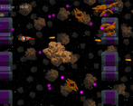
The art of this game is stellar! However, it becomes difficult to notice what is an interactable object vs a background object. In my first run I expected the large astroids that floated by to block bullets & damage the ship. This was not the case and was rather confusing initially.
Controls aren't super clear, I expected to have some mouse movement but didn't, making gameplay and starting the game a bit "janky".
Health is probably my least f favorite aspect here. It took me a moment to even notice where the healthbar was located and even then it wasn't extremely helpful. Colors weren't distinct and it was in an obscure location.
Not a bad game but could use some more refined design!
Thanks a lot :D glad you appreciate the art !
Yeah i had trouble making things as readable as possible but didn't find the right contrast in the end to not have backgrounds be too dark, and objects too bright. To clear things with asteroids, they do damage the ship, i just didn't figure that i should have them block bullets to help better convey that they are solid obstacles :(
Yeah i tried to have the Ui be a bit minimal but in the end it wasn't all that clear, and health i wanted the hud to not obstruct too much during gameplay and this ended up having the opposite effect that it is so discrete that it can't be seen clearly at a glance, so this issue is note for sure.
Glad you enjoyed it anyway, thanks again for giving it a shot :)
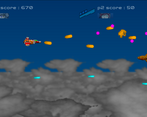
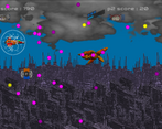
The artwork for this game is seriously awesome. I have no idea how you managed to create everything in 10 days, you've clearly done this before ;D. Especially the player ship models were top notch! Also the backgrounds in the levels work really well, especially in the second stage where you descend in to the mountains, it created some real sense of height and worked perfectly. Also nice to include controller support, however I would've preferred to use joystick for the movement. The gameplay idea worked fine, it was just too slow and easy for me. Also the shooting SFX feel like they could be improved quite a lot. But I must say, it felt quite good to deflect dozens of bullets back at the final boss!
Thanks for your kind words, i'm really glad you like the artwork it means a lot to me ^^
Honestly it is still hard and i just barely made it, but since i have done a few jams now and i'm more experienced with blender and gimp i can work a bit faster on things now, though i feel i'm still slow compared to the amount of work people can acheive O_o, what also helped is the fact that not making a game with a character that walks cuts down a lot of time consuming animation stuff :p
Really happy that you like the ships !
For the player, i wanted to have a diverse enough selection available but not too much as i had to have 2 color schemes to distinguish Players 1 and 2, i had a bunch of mixed inspirations for making these ranging from other games like R-type or Wing Commander, to movie references, mostly star wars, as i always like making any of my sci fi stuff in that "used future" blocky retro look :D
For the backgrounds i wanted to have them be as dynamic as i possibly could, so i went all out on the parallax in hopes that it would look good enough XD
the thing i had in mind to convey height and depth was to acheive a similar effect there was in Phalanx on Snes where the first stage has you gradually go down a cloud layer to reveal a huge city at the lowest level all seemlessly.
On the controller support, i always intend to have it whenever possible if my game hasn't any mouse input, and Godot makes that really easy to implement fortunately, while i agree that analog control would be better to navigate more precisely, i didn't put it here cause i wasn't sure how this would translate for people who couldn't play on controller, so i went d pad to keep the same experience for both type of players.
I tend to make games a bit on the easy side but here i might have made it too easy i can't argue with that ^^'
Sfx were hit and miss and i didn't have much time to adjust them, some turned out ok some turned out really bad like the laser, which fun fact, at first had such a low volume compared to the rest that it wasn't audible at all, so i boosted it and the final result was...
Expectations : Cool pewpew star wars ish laser sound,
Reality : sounds like someone is blowing air into an empty bottle XD
And lastly the shield was the result of past jam experiments with deflecting bullets mechanics, and here i decided to put it to use as a main element, inspired by a similar mechanic in Gigawing :)
Nice entry, old school vibe !! Well done
Thanks ! Oldschool is my jam and authentic retro look and feel can be hard to do right, so i'm glad i could deliver on that front XD
Pretty good! But for my tastes, it needs a bit more of everything. More enemies, more powerups, more bullets. It gets a bit boring, unfortunately. But the effort at play is absolutely commendable.
Thanks :)
Yeah i tend to make my games a bit on the easy side, guess this time i should have pushed the enemy count a bit more to spice things more.
I overscoped a bit this time so a lot of ideas didn't make the cut unfortunately, i wanted more weapon powerups but didn't manage to make them in time, same for the boss patterns which i worked on really nearing the end, so i didn't made much variation.
Glad you appreciate the effort regardless ^^