Play game
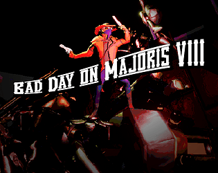
Bad Day on Majoris VIII's itch.io pageResults
| Criteria | Rank | Score* | Raw Score |
| FUN | #1 | 4.500 | 4.500 |
| OVERALL | #11 | 4.333 | 4.333 |
| AUDIO | #14 | 4.167 | 4.167 |
| THEME | #24 | 4.067 | 4.067 |
| EASY TO GET INTO | #31 | 4.333 | 4.333 |
| CREATIVE | #37 | 4.000 | 4.000 |
| VISUALS | #43 | 4.167 | 4.167 |
Ranked from 30 ratings. Score is adjusted from raw score by the median number of ratings per game in the jam.
Do you have any bullet or projectile in your game?
You added some projectile or bullet in your game
How does your game implement the theme? (If your game doesn't use the theme ignore this field)
Power-ups last 10 seconds. You can pick up more to refresh.
What was the size of your team?
2 People
Please credit the resources that you used during the jam (if you used any)
Pre-jam Assets:
Footstep sounds. (UE4 Marketplace Necessary sounds)
Shooting sounds. (UE4 Marketplace Ballistics FX)
Bullet impact sounds. (UE4 Marketplace Ballistics FX)
Pickup sounds. (UE4 Marketplace Necessary sounds)
Checkpoint sounds. (UE4 Marketplace Necessary sounds)
UI sounds. (UE4 Marketplace Necessary sounds)
Global wind sound. (UE4 Marketplace Necessary sounds)
1 Music track for second boss. (Made by me a few months ago)
Blunderbuss Model. (Made by Mike, a few months ago)
Skeleton Model. (Turbosquid)
3 House Models (OpenGameArt)
4 Animations for CRU5H-3R (UE4 Marketplace Frank Slash Pack)
3 Animations for Cyborgs (UE4 Marketplace Frank Slash Pack)
Player Walk Left/Right/Back/Forward (Blended with custom upper-body animation) (UE4 Marketplace AnimStarterPack)
Mesa Rocks (Heavily modified during jam) from Quixel.
Fonts: Vanilla Whale and Share Tech Mono
Credit all team-members that worked on this project (you can link itch.io/twitter/youtube/twitch)
https://www.youtube.com/c/RyanScottProd/featured
https://www.youtube.com/c/Gambsmoore/featured
Leave a comment
Log in with itch.io to leave a comment.





Comments
This is a really well crafted game for a jam! Was really surprised at the amount of settings in the menu, there was a lot preparing, which is a great point!
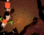
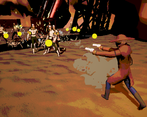
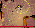
The game's style is impressive, and the gameplay is super satisfying. The fact that there are two crosshairs, one that indicates your cursor and one that indicates the actual direction of the bullet is super good for telling where the bullet's gonna end.
The powerups are so freaking nice, my favourite one is the bounciness, that reproduces this cool sound effect, reverb-like after bouncing, so fun! xD
The boss is terrific as well, really intimidating at first glance, only downside though is that his spiral bullet pattern lags a bit on my computer, but other than that it was quite a fun ride.
Ehehehe he is the easiest of the bosses ;)
Wow, crazy game! cool graphics and music! I think that sometimes the guns are a bit too loud and it's hard to hear the boss music. The 10 seconds theme is implemented really well, and stacking up power ups gives a powerful feeling I really liked this concept! However, it does make the game a bit too easy when you stack up a lot of powerups so maybe restricting some of it? I dunno.
Overall, I had a lot of fun playing the game and it looks really great!
We're working on a full version right now, this whole map thing was super rushed, and not how we wanted it to work, and we're going to be doing... Things... That will limit the power ups sufficiently to not turn you into an instant face roll machine. The current implementation was fun, but not really good long term
I keep saying that I am not a fan of top down shooters because I have seen them a million times, but I just LOVE this game!
5 Stars all around! (4 for creativity)
I don't know how you guys managed to put it together in a week, but you did. I am impressed. This is the best game in the entire jam I have played so far. I don't know what else to say. I am kind of wondering if this could be a full game. I like the power fantasy feeling, but how long could you use it before you get bored of it? That's what I am wondering.
Yeah, we're batting ideas back and forth about whether or not it's just _too_ ridiculous to scale properly into a full game. Right now we're working on some rudimentary multiplayer and procgen stuff to see what it'll feel like if we tone down some of the powerups and add some progression elements. We both really like the idea of gaining, stacking, and losing powerups at a moment's notice, but there should definitely be a little less... Uhhh... CPU Load? hahahah
If you've got any ideas on that front we would very much appreciate them.
Also I'm glad you liked it! :)
If you do make it into a full game, here are a few ideas:
That's all. See ya!
You read our minds with a lot of these. We've already got online play mostly working (yay, unreal!)and the power ups are going to be a lot more balanced, both in availability and in effectiveness.
I am not aware of gauntlet, but I'll look into it. Any specific features you'd advise I look out for? I'll probably try to find someone streaming it on twitch or something
Gauntlet is an old game series. The best out out of all of them was probably Dark Legacy. I doubt people stream it anymore, but it's just a crazy fun arcade game. You could step on switches to get secrets, and the only way to stop the hordes of enemies was to destroy the spawner's they came out of. I'd say look to it for inspiration.
Not really a fan of the visual style (kind of hurts my eyes to look at), but I still had so much fun playing it! Great job 👍
Can you put your finger on exactly what could be improved or changed? We're playing around with the visuals right now and input would be greatly appreciated!
My main issue with the visuals is how "noisy" it is when moving (great example is the ground/sand at the beginning) - pixels are "flashing" very quickly between colors which is not pleasant to look at. (This seems to also be affected by the screen/monitor - I have 2 and on 1 it is much worse than on the other one)
...Interesting. What resolution and refresh rates are the monitors in question? Are either of them HDR?
Let's call the monitors A and B (A is the "bad" one)
Both are 24", Full HD (1920×1080), 60Hz, A has 1ms response time, B has 6ms response time, A has higher contrast.
No
Hmm, alright, I'll try to get a few more people playtesting it with similar monitor specs. Thanks man
Great work! the bosses were quite interesting and visually unique too!
Hey, thanks! I'm glad you think so, they were unfortunately the biggest time sink in this whole endeavor 😅
Awesome game! The only problem I could find is that the graphics is a bit oversaturated. Aside from that, the game as an engaging gameplay, wide range of power ups and monsters, high quality 3d models, high quality audio, high quality everything. I feel like this is a lot of work even for 2 people. 5 stars!
Oversaturated?? We thought the colors might have been too dull, and it was hard to pick out what was going on, ahahhaa
Thank you for the kind words <3<3
Amazing game. Great visuals and audio, tho maybe a bit too bright. Gameplay was super fun and I liked to stack tons of these power-ups and destroy enemies who stood no chance.
But I got stuck on the final (I think) boss and couldn't beat them because their health bars were wayyy too long (especially since there's 2 of them). But other than that, great idea and execution.
Yeah the health bars started bugging out 3 hours before deadline, and we couldn't fix it 🙃
You think the game's too bright? Like, light sources and stuff? There was a gamma slider in the options to make the game darker, but I'm not sure that's what you mean
Must have missed the gamma slider then. It was too bright for me and it was hard to see some details, but it didn't affect the gameplay much.
I removed the gamma slider because most of the options were way to blown out lol. I could probably add it back in and tweak the values a bit, I guess
Greet game. My computer is very slow and I cannot enjoy in full the game (I had to reduce at minimum the resolution). Really good job!
Hahah yes, it is less of a bullet hell, and more of a CPU hell, but thanks for giving it a whirl, and thanks for the kind words!!
Insane is the word to describe this game . The only bad is point is the enemies, i barely can see them. Good work! o/
Yeah, this seems to be a common complaint. We're thinking the best way to resolve it is make them brighter, easier to pick out on the background, and maybe a tad larger. I'm not sure though. Thanks for playing!! :)
Such a stylized and cool looking game, but actually controls and feels great to play as well. I do find myself mashing space to move around which is prolly not faster but is funny. It gets proper cathodic with so much on screen which what I was looking for. My god do I feel like a god stock pilling a bunch of abilities then cowering in fear after the 10 seconds are up. Though near the end of my play through my computer started to sound like a blender but that's more of a me problem.
Hahahaha I'm glad you enjoyed it as much as I enjoyed your game!
Yeah once you stack enough powerups the hard limit on your gameplay is how much of a beating your computer can take. We were gonna do some optimization stuff, but too much work for a one week jam T_T
Thanks for playing!!
Well, this is just amazing. I felt so powerful! LOL -kale
You should've seen it during testing, it was super broken at one point, you would mow down everything (including the bosses) in no time at all. You could plow through the whole map in 3 minutes tops
Hah, must’ve been fun :>
This is so well done, honestly, with a bit more visual and sound feedback of getting hit, and some small polish, this game could easily be an instant buy for me. I just love the atmosphere, the level design and gameplay. Two things I can point out: player should halt to a full stop after a dodge, give him some momementum, and also I think the game looks better without antialiasing at all, so that should be the default option. Also maybe some music during exploration would be nice
Awesome entry, keep it up!
There was no music during exploration? There was when we played on a built version, perhaps it's just too quiet and gets lost behind all the other ambiance.
Also yeah, the dodging is just straight up OP, the reason it's the way it is now is because of a quick fix we had to make that was breaking shooting, ahahaha. It'll be fixed when the jam is over.
Amazing game for a game jam! So much content and really polished. I really liked the audio and stacking power ups is really great. In case you plan to work on this game after the game jam, I really look forward seeing what will become of it. Great job! :)
Thank you! <3
A lot of fun and very impressive amount of content/polish for a jam game! Stacking power ups until they melt bosses (and the framerate) is quite satisfying. A bunch of gripes though :
The dashing is far too powerful, it has no cooldown and, as far as I can tell, too many iframes while the basic movement is too ineffective. The inertia makes precise tap dodging feel clunky, while the top speed is too low to really give a good sense of control.
The enemy designs don't mix too well with the graphics and constantly get lost among all the other clutter, the power ups look too small also.
Besides that, the difficulty (and fun) difference between not having upgrades and having a lot is far too insane, and what's more keeping the upgrade stack refilled never felt like a challenge so once you get a bit of momentum going you reach god mode. The hit detection on a bucnh of the enemy attacks also felt very off (sword boss for example) but I imagine both of these gripes are the results of not having enough time.
Also despite the gripes being dominant in my comment, the overwhelming impression and rating are very very positive!
The biggest thing I've heard from people is that the enemies should be bright easy to recognize colors, whereas the background can stay washed out and dark, to allow for easier vision. Originally the dodge wasn't as overpowered as it is, but we ran into issues trying to get it to cancel out shooting, and this was the best solution we could come up with on short notice.
As for the difficulty difference between having powerups and not, that was kind of the idea, although we did want to make it so you could go back and get powerups if you weren't happy with your powerup loadout, or explore different avenues, but uhhh.. Yeah time restraints ahahaha. Right now all you can do if you get a subpar loadout or lose your powerups too soon is die to the boss and restart, which sucks.
Thank you for the criticisms. They're necessary if we want to try to improve the game, my ego loves the words of praise, but the criticisms are what are really important with a project like this.
The colors are kinda my fault; I remember making them a bit more washed out, and the metallic makes them a bit darker too haha
Yeah they should be bright but that's not the only thing, right now a lot of enemies aren't too much bigger than bullets or random debris, and the colors themselves don't stand out TOO much from the bg. During normal gameplay it's not a big issue but once you get a huge loadout and start seeing bullets ricocheting all over the place, or are focusing your eyes on boss attacks it can be very easy to miss enemies. I'm not sure there's a very clean solution to this besides maybe something sloppy looking like outlines/auras, or redoing enemy designs to make them bulkier so they're more clearly visible in the heat of the action. Nex Machina is probably a good reference since it's a very visually busy game that has no problems with visibility.
Regarding the loadouts, I'm spitballing but maybe make the player lose upgrades one at a time instead of all at once if the time limit runs out, while lowering the extra time gain from picking up extra upgrades? Potentially that could add more pressure & challenge forcing the player to be smarter about timing pickups, without being overly punishing. Being overpowered is cool, but I feel like it's good to make the player work to sustain that OP state a bit
Thank you! Yeah, these are all pretty on point, and stuff we'd like to maybe fix up after rating finishes :)
Some behind-the-scenes: The dash is implemented in the same way as a stun on bosses or enemies, so it has no cooldown, but allows you to cancel out of shooting with it (being unable to cancel shooting felt... very clunky). I had an idea for an input priority system but it was too late to make any changes by the time I though of it haha.
I didn't do much tweaking of the movement values, but you're right - it probably could use some tightening.
Poor CRU5H-3R was the last guy we implemented and never even got particle effects :(
One of the best! The visuals are really good, the overall ambiance is very nice, this universe has a good hook. The gameplay is so fun omg, stacking upgrades feels so good. the changing atmosphere is also a nice touch. The musics are BANGERS, I'm really impressed. The Sound Design is fine, the gunplay feels nice. However I had an issue with the footstep : when the character takes 2 steps, only one footstep sfx plays, it feels weird. That and it seems that the sound for the thing crashing behind us on boss 1 is missing, it takes out the impact of the apparition of the boss, a little BOOM would have been nice. But this is nitpicky, I really loved this game and would love to see it grow!
Nah, it's not nitpicky. Sound is one of the best things in videogames, especially a game like this. We were trying to get sounds in but we ended up spending too much time trying to balance things, and get art in, got too big for our britches I suppose. But nothing that can't be rectified in the future!
The third boss fight is very impressive! Can't believe it all these were made in one week. Execellent work!
You may believe it if you saw our sleep schedules x___x
This is really impressive!! I love the look and feel of it and the the creativity with the traps and points of interest in the level design is awesome! Really fun too! This would be worth working on more as a full commercial release imo! Excellent work! :D
I think we both want to, except... maybe with not quite as much crunch as this week.😅
I'm glad you liked it!
understandably xD
This was really fun to play. Controlls feels good, the setting creative, the visuals coherent and really well made. The Power-Up Juggling is fun, maybe a bit to short for me (though you kept to the Theme with that one well!). Hope you get far!
Yaaaay, I'm glad you liked it! Yeah, unfortunately the short..ness was just the thing we had to sacrifice while working on visuals and balancing. The original plan was procedural premade level "Squares" but uhh HAHA ONE WEEK GAMEJAM.
If people like it and there's enough interest, we'll probably continue taking stuff on, it was super fun to work on!
Thank you! Like Gambsmoore said, we wanted to do some procedural stuff but my poor brain wasn't having it on a one-week timeframe lol.
I liked the Level Design very - had a good intro/drop in to what the game is about.
I did not finish the game yet - the shortness was more refering to the 10 second timer for the power ups - which seemed a bit short to keep going for me. But yeah really curious what comes of this. I played it on stream - so if you are interested in the VOD:
twitch.tv/nahro1001
I noticed you and your viewers praising the soundtrack on your stream, I would like to point out Ryan made 3/4 of the songs in the game DURING the jam. He is a madman and very talented.
Also yeah the 10 seconds COULD DEFINITELY be extended a bit, but you know, jam reasons ¯\_(ツ)_/¯
I really enjoyed watching that! Thanks for sharing!
Fast and caotic, bullets and chaos, what more i need in a game? 10/10 game
Chaos is my #1 objective when making games. I'm glad we accomplished it.
Good
9/10
ehehehehe thank you thank you thank you!
