Play game
Creature Crush's itch.io pageResults
| Criteria | Rank | Score* | Raw Score |
| Soundtrack/SFX | #37 | 4.000 | 4.000 |
| Gameboy Soul | #174 | 3.542 | 3.542 |
| Gameplay | #174 | 3.000 | 3.000 |
| Overall | #193 | 3.283 | 3.283 |
| Graphics | #269 | 2.958 | 2.958 |
| Interpretation of the Secondary Theme | #288 | 2.917 | 2.917 |
Ranked from 24 ratings. Score is adjusted from raw score by the median number of ratings per game in the jam.
How does your game meet GBJam's theme?
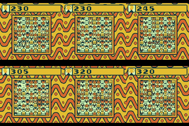
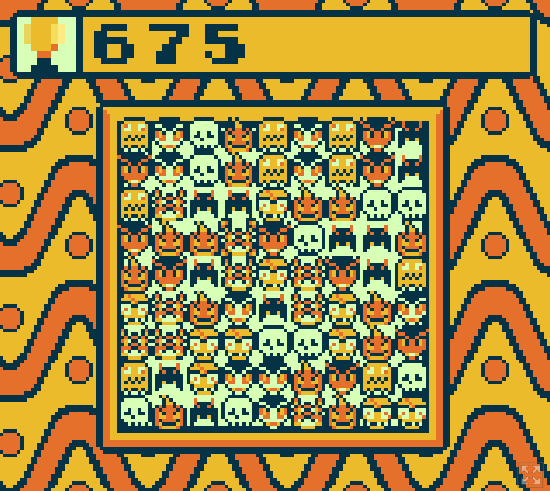
Spooky Halloween inspired puzzle pieces, audio, & color palette
Leave a comment
Log in with itch.io to leave a comment.


Comments
A cool little match3 game. I will say that the fast moving background made it really hard to focus on the small sprites. I liked the music!
Very smooth match3 game, but the sprites are a bit hard to distinguish. My poor-eyesight struggled
Very good match 3, where we need to keep an eyes to not softlock oursel ! Cute pixel art (maybe a bit too messy) and very good soundtrack !! a great entry !!

here is my best
Great use of the match-3 concept here. If we had this in the early 90s it would have done really well and kept me entertained and out of my parent's hair for quite a while! A countdown timer with a leaderboard would have done really well to get the stress/tension levels higher along with replayability. Keep going, as this was well implemented and the audio was excellent. Good job!
Solid gameplay. Great soundtrack. The faces feel a little crowded. I'm assuming they are 8x8, which for the board size you chose leaves a lot of empty space.
I did end up noticing that if you make a T-shape (two sets of three that share one of the same pieces), it only removes one of the sets of three. Given that's been a feature since at least the likes of Bejeweled popularized match-three games as a genre in the early 2000s, it felt like a bug worth noting.
i like this puzzle game, its good for what it is, i like the music, although it's easy to get lost in the graphics, and i think i heard a Michael Myers "Halloween" leitmotif in there, so props for that.
you are definitely right about the motif
there are other references too :)
Really love the soundtrack! The art style is nice too, but it can be a bit overwhelming to look at for me. Also, if there was a bit more of a clear goal or way to lose, I think it could also make it more fun too. But still nice work!
Thanks for playing. The four-color limitation made it quite challenging to make the puzzle pieces distinguishable. I agree that the game could use some more work on that front. Also, I would definitely like to add win & lose conditions post-jam.
Cute and spooky implementation!
I do not think the world needs more candy crush man
my gf would vehemently disagree haha
I guess the cursor stays in the square where you started the swap instead of the one you finished at even though it doesn't look like it, which is a bit confusing. Also it is not clearly visible if you are holding a piece at the moment or no. The background is a bit overwhelming, but maybe you could make it start slow and make it go faster as you score. There is no way to lose now, so it could use a timer that also speeds up as you go.
Anyways I could see it as a gameboy time killer. I also like the art style
I enjoyed this. The music was super awesome. I think the face animation may have been a bit too busy, but my eyes did get used to it. I played until I maxed the score out. That says something. Nice job!
Thank you for playing! Glad you enjoyed the game and the music! haha
I enjoyed this. The music was super awesome. I think the face animation may have been a bit too busy, but my eyes did get used to it. I played until I maxed the score out. That says something. Nice job!
Cool match 3, I dig the style. It was a little tough being able to tell all the different pieces apart, but I started to get it.
A fun match-3 game! a shame you cannot go above 999 :D
Thanks for playing! The score issue was an oversight from when I had limited HUD spacing. I will change that after the rating period
I think the design of the pieces is cute!