Play game
Two Worlds's itch.io pageResults
| Criteria | Rank | Score* | Raw Score |
| Presentation | #809 | 3.699 | 3.699 |
| Overall | #1297 | 3.301 | 3.301 |
| Originality | #1666 | 3.301 | 3.301 |
| Fun | #1875 | 2.904 | 2.904 |
Ranked from 73 ratings. Score is adjusted from raw score by the median number of ratings per game in the jam.
How does your game fit the theme?
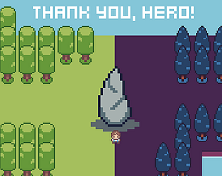
The story in Two Worlds is that you, the hero, needs to recombine the worlds that was one. The mechanics in dark world also requires you to "join" mini-towers to find the orbs.
Did your team create the vast majority of the art during the 48 hours?
Yes
We created the vast majority of the art during the game jam
Did your team create the vast majority of the music during the 48 hours?
Yes
We created the vast majority of the music during the game jam
Leave a comment
Log in with itch.io to leave a comment.


Comments
Nice little game, reminded me of zelda! I agree that it would have been nice to have to beat both worlds to beat the game, but no big deal, still really cool, good job!
This was a fun game (I did complete it), but I agree with a lot of people here that the light world was much less interesting and had some execution issues (e.g. spikes that came out of no where). I think maybe you spread out too thin for such a short game jam.
The art and music is quite nice.
Oh no, I only have a limited amount of torches D:
Nice looking game, didn't quite get through it.
Loved the art style and i found creating a network of lights in the dark world very engaging.
Would've liked both worlds to somehow be connected through gameplay rather than in a "choose your own level" kind of way. However, still kinda fun and good presentation!
Really interesting idea of being able to choose your "game" at the start, although I do agree with other commenters that the dark world is a lot more interesting. Still super impressive that you managed to get both done in the jam though. Well done!!
I think it's really cool that you managed to fit in 2 different environments and mechanics in such short time span. Love the mood and effects in the dark world too!
This is pretty cool, but I think the light world is completely unnecessary from a mechanic point of view. It's basically a tutorial level for the actual game, and right now you have it set up where someone can just completely skip the actual interesting mechanics and just have a really generic experience. Though, I imagine that it was great dev and design practice, so yay for that! You could really throw out the entire light world, though, and the game might be a bit stronger for it.
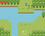
Also, you have a couple elements in the various rooms that feel a bit cheap. For example, in the light world, you have a series of spikes that pop out of the ground, but the player has no way to see them until they're already up, and there's no way to see the indicator of when they're going to come up.
In the dark world, bats can camp out right at the area where the rooms change, forcing you to take damage before you've even seen what the room is. Adding some breathing room to some of the more damaging game elements, at least when you first enter the room, would go a long way to feeling a bit more fair.
The art style is cute. The dark world is an interesting mechanic even if it was a bit fiddly to remove the mini pillars. I feel like the bright world doesn't add much from a mechanical point of view.
It's also a bit frustrating to have to restart from the beginning when I was so close to finish.
Otherwise, nice concept and beautiful design.
I like the game. Art style is neat, gameplay is simplistic yet fun and the idea is definitely unique.
I really enjoyed the game! Light world was fun but i was very lost trying to figure out what to do with the towers in dark world. Great job
Nice game, it looks great and has a good play-feel :)
If you carry on developing it, it could be cool to have one world effect the other. At the moment it kinda feels like to separate (but fun!) games; maybe having to collect the towers for the dark in the light world, or similar, might help weave them together a bit more?
Good presentation, and audio, dash mechanic hard to get used to
amazing game!
Great concept. Dark world kicked my butt haha
Good job! I liked the idea and it fits the theme really well. Some comments: the music could be more upbeat; it would be nice to know how many towers I still have; I liked the idea of kinda having 2 games in 1
Hi oathmilks!
There are a lot of ways this game fits the theme - Joining together the two worlds, and the actual gameplay mechanic of the dark world. I think its really interesting how depending on which side you play you get an entirely different exploration mechanic. Well done!
It would be cool if there was a bit more variety in the music, at least between the two worlds. Additionally, I found I never had enough pillars to finish the dark world. Perhaps this game is just beyond my ability!
Great work though! A nice base to a Gameboy-style top down. Good luck in the rest of the Jam!
Best,
Brandon from TheIndieDream
Cute aesthetic, dashed around like crazy! ^^ The dark world was definitely the harder world! :D
Lovely game, the art style is really cute. The SFX fits well and I like the music too.
The gameplay feels solid, I like the super fast dash.
Congrats on submitting!
This really reminds me of Star Tropics on the NES. Very fun! I really like the dark world. I just want more!