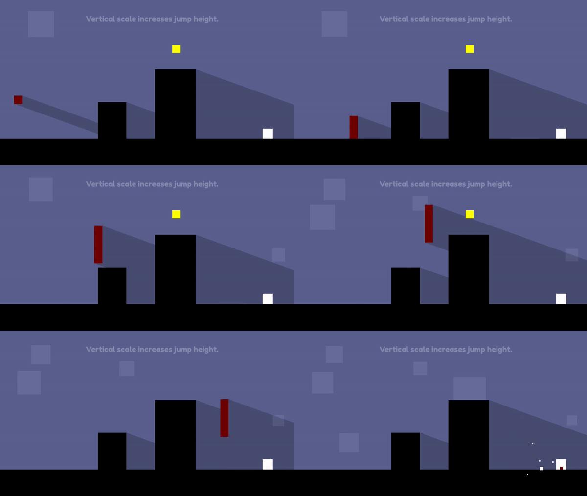
Play Mr SquareScale
Mr SquareScale's itch.io pageResults
| Criteria | Rank | Score* | Raw Score |
| Enjoyment | #1045 | 3.527 | 3.527 |
| Overall | #1066 | 3.642 | 3.642 |
| Creativity | #1247 | 3.691 | 3.691 |
| Style | #1360 | 3.709 | 3.709 |
Ranked from 55 ratings. Score is adjusted from raw score by the median number of ratings per game in the jam.
How does your game fit the theme?
player can scale the character to solve various puzzles
Development Time
48 hours
(Optional) Please credit all assets you've used
see description for full credits
Leave a comment
Log in with itch.io to leave a comment.


Comments
Nice game. I like your mechanic. It's simple but work perfectly. And I really like the music. It's so chill.
Thanks for playing :D
Nice twist , not only gave just simple scale up down, you added vertical and horizontal scale and both has different impact on gameplay,
Great work, enjoyed 💫💫
Thanks for playing :D
Cool game! Mechanics are simple but intuitive, works very well in scope of puzzle and platformer. Visuals and overall style is cool, consistent and charming, I especially like implementation of shadows and background ambient animations. I find this game quite difficult, once you've realised the puzzle solution, the platforming part keeps you from progressing for a long time. I'm not sure your control scheme is best, you use arrows for movement so could as well used up arrow for jump to keep all controls it in two tight islands on keyboard, and using D for upscale and A for downscale seems more intuitive to me. Also I would appreciate highlighting exit before it appears, as now I don't know where exit will appear when I start a level. Aside from that, great take on the theme, nice game, good job!
fun and great concept, feels like one of those old flash games but visually more polished, with some more control polish would be a sellable game!
The concept is a very interesting one indeed, I really like it! I feel like the way the jump height and move speed is affected by the scale gives room for many cool unique mechanics (though I dont have anything specific in mind, I can feel it ykyk)!
some feedbackk: I feel like the dying is a bit abrupt, a little particle or sound effect would definitely give it less of a 'sudden' feeling. Also, the spike collisions are reallly big, making them a bit smaller would make it less stressful and more forgiving for the players!!
I love the idea and execution! It's not too easy but not too hard either (except for someone like me lol, but that's my fault I guess :D).
The style is beautiful too, it seems so incredibly polished and I love the little squares plopping up in the BG, it gives the game some nice harmony! (It's weird but somehow, I see some deep character design in the square lol. This just proves how simple good character design can be :'D)
Super fun idea, very clean visuals and the concept is easy to grasp with minimal text to explain everything, great job!
The controls are a bit tricky to learn, but I think that's because our dumb gamer brains are used to use arrow keys and WASD interchangeably, so I was making a lot of mistakes that way :)
I think that the concept of stretching up and then immediately shrinking down to create some sort of "jumping" motion is very interesting and I was wondering whether it's possible to use that instead of dedicated "jump" button, but maybe it would be too finicky and annoying to use.
The levels were fine, although I didn't really click with levels with spikes. There's nothing wrong with them, but personally I think that the collision box could be a bit more forgiving, since walking into spikes (when those should be jumped over) never felt right and multiple times I found myself moving just a pixel or two to the left and colliding with one (although the reason for that may be that I just suck at platformers :D).
waaw the game is really good! looks amazing visually, i like how you have made the difficulty more manageable by making the coins optional, your implementation of a scaling player is one of the better ones in this jam
awesome game!
Nice work! The platforming for the most part was nice and I liked the simple style.
I did feel like I had some accidental deaths though due to mixing up the horizontal stretch and grow buttons. I kept thinking that right was grow and left was shrink 😅
Really interesting concept! The controls were definitely tricky to get the hang of, but a cool platformer nonetheless!
The controls take a bit of time to master and the current art is a bit simple. But it was a good platformer and the scaling mechanic was well-implemented. Great job!
you've made a pretty solid platformer! the graphics work great and the music is good but feels a little dramatic for an abstract platformer haha. my only real criticisms are that the control scheme takes a while to get used to, maybe could do with a tutorial? and it was hard to tell what your intention was on a few of the levels due to the tightness of some jumps and the slow moving platforms that reset on death. but other than that i feel you've made a really solid foundation for something special here, glad you managed to submit!!
Well done ! I think that the shrink being on A and D was quite confusing ; I'd like it if A and D swapped being shrink/grow respective of what you started with. I think the spike hit boxes were maybe a bit too large.
Great music, game mechanics and level design. Feels a bit strange that A is enlarging and D is shrinking, and the square can go outisde the screen.
What I liked
The thing that stood out to me the most was the visuals, the simple monochromatic pallete mixed in with shadow work make the game stand out and generally looked pretty good. The occasional particle effect was also stylistically nice. The controls felt tight and responsive and the general theme was respected and explored in a meaningful capacity. I also enjoyed the little bit of animation for completing a level.
What I didn't like
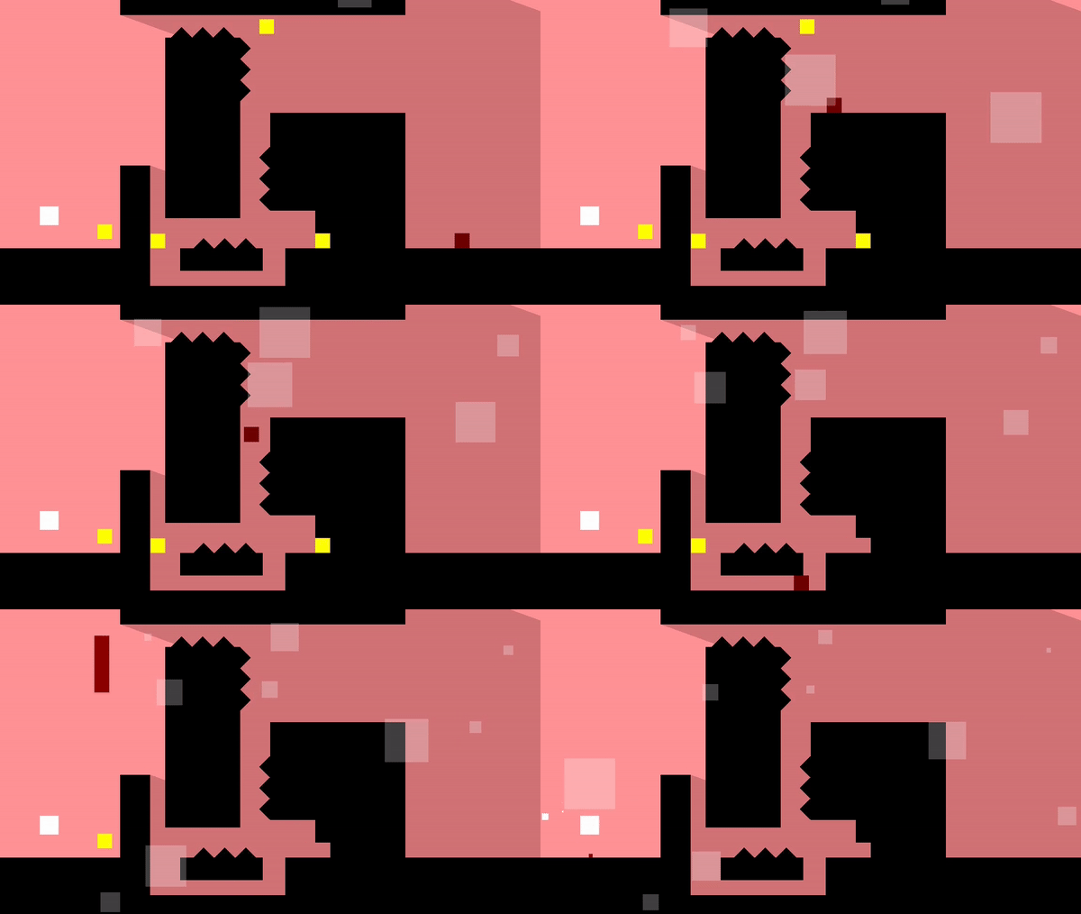
What kills you isn't always immidietly obvious. I thought the first couple of times I tried the spinning Cross level that only the spiked could kill me. Whilst the levels were well design the difficulty ramp up was a little sharp towards the end. Overall however in terms of difficulty you explored a vertical slice of the design space well enough. I didn't like that the collectibles reset after death, though this I believe is just personal preference.
Potential Improvements
A tiny bit of dust trailing behind the player or appearing when they lands would be pretty nice. Post processing to add a tiny bit of bloom would also improve the game quality overall for visuals and would crispen the contrasts you're trying to establish ironically.
Overall Thoughts
This was a very well designed platformer, with a good control scheme. The levels themselves were considered and I didn't find any major or obvious bugs. The game has space to expand and some room for polish, but it's overall a very solid entry, great job.
Super great idea, a bit hard to beat, had to retrain my brain, now I won't be able to play any other game!
Simple but amazing visuals with pleasant to ears music music.
The level design isn't all that complex but does push your scale changing skills which makes it satisfying to play. This especially comes into play with vertical scaling as you need to be taller to jump higher but cant make it past the ceiling unless you shrink mid jump. Horizontal scaling however seems to mostly go unused. Might be an idea to explore levels with long gaps you can't jump over but can bridge over when wide enough.
As a small gripe, the controls could do with an invert option where it swaps wasd with the arrow keys. My brain is just hard wired to associate the left hand with movement and the right with actions and I kept dying due to mixing up the controls.
But otherwise this was very good.
This is good game, and I especially love the Thomas Was Alone style artstyle, but I went the whole game without using the horizontal scaling ability once which felt like a bit of a waste. The jumps with the vertical size changing were cool though!
Interesting concept, but I found that most levels where about precition plataforminga nd not about size changeing.
The game has interesting gameplay but movement and punishing level design makes it a bit harder than I like.
Anyways I hope you will continue making games for jams good luck!