Play game
Master Kibo's itch.io pageResults
| Criteria | Rank | Score* | Raw Score |
| Style | #2567 | 3.226 | 3.226 |
| Creativity | #2690 | 3.226 | 3.226 |
| Overall | #2712 | 3.108 | 3.108 |
| Enjoyment | #2983 | 2.871 | 2.871 |
Ranked from 31 ratings. Score is adjusted from raw score by the median number of ratings per game in the jam.
How does your game fit the theme?
Change player and object sizes in order to progress through the platformer
Development Time
96 hours
(Optional) Please credit all assets you've used
see description for full credits
Leave a comment
Log in with itch.io to leave a comment.


Comments
This is a super-unique idea. I really like the different puzzles and the fact that you not only have to play with the player's size but also the size of the boxes. I also think it is super cool how you need to time it when you push the box past the turrets so it doesn't accidentally get hit.
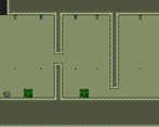
There's one small criticism I have, and that's that the boxes have way too little friction. In the second level, stacking the boxes on top of each other took me like 15 tries, for one, because they wouldn't be in the position I wanted them to be, and for two, because they could rotate. So even though the green landed on top of the white, it was rotated and fell off.
Besides that, I really enjoy the different puzzles and the level design. I also really like the Game Boy graphics. Super cool. Overall, it's a great start, and I can really see this being expanded upon. Good job!
Thank you for the feedback! Yeah the boxes are a bit too slippery, we thought that could be an interesting mechanic to play around but we end up tweaking it enough. On the second level you're meant to grow the green box to make it through and not stack them, we did see many people doing it like that though we wanted to keep the solution some what open but maybe we didn't communicate the intention well enough in the level design. Anyway thank you for playing!
Liked the idea, but there are some things that frustrated me, so I'll try to give some constructive feedback if you wanna continue this project or expand the game :)
The colors yellow and blue didn't ring any bell to me, didn't tap on any common knowledge that would help me learn which of them make large or tiny, so I kept using the wrong projectile, shrinking when I wanted to scale and vice-versa. I think green to grow and red to shrink would make it easier to learn and the game more readable. Green is commonly 'good' in games, and 'red' bad, so good to grow and bad to shrink I think would make more intuitive. But ideally, the guns could have different shaped guns and projectiles, like a "+" and a "-" for projectiles and like a big crossbow for "+" e a tiny laser gun for "-", this would help a lot too.
On the first level with a box, there were no clues that the box would also be affected by the projectiles, so I kept trying to stack the two boxes on the starting size, and it was really janky. Got so frustrated I almost quit haha but I ended up completing that level stacking the box, to later learn that the box could also scale and shrink. The physics with the boxes are a bit janky. The box slides and it always moved more than I intended to move them, and many times I had to reset the level for tiny mistakes that I didn't feel was my fault.
I did not finish the game as I ended up a bit frustrated, sorry. Maybe I'll try again later
Despite these details, I think the game is cool, there are some cool puzzles with these mechanics. Solid game, great entry and congratulations!
Thanks for the great feedback, really appreciate you keeping it real! A lot of your critiques we were already aware of during development but kinda ran out of time to properly tweak and polish all of it unfortunately but such is the nature of a game jam.
The idea with the colour of the guns was to have yellow represent the sun and blue the moon, i.e. something big and something small, but then we ended up forgetting to show that anywhere, maybe if we had implemented that somewhere the colours might've been more intuitive but perhaps a more direct approach like you suggested would've been better.
Anyway thank you for playing! I also thought we made it really hard xD. It's always great to have detailed feedback so we can improve for next time :)
I like the screenshake, the info on the UI on how to play and the visual with a gameboy vibe. It's super cool, i just feel like the difficulty curve is quite high (or it's just me !) apart from that, that was fun to play ! Liked the puzzles
First thing as a visual designer that stood out to me the most is the retro gameboy color palette. Comfortable in the eyes for a long run platforming game. The puzzle design is cool, platforming feels fun while scaling the size. Good job all around. :)
Cool concept, puzzles were good, had fun.
Great game ! I like the art and the way the puzzles are made ! Keep up the good work :)
We had the same idea :D
Really nice game, the puzzles are clever, and the art is great of course. And the fact that you can get so tiny you almost disappear is hilarious, I love it.
Perhaps check out my take on it, it's less puzzles and more platforming, I would really like to know what you think of it :)
good puzzle!!!The feel and production are both perfect, and the characters can even become very small!!!! There is an infinite feeling~
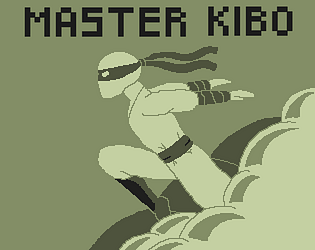
Great puzzles bro. I liked the old school artstyle; I find with me that I tend to do that style because I'm not good at art. But from your cover photo you clearly are, so it was a stylistic decision it seems. lovely game
Thanks for the compliment! But can't take all the credit hahah the idea we pictured always was to use retro style graphics as it would both make it easier and look nice, we then found these very nice assets that I made some extra additions to and drew the cover art, we will definitely be trying to make full custom assets in the future!
This is a fun little game, the fact thant you don't choose when the size guns are shooting make it can be hard to do what you want and sometimes you grow while you wanted to shrink and vice versa, but anyway it's still a good game, good job !
Nice!!! we use kind of the same mechanic!!
really fun and juicy! i like the limited color pallete too.
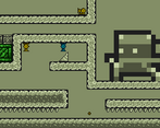
Nice retro pixel art game! I got stuck in the room with the cannons and the sloped platforms.
Really fun, love the vibes with the art and the music!
Great use of scale and color palette. Good thing you had the level reset button as some of the levels were very easy to get soft locked. Excellent submission
Nice game!
Nice game! The colours you used were really nice
I loved how small you could get! Very silly and fun
Internally we called the smallest size "Le bullet" xD
Great idea!!
Thank you!