Play game
DARK WORLD's itch.io pageResults
| Criteria | Rank | Score* | Raw Score |
| Theme | #14 | 4.200 | 4.200 |
| Art Direction | #17 | 4.210 | 4.210 |
| Overall | #29 | 3.794 | 3.794 |
| Game Design | #48 | 3.670 | 3.670 |
| Innovation | #72 | 3.520 | 3.520 |
| Fun | #97 | 3.370 | 3.370 |
Ranked from 100 ratings. Score is adjusted from raw score by the median number of ratings per game in the jam.
Leave a comment
Log in with itch.io to leave a comment.


Comments
Art style is fantastic. The music doesn't directly match the visuals and I think that adds to the creepy mood, like something went horribly wrong during the cold war era, but somewhere in the rubble there's an old radio still playing classical tunes. Nicely done!
Really nice, great work
Art style and audio are insanely good for a jam game, loved the atmosphere you went for!
Excellent game design and built in tutorial
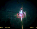
Minor criticism - I would like 'R' to be a restart button at all times, there are some points where I accidentally mess up and know I therefore won't be able to complete a level but I have to end up using the remaining wire before I can actually restart.
Overall a really solid entry :)
Thank you for playing and for you kind words!
There is a way to restart a section of the game through the pause menu, but we failed to tell the player at any point how to do that outside of the store page (it's the escape key). Thank you for your feedback!
Fantastic game fantastic art style ,overall a great game
well done!
Nice game!
I really liked the game concept and gameplay. The art can be furnished a bit. Overall great feeling.Well done!
Loved the gameplay, its innovative for sure, and its fun as well. I digged the cryptid aestethic, and the music oddly suits the picture, creating this classic creepy storytelling
Art and music lend to one of the best atmospheres I've come across! Gameplay seemed pretty straight forward but provides a nice proof of concept. I did experience a little bit of slowdown it seemed and movement became a little choppy. Enemies look great! So much room to build off this idea and keep going if you decided to. Great job team!
It seems like you went with the strategy of making a very unique product - in terms of art, music, and design and it works! Its nice to see a turn based / grid based game like this in a game jam, its the first one I've seen in any game jams.
As others have pointed out, due to the nature of the core mechanics and design, getting through a level can be slow, but I feel like those who really like this genre of game will appreciate this. I like how you introduce concepts to twist the main mechanic as the game goes on.
Really neat. I like the visuals a lot. Has some great ambiance and all fits nicely together with the theme. A bit curious how you made it look that way, to be honest. The core gameplay loop is intriguing and required a lot of thinking, which is good. The turn-based nature felt a little slow and it seems like the path is forced. Might be interesting if you could go in multiple directions and have a bit more slack to explore instead of always moving up. Otherwise, a really solid entry.
Wow, this is really cool ! Loved especially the music and sound effects !
The theme was well matched with the Game design, great work !
I like the visuals of this game. Movement is a little slow, hope that I can move faster.
Really cool mechanic and it was fun to play. It matches the theme extremely well and I love the art direction. I didn't mind the music so much, but as others have said it didn't fit all that much.
My one gripe was the movement. It ignored my inputs until he had finished moving to the next square, and so there were many times I pressed W but then had to press again. It felt kind of jarring when failing because I wanted to quickly get back to where I died. I'd recommend either storing the last input pressed, or speed up the movement animation.
Anyway, great job! :)
Thank you for your feedback and for playing!! Getting into the rhythm of the turn based-system is a bit weird I'll admit, and it doesn't help that the turns can often take quite long!
The music was definitely a conscious decision though we were still figuring out the overall feel at the time. It seems some people are put off by it while others enjoy it. For me, I still prefer it over something that's typically heard in the horror genre, but everyone has different tastes and I appreciate your feedback nonetheless! :)
The game is good and the way the theme is implemented also worked. Would be better if the music chosen is a bit more horrifying/eerie to match the darkness and the mood of the game. Still, great job!
The game feels quite complete. I like that you fit the theme very closely. Thought the music doesn't fit that well - that would be my single issue.
So eerie! I want to see more of this world!
love the music and the graphics!
Visually and thematically evocative game, wish I could move a bit faster when I'm retrying a level for the 10th time but other than that it all melded into a cohesive experience.
Thank you for playing! The slow turns coupled with many enemies on screen at once is definitely the first thing I'd tweak if I could go back!
Very interesting idea. Gameplay mechanic is nice and simple, yet engaging! Art is very oldschool and works nicely with the music.
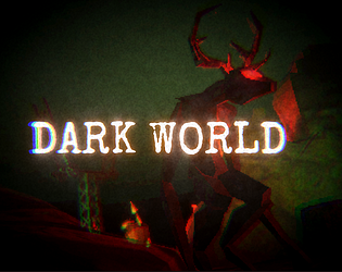
I love the visual of how the camera looks. it really adds so much for the setting you made for the game. Reminds me of old PlayStation era of gaming its gave me a lot of nostalgia of how ff7 looks in that regard. You also have to be very careful about the steps you take and pay attention to enemy pathways or you are a goner. I really liked this on top of how strong your art direction felt. Great Job.
Thank you so much for your kind words!! We started with PS1 style graphics in order to cut down on modeling and texturing time and I actually had a blast trying it for the first time for this Jam, I think it was the right choice. Thanks again for playing!