Play game
Cerebrum's itch.io pageResults
| Criteria | Rank | Score* | Raw Score |
| Audio | #13 | 4.200 | 4.200 |
| Graphics | #33 | 4.280 | 4.280 |
| Overall | #51 | 4.060 | 4.060 |
| Gameplay | #126 | 3.400 | 3.400 |
| Authenticity (use of resolution) | #163 | 4.360 | 4.360 |
Ranked from 25 ratings. Score is adjusted from raw score by the median number of ratings per game in the jam.
Did you work in a team?
Three members team: a programmer, an artist and a music composer.
We went for a semi procedurally generated horror game. It was really fun to make, although we had to cut a lot from what we originally intended. An introductory text to the game follows.
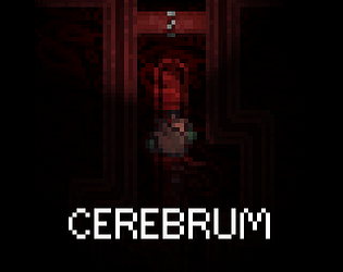
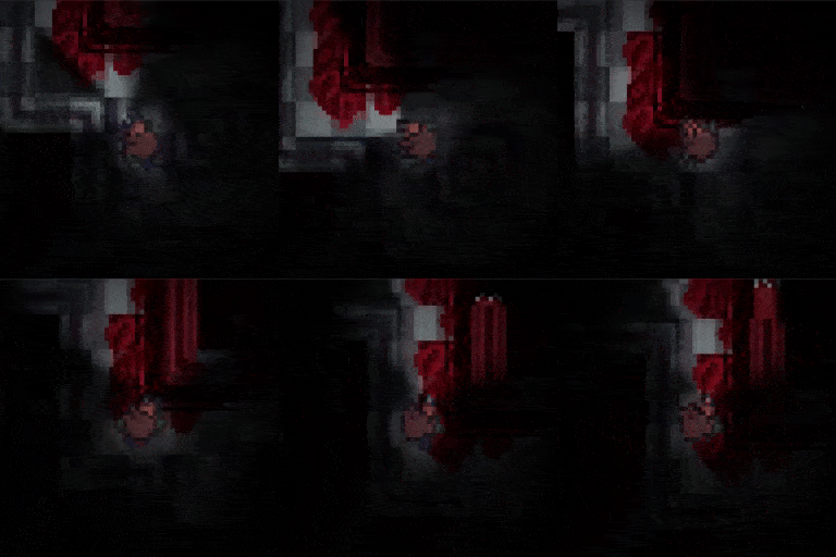
You find yourself in a dark and unwelcoming building. Disturbing blood-like organic growth can be seen everywhere you look. You feel a wicked presence around you... will you survive the encounter?
Was the resolution a challenge?
It was the first experience in 2D game dev in Unity, getting it to work right in 64x64 seemed easy at first but required extra care in the end to avoid jerky camera movement in particular.
We solved the jerkiness with absolute movment that's faster on the diagonals. There was also a problem with the player rotation towards the mouse that was due to how we normalized the mouse position. In the end we multiplied the normalized direction to the mouse by ten and it solved the jerkiness.
Finally the pixel perfect camera from Unity was way too flickery, in the end we used a 64x64 render texture on a raw image on the canvas.
What did you learn?
We learned a lot about 2D development which was new for us, it was also our first attempt at some sort of procedural generation that tought us a lot about what actually goes into making it happen.
Leave a comment
Log in with itch.io to leave a comment.


Comments
Really scary and intriguing.
Beautiful combination of graphics, sounds, movement, idea.
Atmosphere was asphyxiating
Great atmosphere, simple but solid gameplay, great graphics, excellent sounds. Everything is great. I didn't think horror could work so well in 2D, an amazing job, and a solid entry.
Thank you and best username!
I really like the depressing atmosphere this game exudes. the character speed is just right, the artwork comes through. I played the originally uploaded version (which doesn't have the brightness right), but I still really enjoyed it.
Thank you!
Must be already said but great use of the resolution for graphics.
I found the game a bit hard by throwing you enemies instantly instead of building up fear a bit.
Otherwise perfect and spooky !
Thanks! Indeed I totally agree, should have built tension but ran out of time for that.
Really well made!
You've utilized the resolution really well, the ambience is on point, and the chases do a great job at freaking me out lol
Admittedly it's not entirely clear what the player is doing and I found it rather easy to get lost. Perhaps changing up the tileset a bit for different rooms could remedy the latter. (A map works too)
Overall this is a great submission! Good job!
Thank you! The tileset could definitely use more variation. I'm not fond of the map idea, but I wish I had a time to allow the player to actively mark the floor as he goes around so that not getting lost is up to him.
Super cool, loved the atmosphere, and the light/dark mechanic was interesting.
Walking felt a bit slow though, and the flashing and shaking when encountering an enemy was way too much in opinion.
Thanks! Walking is intentionally slow, I debated adding a run button but I don't like the idea of either dashing through everything or exhausting the player quickly. Shaking was right imo, you might be right about flashing tho.
Awesome art and atmosphere. It would be great to have some visual landmarks in different rooms to help identify where you've already been
Thank you! Agreed, I wish I had the time to add a "mark this floor so I know I've been here" mechanic for the player to use.
Oh god I beat it \o/ that was intense! I LOVE the eyes adjusting to the dark mechanic ^^ and somehow you made it feel safer to be in the almost pitch dark than in the light that's something! loved every second! :)
I have to admit for a second there I thought I was repeating rooms and it might be procedural ToT but I kept going it all added to the vibe, I encourage people to keep going and TURN OFF THE LIGHT! haha :)
Thank you! :)
Real cool horror game! Nice approach for the resolution, it really fits well if an horror game. The light effect are pretty great too as well as the art-style of the pixel art. Great job :D
Thanks! :D
What a cool low res horror game! The flashlight flickering when being pursued by a monster was totally terrifying! Great art and lighting, and the music/sound design also fit perfectly! Awesome game, great job!
Thank you so much!
I got the spooks!
I am not the best at horror games, and I thought pixel graphics would help me with the problems I have with horror games. But no, you nailed the "spookiness" of the game even with pixel graphics! I'm amazed that you've come up with a cool game like this during the jam!
Great job!
There is no escape from the spoopy! Thank you for your words!
Yo get OUT of here with this creepy a** game its 4:30 PM with full sunlight and this freaked me out. Really fantastic work y'all!
Thanks <3
As soon as the game loaded I was like “NOPE”, but I found the courage to play.
It was easy to get unintentionally lost, so I just cowered along the right wall as if I were in a maze. And then [REDACTED] happened, at which point I went “NOPE” and closed the game.
Really great (terrifying) aesthetic.
Edit:
Grammar and stuff.
Thank you so much for finding the courage! Really glad the game can have that "NOPE" effect on people. Also thanks for redacting spoilers :P
I started getting creeped out from about 3 seconds in. That's a really intensely spooky atmosphere and I love the stressful little touches like having the torch flicker out from time to time. The game has some depth to it with the discoveries and learning you need to do along the way. It's quite an accomplishment for a 2 week game. Great job.
Thanks a lot and glad to hear it spooked you!
Amazing atmosphere, even though I ran into no real threats for the first five minutes i was still spooked as hell even without any atmospheric sounds. Graphics are phenomenal too, especially considering the grungy style and the low resolution. It would be nice if there was more incentive to actually use your flashlight for vison purposes, as I had an easy enough time seeing what I was doing even without it on. It would have also been nice if there was visual indication of how a door would react to light. Monster encounters were easily avoided (as they mostly stood still) and when encountered were easily escaped. I didn't find an ending, but I did find the biggest wad of meat I had ever seen, which was very nice.
Thanks a lot for the feedback! You are totally right about the flashlight, the experience was much different from what I was seeing during development because I always keep my monitor brightness really low, so lighting was way higher than intended. I've fixed it now.
You're right about a visual cue for how doors would react to light, I should have thought about it.
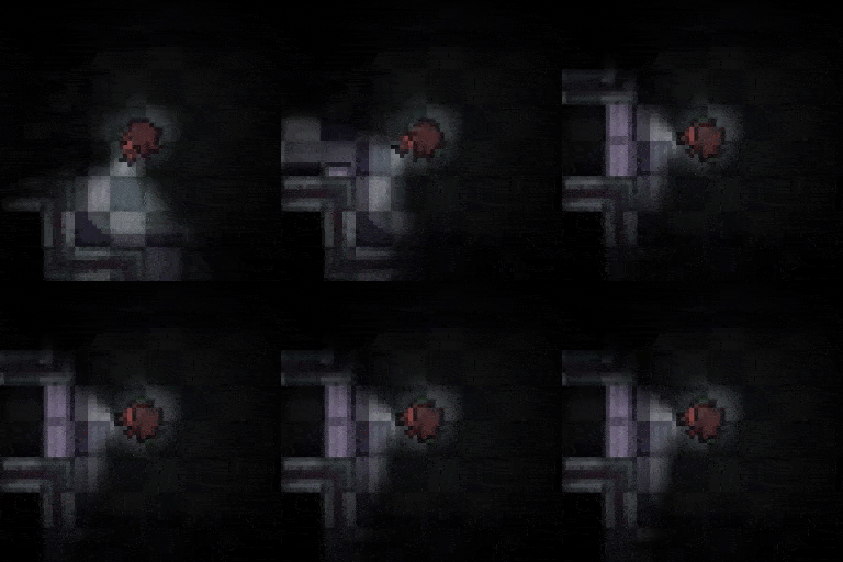
About the monster: I didn't want them to be frustrating and also you weren't really meant to see them before they would aggro. As in outside the flashlight cone it was supposed to be almost pitch black so that when you actually see a monster it's because you're shining light on it which also makes it aggressive.
fun game the las room was tense and i wasnt sure if i could get out, the onlt two thing is that i think you see too much in the dark i didnt really needed to use the light to see, second is that before you get to the blood and meat room, everything is so similar, i wish i had something telling me i was actually going foward like diferent colours in the rooms.
Great game i really got into it
Thank you a lot for the feedback, that's really useful to know! I keep my monitor's brightness very low as it strains my eyes a lot and I should not forget that most people don't. I'll make sure to account for that in the future.
Great audio and gameplay. Wondered about for a bit. Snakey snarled me up. Escaped, but my torch is now on the blink. Terrifying !
Brilliant stuff. Well done.
Thank you!
The game looks and plays really good, when I first got to the brain thing I pointed my flashlight at it for a few seconds, saw nothing happened so I went aways looking for something else. After finding nothing I came back and realized that I needed to point my flashlight at it for a longer time lol. Really good game non the less.
Thanks! You're right, I didn't consider the player might not understand what to do there. Guess I should have locked the way out or something, so that you know there must be something to do there. Really appreciate the feedback, thanks!
Holy moly great job!
This game felt so polished!
Thanks!