Play the power systems
Mechs and Titans's itch.io pageResults
| Criteria | Rank | Score* | Raw Score |
| Audio | #15 | 3.632 | 3.632 |
| Overall | #37 | 3.316 | 3.316 |
| Visuals | #44 | 3.474 | 3.474 |
| Fun Factor | #45 | 3.053 | 3.053 |
| Originality | #46 | 3.368 | 3.368 |
Ranked from 19 ratings. Score is adjusted from raw score by the median number of ratings per game in the jam.
Is your game a video game or a physical game?
Video Game
Was your game made solo or in a team?
Team
Did you use any third party assets, if yes what assets did you use?
Sound effects: partially original (a few sounds from freesound.org) || Animation: Creature Pack from Mixamo.com
Did you choose from one (or more) of the optional secondary themes?
Arena
Does your game contain 18+ content (Nudity, Gore, Language)?
no
Leave a comment
Log in with itch.io to leave a comment.


Comments
Nice job! I think it would be nice if the enemies had longer aggro/aiming ranges or the player had shorter ranges for their projectiles. I found it pretty straightforward to keep to the other side of the map for each fight and shoot the enemy from afar, as the AI would not seem to target me from those distances.
Armored core 7, Ladies and Gentlemen.
A solid game all around. I really enjoyed moving around my stats in real time, and it added a fun dynamic to the game. quickly swapping between speed and heat made dodging around the bosses rather fun.
low key a hidden gem, very complete game, with great mechanics and well made fights, while the overheating is kinda annoying its important for the balance, the visuals are quite pleasing, and the controls are a bit slow, but control well, I especially like the sound design, the gun SFX is crunchy, the the Mech SFX are well thought out, I like the whizzing sound when you rotate, and how it pitches up depending on your speed, overall a very solid entry, well doen!
I like the whole concept (especially the prioritizing concept)! Would be really great to see this expanded on.
I like the designs of the bosses (especially the final boss) and would love to see how everything would have looked if you guys had more time!
My only notes I can think of that haven't been said is diverting everything to speed doesn't really feel like it does anything, as well for the weapons I found it difficult to determine how close to the enemy I would have to be for the chain-guns to deal damage, and where I would have to aim to have my shots hit.
Great entry! Well done!
Thank you for checking us out and writing a comment ^^
It sounds like a bug, it should change noticeably. Does that happen both in web and desktop versions?
This really nails the mood,
Excellent atmosphere, graphics, and music ! Really close to an AC game with the power managment twist which is great :) one of my favorites entries so far !
Regarding gameplay,
- camera is a bit low behind the mech, it is kinda difficult to see where you aim sometimes
- a cross hair is a must for a mecha game ^^ why note green or orange hud for added atmosphere !
Once again, impressive ^^
Interesting Mech Shooter game. Cool but a bit rough around the edges. Not sure if it's because I'm playing on a 4K screen but the sensitivity way INCREDIBLY HIGH, like I could 720 spin by moving my mouse half an inch to the side. I advise you lift the player camera a bit instead of being directly inline with the weapons. If the player is shooting upwards, which I did for the second 2 bosses, it's very hard to see where I'm aiming. Needs a bit of other tweaking across the board. Heat bar, HP and Boss HP bars need to be more noticeable, adding borders can help with that and changing their sizes. I didn't notice that you could switch priorities, I thought those were fluff in the description and not actual things you could do in game. Might want to change the word "prioritize" to "increase" or "divert % to" or other variation or add text above telling the player they can change modes to an extent. Also, you have player bars all over, the top, the right and bottom left corner, so you are asking your player to look at 3 different places on screen just for their stuff and one of those is right under the Boss HP Bar, which makes it look like it belongs to the Boss instead. Loved the music btw.
Hello, thank you for checking us out :D Unfortunately UI and mouse sensitivity is scaled with the resolution - I’m trying to figure out a setup in Godot to mitigate it. We plan to do a complete UX overhaul in the future, so thank you for all the suggestions!
Very cool experience. Love how the mech moves and is animated, it really feels like you’re a heavy machine. Also so the drop down entrance in the first level was really slick. Only the jump doesn’t fit right quite into that, becaues this just feels like you’re floating up a bit (i also dunno what i would need it for)
The area is cool and the music really gives this epic, heavay mech battle feeling, very well done. I also liked the switching between heat, speed and amor, was quite a interesting mechanic and fun to use.
I have 2 issues with this, first is the bullets are barely visible, especially in the dark levels, so i don’t know what i’m hitting if anything. I would like to see in what direction i’m shooting, maybe you could add some highly visible bullet trails or something? Because the mech is already half in the way, so it makes it quite hard to see if you hit or not.
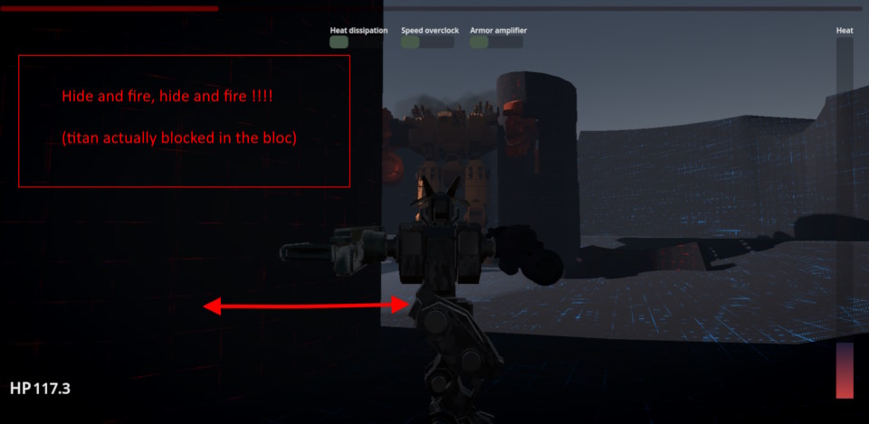
Then there is the camera, whenever you are close to a wall it glitches out, so you don’t see anything anymore. Especially in the last battle this happened alot which was quite annoying. It also felt a bit unfair that the big one would clip his one gun through the rock so i couldn’t hide behind it anymore, and then dodging was impossible.
At the last second the bullet impact feedback system broke, so we had to cut it (still trying to figure out the issue). But thank you for valuable ideas, they would be great to include once we release the upgraded version. Also some better boss behavior for sure.
Very cool looking game! There are some issues where I'm not sure how to survive/defend against the enemies and there could be some feedback when you receive damage but very cool game!
Pretty cool! I liked the concept of diverting power to different systems
I definitely struggled, but loved the visuals and all the design work.
Really cool game! The boss rush concept works perfectly for a mech game, and I think the idea of moving around your stats to focus on different things is a very smart choice.
The modelling on the mechs is top notch! I wish you could make some more animations though, to really sell the player on the power of what's happening. I know there's time constraints and stuff, so if you continue working on it, that's something that I'd like to see. Maybe some more explosion effects, some more telegraphing of the bosses' attacks, damage animations, more recoil and weight to the guns, particle effects, stuff like that.
Mechanically, I think the game has a lot of room to grow because you have a very solid foundation. The stats distribution part is a very cool start that makes me think of other things you could do with this system, like unlocking abilities at certain thresholds for each stat and stuff like that. I think the controls for distributing the stats could be more intuitive (although I can't come up with any suggestions as to how), because when I pressed a button I didn't know how much would be subtracted from the other stats. Maybe instead of having a filled bar you could have a segmented bar or a segmented circle or something, so that the player can quickly tell how many points they have allocated to each stat and how many they move when pressing the button.
Really cool concept, I hope you keep working on it. Keep up the good work!
Hotfix 1:
-balance changes
-laser reticles
-fixed navigation issues on the 3rd boss
-settings menu fixes for html build
The modelisation of the mechs is very nice, but it lacks of animation (specially for the titans). And can you add a crosshair ? Because it’s difficult to see if i hit or not (can only see on the life jauge of the boss), a little lack of effect and feed back. Otherway the concept of boss/titan fight is very nice, think of add different patterns/fight scheme for the titans next time to make fights more interesting.
Thank you for playing and feedback ^^
The reticles are now in, and the navigation issue should be fixed. We plan on keep working on the game so hopefully we’ll do the rest of improvements as well. Cheers.