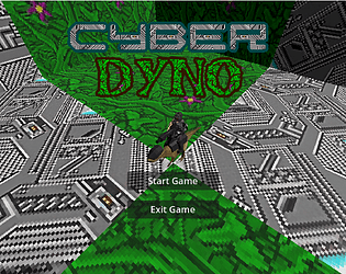
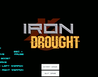
Nice job. Lots of variety between the weapons. Having it work in 1st and 3rd person is a nice touch. Neat retro vibe.
ataboo
Creator of
Recent community posts
Nice work with this project! The style matched itself well, the movement and animations were well polished. The upgrade system scales things without getting to complicated.
Like others have said, the travel time ends up being a bit of a chore but I don't think you'd want to boost the speed too much or it would lose some grounding. Maybe some kind of occasional fast-travel ability.
Amazing atmosphere and world building. Love how the story shifted between different voices and context and there was a lot of great subtext that was making me say "oooohhhh okay" out loud. The tension between the official accounts and the darker truths really feel like it's chipping away the veneer of war.
It can be a bit daunting when you don't know how deep the wiki link rabbit-hole is so I'm not sure if there's a way to indicate that somewhere (maybe a map or percentage completion?) without breaking the experience. Like in the beginning part of me was wondering if someone generated 1000 pages of dialogue with ChatGPT or if there were circular links haha. But I got past it and pulled into the story so it's probably not an issue.
Really impressed by the depth of story you put together in 2 weeks and the illustrations supported it well.
Go Godot! Yeah we were trying to give it some weight and feel along the lines of operating equipment like a backhoe or something. I thought people would start out a bit awkward and get a feel for it but it looks like the movement really hasn't gone over well. I guess we could have moved closer to typical FPS and away from any simulatory feel.
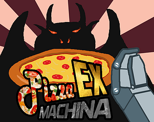
Glad you enjoyed it. Yeah pizza and mechs was an easy win for all our inner 8 year-olds.
We were trying to walk the line (pun intended) between giving the movement some weight and having it be too clunky. I think the colliders between the arm and things like the oven are probably the biggest annoyance. It's tough to have some kind of skill ramp for movement but not be too awkward.
Glad you liked it! It's one of those things that's starts as a joke "wouldn't it be funny if you were making pizza in a mech" and then it turns into "so it's settled, we're making a pizza making game" haha.
There's 4 dough meshes that we swap between as the player interacts:
- The round un-kneaded one (rigidbody)
- The kneaded ball with the flat bottom (another rigidbody)
- A cylinder shape that never gets removed from the plate (this is the spinning one)
- The pizza crust which is another rigidbody that gets attached
The cylinder one on the plate is just made so we can stretch the scale on x and z while we spin the y axis and it still looks reasonable
Our source is up here if you want to check it out: https://github.com/ataboo/mj2023 but be warned that it's game jam code haha.
Yeah I've found it's one of those things that you don't realize how tricky it is until you make it. I was in a group doing a mech game a while ago where I would have liked to capture the scale as well as you did here and then add sound, camera shake and dedicated animations to really show the melee hits and building destruction. It really made me appreciate professional first person games that manage to make impacts and melee combat work well.
I liked the variety in the problems presented and solved in the dialogue. Where some games might have you strong-arming all antagonists, it's more interesting to reveal a sympathetic reason through direct conversation.
Like others have mentioned, music and effects would have really helped the experience but it sounds like that was just pushed out by other priorities.
At the end of the day, it was well put together and the movement was tight.
This is a fun concept and you guys put out a lot of assets in a short time. The details in the buildings, parks, etc. captured the scale really well.
I always get a kick out of a good destructible environment but I think the feedback from the destruction could have been pumped up a bit (particles, bits falling off) since everything is first-person (monster) immersive. i.e The claw swings seemed a bit disconnected from the damage they did or didn't cause.
The Japanese theming was fun and those still images were really great.
That was fun! Great animation on the characters. I like the West Wing style talk while we walk story telling. The push mechanics had a lot of opportunity to be creative in the fights.
I did get a soft-lock when I lost a round twice and it wouldn't let me retry. Not sure if this is worth trying to patch out or if I won the lottery.
Great atmosphere from the visuals and audio. Having the landmarks poke out of the fog was a nice way to find your way around.
I didn't manage to get the last skull. I'm not sure if it was stuck in the one rock that was glowing and whispering.
The Giant's Causeway style hex stone environment was really cool.
The first section to get familiarized with the controls is a nice touch and I liked the art style.
Not sure if you noticed but the aiming controls felt a bit strange and it would get a bit choppy at times. I'm just on a laptop and it may be the fog or something. Maybe when the bow is drawn, the mouse sensitivity could drop temporarily.
The music kicking in for the fight was great and fit everything really well.
The de-saturated minimalist vibe with that lighting makes for a cool atmosphere. I think a horror score (ex. musical stings when you see things) would have really punched it up.
You did a lot with very few simple assets. Why render a whole car when you can slowly wheel in the headlights? The switching things out when the character turns around is fun too.
Nice work on getting your first Wild Jam in!
I like that you're trying a lot of things with the lighting especially the shadow on the title-card. I like that you couldn't really see the whole monster and what you could see was looming.
I missed having the ability to strafe but falling over when dying was a nice touch.


