Whoops, you tackle that problem in the final paragraph of the Overview! Alright. So COLOR MODE it will be in forthcoming installments – got it!
Clapostrophe
Creator of
Recent community posts
With the latest build (lesson 6) there’s a noticable lag in the movement in the platformer section. I both tested it in the browser and with the BGB emulator. Is this just how it is with platformers in DMG mode (build with GB Studio and Platformer+) or may have something crept in the latest build that causes that lag (e.g. an unnecessary, costly check in an “on update” event) and was forgotten to comment out?! I compiled the project in Colour Mode and that’s when the simulated CPU can handle everything fine – but it’d be cool if DMG mode needs not to be abandoned for a great-feeling platformer. That being said, excellent new lesson – already learned plenty from your documentation! Thank you so much!
I’m 3 weeks late with my reply, sorry; a whole lot of tasks found their way into my queue. I really appreciate(d) your comment/suggestions – very motivating! Moving platforms will definitely happen in some way, and I already began implementing a challenge that demands other buttons (just not other letters though, since the Game Boy only has A & B to offer). But yeah, thanks so much for taking the time to play & comment! Kind regards!
My pleasure! I can assure you, I’m truly impressed. (My poor wife had to listen to my over-excited descriptions of that demo I just played.)
Regarding the illusionary door, I think adding a small animation that shows the wall desolving when »touched« could just do the trick. Though I feel something like an illusionary pathway should be reserved for a later tower (that then has the theme playing out further in its puzzles). That way the initial confusion of the player has a different quality when a tower pops up apparently sans door.
Replace the rope with a telephone?! Ha! That’s my kind of quirk! Would love to see that rope being re-purposed in a later tower as part of a puzzle, though. Loved the feel of going down that rope on the outside.
Yeah, too bad it’s on ice! Btw, when I intially went to the Kickstarter page I was looking out for the physical release tier. Probably what a majority entices when they see Kickstarter. Sure, it’s a massive can of worms to go physical and since its actually an adaption of another game that is probably not even a possibility at all. (Are you in contact with the original author?) Though I came in already late enough to see the backing is very unlikely to work out. There’s actually a chance that in an earlier phase I would have been allured by that Pixel Art portrait tier enough.
Have a lovely day & best of luck with your ongoing projects!
Too bad it didn’t work out. VERY impressive demo, I had a lot of fun playing it (so much that I had to play it through once more the next day). I love the intro sequence(s), the music, dialogues, stuff like the mage/slime fight, excellent credits reveal and the simple, but super-effective UI. Oh and that scene with the binoculars view – beautiful! I was in awe a lot.
P.S.: The only issue I had was that the tower is missing an (visual) entry, and that the whole rope-scene (as lovely as it is in itself) sent me on the wrong track by suggesting it was a crucial part of the puzzle.
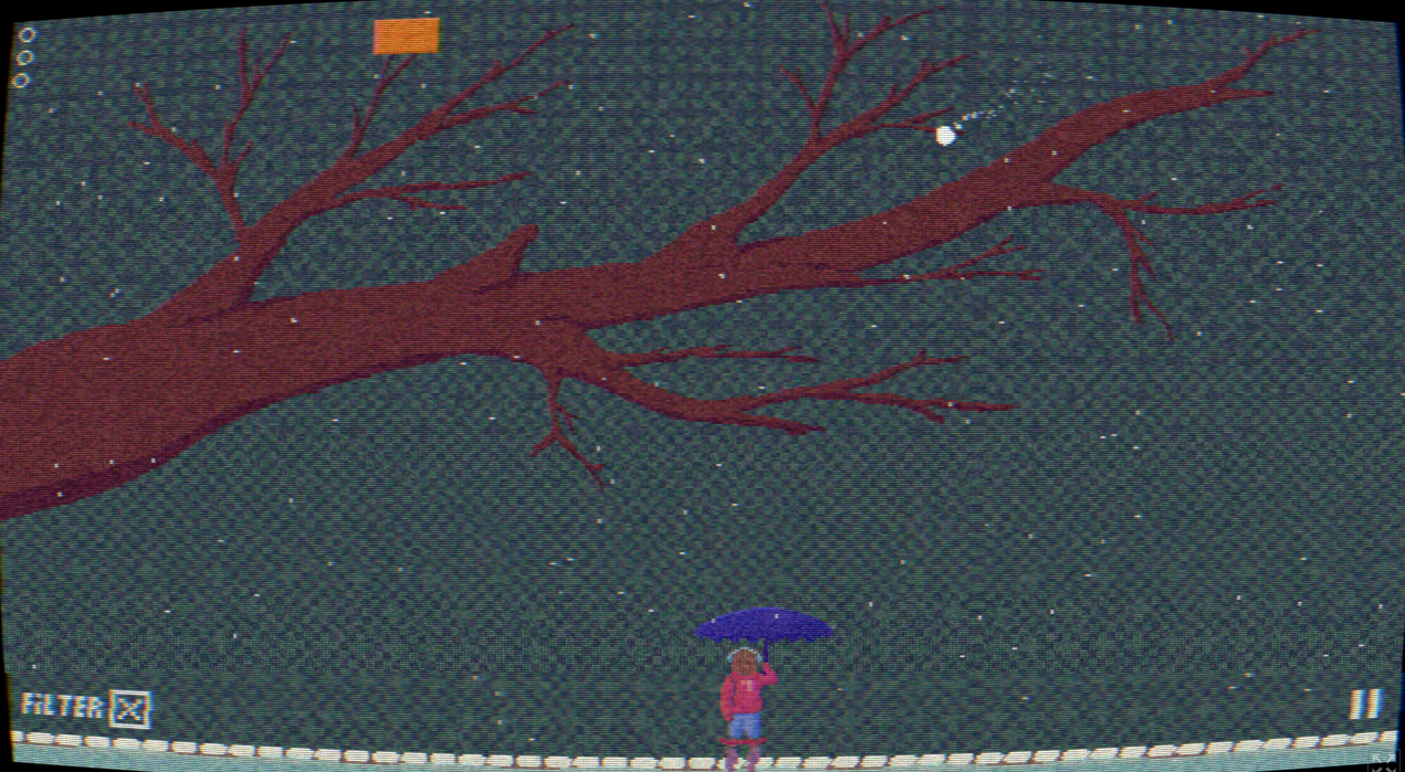
Lovely ambience, especially with the filter enabled (gives the blocks a bit of vividness). Impressive to see the care that went into the bear’s animation when aquiring & throwing the ball, then hitting play on the walkman! Tree looks beautiful (reminded me of an artwork series by Stanley Donwood).
In-game pysics had its strange moments… this ball surely took some unexpected directions when hitting umbrella or blocks. Which happened to stretch out the final step significantly… since my predictions about hit angles happened to get lampooned 4 out of 5 times. But the flattery at the end made up for it. :) Very well done, and once more: great music to accompany the scene.
“Wow thank you! You don't know how much I appreciate gaming experience feedback as detailed and complete as the one you write. I appreciate it very much.”
Thanks! I’m happy my comment was so well received! Now, I would not call it “complete”… which I try to proove by adding a crap load of more nitpicks below. Haha.
“There is information about jumping (and double jumping), I think you skipped it, hehe.”
Whoops. Right there over the player sprite. I’d say gracefully overlooked that one… *cough*. Granting the tutorial screen a bit more thought… the amount of text encountered at first sight is surely overwhelming. It would benefit from applying more principles of visual hierarchy. Using button symbols instead of the words (e.g. “arrow keys”) would make it easier on the eye and also allow for a quicker nagivation of the info (i.e. a first glimpse tells you already what paragraph is about controls, and what is about game elements like enemies, etc.). And a very general tip: for paragraphs one should always use left aligned text instead of centered or right aligned text. Looks more orderly right away and is easier on the reader’s eye.
“SHIELD. I admit that I tried some of this things. Like puting a duration bar and recharging it after a period of no using the shield. But I still have many programming limitations, even with GDevelop.”
Ah sure, that combined with a strict time limit (as in 3 hours … total rando example) makes these things especially tricky. I havn’t yet looked into GDevelop, though I spotted the logo in many Jam games already.
“Before that, I've only made Bitsy games (extemely simple motor of 1-bit games).”
Ah, that one I even tried out! I think I heard about it on a YT channel, normally about D’n’D table top stuff… if I remember correctly he used it specifically to quickly test dungeon designs before he exposes his TTRPG parties to them. Btw, I’d recommend to look into GB Studio … it’s really quick to set up, received a lot of great upgrades with the latest releases, and the coolest thing is that the compiled game can run on original Game Boy hardware (or other handhelds of which some are contemporarly produced… like the Analogue Pocket). And the rather strict limitations (like 4 gray/green shades at max.* – oh boy, it’s 2-bit! – for the original Game Boy) are actually great for beginners to handle.
*… though you can later kick things up big notch by developing for Game Boy color (easily activated by ticking a single checkbox), which allows the handling of several 4-color palettes where multiple can be used within the same screen and even sprite.
“SCREEN. Oh! That error you mention has not appeared on any screen I tried. Have you tried playing it on the Gd.games website? Which resolution are using? Maybe I need to check the propeties of the project to adapt the resolution...”
Yes, I tried it also in the GD.games page with the same result! 1920 × 1200 is my main monitors resolution. I’d assume there’s a section in the preferences of a GDevelop project to tell it how to prioritize the view port’s dimensions to fit monitors with a different resolution. Right now, apparently, it makes sure to match the height, which then potentially leads to horizontal clipping.
Whoops, I just saw that I typed away for a straight hour. Cheers & till later!
Oh my! THIS is a fever dream of a game! Very well done. (I surly felt some relieve after reading that it took much more than 3 hours… phew.) This feels very complete, mechanic is a lot of fun, the combo challenge is an excellent addition. Oh wow, and you made that music as well?! I think I have to check your twitch channel ASAP.
Oh, that is a cool one! I love that mechanic (have to show this my wife who in her childhood excessively played a pool billard game for Game Boy… that and Tetris, of course). Really satisfying asteroid explosions as well! A note to the start screen: I’d suggest to make the »Play« button look like an actual button to get a sense of actually colliding with it (btw, I really like that you already use the in-game mechanic in the start menu!). And maybe put the info about »smashing it to start the game« in a bubble close to that button. Cause I had not read that far in the beginning and was surely surprised when the game suddenly just started.
Congrats on keeping it to the 3 hours! The review deadline is getting closer and closer, so I try to get to one more of the Trijam entries now, but I’ll return to Asteroid Smasher… who proofed to me that arcade-likes can really profit from a modern technology like Drag’n’Drop. :)
I had a surprising amount of fun with this, didn’t expected to get used as quick to the mechanics as I did. I also think I had a pretty good run after a while, but a technical issue prevented me from seeing what was left of the time: in full screen mode, the right side cuts off (halfing the »M« in »TIME«… signed: ancient monitor man). Did I not think about trying to press ESC to see what’s going on? Yes.
TUTORIAL
When seeing the manual screen my initial thought was: would be cool one could try out the keys… then I tried doing that at was pleasantly surprised. :)
Oh, maybe dropping an info that jumping is also a thing?! I had to learn it the hard way.
SHIELD
First: I dig the look of the shield, that waterfall like movement: very nice. Second: I miss is a visualization of the remaining shield energy (using the outer ring as an »energy bar« could work quite well). And I’d also like to have a way to recharge the shield by doing something, something?! Maybe by accessing a special port within the scene, or by means of smacking bot-butt extra quick; or for being extra-close to one when it goes down so that a kind of energy transfer can take place?! To quote myself: something, something.
Also: kudos regarding the detailed credits screen. Always happy to see that.
I’d write even more, but I have to check at least another game out before the deadline hits (only 45 minutes left, ugh).
So yes, I’d return a bit later and would play it through! Very much enjoyed the final boss who gave off actual Cuphead vibes. Now risking to sound extra-lame with this one, but…: adding a classic mode that offers an HP system would be dearly appreciated. Not that I think I would survive any of the current boss fights in that case… but I’m afraid, I couldn’t make myself care that much about the scores that I’d reach at the end of each level. Nonetheless, I had a lot of fun throughout the game (and actually also enjoyed the wall-jump mechanic).
Howdy! Excellent work, everybody! Love the graphics (right down to the font), enjoyed the writing… and all is greatly accompanied by the music! Thus far. At least. I stopped by in the comments section after I met a nasty bugger… reaching Kewpie in 2-2 without the soup(?)/tea(?)… and after I got served a well(?) deserved(?) insult this happened: nothing, can’t control Tommy any longer by means of the arrow keys. The man’s locked in his idle animation! Too bad, eh?
Hi & thanks kindly for your reply!
“Hey, this is pretty cool, the insect designs are great, and tapping into a different detail for each portrait is pretty cool.”
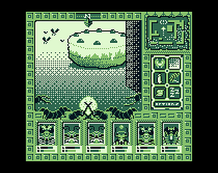
I surely had a lot of fun with gathering that insect party! When I was forced to minimize the number of unique tiles I hardly touched any part of the portraits, but rather reduced that cake. Previously it was a ring cake on a plate but it was also very “tile consuming.” Overall the reduced look better matched the rest of that “3D view” anyway.
The room being represented on the map to the right shows the value in the drawing.
I’m glad the map gets some love, too! Another consumer of precious tile ressource – but hey, what’s a RPG without a map?! Maps ♥! And while I’ve never seen a mini map visualizing the party’s covered path I felt the apparent erratic nature of our insect friends deserved a recognition.
“I was surprised when I looked at the jam page and there was yet another new pixel art, but it was good to have taken some time to look.”
Yeah, surprisingly it was decided to include my very belated entry… and that actually sweetened the rest of my week!
Cheers!
If anyone’s curious, Nino refers to Vimlark’s entry for TriJam #121: https://vimlark.itch.io/dimension-hop
Yeah, too many similarities to be classified a mere coincidence; should at least be mentioned in the credits.
The mechanic with the leaking pipes leading to rising water levels when not fixed quick enough is a great addition. Ties the goal neatly together with the threat.
Well, on the topic of “where’s the target” vs. “shoot the target”… I actually felt that the circumstance that the skunk does face the opposite direction was kind of a clever play on the theme. Sure, as the player we know where the target is, but that skunk on the other hand… always farting towards the unknown. So my question would be: was that indeed intentional? No worries, that doesn’t affect the rating, ha.
The movement of the ducks is well done. Great little detail with the eyes. I think a little movement of the waves could have been a great addition, too. It should be considered to give minus points for hitting non-target ducks, I agree with Musab here. Sadly I can hardly stand the particular music due to its overpopularity on… er… TikTok (that I happen to endure second-hand, so to speak). Last but not least – as with other contestant games for this jam: a graphical solution (bar, or a pie-chart thing) would have allowed to much easier keep track of the time while in the middle of the action. Oh, finally: thumbs up for the game keeping track of the previous best score!
Fits greatly the theme! The one big issue I have with the gameplay though, is that the complex setting of invisible barriers doesn’t seem to allow for any well-informed decisions. All action ends up producing very random results. For example: one time my first shot already lead to a green mark (after producing a lot of red marks (and maybe 1–2 yellow ones?!). But that information didn’t helped much as further shots only produced red marks, until the 7th finally hit the target. Maybe I miss something here, though.
First big kudos to the art department!
Sadly the game felt too unforgiving right from the beginning. The color changes of the fireflies happen to quick. Audio (deeply missed) could have helped to understand what is going on intuitively: like a fizzle sound if he burns his tongue. +1 for the suggestion by Oknaa with the fullness bar and transforming the time into seconds. Furthermore: it makes little sense that the fullness meter goes down when he burns his tongue – I’d suggest an additional health bar instead that is affected by the burning (and may slowely decrease when the hunger is too much).
No doubt it would have been harder if the kids from right to left could have been potential targets, too – but that it is currently fixed to the left-to-right direction does feel rather like a cop-out than a solution. Now easy way would have been to change the orientation in the WANTED picture accordingly. And later in a 2nd stage don’t offer that service, while the targets can still come from both directions. 2–3 more facial expressions would have been nice to encounter – but sure, time constraints are absolutely a thing. Beside that, charming entry, and nice choice in the audio section (btw, music credits?) – hey, maybe total surveillance isn’t that dystopic after all?! :)
Is there a win-state, actually? After the 5th (maybe 6th) target I gave up the search. Of course, given the theme (and game description) it would have been very helpful to mention that there is more than one target to be found in the first place. The disorienting space (given the constantly moving blocks) adds to that confusion. Could have been interesting to make the player more dependant of the “Nite lights” by not making them emit light as well, and maybe add a re-charging mechanic to the summoning of the lights.
What a likable end screen :) Though… that collision box’s placement is really something else. Level 05 misses the initial “T”, Level 07 (from there on btw, the term “Level” is switched with “Puzzle”) checks for the row below (that makes the solution “JBYCUR”), balanced out by Level 8 that checks a row above (solution: “LOMTGK”), Level 09 avoids the first “T” as well, and in Level 10 the box is back to close-to-accurate. I kept Level 06 for the end to address a slightly bigger (though not hard to solve) issue: in that level the box has a hard time with its diagonal placement (only time in the game) since the letters have their issues keeping to the grid. I recognized that you abandoned the “I”, since it would have messed with the rows even more… I’d assume. Easy solution would be using a monospaced font for the letters – as the name suggests: with these fonts a narrow letter like “I” has the same width like a heavy-hitter… e.g. “W”. Actually the font that you used for the “Where Is The Target ?” header appears to be set in a monospaced font. Now if the game would have thrown out minus points for clicking beside the box, or if it had a timer, those box misplacements would have had the potential to really frustrate. But it felt refreshing to not worry about that part. It turned more into a “find the misbehaving box” over time. Ha. The relaxing music really added to that experience. :) Oh, right… talking about the music… the game is missing any credit in that regard, neither to be found on the page.
P.S.: This is my attempt at constructive criticism and I hope I don’t just come off as a terrible nitpicker. (And so much for my attempt at self-awareness.)
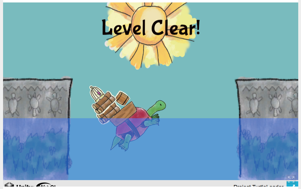
Yeah, that 2-logs-1-birdgage-1-barrel level takes it up too many notches and turns out quite frustrating. I managed to balance them after countless tries, it held over the full countdown, was cleared, and then indeed everything fell, and it switched to “level failed”. Dang it. So I would assume that this is the very last level – else it would probably have switched to the next one. [However, confession, it turned out right after the deadline, that in mine you can reach the win state and then get accidently hit by a remaining missile (who would try to avoid them any longer?) and it switches to that “failed” display. Sigh.]
Okay, pretty fickle, but a cool idea, very charmingly delivered. Also, I could have sworn it had music when I played it two days ago for the first time. Weird.
Ah, thanks so very much – glad you enjoy the concept! Sorry that it turned out too tough. But I totally get it. I played it over and over from the second on that the basic mechanic was implemented and at some point I decided to half the damage that is dealed by the bullets… worried players may blast through it in no time. I even considered to let the playing arena not wrap around and just destroy the ship when leaving the borders – now I’m extra-glad that I decided against that. Thanks for your encouragement – I have indeed plans for a Post-Jam version and that motivational boost definitelys helps. Currently I consider offering an more forgiving mode with at least a healthbar for the player. And I hope adding a speed limit for the ship can solve at least some of the controlling issues. Once in a while it gets out of my control as well and I just smash into some random missile.
Again, thanks for playing & commenting!
Dang, actually for most of the time, the damage the bullets caused was indeed double of what it is now. Then, after playing it over and over… surprise… I wondered if it might be too easy and halfed it. Absolute 0 beta-testing is definitely not the path to continue on. Ha. Thanks for your feedback! As I plan to do a post-jam edition (there is at least one mechanic that I wanted to include but had to cut), I will take this in consideration. Somehting like a standard and a hard mode (the former with an actual health bar for the ship… I mean, after all the game is all about the bars. :) ). Cool, cool. Glad you liked the rest. Cheers!
Ahh, thank you, Selkione! Very glad you enjoyed it & also managed to defeat the bar! And I hear you with regards to the NG+. It was a very last-minute thing that I had added as a placeholder for an idea that I felt I couldn’t finish in time. I most probably am going to make a post-jam edition of this one (right now I am busy with a post-jam edition of its predecessor).
Already when I added the NG+ I felt that it was a bit too cheap, but then I wanted at least some bonus for winners to pop up. Personally, so far every time I reached the NG+ level my ship was destroyed within the first half minute. Now it just appeared to me that a more interesting variant of the two-enemies approach could have been to just add to the standard enemy a sidekick with lower HP. Something like that. Or just keep it to the one bar and add some changes to the playing field.
Okay, thanks so much for checking it out and letting me know your thoughts! I really appreciate it!
Just a quick note on the time aspect: I attended Trijam to actually get me into some good planning-ahead mindset, but apparently a part of me rebelled big time. The core mechanic was working in under an hour and when I was a few more hours busy (with hardly seperatable phases of just playing, testing features, and reading the Game Maker documentation, etc.) I decided to just go with it and not bother with reconstructing my schedule. So without an underlying plan, I just continued and easily surpased the 3h, and then some more, and then some more. Arrrgh. Definitely trying to up my discipline levels for the next one. I’m quite confident this one would have fit into the 3h constraint quite well – without cutting any of the important aspects.
Cheers!


