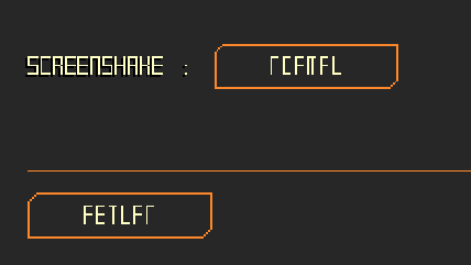
Sorry about the screen tearing. Will have an option to turn on vysnc as well as fixing the text in the settings. Really strange bug with the text as every other button writes correctly on my end using the same font and text writing code.
Will definitely work on the readability too, it's going to be my highest priority as others have said its a problem. Cheers!
Everything from sound design to UI and coherent artstyle are top notch. I've got nothing of value to point out, you clearly know what you're doing and you do it well. Hope to see more.
Besides all the readability and scaling stuff I felt like rotary cannon needs to have x2 ammo from the current one to make it worth choosing instead of autocannon
I like how you made the guiding system, but the rockets felt awkward against the maggots so I hope you will add another secodary weapon or allow to install cannons instead
The ammo crates should actually give the player twice the normal amount of ammo when they have the rotary cannon, but I definitely agree on the grub mission it doesn't feel as impressive as hoped. Honestly it works best as a close-range weapon to take out the mechs quickly, especially as they can't fire back when they're flashing white.
There'll definitely be weapon switching between primary and secondary, I planned that from the start but don't have enough weapons to do that yet. Thanks for the feedback!
Bro this is fantastic. I wish Armored Core leaned more in this direction, it sells the mech urban warfare fantasy so hard. Don't you dare stop developing this, I want to see it released.
At the moment I'd say readability kinda suffers, requiring LoS to lock missiles is also pretty awkward in practice, because going into enemy LoS is very dangerous so you might as well fire blind. I wonder if some kind of dash wouldn't improve the experience, so you aren't completely tied to cover 100% of the time.
Thank you kindly! I plan to continue development after a short break.
Readability will totally be improved next update. In the meantime, I've implemented an overdrive/boost function by pressing shift for now. It's pretty limited but if you need to dodge missiles you can duck out pretty quick or do a driveby with it. Will work on the enemies being fairer as well, thanks!
Super juicy, all the explosions and debris are really satisfying.
I’m a Brigador nut so I was put off by having actual twin-stick controls instead of tank controls. Not really a complaint because the mecha turns fast enough to not need tank controls.
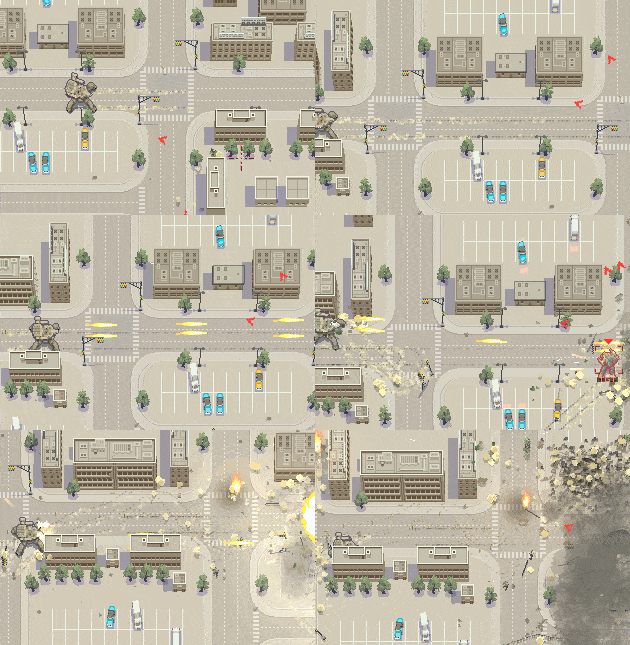
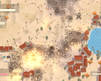
The visual style is really cool but it can be hard to tell what’s going on on the first map. I never intuitively know when I’ve taken damage because it’s lost in all the mayhem already on screen and the only unique feedback is a soft sound cue. The enemies are also really hard to make out against the background once there’s collapsing buildings and debris all over the place. It makes sense but I imagine the AI are completely unaffected by it which makes the visibility impact somewhat one-sided.
I’d also recommend having some way for the radar to show you where ammo pickups are even when you aren’t critically low.
I prefer the mission style Brigador has with fixed enemies and specific objectives over endless survival. But I’m sure I’m in the minority in that regard.
Good idea with the radar displaying ammo packets, will for sure add that in. The UI is supposed to only shake when you're hit, but there does need to be some stronger indicator. I might add some red line flashes or have the whole UI turn red to indicate that better.
I too prefer the Brigador-style of missions with fixed objectives; both missions do have a limited enemy count and once you neutralize all targets it should conclude and tally up the score (hopefully)
Thank you! I will definitely add an outline to them, maybe solid black so they pop-out more. For now I've added a little indicator arrow when they're hit so they kind of get "tagged" by the player, but it's just a temp fix.
I'm absolutely blown away by this and think it's criminal you've put this on itch for the low cost of zero dollars. I'd gladly pay good money for this on Steam, the quality is just that high. This really goes without saying as so many other people have already mentioned it but the attention to detail is insane. Explosions setting off car alarms in the distance, bullets occasionally penetrating through buildings and recoiling off things, fire spreading around on a farm/garden, even thinking about it I might've missed stuff but that sense of discovery makes me wanna fire up the game right now and see! The art is phenomenal and the ui compliments everything perfectly, I'd go so far as to call it one of the best ui's I've seen in a while it's got a clean aesthetic, works and doesn't obstruct the gameplay, again, it compliments it. I could sing high praises for this game all day (and I might) there's just one teeny tiny problem: the enemies are a tad too difficult to see sometimes. This goes for the player too, I felt a little disoriented after a good firefight and I guess this could easily be fixed by giving the player a brighter color to contrast against the muted background. If I can see those red fire trucks in that tiny Gameboy screen sized thumbnail to my left, I should be able to see the character. Just food for thought. Also, not that you've indicated plans for it or anything, just a precaution, if you ever feel tempted to give Landsword angled camera movements (which I know you can, I've done pixel stacking in GMS too lol), please don't. The 90 degree camera unifies the scene and anything else would complicate the controls.
Thank you so much for your kind words and feedback. It really means a lot and I'm glad you noticed all of the tiny details I threw in with the destruction!
I will definitely get the player and enemy models to have a higher contrast and much better readability, some indicators to point out enemies coming from behind the view would also help as well I think. Happy to hear the UI is super readable as well, spent a long time trying to decide on what it should actually look like - ended up settling on semi-functional but also semi-decorative in a way. I'm glad you know about the sprite stacking method haha. Early on I was definitely tempted to turn the view around, but sorting out the depth between objects is already difficult with the way they stretch from the center, and there's no real need to actually be able to rotate the view. I might rotate it for cutscenes though, like a news helicopter reporting on some destruction could be cool.
Note: As of build V.03 resolution resizing still doesn't work. Will try again tomorrow to get it working, need to ensure the application surface on GM scales appropriately as well so things don't look like garbage.
Update: 1920x1080 and 3840x2160p resolutions should be scaling correctly now.
Update 2: V-sync and alternate synchronization method added.
Thank you so much for playing and streaming it! I really need to fix the resolution rescaling, I'm sorry you couldn't play it in fullscreen. Wish Game Maker 1.4 had an easier way of resizing the screen.
I will definitely take your feedback into account and tweak the visibility of enemies more as others have said too, cheers.
Game Looks and feels great. I love the destructible terrain and the small little touches like the car alarms going off when they're hit. My only real issue is that I have trouble seeing whats going on, The mechs kinda blend into the city especially when there's a lot of dust effects and explosions, and the enemies are hard to tell apart from the player so I kept looking at the wrong guy and wondering why my inputs weren't moving him. I even kept losing track of the cursor even though it seems like the red should stick out over all the tan and grey. Great work keep it up!
Thank you for the kind words and feedback! I'm going to be redoing the player mech's sprite and I'll make sure it's more readable, as well as have the cursor be larger too. Thank you again!
absolutely astonishing. i dream of reaching a fraction of this quality.
one thing though, considering the top view and the city environments, shouldn't the player and enemies pop up more compared to the backgrounds? it gets easy to lose track of them during the fights. maybe use different colors for them
Thank you so much! Honestly they definitely should, and I'm going to be redoing them soon. I had wanted to change the player sprite before demo day, but time ran out between coding all the menus and options. Differently more brightly colored enemies will come as well.
Unrelated, but your avatar gave me quite the neuron activation. I remember playing Bosconian on the PSP Namco Museum Battle Collection maybe 15 years ago, that sprite instantly took me back. Good taste.
The models, the effects and the destruction are gorgeous and the game ran smoothly at all times. The mechs in mission 1 were a lot of fun to fight, but I gotta say the map in general is hard to read. There's very little contrast between buildings, mechs, enemies and even the road, everything has this light beige hue and it all kind of blends together, I had to rely on the radar to search for enemies on the screen. It's also not the most pleasant of colors to stare at.
The maggots mission could have used a boss or some actually threatening enemies. Returning to the main menu always shows you have the autocannon equipped even you you still have the rotary cannon equipped. And the option menu buttons say this?
Other than that the game is really promising, the art is so good looking, and I'm looking forward to play more of this.
Thank you for the feedback and for finishing both levels!
Regarding the readability of both levels: I wanted to vary the buildings and ground more with grass and different areas, but time ran out to add them. I agree that there needs to be way more contrast and I'm going to try and focus on that next. Also need to fix the button with the weapon select; it was a last minute addition instead of a proper hangar and weapons screen so I didn't bother having it save the setting, apologies.
The options menu text is a weird issue, not sure what's causing that. Could I ask what OS you're on? Might be an issue with GMS 1.4 being old software; also trying my best to get resolutions working ASAP, sorry for the bad pixel stretching!
Look, the art style is gorgeous and SOVLful and the destruction effects are gorgeous but it's getting in the way of the gameplay. It's hard to tell what's going on once things start happening and it's frustrating dying in a giant cloud of smoke and I don't know where enemies are. The radar seems like a potential solution to this, but at the same time the scale it's using seems off- at one point there was a red dot near me according to the radar but that enemy was not on-screen yet, so it's hard to gauge how accurate it is. As much as I'm complaining, I do want to reiterate that the artstyle and effects are all 200% great, but it feels like the cart was put before the horse.
I've since added some indicators to the enemy mechs and also turned down their aggression. I realize as the programmer I'm too familiar with how they behave, so I know what to anticipate for their attack patterns but to normal players it's almost relentlessly hard. I agree that the radar could be more accurate with the distance, and I'll also try adding some arrow indicators around the player to point out enemies coming from behind the camera position/mouse.
Thank you greatly for playing and the feedback, will use this information to refine it!
Yeah, it feels like just a few tweaks are needed to have a solid game. Going to throw a suggestion out- would it be possible to have like an outline on the mechs when there's heavy smoke? Like how L4D or other games do for low visibility areas?
It's going to be a bit tricky with how GM's draw_sprite function works and how I'm handling depth sorting of the smoke particles, but it should be possible with a shader. Will look into it, thanks for the suggestion!
This is really cool, great effects and destruction, reminds me of desert strike somewhat
I did have some trouble reading what was going on since the colours all blend in. It would really benefit from some icon overlays for enemies and yourself, or just different colours for the mechs even if its just army green
I like the idea of icon overlays, maybe they'd pop up Far Cry style when you mouse over them and they get marked. Will definitely work on the readability, thanks for the feedback!
What the hell I didn’t know Game Maker could be made to do things like this.
Doesn’t go past 44 FPS for me though, I’ll blame that for me not beating level 1 (edit, I beat it, was focusing too much on keeping the city a city). Wait, I fiddled with the .ini and uncapped it. Game speed is tied to framerate, no bueno. I’d try my hardest to fix that while it’s early.
Sounds are fantastic, wonder if a bit of directionality would make it better.
The rotary cannon sounds cool but it seems to have a white noise element that’s too harsh to my ears.
Also have trouble with visibility and it doesn’t feel right to be overly reliant on the radar. If it gets to that might as well have some kind of onscreen target identifiers.
Think it needs better feedback for when you take damage. I get through a fight thinking I did well then I peep the HP and half is gone. Also, some form of healing for the casuals?
Single (fire) clicks don’t register sometimes.
Add some screenshots on the jam page because not everyone checks the main game page.
Thanks for playing. Can I ask what your system specs/OS is? I made this game on a Toshiba Satellite C855 laptop from 2013 that has no GPU, 4 GBs of RAM, and an Intel Pentium 2020 processor. Despite that, the game plays at a stable 60 FPS on level 1 and 2.
I'll see if I can have a setting to turn off the FPS capping, but I think that's just how Game Maker handles all games made in it.
I realize how much the visibility is a problem now, I'm going to fix that ASAP along with a patch to fix the resolution. Healing would definitely be nice, I'll have repair kits available along with the ammo drops. Not sure why the single clicks don't register, are you using the minigun weapon?
Will add some screenshots too. Thank you very much for this feedback, it's extremely valuable.
Setting AlternateSyncMethod=1 moves the cap to 144 but also speeds everything up to the point it’s unplayable. Lowest dip I saw is ~75 when getting really hectic.
It matches the refresh rate, so switching to 60Hz caps to 60. So my workaround is keeping 144Hz and using RTSS to cap to 60.
Clicks seem to register fine at 144 FPS but capped at 60 with RTSS I can pretty consistently make it fail. Try tapping single shots yourself, maybe my mouse is failing or RTSS cap is not ideal still. Oh, I see the cursor changing when clicking but the shot isn’t fired. Autocannon not rotary.
With AlternateSyncMethod=0, tried single monitor, 50-60-72-120-144Hz, all cap at 45. Maybe a Game Maker quirk, I don’t use it or I’d have run into it.
Right, I've just added under the options menu the ability to turn on v-sync and the alt sync method, thanks for letting me know! Still need to figure out what's causing the mouse button issue, haven't seen anyone else have it but still want to make sure its patched.
Sorry to see that the shader is causing a problem on Linux. It's a GSLS ES shader which is the most compatible, but it seems l still need an actual Linux computer to compile a dedicated build. Thanks for playing nonetheless and the fanart!
Very cool game, the destruction is superb. Nice juice already. UI looks really good too, except the font scaling is off, some words I can't even make out. No borderless/fullscreen mode. Some utility and counterplay things to use would be nice, like smoke and flares against missiles.
The problem is that its way too hard to make things out, hard to see yourself, enemies, even bullets. I'd suggest to slather some color on the mechs and aliens, make the ground a lot darker generally.
Man, I didn't think anyone was actually going to take the time to ace both levels, that's awesome!
Thank you for the feedback. I'm working hard on getting a patch out to change resolutions right now; it's really stupid that I didn't code it earlier. As for the enemies, I'm going to make sure they're way more visible too, thanks!
I definitely am going to improve the enemy visibility, I'll give them highlights and an indicator arrow so they won't blend in.
That cursor issue is really odd as the menus have the least amount of stuff going on haha, glad to hear it didn't occur when the actual gameplay was happening. Might be some compatibility issue, I'll look into it.
I'm working really hard on getting a patch out to change the resolution right now. I'm ashamed to say it, but I work with a 1366x768 display and it just didn't occur to me to add that option, oops. Thanks again!
This was the game I was most looking forward to playing, and it didn't disappoint. Looks amazing, and feels great! Can't wait to see what you add next.
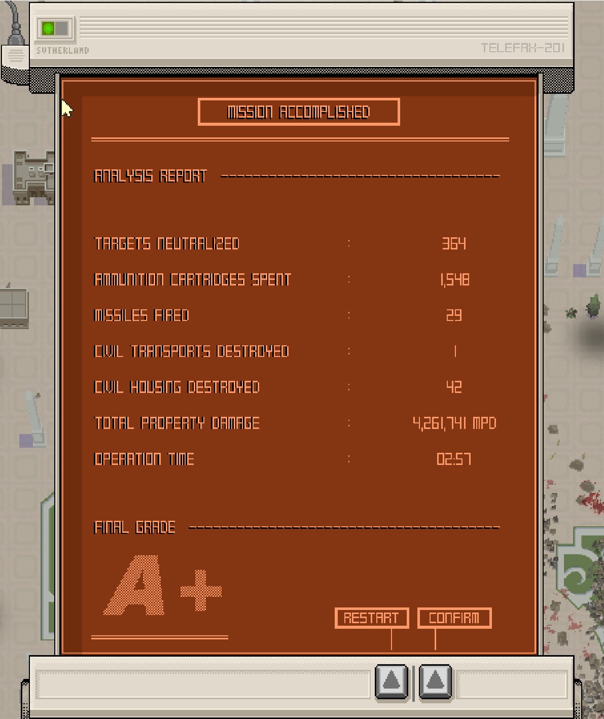
My only problems were that the enemy mechs were a little hard to see and blended into the background, the same for the player mech, although that matters less. Maybe make them a brighter colour or add black and yellow caution stripes to them or something. The other thing was the end screen. It's cool that it counts up kills, damage etc, but having a button to just show the results would be a nice feature.
Thank you for playing and your kind words! I'll definitely have it so you can just push the button and it'll display everything at once, I wanted to add that but there just wasn't enough time to do that between menus. Enemy mechs are also going to be revamped, sorry they're so hard to see (guess it sorta makes sense since they're camouflage in olive drab though haha)
Comments
Mechanicool!
Thanks for playing and streaming!
Sorry about the screen tearing. Will have an option to turn on vysnc as well as fixing the text in the settings. Really strange bug with the text as every other button writes correctly on my end using the same font and text writing code.
Will definitely work on the readability too, it's going to be my highest priority as others have said its a problem. Cheers!
Everything from sound design to UI and coherent artstyle are top notch. I've got nothing of value to point out, you clearly know what you're doing and you do it well. Hope to see more.
That's very kind, thank you!
Dude thats amazing!
Besides all the readability and scaling stuff I felt like rotary cannon needs to have x2 ammo from the current one to make it worth choosing instead of autocannon
I like how you made the guiding system, but the rockets felt awkward against the maggots so I hope you will add another secodary weapon or allow to install cannons instead
Hey, thanks!
The ammo crates should actually give the player twice the normal amount of ammo when they have the rotary cannon, but I definitely agree on the grub mission it doesn't feel as impressive as hoped. Honestly it works best as a close-range weapon to take out the mechs quickly, especially as they can't fire back when they're flashing white.
There'll definitely be weapon switching between primary and secondary, I planned that from the start but don't have enough weapons to do that yet. Thanks for the feedback!
Bro this is fantastic. I wish Armored Core leaned more in this direction, it sells the mech urban warfare fantasy so hard. Don't you dare stop developing this, I want to see it released.
At the moment I'd say readability kinda suffers, requiring LoS to lock missiles is also pretty awkward in practice, because going into enemy LoS is very dangerous so you might as well fire blind. I wonder if some kind of dash wouldn't improve the experience, so you aren't completely tied to cover 100% of the time.
Thank you kindly! I plan to continue development after a short break.
Readability will totally be improved next update. In the meantime, I've implemented an overdrive/boost function by pressing shift for now. It's pretty limited but if you need to dodge missiles you can duck out pretty quick or do a driveby with it. Will work on the enemies being fairer as well, thanks!
Super juicy, all the explosions and debris are really satisfying.
I’m a Brigador nut so I was put off by having actual twin-stick controls instead of tank controls. Not really a complaint because the mecha turns fast enough to not need tank controls.
The visual style is really cool but it can be hard to tell what’s going on on the first map. I never intuitively know when I’ve taken damage because it’s lost in all the mayhem already on screen and the only unique feedback is a soft sound cue. The enemies are also really hard to make out against the background once there’s collapsing buildings and debris all over the place. It makes sense but I imagine the AI are completely unaffected by it which makes the visibility impact somewhat one-sided.
I’d also recommend having some way for the radar to show you where ammo pickups are even when you aren’t critically low.
I prefer the mission style Brigador has with fixed enemies and specific objectives over endless survival. But I’m sure I’m in the minority in that regard.
Cheers for the feedback and kind words!
Good idea with the radar displaying ammo packets, will for sure add that in. The UI is supposed to only shake when you're hit, but there does need to be some stronger indicator. I might add some red line flashes or have the whole UI turn red to indicate that better.
I too prefer the Brigador-style of missions with fixed objectives; both missions do have a limited enemy count and once you neutralize all targets it should conclude and tally up the score (hopefully)
Looks cool, but it is really tiny on my screen and to difficult to see well enough to really get into.
I've since updated it so it can run in 1920x1080 now, sorry for the tiny size!
Kamige.
2000 reviews minimum. An outline/higher contrast for mechs against the background is super important. they all feel like camouflaged mechs right now.
Thank you! I will definitely add an outline to them, maybe solid black so they pop-out more. For now I've added a little indicator arrow when they're hit so they kind of get "tagged" by the player, but it's just a temp fix.
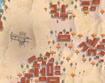
I'm absolutely blown away by this and think it's criminal you've put this on itch for the low cost of zero dollars. I'd gladly pay good money for this on Steam, the quality is just that high. This really goes without saying as so many other people have already mentioned it but the attention to detail is insane. Explosions setting off car alarms in the distance, bullets occasionally penetrating through buildings and recoiling off things, fire spreading around on a farm/garden, even thinking about it I might've missed stuff but that sense of discovery makes me wanna fire up the game right now and see! The art is phenomenal and the ui compliments everything perfectly, I'd go so far as to call it one of the best ui's I've seen in a while it's got a clean aesthetic, works and doesn't obstruct the gameplay, again, it compliments it. I could sing high praises for this game all day (and I might) there's just one teeny tiny problem: the enemies are a tad too difficult to see sometimes. This goes for the player too, I felt a little disoriented after a good firefight and I guess this could easily be fixed by giving the player a brighter color to contrast against the muted background. If I can see those red fire trucks in that tiny Gameboy screen sized thumbnail to my left, I should be able to see the character. Just food for thought. Also, not that you've indicated plans for it or anything, just a precaution, if you ever feel tempted to give Landsword angled camera movements (which I know you can, I've done pixel stacking in GMS too lol), please don't. The 90 degree camera unifies the scene and anything else would complicate the controls.
Fantastic game, easy recommendation.
Thank you so much for your kind words and feedback. It really means a lot and I'm glad you noticed all of the tiny details I threw in with the destruction!
I will definitely get the player and enemy models to have a higher contrast and much better readability, some indicators to point out enemies coming from behind the view would also help as well I think. Happy to hear the UI is super readable as well, spent a long time trying to decide on what it should actually look like - ended up settling on semi-functional but also semi-decorative in a way. I'm glad you know about the sprite stacking method haha. Early on I was definitely tempted to turn the view around, but sorting out the depth between objects is already difficult with the way they stretch from the center, and there's no real need to actually be able to rotate the view. I might rotate it for cutscenes though, like a news helicopter reporting on some destruction could be cool.
Thanks again, I really appreciate it!
Note: As of build V.03 resolution resizing still doesn't work. Will try again tomorrow to get it working, need to ensure the application surface on GM scales appropriately as well so things don't look like garbage.Update: 1920x1080 and 3840x2160p resolutions should be scaling correctly now.
Update 2: V-sync and alternate synchronization method added.
https://www.twitch.tv/videos/2136719263
Thank you so much for playing and streaming it! I really need to fix the resolution rescaling, I'm sorry you couldn't play it in fullscreen. Wish Game Maker 1.4 had an easier way of resizing the screen.
I will definitely take your feedback into account and tweak the visibility of enemies more as others have said too, cheers.
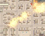
Game Looks and feels great. I love the destructible terrain and the small little touches like the car alarms going off when they're hit.
My only real issue is that I have trouble seeing whats going on, The mechs kinda blend into the city especially when there's a lot of dust effects and explosions, and the enemies are hard to tell apart from the player so I kept looking at the wrong guy and wondering why my inputs weren't moving him. I even kept losing track of the cursor even though it seems like the red should stick out over all the tan and grey.
Great work keep it up!
Thank you for the kind words and feedback! I'm going to be redoing the player mech's sprite and I'll make sure it's more readable, as well as have the cursor be larger too. Thank you again!
absolutely astonishing. i dream of reaching a fraction of this quality.
one thing though, considering the top view and the city environments, shouldn't the player and enemies pop up more compared to the backgrounds? it gets easy to lose track of them during the fights. maybe use different colors for them
Thank you so much! Honestly they definitely should, and I'm going to be redoing them soon. I had wanted to change the player sprite before demo day, but time ran out between coding all the menus and options. Differently more brightly colored enemies will come as well.
Unrelated, but your avatar gave me quite the neuron activation. I remember playing Bosconian on the PSP Namco Museum Battle Collection maybe 15 years ago, that sprite instantly took me back. Good taste.
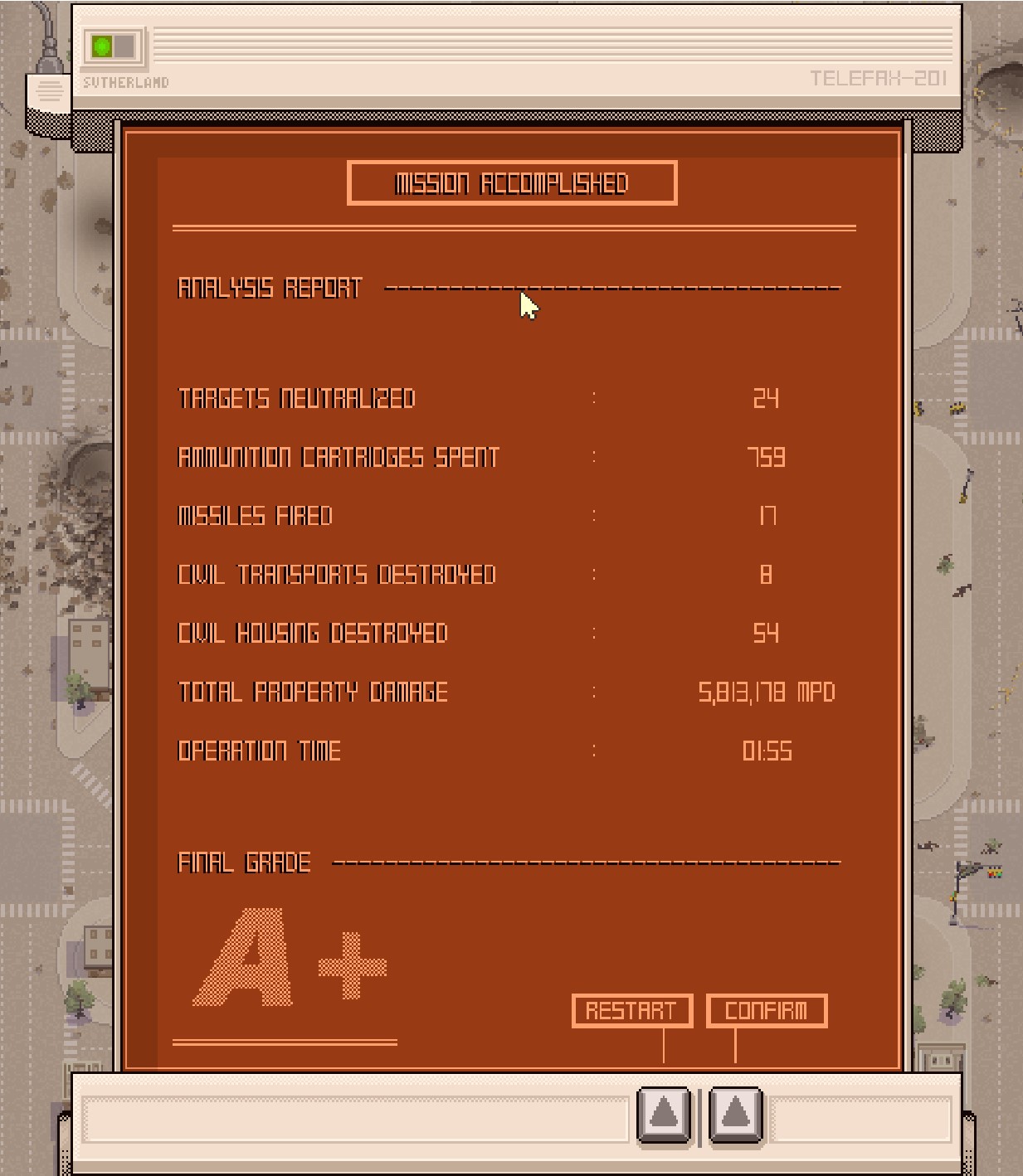
Very nice, I finished both levels with an A+
The models, the effects and the destruction are gorgeous and the game ran smoothly at all times.
The mechs in mission 1 were a lot of fun to fight, but I gotta say the map in general is hard to read.
There's very little contrast between buildings, mechs, enemies and even the road, everything has this light beige hue and it all kind of blends together, I had to rely on the radar to search for enemies on the screen.
It's also not the most pleasant of colors to stare at.
The maggots mission could have used a boss or some actually threatening enemies.
Returning to the main menu always shows you have the autocannon equipped even you you still have the rotary cannon equipped.
And the option menu buttons say this?
Other than that the game is really promising, the art is so good looking, and I'm looking forward to play more of this.
Thank you for the feedback and for finishing both levels!
Regarding the readability of both levels: I wanted to vary the buildings and ground more with grass and different areas, but time ran out to add them. I agree that there needs to be way more contrast and I'm going to try and focus on that next. Also need to fix the button with the weapon select; it was a last minute addition instead of a proper hangar and weapons screen so I didn't bother having it save the setting, apologies.
The options menu text is a weird issue, not sure what's causing that. Could I ask what OS you're on? Might be an issue with GMS 1.4 being old software; also trying my best to get resolutions working ASAP, sorry for the bad pixel stretching!
Windows 10
Noted, thank you. I'll look into fixing the issue and test it on a few different OSes.
Look, the art style is gorgeous and SOVLful and the destruction effects are gorgeous but it's getting in the way of the gameplay. It's hard to tell what's going on once things start happening and it's frustrating dying in a giant cloud of smoke and I don't know where enemies are. The radar seems like a potential solution to this, but at the same time the scale it's using seems off- at one point there was a red dot near me according to the radar but that enemy was not on-screen yet, so it's hard to gauge how accurate it is.
As much as I'm complaining, I do want to reiterate that the artstyle and effects are all 200% great, but it feels like the cart was put before the horse.
I've since added some indicators to the enemy mechs and also turned down their aggression. I realize as the programmer I'm too familiar with how they behave, so I know what to anticipate for their attack patterns but to normal players it's almost relentlessly hard. I agree that the radar could be more accurate with the distance, and I'll also try adding some arrow indicators around the player to point out enemies coming from behind the camera position/mouse.
Thank you greatly for playing and the feedback, will use this information to refine it!
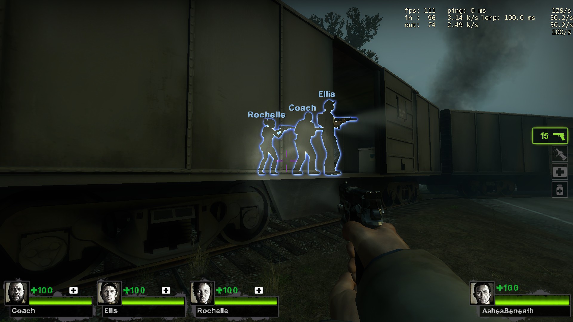
Yeah, it feels like just a few tweaks are needed to have a solid game. Going to throw a suggestion out- would it be possible to have like an outline on the mechs when there's heavy smoke? Like how L4D or other games do for low visibility areas?
It's going to be a bit tricky with how GM's draw_sprite function works and how I'm handling depth sorting of the smoke particles, but it should be possible with a shader. Will look into it, thanks for the suggestion!
This is really cool, great effects and destruction, reminds me of desert strike somewhat
I did have some trouble reading what was going on since the colours all blend in. It would really benefit from some icon overlays for enemies and yourself, or just different colours for the mechs even if its just army green
I like the idea of icon overlays, maybe they'd pop up Far Cry style when you mouse over them and they get marked. Will definitely work on the readability, thanks for the feedback!
What the hell I didn’t know Game Maker could be made to do things like this. Doesn’t go past 44 FPS for me though, I’ll blame that for me not beating level 1 (edit, I beat it, was focusing too much on keeping the city a city). Wait, I fiddled with the .ini and uncapped it. Game speed is tied to framerate, no bueno. I’d try my hardest to fix that while it’s early.
Sounds are fantastic, wonder if a bit of directionality would make it better. The rotary cannon sounds cool but it seems to have a white noise element that’s too harsh to my ears.
Also have trouble with visibility and it doesn’t feel right to be overly reliant on the radar. If it gets to that might as well have some kind of onscreen target identifiers.
Think it needs better feedback for when you take damage. I get through a fight thinking I did well then I peep the HP and half is gone. Also, some form of healing for the casuals?
Single (fire) clicks don’t register sometimes.
Add some screenshots on the jam page because not everyone checks the main game page.
Thanks for playing. Can I ask what your system specs/OS is? I made this game on a Toshiba Satellite C855 laptop from 2013 that has no GPU, 4 GBs of RAM, and an Intel Pentium 2020 processor. Despite that, the game plays at a stable 60 FPS on level 1 and 2.
I'll see if I can have a setting to turn off the FPS capping, but I think that's just how Game Maker handles all games made in it.
I realize how much the visibility is a problem now, I'm going to fix that ASAP along with a patch to fix the resolution. Healing would definitely be nice, I'll have repair kits available along with the ammo drops. Not sure why the single clicks don't register, are you using the minigun weapon?
Will add some screenshots too. Thank you very much for this feedback, it's extremely valuable.
Setting AlternateSyncMethod=1 moves the cap to 144 but also speeds everything up to the point it’s unplayable. Lowest dip I saw is ~75 when getting really hectic. It matches the refresh rate, so switching to 60Hz caps to 60. So my workaround is keeping 144Hz and using RTSS to cap to 60.
Clicks seem to register fine at 144 FPS but capped at 60 with RTSS I can pretty consistently make it fail. Try tapping single shots yourself, maybe my mouse is failing or RTSS cap is not ideal still. Oh, I see the cursor changing when clicking but the shot isn’t fired. Autocannon not rotary.
With AlternateSyncMethod=0, tried single monitor, 50-60-72-120-144Hz, all cap at 45. Maybe a Game Maker quirk, I don’t use it or I’d have run into it.
Right, I've just added under the options menu the ability to turn on v-sync and the alt sync method, thanks for letting me know! Still need to figure out what's causing the mouse button issue, haven't seen anyone else have it but still want to make sure its patched.
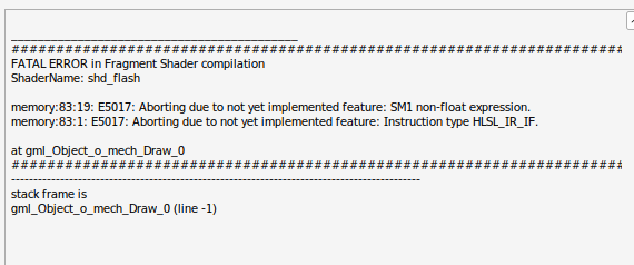
Try the game on linux with wine proton 9 experimental, got this error everytime an enemy appear on screen
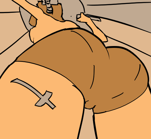
But I like destroying everything on my path until I crash.
Sorry to see that the shader is causing a problem on Linux. It's a GSLS ES shader which is the most compatible, but it seems l still need an actual Linux computer to compile a dedicated build. Thanks for playing nonetheless and the fanart!
Very cool game, the destruction is superb. Nice juice already. UI looks really good too, except the font scaling is off, some words I can't even make out. No borderless/fullscreen mode. Some utility and counterplay things to use would be nice, like smoke and flares against missiles.
The problem is that its way too hard to make things out, hard to see yourself, enemies, even bullets. I'd suggest to slather some color on the mechs and aliens, make the ground a lot darker generally.
I had fun, completed both levels. Keep it up.
Man, I didn't think anyone was actually going to take the time to ace both levels, that's awesome!
Thank you for the feedback. I'm working hard on getting a patch out to change resolutions right now; it's really stupid that I didn't code it earlier. As for the enemies, I'm going to make sure they're way more visible too, thanks!
I loved the aesthethics and polish of the game. Rotary gun is very fun to shoot.
The only problem I had was with with enemy visibility. Especially in first level since they have similar colors to the background.
There are alot of little details like kicking the cars which was pretty cool. Overall I enjoyed it and I'm looking forward to where you go with this.
To small technical details:
- mouse cursor in the main menu is pretty choppy when it moves, not sure why, the gameplay is smooth
- you could add the 2x scaling option, window can be resized but it's hard to nail exact ratio and without it the window is tiny on 1440p monitor
Thank you for playing!
I definitely am going to improve the enemy visibility, I'll give them highlights and an indicator arrow so they won't blend in.
That cursor issue is really odd as the menus have the least amount of stuff going on haha, glad to hear it didn't occur when the actual gameplay was happening. Might be some compatibility issue, I'll look into it.
I'm working really hard on getting a patch out to change the resolution right now. I'm ashamed to say it, but I work with a 1366x768 display and it just didn't occur to me to add that option, oops. Thanks again!
This was the game I was most looking forward to playing, and it didn't disappoint. Looks amazing, and feels great! Can't wait to see what you add next.
My only problems were that the enemy mechs were a little hard to see and blended into the background, the same for the player mech, although that matters less. Maybe make them a brighter colour or add black and yellow caution stripes to them or something. The other thing was the end screen. It's cool that it counts up kills, damage etc, but having a button to just show the results would be a nice feature.
Thank you for playing and your kind words! I'll definitely have it so you can just push the button and it'll display everything at once, I wanted to add that but there just wasn't enough time to do that between menus. Enemy mechs are also going to be revamped, sorry they're so hard to see (guess it sorta makes sense since they're camouflage in olive drab though haha)