Play game
EUR01's itch.io pageResults
| Criteria | Rank | Score* | Raw Score |
| Graphics | #2 | 4.476 | 4.476 |
| Overall | #4 | 4.135 | 4.135 |
| Audio | #4 | 4.238 | 4.238 |
| Theme | #5 | 4.476 | 4.476 |
| Game Design | #7 | 4.238 | 4.238 |
| Innovation | #44 | 3.667 | 3.667 |
| Fun | #55 | 3.714 | 3.714 |
Ranked from 42 ratings. Score is adjusted from raw score by the median number of ratings per game in the jam.
How does your game fit the theme?
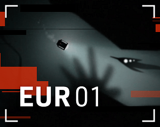
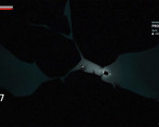
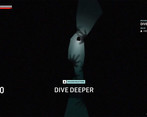
We are going to dive deeper into the ocean of Jupiter's moon 'Europa' and explore alien life.
Did you write all the code and made all the assets from scratch?
All code is written this week.
All art is created this week.
All audio comes from Artlist (with adjustments made to fit our project).
Leave a comment
Log in with itch.io to leave a comment.




Comments
Wow! 4th place! Thank you all so much for voting and your lovely comments!!! And reply YES of you want to see an optimal version of this game released in about 2 years time 😉...
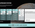
This is such a fantastic game! It has so much atmosphere and the gameplay is great! Really enjoyed diving deeper and discovering new creatures, then upgrading to venture further and discover more! All the upgrading options are great! Really loved all the graphics / lighting along with the sound, it felt like such a polished game!
Really amazing work! Well done on creating such an awesome game! :)
Thank you for the review! Liked your game a lot.
Thanks a lot for reviewing! Your game is probably my favorite of the ones that I've seen.
Do you have any suggestions for improvement? Would love your opinion.
Thank you so much for that! We're really glad you enjoyed it! :)
Your game is really great to play! You've done an amazing job! As far as suggestions go - I really enjoyed the feeling of discovery and scanning for new life, it was really interesting discovering something I hadn't seen before and trying to scan it. Just an idea, but perhaps there could be some kind of log of all the new discoveries made it look back on? The game itself is so well made, fun to play and feels very rewarding the more you explore. You really captured the feeling of exploring the depths! A really great job! Keep up all the awesome work! :)
Where to start... Perhaps I won't be totally subjective, as I'm an astronomy enthusiast and particularly a Jupiter fan. The movie Europa Report being one of my favorite films.
So I launch your game with great expectations!
The game is a total success! The atmosphere is really well realized, the interface is worthy of a professional game interface, it's beautiful, you want to develop your submarine and go deeper and deeper to discover what's hidden there. In short, a huge bravo to you for your work! It's a top mark as far as I'm concerned, and I really hope to see you at the top of the rankings, because the work you've done is impressive.
Thank you for taking time to play and review our game. Europa Report is awesome 😎 indeed.
The artist is also a great Europa enthusiast that is why we needed to do this jam like this.
Wow, where to start with... your comment! Thank you so much! And nice to see that it hooks a fellow astronomy fan. I had this idea in my head for a long time now, so we just had to participate in this jam :). A high rating would be amazing, but we are here to test our game concept and to receive feedback. We managed to only get a fraction of our ideas into this little prototype and we are curious to see what players (dis)like.
Since you enjoyed it so much, what would you like to see in your ideal version of this game? Would love to hear that!
I'll make sure to play your game soon.
So, in an ideal version of your game, I could imagine the following:
* An aesthetic evolution of the submarine when it is upgraded (very slightly, it wouldn't be a question of modifying its design but more of adding a few small details as you go along).
* A codex of analyzed species, allowing you to immerse yourself in Europa's universe and give free rein to your imagination concerning these life forms.
* Why not add a mystery to discover? For example, discovering the remnants of unknown technologies when you go down deep. This could be an opportunity to play with lights in the dark depths. Your light management is extremely well done, so I'd use it more (while staying dark).
This technological life-form could take sounds from the depths. The muffled sounds are also very well integrated.
(I'm not in the habit of lavishing praise on you, but I have to admit that your game left me on my ass!)
* Well, the animation at the beginning is a bit long, but the other comments have pointed that out to you.
If I come up with any other ideas, I'll let you know. I congratulate your team again, the sound design is perfect, the game play fluid, the inertia of the submarine and the art direction... You'll go far!
As for my game, it will probably be of little interest compared with yours. I'm more proud of the previous Brackey gamejam, which I continued to develop. A title in space but much more arcade-like. I'm not much of an artist, my skills are more mathematical! Here's a video of where I'm at:
Again, thanks so much for your opinion! You have some nice ideas that we also had in mind, so that is a nice conformation. I have looked at your video and it looks really good! Nice frantic action in a space setting, always works. I have one tip for using color in interfaces: only introduce a new color when you absolutely need it. And only use highly saturated colors for the most important elements. Your games look and feel very nice, but the interface screams for attention and that distracts from the nice gameplay. Hope it helps! Cool that you are developing that game further! Keep it up!
Thanks for the tip about the interface. It will be a great help as I want to redo it completely.
sick particles unreal 5 ?
yes!
Amazing experience! 🌊
Things I enjoyed ✔️
Things I would like to possibly see with your title. 🤷♂️
Overall 📓
This game was alot of fun! The gameplay felt very polished and made for a great experience. The ambience is very well done and you truly feel like your in the ocean. Great work on this game!
That is some constructive feedback! Thank you for that.
Agree with your points 100%
Glad I can help! Great work on this game! It is very well done! and this is not related at all but I love the logo, looks sick.
great game of yours. Lost some time there hehe.
Good job, not bad game)
Extremely well made game, really enjoyed the atmosphere and general feel to the game.
You should be proud of this one!
Thanks Slowbision! Glad you like it :). If you have any ideas how to improve on the game, don't hold back ;).
I have 2 suggestions! But they are very minor.
The first is when replaying the level, seeing the intro every single time (the launch sequence) could frustrate players.
secondly, I love the way the sub maneuvers but when you reverse, it seems to instantly stop all velocity, but the same doesn't happen when you go forward, it's a little jarring.
Very small things, I loved how well polished the game felt, very original!
Thanks for the feedback!
Art direction and audio design are an easy 10/10, and I love how you decided to tackle the theme. I really liked the mechanics of scanning and buying upgrades for your ship. I just wish I could skip the intro, which felt very long especially for a game where dying and retrying is such a core part of the gameplay loop. But aside from that, congratulations on the game, it's nothing short of amazing!
Thank you for those kind words! Respawn sequence could be shorter indeed.
Very interesting game, graphics and UI are top-notch, cool spooky atmosphere. Takes a bit to figure out what to do - especially when one, say, skims most of the description in search for controls - but not too long.
Thank you for the feedback.
I’ll rate your game soon.
Game Design is cool
Thank you !
god damn its scary i love it
Thank you for the feedback.
Very Good!
Thank you so much.
Extremely atmospheric, very well done!
Thank you for your time !
Few things, i loved how polished this game was and the overall aesthethic of it, the audio, i felt so immersed, but i was a little bit of confused how scanning worked at the beginning and what was my goal, since milestones changed for supposedly no reason... but other than that, upgrade system is cool, and clean, i would love more explanations on how stuff works and why i do things at the beginning not after my first death... but overall this game is amazing would love this more build upon in the future 29/30
ty for the idea future can be done ✅
You are spot on with your feedback, because this is exactly how I feel ;). We would have loved to build the world out more, because the scanning and lore of the game are a bit rushed. We had so much more ideas to slowly build a nice experience where you could scan more and more interesting flora and fauna. With a bit more lore about how the technologies and the flora and fauna worked. The scope was already too big ;).
This is the best progression system I've seen in the jam. Also the cleanest GUIs! I think the game could do with a little bit more sound design during the missions themselves, but otherwise a legitimately perfect entry and super impressive accomplishment of scope given the time constraint. Awesome awesome stuff!
If you want to check out Growing Up, that would be so lovely ;D
Ok one more today :) played your lovely game !
Thanks for your feedback!
I loved the aesthetic of this one, the UI did a good job at immersing me, the audio was on point and I loved that you can upgrade your stats, I also enjoyed how the progression worked. Overall a very good and enjoyable game!
Thank you for the feedback/ kind words. Ps enjoyed your game!
Thank you!
Excellently presented, graphics and audio are exceptional, though the background music seemed to fade into the ambience a little bit until the ending scene. I agree with other comments that the intro scene is a little long on successive restarts, and I thought the ending was also a little long.
The sub usually felt good to control, though before getting any upgrades I did manage to spend 27% of my energy getting stuck in a little crevice while scanning the little thing to the left of the start point
It was sometimes a little finicky to get in the right position to scan, so showing some hint of the scan arc could be useful, and it wasn't until almost the end that I noticed the scan percentage on screen, so that could either be placed above the item being scanned, or turned into a bar or radial progress meter over/on the scanned item. Toward the end of the game, scanning as a mechanic seemed to drop off somewhat anyway. The light upgrade didn't seem to be very useful, I never needed it to see and turning it on only seemed to drain the battery and trigger enemy aggression.
I did almost get stuck at the beginning, before I understood that I needed to die to upgrade, I ran out of energy and wasn't able to move, so I had to restart the entire game.
Overall very well made, great game.
Thanks for the feedback , when the battery is empty or you are below max dept you should implode in wall touch. I’ll look into this. You got us the scan numbers are implemented the last few hours :)
Thanks for taking the time to comment and share your findings.
This has one of the best graphic, theme, and UI in the jam. One minor is that I think the downtime at the start of each run is a bit too long tho. But everything else is fantastic, I just love the UI, Extremely polished game!
Thank you for the compliments.
This game is incredible! Rlly like everything about it! Cant belive, you did this in one week. Amazing work! You earned yourself a new follower
Thanks for the follow !!!
For a game made in just a week this feel so polished! It has a nice creepy vibe and I couldnt help myself but play more. At first the controls were weird but when I got a hang of them it felt really good. Amazing job!
Thank you for the feedback ! Its ment to feel a little "bad" in the beginning. This so when you die you are "happy " to upgrade steering and speed.
That makes sense ^^
Very cool stuff, this is super sleek, I've heard good things about construct, that it makes making games very much more convenient. I'm a sucker for space stuff though but that jump scare X_X didn't expect that, thought I could just chill and snap.
Alright so, sfx was great, visuals were good, I kind of wish there was more to the background, like seeing some areas where the surface cracked or like background geysers from the tectonic activity.
But besides that the attention was more on the use of shaders and particles, I can't speak to it because I do Unity, not sure how construct handles that but regardless it looks great.
Games design is top notch, and its clear you know what you are doing.
The particle system in Construct needs work. We don't have shaders, so all you see is the artist working his a@# off. Thank you for the feedback! When we continue with this project, you will see the full potential of Construct and my artist :)