Play game
EUR01's itch.io pageResults
| Criteria | Rank | Score* | Raw Score |
| Graphics | #2 | 4.476 | 4.476 |
| Overall | #4 | 4.135 | 4.135 |
| Audio | #4 | 4.238 | 4.238 |
| Theme | #5 | 4.476 | 4.476 |
| Game Design | #7 | 4.238 | 4.238 |
| Innovation | #44 | 3.667 | 3.667 |
| Fun | #55 | 3.714 | 3.714 |
Ranked from 42 ratings. Score is adjusted from raw score by the median number of ratings per game in the jam.
How does your game fit the theme?
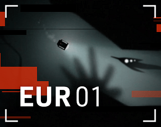
We are going to dive deeper into the ocean of Jupiter's moon 'Europa' and explore alien life.
Did you write all the code and made all the assets from scratch?
All code is written this week.
All art is created this week.
All audio comes from Artlist (with adjustments made to fit our project).
Leave a comment
Log in with itch.io to leave a comment.




Comments
Excellently presented, graphics and audio are exceptional, though the background music seemed to fade into the ambience a little bit until the ending scene. I agree with other comments that the intro scene is a little long on successive restarts, and I thought the ending was also a little long.
The sub usually felt good to control, though before getting any upgrades I did manage to spend 27% of my energy getting stuck in a little crevice while scanning the little thing to the left of the start point
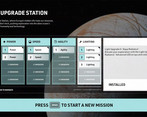
It was sometimes a little finicky to get in the right position to scan, so showing some hint of the scan arc could be useful, and it wasn't until almost the end that I noticed the scan percentage on screen, so that could either be placed above the item being scanned, or turned into a bar or radial progress meter over/on the scanned item. Toward the end of the game, scanning as a mechanic seemed to drop off somewhat anyway. The light upgrade didn't seem to be very useful, I never needed it to see and turning it on only seemed to drain the battery and trigger enemy aggression.
I did almost get stuck at the beginning, before I understood that I needed to die to upgrade, I ran out of energy and wasn't able to move, so I had to restart the entire game.
Overall very well made, great game.
Thanks for the feedback , when the battery is empty or you are below max dept you should implode in wall touch. I’ll look into this. You got us the scan numbers are implemented the last few hours :)
Thanks for taking the time to comment and share your findings.
This has one of the best graphic, theme, and UI in the jam. One minor is that I think the downtime at the start of each run is a bit too long tho. But everything else is fantastic, I just love the UI, Extremely polished game!
Thank you for the compliments.
This game is incredible! Rlly like everything about it! Cant belive, you did this in one week. Amazing work! You earned yourself a new follower
Thanks for the follow !!!
For a game made in just a week this feel so polished! It has a nice creepy vibe and I couldnt help myself but play more. At first the controls were weird but when I got a hang of them it felt really good. Amazing job!
Thank you for the feedback ! Its ment to feel a little "bad" in the beginning. This so when you die you are "happy " to upgrade steering and speed.
That makes sense ^^
Very cool stuff, this is super sleek, I've heard good things about construct, that it makes making games very much more convenient. I'm a sucker for space stuff though but that jump scare X_X didn't expect that, thought I could just chill and snap.
Alright so, sfx was great, visuals were good, I kind of wish there was more to the background, like seeing some areas where the surface cracked or like background geysers from the tectonic activity.
But besides that the attention was more on the use of shaders and particles, I can't speak to it because I do Unity, not sure how construct handles that but regardless it looks great.
Games design is top notch, and its clear you know what you are doing.
The particle system in Construct needs work. We don't have shaders, so all you see is the artist working his a@# off. Thank you for the feedback! When we continue with this project, you will see the full potential of Construct and my artist :)
I would be lying if I said the game is average, the game looks like it was made by 5 people done in 2 or more weeks! This game is super polished, the art look so fitting and detailed, the story and the description of every upgrades is great too!
The only downside is that the ship have to move forward or backward to steer, with the steering felt too slow and sluggish, so I propose that the ship can steer or rotate regardless if you moving or not. This game is excellent!
We put a lot of hours into making it as it is. The steering was a point of discussion because a sub steers only when moving, but gameplay-wise, it would be better to rotate. We finally chose the first one and reduced the backward speed so you can still maneuver your light as you want.
Thank you for rating our game!
This game is AWESOME! It looks and plays like an actual finished game. the art is really impressive and the sound and music is really good. And thank you so much for giving it an actual ending, since you could have easily made it infinite. (In my opinion games with actual endings are way better.)
The only problem I had was that the flashlight felt really useless, since it had only downsides to using it (You'd die easier and consumed more power). But thats just nitpicking. It was an absolute amazing game.
Great game. Keep it up♥
Thank you for the honest review.There whas a machenic the light scaned quicker and further but it didn make it because it had some glitches.
This game is insane for a one week project! Liked the graphics and sounds design
Thank you so much!
This game felt very polished and as if it was a final product, the UI was very impressive and I feel that your idea fit the theme very well, I liked the funding system and the sound design was very clean. However, I would like that there would be an option to skip the intro sequence as it feels a bit long furthermore I would like to be able to turn without having to move forward and that the scanning would be saved because it feels redundant to scan it every single time you die. In conclusion, this game is very impressive and the UI is incredibly clean and polished. You have truly outdone yourself and I wish you the best of luck on your future games!
Thanks a lot!
The mood is very nice and it feels very polished.
The biggest issue I had is that I kept being killed by surprise and the intro sequence was too long to go back. I also don’t think it makes much sense to allow re-scan the data you’ve already scanned before dying, as this discourages a bit discovering new areas.
Very well done entry, congrats! thank you for the game
The scan is decreasing to 0, so you can scan the same object a few times. The scanning reward is a bit high now, considering it's a jam, and we want people to upgrade the drone to its full potential. We had the idea of adding more pods with a persistence mechanic, but we had to cut this idea due to time constraints. Do you agree that the respawn time could be shorter after 2 or so deaths.
Excellent entry. The environment looks great and the UI is so clean.
For some feedback, I might consider speeding up the entry sequence a little bit. It's well done and feels immersive, but after a few deaths, I would have liked to jump back in quicker. Aside from that I can't find anything else to critique. Amazing job!
Think I was a little to proud of the opening scene indeed. After 2 times it world be better to just do the sub animation. Thanks for the feedback.
WOW ! I have no idea why there's not more people playing it. It's incredibly well done.
Thank you, hope more people find the game. I’ll leave a review on your game shortly.
Can't believe this was made in a week, that's insane! Very polished, awesome graphics, great system. Fits the theme :) cool. Good luck with the continuation of it.
Thank you for taking the time te review our game. I will look at your game later.
Thanks so much that means a lot!
Thanks for your rating! Your game looks amazing. You also have a black/white color scheme :). Everything about your game is very polished. Congrats.
We did indeed go for the B&W scheme :D Thanks for your support!
This... This is way too polished... love the atmosphere that the sound design built, really felt in a dark underwater unexplored place, really enjoyed the tank controls, adds to the experience. the art style looks like something that would spawn from mixing Limbo and Subnautica. The little tiny details like trails and particles add so much to the experience. I would love to see this made on to a full game with a proper narrative.
We hope to find te time to make this into a full game , with a lot of abilities and cool enemies.
Wow, Limbo and subnautica is exactly right.
Thank you for your review!
Wow, just wow. Such a polished game, and you did this in a week? Bravo!
I was a bit skeptical about the "Use headphones for the best experience", but I glad I followed the tip.
The art style and audio together made a very "deep water exploration" experience, which very much adhere to the theme.
The gameplay part is also very good, the risky and hostile aliens and environment gave the exploration experience a boost.
If you told me this is a game ready to be sold I would've believe it. There's a lot of game on steam that are less polished than this game. Great job!
Thank you kyboon appreciate your kinds words. Yes headphones makes a big difference. This game is maybe the beginning of a full game.
Great way to stick the theme. A great Jam submission, really.
Thank you for your time to rate our game . I’ll have a look at your game later .
This has to be one of my favorite games from the jam, the graphics are so good, and the sounds are so satisfying to listen, the gameplay becomes slowly engaging as you are upgrading your robot, it feels so lonely but the fact that you beat missions makes it better, to me this a 5/5 game, fantastic work guys!
Wow thank you so much for your kind words.
I’ll play your game later this day :)
Thanks a lot!
I had a really enjoyable experience playing the game, thank you
Exactly why I made this, love that you call it an experience.
Cool entry, very polished and amazing art style! I like the concept and I think it very well suit the theme!
After some run (like 10 or something) I got frustrated to have to restart from the beginning every time, especially when I acidentally crash into something as soon as I went deep. Checkpoint of some sort could help dumb player like me to enjoy the game more. XD
The thing I liked most are the atmosphere and that sense of unkown the game give to you, It really makes me want to explore and find new creature and curiosities that lies under the surface.
Thank you for the feedback and kind words. Few tips: few upgrades of light helps a lot . Then don’t do to much speed without steering . Balance and don’t rush :) oh and kill flashlight close to jelly vine .
Ps the dark abyss beneath is awesome .
Thanks! Yes, you are right about restarting every time on the same location. We have a lot of ideas to improve the game. Having different starting locations is one of them. Also we would have loved to add a sort of encyclopedia about the life you discover. To amp up the discovery aspect of the game.
Love your game. Very polished art and UI. The atmosphere is great. Kind of interesting that settings of our games is kind of similar. If you have time, please take a look at my game, thanks.
I will have a look ! And thank you for rating my game :)
Thanks for your kind review :). Rated your game as well and left a commend.