Play game
Scalien Showdown's itch.io pageResults
| Criteria | Rank | Score* | Raw Score |
| Gameplay | #151 | 3.200 | 3.200 |
| Innovation | #166 | 3.040 | 3.040 |
| Graphics | #190 | 3.240 | 3.240 |
| Overall | #247 | 2.880 | 2.880 |
| Theme interpretation | #334 | 2.360 | 2.360 |
| Audio | #356 | 2.080 | 2.080 |
Ranked from 25 ratings. Score is adjusted from raw score by the median number of ratings per game in the jam.
GitHub repository URL
https://github.com/Slaith12/GameOff-2023
Leave a comment
Log in with itch.io to leave a comment.


Comments
Rate no. 23
The good stuff:
- Really nice spritework
- Game is really well balanced and fun to play
- The fast forward button is a really nice QoL feature, thanks for adding that!
The stuff to improve:
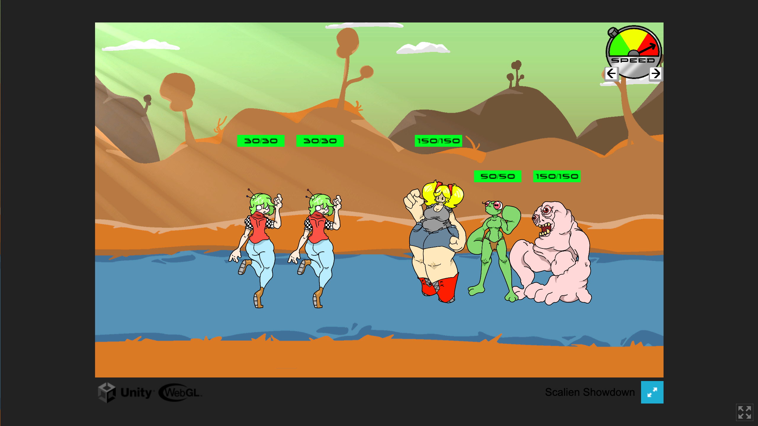
- UI stuff: Inconsistent text size everywhere, font doesn't fit the game, why is the "back" button a sword in a sort of futuristic alien game?
- The characters and the map don't fit together nicely, it feels like they were just "placed there". Add a circle shadow underneath them or something and it'll be much better.
- 0 theme integration. "Scale up the power..." is just a different wording of "Power up..." (from the game description)
- Should add an ingame tutorial. The game should teach the player instead of having the player read some text on the game page, which most non-webgl players probably wouldn't do.
- Needs a lot more sound effects and juice (game feel). The attacks between characters feel empty, no impact whatsoever. Add screenshake, flashes, particles, sounds, hitstop etc.
Overall, a fun game that desperately needs juice (which is my biggest problem with it).
edit: I played through most of the game without using pellets, and it was pretty well balanced that way. I can see how those can throw off the balancing quite hard, so I would suggest making the game harder to force players to use them.
Nice work with creating those characters. I think there's room for improvement, but it's a great entry. Congrats!
Interesting card fighting game. The art for the enemies looks good and funny but the cards are way too busy. Usually I'm a proponent for flavor text, but I think these cards would be better off without. Have the text box for abiilty explanation only, like the healing one.
The pellet system is fun, but getting all your pellets back each time your card is removed is very powerful. I was just making my fastest attacking guy as strong as possible which worked very well to be honest.
One more note: When brainstorming ideas one of the games we came up with was "Outscale the Scaliens" so it was funny to see someone else make the same portmanteau of Scale and Alien ;D
Great job !
The first thing that I noticed was music. I didn't like it at all. The gameplay could have been better in the way I can choose different attacks and all. I liked the whole concept. I recently played Yodha in IGDC 2023 which was turn based card rouge-like and I really enjoyed it but except for that I really don't have enough experience of playing card games.
Hello, thank you for playing the game.
It seems like you just didn't like the genre of game, it's isn't meant to be anything like Yodha, the only things they share gameplay wise are cards. This is a auto battler like super auto pets, you don't select attacks in super auto pets. Comparing our game to a Rouge-like with cards is like comparing Dwarf Fortress to Deep Rock Galactic because they both have dwarves.
The music was a last minute addition and will be changed if the game gets finalized.
Yeah. I will try this again after some time. I think I sounded rude in previous comment. I'm sorry for that.
Nah, it's ok to not like a game based on genre. This isnt for everyone. Compared to super auto pets this game dose have a lot of flaws in gameplay.
Very enjoyable and I really love the art style you have created, very fun! My only critisims are that the music is a little repetative and the font size on the card is a little small for me.
I also found an infinate loop but it was really fun seeing how the cards interact with eachother:
Hello! Thanks for playing! I'm glad you found the game fun. The Mary bug is known, we didn't have any time to find a fix that wouldn't interfere with her balancing so we decided to keep it in, and it seems you're the only one to run into it so far.
The music was a last minute addition, we ran out of time to really make anything so we deat with what we had :P
Fun concept, kinda like real-time Super Auto Pets. I really like the diverse and striking character designs, very creative and really out-there.
Misc Notes:
That font choice is a bit rough. It might fit the aesthetic you are going for, but people already don't want to read a bunch of text when gaming, you should consider choosing a font that's kinder on the eyes!
I both like and dislike being able to see the enemy lineup. In one hand you kind of need the information to construct your lineup. On the other hand it means a lot of keeping track of information and swapping back and forth (which at least can be done easily with the SHIFT key).
There might be some UI ways of handling this, or maybe a "simulate battle" button that basically lets you test out your lineup before submitting it, or like a "see the future" button which shows what your lineup would look like after the fight without showing the details of the fight.
This sort of trivializes the game (just throw in random units, test it, then re-arrange test it, re-arrange, test it etc...), but maybe that's a good thing? Since you have limited use of your units, the real decisions the player makes is what units they are willing to lose and take damage on each round instead of just trying to win and lose.
The music could use a bit of work. The melody isn't bad (although it's not very background music-like. It's a bit more in-your-face punchy in execution than I would expect for a strategy game), but the repetition of the base chords gets a bit grating. Maybe dressing the base chords up with some arpeggios or grace notes could help. The issue might also just be that the progression is always two chords, when usually we want at least a three chord progression like I -> IV -> V -> I to feel some movement and resolution. Just some thoughts.
The art style is very unique. It lacks cohesion, but I could see that being a cool thing if you lean into it enough. A lot of the art borrows visual tools from DBZ which is neat, but is a bit distracting since it's not shared across all the assets (so it sticks out as inconsistent instead of a conscious choice).
Thanks for the play!
I'm glad you liked my art, the difference in styles most likely comes from the cameo characters, they were originally supposed to have different card borders to indicate the fact that they aren't game originals but we ran out of time before that could be implemented. It also probably came from exhaustion, I have over 24 hours in the ibisPaintX canvas that these guys were drawn in so I was kinda over it near the end. I tried to make them as DBZ as possible but considering I don't really draw male characters I ended up reverting to default settings style wise near the end. The UI was also drawn last second, it's not my strongest work.
Some people have complained about the font, I like it but I guess that isn't the general consensus ._.
As for the gameplay changes I'm going to be honest I really dislike the simulate battle idea, what's the point of playing the game then if you know when you have a winning combo. I get that there are a lot of guys to remember but I feel like that's kinda the point. For it to be a strategy game you have to well… strategize, play to the strengths of your own characters and to the weakness of your opponent. That's also why the enemy preview button is there, I feel like there's no way to make it fair if you just go in blind. I recognize the faults in the gameplay, it was our first time making something like this and there were some bugs that really threw off balance (like with the support characters, if you know you know).
As for the music, it was recycled from some older project last second :P Better than nothing.
Love the alien design. Such a fun game. Done all 10 rounds already.
Thanks for playing! Glad you enjoyed the game!
this was a lot of fun! i loved watching the fight after setting up all my cards. the character designs were truly incredible! my only note was that i wasn't super sure about what the game's end condition was? i ended up just stopping after some number of rounds. overall, very creative and really well done!
Thanks a bunch for playing the game! I'm glad you enjoyed my art! There are actually 10 rounds, a little bar near the top shows your progress /10.
oh gosh, sorry i don't have eyes haha
Very cool card battler. Art was fantastic. Really an ambitious game and you all pulled it off! Only thing I'd add is some sound effects for the attacks. otherwise Great work!
Thanks a ton for the play! We actually had a hit sound effect made, no idea what happened to it or why it wasn't implemented :P
Did you guys conceive and hand draw all these characters? So much fun. I loved the variety of the cast, so creative! I wished the cards had detailed lore descriptions for each of them.
A couple critical notes to consider: The text font could be more readable. The card slots should maybe change color when you select a card, so I know I can place one there, drag'n'drop would be even better, just juicing up that UI all around. Also, I wanted something to do during the battles, maybe instant ability cards I could also lay down or something.
All in all, a nice little game!
Thanks for playing and I'm glad you enjoyed the game! I was the team's sole artist so (except Magnus, who was from one of our previous games that I wasn't involved in), I designed and drew all the character sprites. Mary, Orictect, and Shopkeeper are also from some of our previous projects while Claire, Sammson, and PF are from my personal endeavors. The rest are Scalien originals!
I thought out a bit of story for each character and faction, like the Glunkites who are meant to be similar to Freiza's soldiers, with them even wearing some "totally not Sayian armor." Or how a glass golem is created from a Novakin dragging in a bunch of sand through his gravitational pull and melting it into a shell of himself.
Personally, I think the font is fine but definitely way too small, especially on the cards. We were going to have a zoom-in function to better read the cards but that was sadly cut for time.
Drag and dropping the cards was another idea we had to cut because there just wasn't enough time, If we ever go back to the game, it's going to be one of our first additions.
As for instant ability cards, It was an idea that popped up earlier in development in the form of special pellets, but I don't think it resonated with the rest of the team, and as is a repeating pattern in my excuses, we didn't really have the time.
Alright, so a couple of technical stuff first.
The option menu in the web version doesn't work, not sure why. Had to download the game to be able to reduce the volume of the music (it's too high :P).
There is not feedback when I click on a card to tell me that it is currently selected, so it took me a while to understand how to put the cards in the top row. Having a system where you can drag and drop them would be more intuitive.
The game was interesting, it felt like there was some strategy involved, but it felt like the characters at the back of the row were just waiting to be hit on. Would have been nice if they had some power like "Attack over the first 2 characters" or "heals the character at the front" or "provide shield for the whole row". Feels like there's a lot of potential here if the idea went further with those mechanics.
I liked the Dragon Ball aesthetic of the aliens :P And it was pretty fun to try and make a line-up that made sense to kill the other team. Overall, great job!
Thanks for the feedback!
I don't know what's up with the options menu, there's a 2nd one in the line setup screen that works just fine :P
Dragging and dropping cards was my original vision for the game, but I guess that never ended up happening, due to time constraints or difficulty. If we ever come back to the game, I'm sure that we can at least implement a glow for the cards when selected.
There are some aliens that work from the back, Magnus and Frogman Mage buff the characters that are next to them, but as far as more in-depth support cards we don't have much as this is more a proof of concept and we wanted a wider range of abilities.
I'm also ecstatic that you noticed the Dragon Ball inspiration on some of the characters, the Ginyu force were actually in the design doc I made as inspiration if anyone else from the team wanted to make an alien of their own (they never did :( ).
I'm glad you played the game!
I don't know how to start describing my experience playing this for the first time!! i was so confused as i have never ever in my life played such genre but i love it !!! the graphics and the music just fit ! i really like it and i got hooked up to playing it. Great job and well done! keep it up, the gaming community needs such games.
I'm glad you enjoyed it! If you want more games like this, Super Auto Pets has a similar gameplay loop, you should check it out. Thanks a lot for playing!
A game loosely in the genre of super autopets. The whole thing is a delight, over the top waifu art is fantastic. The balance is all over the map which I love, I thought I'd lost the game but then one of my creatures going away returned a bunch of capsules which I loaded into a human who swept the whole enemy lineup. Mary is hella busted but I guess that's balanced by her not coming up much. The wide range of art styles and vibes from a huge range of sci-fi worlds is great. I would have loved a little hit sound with the battle and it's a little vague sometimes why you are losing. But overall the game is just oozing with fun.
Thanks a lot for playing! Mary was actually the last character to be added (and also softlocks you if 2 are placed next to each other, oops), although I never found her to be too useful in my own playthroughs I'm really glad that someone else did, creative utilization of the characters was a large part of the game and I'm glad to see we succeeded. We actually did make a hit sound, but I guess it was never implemented. Glad you enjoyed the game!
Pretty good! I would add some animations but the wojak cover image more than makes up for it
Thanks for playing! Glad you liked the cover image :D
Pressing options at the start gives exceptions.
I have no idea what the pelets do.
yeah, the options crash is an issue with the web build, sorry about that. As for pellets, considering they're color-coded to match the alien's stats, I belive they're fairly self-explanatory. The description goes more in-depth on their functions and how to use them.
I like the artwork in this. I think I managed to cause a bug where you can stack multiple cards on top of each other (I think that's a bug?). Can't reliably reproduce it though on my second try to tell you how I did it :(
Thanks a bunch for the play! There are a few bugs we've found (2 Marys is a lineup softlocks you :( ) but we've never encountered the card stacking issue. Hope you enjoy the game anyhow!
Very original art!
At first UI seemed very confusing but after some time figured some parts but not all.
Thx! We updated the itch description to include a how to play section. Hope you enjoyed.