Play game
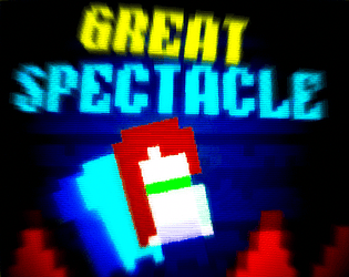
The GREAT Spectacle's itch.io pageResults
| Criteria | Rank | Score* | Raw Score |
| Did you enjoy this entry? | #17 | 3.739 | 3.739 |
| Overall | #31 | 3.496 | 3.496 |
| Do the animations/effects improve the player experience (game juice!)? | #34 | 3.478 | 3.478 |
| How well was the Theme implemented? | #37 | 3.304 | 3.304 |
| Is the art appealing (do you want to spend more time in this world)? | #39 | 3.217 | 3.217 |
| How cohesive is the game art (do all visual elements work well together)? | #39 | 3.739 | 3.739 |
Ranked from 23 ratings. Score is adjusted from raw score by the median number of ratings per game in the jam.
Which team were you in and what was the modifier for your team?
Team Spacesy : Minute
Which game engine did you use?
Construct 3
If you are chosen as the wildcard will you continue in the competition?
Yes
Leave a comment
Log in with itch.io to leave a comment.


Comments
I like the complex movement mechanics and the vibrant artstyle. Neat entry!
I love the art style, I think this game has such a nice atmosphere! It took a bit of time for me to get used to the controls, but once I did, I had a great time!
Nice mix between celeste and geometry dash. The challenge was a bit too high for me at some point but it was fun. Visuals works well together. Good job !
This was really fun and challenging. The visuals were great too.
Definitely could see the Celeste inspiration! Overall your visuals were really good. There were a few things that started to feel a little busy, like maybe too many after-images for the player. Still a very cool world and fun gameplay!
I like the platforming challenges with all of the spikes and lasers. I got pretty far but I didn't manage to complete the game, although I might have been able to with some more determination. The player's abilities are cool and the platforms have a nice colourful style too
I see you took a lot of inspiration from Celeste, and I really like the visuals and the movement is really fun, but I think there’s a little too much camera shaking
The dashing felt good to control, although it was a bit hard for sure. I said this on stream, but I think some color changes would benefit this, as lasers and spikes sometimes were hard to see since the background color was similar. Still, nice entry!
Yo this was really challenging. I can see the celeste inspiration.
I think the camera moved a bit too much, and made it a lot harder to play. But I made it to the last level (i think). I liked the chase that happens near the end. I kept overshooting the goal on that level though. I think it'd feel more fair if it was taller.
thanks! i will fix the camera movement once voting ends the chase is the 3rd last level before the ruins and THE END
I see what you are trying to go for and it is in fact really fun just the last 3 levels had a very overwhelming difficulty curves, Thi hit box of the player felt a little wonky at times I think I can make it but then I hit a spike but then I think I am going to die but I hit the same place on the spike and end up getting through alive, other then that I am not sure what the a/d does in the menu exactly.
anyways Good Job and Goodluck
the hitbox is half the size of the player, Yeah really messed up on that design choice( a and s shows your times btw) after you activate the nuke at the end you can come back to the menu to see your times( or use q and e to go to the menu)
i nerfed the starting levels like 5 times, and forgot to nerf the rest
I really like the idea but for me the camera was really difficult to deal with. i often found myself dying because i could not see what was happening from the camera studdering. I really liked the controls thought and the speed running feeling
yea i should remove that in round 2(IF I GET to round 2), your game is really good, just the decelaration and acceleration makes it feel slippery and kinda annoying
Love this game. It takes a minute to get used to the controls but it's sooo worth it.
This game has something addictive, I like how challenging it gets :)
Nice work!