Play game
I used to be an Adventurer's itch.io pageResults
| Criteria | Rank | Score* | Raw Score |
| Presentation | #432 | 4.173 | 4.173 |
| Overall | #596 | 3.815 | 3.815 |
| Creativity | #804 | 3.840 | 3.840 |
| Enjoyment | #1056 | 3.432 | 3.432 |
Ranked from 81 ratings. Score is adjusted from raw score by the median number of ratings per game in the jam.
How does your game fit the theme?
You took the arrow to the knee!
Did your team create the vast majority of the art during the 48 hours?
Yes
We created the vast majority of the art during the game jam
Did your team create the vast majority of the music during the 48 hours?
No
We used pre-existing audio
Leave a comment
Log in with itch.io to leave a comment.


Comments
I enjoyed playing the game. However, a few minor bugs need to be fixed as they disrupt the gameplay. Additionally, I need help figuring out how to trigger the jackpot (of the income chest).
Can you guide how to make the chest rewarding and plump?
Should I combine the quest colors in a certain way?
Nonetheless, I appreciate your efforts in creating this game.
The art is lovely (characters, music, etc.) :)
The chest is filled up with reward money from the quests completed by heroes. Essentially, you pay heroes for completing the quests, then you get payed for having gotten the quests taken care of by the clients. To fill the chest up all you need is to assign quests with higher rewards on them to heroes.
Note that you need to pay out the hero yourself until the client reimburses you for the quest, so the higher reward a quest is, the more you have to pay out to the hero. The pay split between hero / guild is meant to be based on quest preferences of the hero, but is unimplemented so it is a random value from 25% - 50% of the quests total reward.
Thank you for the explanation. I understand everything except for the color scheme of the quest types. My suggestion is to increase the outcome based on the raw data of the quest, such as doubling the outcome for three of the same color.
This will make it easier to pass the quest as there will be more strategic options rather than relying solely on random chance.
I accidentally made the chest slide off the table. I didn't receive any coins and couldn't ring the bell to end the day.
this is a good reminder that I forgot to add it to the list of respawning objects, thank you for the feedback!
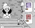
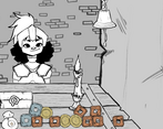
Man, I love me some diegetic UI. Everything looks great and feels great. I loved that the adventurers and king had so much character without ever needing to read a line of dialog. In fact, beyond the tutorial, there wasn't any text that I could see, and yet everything was so intuitive. I think that's indicative of some masterclass UX, right there. The only bug I ran into was not being able to see how many coins were in my purses, but I managed by just trying to be as conservative as I could.
I really like the pictures and the sounds. I liked the way you had to pay the king and the customers the money. I would have liked to see more colors, but I really liked the drawings either way.
The game is really good. With some polish and some new features this seems like a game on steam similar to papers please.
Love the hand drawn art! Looks amazing!
Love the art, I'm sure this game would be really fun when polished!
Really cool concept and art style but in gameplay i felt like i lacked a lot of information, for instance, how long could the tasks take, how long it takes for the king to appear, whats the difference between each mission or how suited is an adventurer for a mission, basically it lacks information for the player to make decisions.
Also i liked the music you chose, it really fit the theme of the game, keep up the good work!
I think I got the doggie adventurer killed by giving too difficult a quest, but I don't know ._.
There's some cool underpinnings for a management game here, though!
NO NOT PEBBLES! D:
LMAO OMG
Cool art style and music. Sadly, I'm not sure if it's bugged but I never got a visit from the king.
huh interesting, he's supposed to show up on day 6 each week before you get the chest? did you ever get the chest well playing the main game?
No, I didn't get the chest either.
I think this game is put together well and really liked the art. A few more game mechanics for me would maybe add some suspense other than just impending taxes haha.
Really like the art style, and fun mechanics. Took me a bit to figure out what was going on, feels like it could have been explained a bit better. Had to spawn some extra coins for the first day. Pretty fun once you get going though!
If you don't mind me asking, which part in particular was confusing? I know the tutorial is a bit slapped together, but in your opinion which bit was the least clear about what's happening?
Totally blown away with the art style! Had a fun time sending out the adventurers on their tasks!
Interesting game, loved the art! Only not-pick is not being able to see how many coins I had, but it was otherwise good!
What an awesome take on papers please! And it is very fitting for the theme. Would be cool to see quest requirements mechanic, even a simple rank A-F system would be very effective. I really like the visuals and the soundtrack, it gives a really chill vibe! Amazing Job!
Fun game and a very unique take on the theme, like a mix of Papers Please with Skyrim, I loved it! The hand drawn art-style is great! I don't know if it was just my screen, but I couldn't see the number of coins I had in my bags, which made the resource management a bit tricky, but otherwise I really liked it and can see a lot of potential :)
Unfortunately there was a last minute change to try and tidy up the Text elements, but I missed 2 letters so it won't display that, the end screen, and it puts the arrow on the tutorial text boxs in a weird spot x)
Love the arts and music giving me a true professional quest-giver in skyrim vibe XDD
It's relaxing and charming just, I'm not sure if giving quest to different NPC have any different implications though.
Unfortunately, it doesn't -- we wanted too but ran out of time <:D Thanks so much for your comment and for playing!!
Understandable, I also have a lot of things that I wanted to do with my game but ran out of time XDD
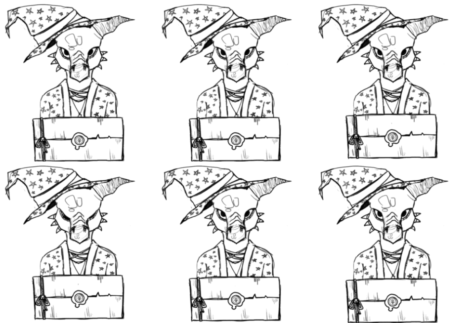
I love the art! The style works very well, and the hero designs are great.
I love the art style for the game! Every characters looks super unique and well thought out in their design ^^
Gameplay-wise, I think it's a great base, but it could use some work? I couldn't tell what each quest meant or if it had any impact on the hero you gave it to. If not, then I think that could be a great place to start if you're thinking about expanding on this concept! A lot of games in this genre seem to focus on reputation, which gives you access to bigger challenges/rewards as you progress in the game, and I feel like that could work pretty well here! The two bugs with the money count and end screen were pretty rough, but I saw that they got fixed in an updated build, which is nice.
Overall, I had a fun time with this one! The game's whole vibe definitely kept me going until the end, and while the current game feels a bit shallow, it's a phenomenal base to build off of! Amazing work all around ^^
The quests have the base for mattering, but since we didn't have time to make a UI and display it, we just cut it out in favor of a more polished experience unfortunately x) But thank you for the good and detailed feedback!
This is a very interesting concept! It was very satisfying putting the seal on the quests and I loved how the coins were physical objects in the world. Unfortunately I was having a problem where I would hardly ever get anyone showing up and I had to skip several days in a row. I think if the bugs were ironed out and the UI was made a little bit more clear this could be an amazing game! Great job overall!
there was *supposed* to be a day of the week after you get the chest where you hire new heroes to get more than the starting 3, but yknow, scope creep an all that x)