Play game
Agent DOC's itch.io pageResults
| Criteria | Rank | Score* | Raw Score |
| Style | #2224 | 3.359 | 3.359 |
| Enjoyment | #2289 | 3.077 | 3.077 |
| Overall | #2313 | 3.222 | 3.222 |
| Creativity | #2677 | 3.231 | 3.231 |
Ranked from 39 ratings. Score is adjusted from raw score by the median number of ratings per game in the jam.
How does your game fit the theme?
Player Resizable
Development Time
96 hours
(Optional) Please credit all assets you've used
see description for full credits
Leave a comment
Log in with itch.io to leave a comment.


Comments
Surprisingly difficult as I can't change the mouse sensitivity - but I understand that there just isnt enough time in a gamejam like this for accessibility settings.
Still, fun idea and solid execution!
This is a really nice looking, nice sounding, well-executed game! Well done!
Little guy scaled into my heart! Good Game!
Loved the mechanics, it worked pretty well. I would just add sensitivity option to settings as it was very low for me (but very low is still way better than too high xD).
I love this interpretation. The audio is nice and relaxing (despite how frustrated i got at certain parts lol) and the style is simple but pretty. I did clip through some walls and floors a couple of times, but I love it and the ending is such a plot twist
Bit tricky with the 3d platforming. I would recommend adding a shadow or some indictor of your position. But otherwise this had a ton of charm, and a really neat atmosphere! Nice work!
Really enjoyed the style of this game, the whitebox prototyping feel was a perfect fit for the scaling and it made the colours stand out really nicely. I wish the jump went just a little bit higher as I was constantly getting caught on the edge and felt like I was being punished for a marginal thing, but I got it eventually :) The audio is really catchy and a pleasure to listen to, its a really lovely interpretation of the theme :D
Love your choice of rescaling the champion with the XYZ scales! I had the same idea but instead of the player, I tried to figure out how we could rescale the surroundings to get to the arrival but couldn't find the right way!
Interesting game! It feels like you put a lot of heart into this and it shows.
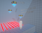
I noticed that the forwards-scaling can go through every hole? It sort of feels like a pity since you went through the effort of colour-coding every wall with a hole (which I appreciate). It's like a symptom of a problem that the scaling and platforming are sort of... separate? You can scale, platform, and dodge lasers, but they don't end up interacting, feeling like 3 game mechanics put together instead.
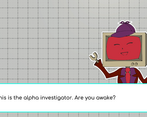
I was sort of blindsided by the story. Throughout the first 6 levels, it felt like something deeper was implied, but things only started to happen at the end of the 6th. By then, I wasn't really expecting any story and wasn't paying attention, so the dialogue elements felt kind of like a waste (which is a pity because it was very well-implemented!)
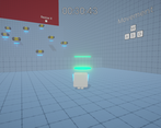
Finally, I think this game has too much precision platforming. The player's shadow doesn't correspond to what's below you, which theoretically makes sense, but now you can't tell whether you are above a platform and have to approximate it and hope for the best. This feels like the weakest part of the game and is a frustrating part of what would have otherwise been a pretty clean experience.
Whew, I've said a lot. Like the others have said, it's charming and has artistic flair, and I can tell there's attention to detail. It's just got a couple of issues that might turn the average player away.
Thank you for the review. Regarding the fact that forward scaling passes on every wall, I made it so that if you go by a wall with the scaling not matching the wall, the speed reverts to the base speed (thus losing the accelleration gained) this makes it virtually impossible to get three stars if you use the wrong shape (it is a hidden mechanic though, making it explicit would have been better). I am very interested in the talk about disunity of mechanics. Do you have any ideas how they could have been made more synergistic? Or if other mechanics would have benefited the experience? Thank you very much for the feedback.
I didn't really notice the stars because I didn't see any indicator of what gives you the stars or how fast exactly you have to be? (I actually thought they were pickups I was missing) Because speed is the only reason to match the shape, if the player isn't interested in stars, the acceleration loss actually becomes a good thing (I've slipped off a ledge to my death many times due to going too fast).
I'd say the scaling might need a purpose other than speeding through the right hole, like if scaling in a direction also scaled your speed in said direction (so y scaling gives more jump height, forward scaling makes you faster forwards, etc.).
I think having to get to a certain location to revert your scaling had some puzzling potential, i.e. you have to get to location A before you can resize yourself and fit into location B rather than a linear route. Though, this wouldn't work in this specific game because having time pressure and puzzling don't mix.
A more brute-force method would be to give the stars a purpose, like an alternate ending if you manage to get a certain amount. It's elegant and easy to implement, but it also forces players to prioritize speed, and time pressure can be rather stressful.
I think the best solution really depends on what you think is most important about the game. Is it about beating the clock and executing moves with the perfect timing? Is it about using the mechanics given to you and the map's features to methodically solve each level? Is it about coming up with new and novel ways to use a mechanic already given to you? As long as it feels rewarding to engage with, I'd say it works.
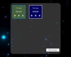
The times to get the stars are only present at the end of each level (in the tab that is opened when collecting the microchip) but it would be more correct to include them in the selection menu as well.
I agree that the purpose of the stars is indeed ephemeral, a player can decide to strive to get them all or ignore them not interested in the challenge. Giving a reward for achieving a number of stars (such as unlocking levels, dialogue, endings, cosmetics, or in-game currency) is certainly a clever way to entertain players who are not solely interested in the challenge.
The puzzle approach I usually rule out since these gamejams are always saturated with such games, but the idea of providing a speed boost based on the scaled-down axis is something that would definitely have interesting applications.
The idea I started from here was actually was to create a very basic version of Neon White, then make the speed of level completion a priority challenge.
One design (or rather geometric and engine) problem I had was that resizing on the z-axis could virtually negate the need to have to choose other types of resizing. I solved it by reducing the speed when the hole was mismatched and limiting the ability to resize on that axis by level. Initially, though, I had solved it by making that transformation a little bit thicker in the x and y axes so that it still didn't go through the other holes, but capturing the velocity caused Unity to make the colliders interpenetrate anyway. If this solution had worked, the levels would definitely have been geared toward a more puzzle approach.
From a 12nd attempt passed the first level in less than 10 seconds! the game is quick and fun, controls are dynamic and I like it.
really wanted to play the game, but I struggle for quite a long time yet can't get pass level 1 :(
Nice writing and fun quick fire levels once you get the hang of the mechanics and controls! I don't think I was even close to getting 3 stars but had fun trying. Nice work!
Super fun game, love the style. Good job!
Cool game! had lots of fun, i liked the way you used the storytelling to enrich the game (especially in the end), although I had some trouble to get used to the camera, but once I got it, it was fun. (I felt like I was in one of those funny japanese tv shows, full of obstacles). Well done! (laser madness almost made me mad xD)
The initial platforms were a little to small for my taste. Loved the artstyle. Great entry!
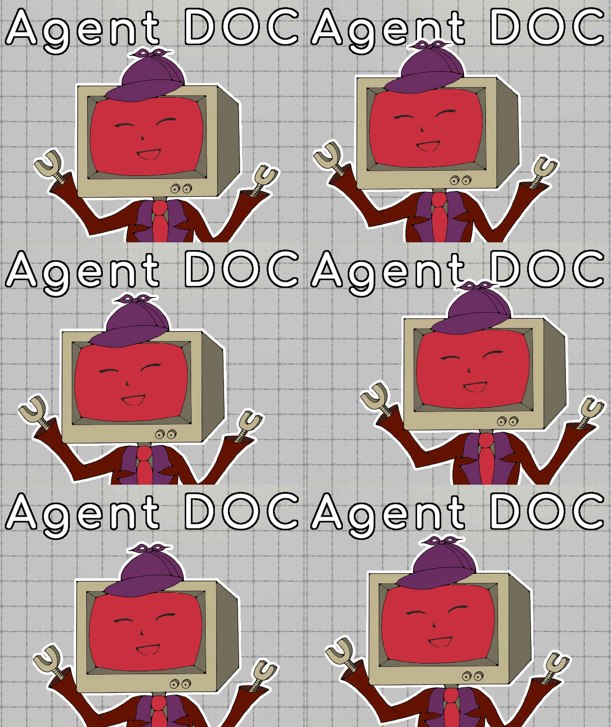
Came for the show TV guy and wasn't desappointing, cool game but a bit complicated sometime, apart from that, cool game :D
It was a challenge at first to get the hang of it, plus maybe I would add some mechanics to increase jump values when changing size or something like that, but overall very fun
this was really charming! one piece of feedback, i found the camera angle made depth perception a bit hard
Maybe I should have included it in the tutorial but the camera can be moved with the mouse. Thanks for the feedback.
I always like monitor head characters hah! The game was an interesting way to fit the theme. Also the voice sound effects lol
I really like the art style and theming for this game. I am not great a platforms and I wish the the jumping sections were a little more forgiving (larger platforms to land on, darker shadow so you can see where you're landing, etc). Having the mechanic where you are stuck in your shape until you hit a checkpoint is cool though! I hadn't seen many other platformers on here do that