Play game
Vampire Bedtime's itch.io pageResults
| Criteria | Rank | Score* | Raw Score |
| Graphics | #9 | 4.220 | 4.220 |
| Fun | #21 | 3.560 | 3.560 |
| Accessibility | #21 | 3.320 | 3.320 |
| Overall | #22 | 3.529 | 3.529 |
| Audio | #25 | 3.480 | 3.480 |
| Theme | #29 | 3.800 | 3.800 |
| Originality | #34 | 3.620 | 3.620 |
| Controls | #90 | 2.700 | 2.700 |
Ranked from 50 ratings. Score is adjusted from raw score by the median number of ratings per game in the jam.
Godot Version
Godot 3.5 Mono
Wildcards Used
Here Comes The Sun.
Game Description
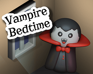
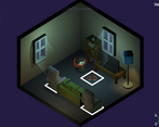
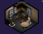
Its the little vampire's bedtime. Help him escape the morning sun by rearranging the furniture to create some shade.
How does your game tie into the theme?
Vampire's cannot be in the sun. Since the vampire wants to go to sleep, you need to escape the morning sun by finding shade.
Source(s)
No
Discord Username(s)
cadoink
Participation Level (GWJ Only)
13
Leave a comment
Log in with itch.io to leave a comment.


Comments
Very nice game, congrats! :)
I enjoyed the puzzles a lot; some of them stumped me for a while, but none were impossibly difficult. Good job with that!
I agree with some people here that it is not always clear where the shade will go, but once I figured it out it made sense. Sometimes the movement felt unresponsive, I think this happens when you press an input before the vampire finishes the last move. Adding some kind of Input queue would relly help to make it feel more responsive I think.
Overall good job with the game, I enjoyed it!
Thank you for the kind words! Glad you enjoyed the puzzles! An input queue is a great idea! I wish I would have added that. :)
This was interesting. I wish the angle wasn’t perfectly 45 degrees, so that it was clearer which direction was “up” (w), it took a bit to get used to the controls.
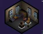
Also, for level 7 I think there was a window on a wall we couldn’t see? At first I thought it was a light coming from the TV in the room but eventually I pieced together what must be going on. It was also generally unclear to me when/how shadows would be cast from which objects. I initial thought the orientation of the chair backs mattered and then at the end it didn’t seem to.
Regardless, there were some interesting puzzles here and the art was very cute. Nice job!
Thank you for playing!
Yes level 7 was an odd ball. It was the only level where I designed the puzzle around the art/layout rather than the other way around. That's because level 7 is based on a real living room and was an Easter egg for my friends/family. As a result, I had to put a window on the far, invisible wall, and it wasn't very obvious.
The orientation of the objects did not matter unfortunately. Basically some objects are just deemed "tall enough" and other's aren't. Under the hood they are all just cubes either with or without a collision shape to block some ray casts.
Congrats on the game ! I found the keys quite confussing, maybe the ablity to turn around the map would solve the problem for some ?
I like the puzzle idea, got me stuck few times before solving some levels :D !
Interesting. I thought about allowing some camera rotation just to give the player some different views of the room, but I didn't think about it as a way to make the controls easier. My week was cut short so a lot of ideas got cut. Great suggestion though!
Thank you for playing! :)
Hey, nice game, congrats! I just found the keys a little confusing. For some reason, I keep trying to move like it was WD/AS instead of AW/SD. ^^'
Oh interesting. I wonder if maybe I should have given players the choice for which way was "up/W". 😅
I enjoyed this game. I played it with my girlfriend and we had lots of fun.
One of the issues I had with the game was that 4 of the 10 levels I completed by complete accident. It was very difficult for me to figure out where the shade would go.
Another thing that was confusing me was that I would constantly press the wrong key to move. The perspective was messing with my head somehow. I can’t tell you why or how to improve the controls but that is not a big issue. It was just an issue for me.
Thank you for the kind works. I am glad the two of you had fun! I knew the controls would be a concern, but since the game didn't have any element of urgency, I let them be a little unintuitive for the sake of the visuals. The same is pretty true for the shade mechanic. Code wise the rules are consistent and I tried to build the rooms and art to fit those rules, but I think it was ultimately not very intuitive. Either way I am glad you were still able to enjoy it
Really nice puzzle game and you can see that there is experience behind it! Art was really cute and it fit perfectly.
Oh and I loved the transition between levels with the bat cutout.
Good job!
Thank you! I was pretty excited about the bat transition screen. :)
Really fun puzzle game! I finished all 10 levels! I liked the graphics and sound effects the most.
Thank you! I'm glad you got to the end! I was really happy with the graphics and sound too, so I'm glad to hear other enjoyed it. :)
Solid gameplay. I seem to have not understand fully how the shadows form.
Yeah its not super intuitive. Basically the pieces of furniture that are "tall enough" to block the light from the windows have collision shapes. Raycasts get sent from each grid cell to each window and if they can find a window the cell becomes unlit. As a result, I tried to make the furniture that would block light taller (liked stacked boxes or the taller recliners), and objects that would not block light (like the shoes) shorter. I also tried to rotate them so they would look like they'd block the light, but in reality the rotation of the object didn't make any difference.
Anyway, thank you for playing! :)
I really like the idea and graphics are good.
Thank you! :)
Very nicely done little puzzle game. The art is nice, and it's in that good spot where it's easy to understand, but hard to master (at least for me, haha).
The controls were definitely difficult to wrap my head around. The little WASD compass in the bottom was helpful, but I still kept jumping to the wrong square every now and then.
That said, this really is quite put together and fun. Great work!
Thank you! I'm glad the compass helped. The movement isn't very intuitive, but visually I really wanted that camera angle. After a week of constantly playtesting, the controls become second nature. I'm glad you had fun!
Really polished, really well done.
Thank you! :)
This was such a polished game, there is even a custom transition screen. I struggled in some levels but I managed to finish it and loved it! Really good job!
Thank you so much! I am glad you enjoyed it. :)
Very fun and challenging game. I think the game would benefit from a timed mode. I really enjoyed the music and the sounds, but I think that there should be a better rappresentation of when the windows are covered. Very good job!
Thank you for playing! Yeah I originally wanted a time mode, but ran out of time 😅. Agree that the readability of blocking the light isn't very clear. Thank you for the feedback! Glad you enjoyed it. :)
This is really charming. Got all the way to the end!
Thank you! Glad you were able to get to the end. :)
First, I love that you went the vampire route! This is such a cute little game! It's a very cool take on the theme as well, hiding in the shadows to "escape" the sunlight. Love it! It would be cool to have a timed mode to add some more agency to the game! I could totally see this as a fun game on an app store! Great work!
Thank you so much! I'm glad you enjoyed it! The original plan was to have it be timed, but I worried it might be too difficult. I thought it would be cool as a "hard mode" but didn't have time to implement it.