Beautiful work! I loved the art, premise, and the layout. Great stuff.
Play adventure
Under the Desert Manor's itch.io pageResults
| Criteria | Rank | Score* | Raw Score |
| Usability: Is the adventure easy to use on the fly? | #16 | 4.048 | 4.048 |
| Fun: Is the adventure fun to play in an OSR playstyle? | #20 | 4.048 | 4.048 |
| Overall | #28 | 3.921 | 3.921 |
| Writing: Is the adventure original and fun to read? | #56 | 3.667 | 3.667 |
Ranked from 21 ratings. Score is adjusted from raw score by the median number of ratings per game in the jam.
Comments
beautifully drawn map, I can never hold correct perspective when drawing at an angle. Excellently unsettling themes and well laid out rooms will make this a pleasure to run. Though I'm not sure all of my group have the stomach for the horror!
Dense, creepy, and incredibly well organized. Great adventure designing-minds think alike I suppose when it comes to alchemists hiding horrible secrets in their basement. I only wish some of the negative space was populated with more great illustrations like the ones shown. Well done.
Very creepy adventure, sad story too. Love the artwork. Hate “the creature” 😆. Its terrifying. The memory triggers are a really neat way to give it a weakness.
I enjoy the layout and art. The hand-drawn map is nice to look at and easy to read and follow. Also enjoy the effects in the music room!
Truly terrifying creature...and yes, knowing now what it is...this triggered my fear from childhood of the 'Children Under the Stairs.' Memorable is a great way to bring people back for another round. I echo what has been mentioned about readability, but an easy fix overall and might not effect some. Great job, and wonderful concept as a whole.
Darela the Creature is the star of the show of course, with a deadly illustration and procedure for her movement through the dungeon. But lots of nice additional details here and there like the twanging of bowstrings in the music room.
The survival horror vibes are strong here! Nice one, Jod 🤘
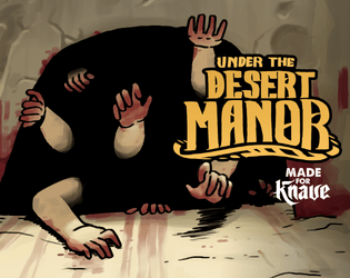
That monster is f***ing terrifying! Every time I scroll past the cover for this adventure (now that I know what those arms lead to), it gets me every time.
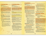
I love the art, and I love the adventure. My only critique is that it's a little hard to read. Maybe select a different font for the main text?
Great work! Good art, a fun concept and a nice layout. The Timeline is always a good touch and the alternate dungeon turn/shift rolls for the creature are a good touch to keep players engaged in the central tension of the dungeon!
readability speaking the font is a bit small for an A5 page. The contrast between some of the colours used for box-outs and highlights might be a bit too similar to the background from an accessibility standpoint. The map is good, nice and clear. Stat blocks are nicely laid out, Some of the rooms are a bit information dense so the pages can be a bit overwhelming. Some images mixed in would probably counter the 'wall of text' feel a bit.
Pretty horrific stuff here (in a good way!). A simple yet effective dungeon. I specifically like the handout and the music room. Good layout!


Leave a comment
Log in with itch.io to leave a comment.