Play game
Rogue Storm's itch.io pageResults
| Criteria | Rank | Score* | Raw Score |
| Overall | #6 | 4.000 | 4.000 |
| Fun Factor | #6 | 3.920 | 3.920 |
| Visuals | #10 | 4.280 | 4.280 |
| Audio | #20 | 3.560 | 3.560 |
| Originality | #46 | 3.360 | 3.360 |
Ranked from 25 ratings. Score is adjusted from raw score by the median number of ratings per game in the jam.
Is your game a video game or a physical game?
Video Game
Was your game made solo or in a team?
Alex Lazea (Griggy): Programming Lead | Designer; Carlo Sbisa (theEarthWasBlue): Lead Artist | Programmer; Russell Lim (russ_audio): Audio Lead | Technical Sound Designer; Edwin Zachman (zachmanity): Music Composer; Alyssa Fabian (Eggie777): Sound Designer
Did you use any third party assets, if yes what assets did you use?
NA
Did you choose from one (or more) of the optional secondary themes?
Rogue and Resourceful
Does your game contain 18+ content (Nudity, Gore, Language)?
NA
Leave a comment
Log in with itch.io to leave a comment.


Comments
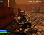
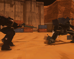
Great work! Nice feedback on the shooting and movement. Procedural levels seem to work well. Good variety in the enemies and weapons.
Absolutely lovely. Needs to be a full game.
A great addition would be adding somewhere in the game what the icons mean. I know they are on the game's main page, but I didn't see that until after I was done. Also selecting the new level was a bit clunky and hard to select at times. I also did notice sometimes I would spawn in some scenery object, but was able to get out easily the times it happend to me.
Great job guys!
Solid controls, tight gameplay loop, nice visuals and really solid audio. Amazing job!
Very solid jam submisssion! I had a blast hunting down the enemies and trying out all the guns. There is clearly an ambitious game being made here and I hope you keep working on it. My favorite part was the responiveness of hitting enemies, with the hit counters and effects it felt very tactile.
I wished the player mech moved a bit faster/was more agile, but that's just a small detail in an otherwise fun experience! Nicely done!
I had a blast with this one! I love rogue likes and this was right up my alley. The fact that you managed to cramp this much content with such quality in just 2 weeks is some really good work. I felt that the player movement was a bit sluggish at times but overall the gameplay was well implemented. I really enjoyed battling the enemy mechas, great enemy variety.
Standard movement feels a bit slow for me personally but the animation is nice and feels weighty. Enemies felt a bit spongey to me and I'd like if I could hold to shoot instead of clicking rapidly. Visuals are nice with that retro PS1 look, and as I mentioned, animations are very nice. I like the variety of locations.
Minor Bug? I had with the teleporter. I'd move onto it while holding forwards and it'd automatically orient me to face the other way and I'd walk off before I could select something. So I had to slowly and carefully land on it everytime.
UI is nice and I like the roguelite elements and with permanent upgrades so you still gain something.
Thanks for playing!
That bug is a new one to me. By teleporter do you mean the exit platform where the different level UI elements show up? Mind describing the bug in a bit more detail and does it repeat even after restarting the game? Appreciate the feedback.
Here's a recording of it
Oh super weird! This happens on all levels in all cases for you?
Yeah pretty much
Really well done, this is some top stuff especially given you are not using 3rd party assets. Frame rate is super smooth even with my older PC setup, I got a bit stuck in the first stage as I kept going to the beacon but nothing happened, should have realised to click on the repair shop or next stage but I thought there were other things so kept looking around. Almost everything was on point, the sounds both in game and UI were all great. Some very slight overlapping text on some of the Ui in the mech repair area, also when you jump forward the aim reticule gets covered by the mech and you can't see the target. Really polished and a fantastic entry!
Cool game, I like the atmosphere and the gameplay - The AI for the enemy mechas is also quite good.
Great work.
This feels fantastic to control! The physics are great and the hovering feels empowering without being gamebreaking. Works great as an arena shooter! My main complaints are that the mouse sensitivity seemed to be extremely high by default and even the lower ends of the sensitivity would cause the camera to shift around overly quickly, and also the game has a bug which causes immediate death every time a new run is attempted. Other than that though, really solid work!
Could you clarify, the camera movement was too fast even with the sliders set to the lower settings in the options menu? Might need to better scale the sensitivity in the code if that's the case.
Thanks for playing!
The camera movement felt a bit fast even when put to the lower end of the sensitivity spectrum. At the lower end, it felt like it was at about a medium-high (6 or 7/10 maybe) sensitivity as compared to other shooter games--at least from what I experienced.
That helps, ill look more into this. I assume the DPI on your is not super high?
It's a portable wireless mouse that isn't made for gaming, so it's probably a pretty low DPI.
Cool that you were able to piece all of this together in such a short time, visually I think it looks decent. There is a lot of potential, I like that I could switch guns to get new ones after killing enemies, however the problems I had when playing were too much. 1. After I died every time I clicked to start a new game I would insta-die when it started so I had to reload the page to try again, I had to reload the page 3 times before I got good enough to not die. 2. It should be more clear that I could adjust the mouse sensitivity in the options, as it was near unplayable with the starting sensitivity (at least for me), though it was nice that you had that as an option. 3. Why do you have a space for "Controls" in the menu when I can't click on it? 4. After I killed 10 enemies on the map I wasn't able to find any more or where I was supposed to be going.
Thanks for playing and providing feedback!
The controls button was intended but we ran out of time and thus disabled the button. Hope to add a controls or more like how to play menu sometime.
As for where to go, each level has an exit marked by red smoke. The level size makes it hard to find but our recent udpate makes this much more doable. There is a marker on your radar now once combat completes and you now see a big blue column of light coming from the exit to help guide you to it.
Hope these changes + a few extra make the game more fun to play.
This is great, but there's a game breaking bug that makes you only play once because you end up getting stuck in a death loop. So my rating will be based on a little bit of the game 👍
Understandable, the bug should be fixed now. Give it a try so you can hopefully enjoy the game fully.
Really enjoyed this! Felt like it had a great Armoured Core vibe/inspo which I loved. The dash button is so addictive and being able to change between a variety of weapons was awesome. Loved the ps1 style aesthetic too. Will be playing this again!
Really enjoyed the setting and being able to pick up different types of weapons was really cool, spamming the rockets to obliterate anything in the way was really fun lol
One big problem I cam across was that the camera always was moving to the right making it very hard to aim or move around at times, the closest thing i can compare it to is stick drift on a controller but I made sure to have no controllers connected while playing.
The art style is also really nice is and the type of retro look I really enjoy
Great job on the game!
Interesting, this was on mouse or track pad? Never experienced that kind of drift during testing but there also is no implementation for dead zone that could help.
It was on a mouse for me
Tons of fun and variety !
The whole randomly generated weapons aspects in awesome, especially when you manage to get lucky and find some totally broken combo like fast shooting multi rockets and such :p
The shop and skilltree systems are also very nice, even if it feels like you’ve gotta grind a lot of credits to get access to skills.
My main gripe though would be that there’s no way to adjust the mouse sensitivity for the controls, and the default sensitivity you have feels like way too much.
But other than that i’ve had a great time, and the rogue like aspect with the random weapons really shines through and gives tons of replayability.
Good job to you all :)
Thank you for the feedback. Check out the latest build. Left some sliders in the options menu ;)
We also rebalanced the game to have a more intentional progression and difficulty curve.
Really well made and I'll definitely be playing more. The environment and overall designs of the mechs are very well made.
Wow feels like I was playing armored core. Really interesting and I like how I could pick up weapons. Really awesome how you all made this together and all. Really enjoy the simple and yet effective look going on here.
The mechanics and mech feel are so tight and responsive it really fills me with joy! I really like the rough like nature of going from level to level, gathering resources, at the beginning I thought the exraction point was annoying but later I began to like it, Although it might be easier if there is a big red marker or something pointing to it, and this game with just a bit more sound effects and a pretty coat of paint over the menu and such, I tell you this would be easily a top contender!
Already as it is, is a great prototype! If you kept working at it, this could become something more!
I agree on the extraction point. We will be updating the UI later to include a marker that helps guide the player to the extraction. Have some other ideas on how to make it easier to spot and get to it.
The game is really fun and I love the visuals. The UI needs polished and the sound design is unfinished, but I read that you are working on that.
Thank you! Please check out the latest build which has audio finally. UI polish in the works :)
Really fun game, hope to see the idea taken even further
Really cool game! I did get a few bugs, like how the weapon preview didn't tell me how the gun works (I just picked it up then tested it to see if it was different) & I didn't have any credits after selecting 'exit' from the repair shop, but the gameplay itself was really cool
Thank you for the feedback. Our UI will certainly get an overhaul and hopefully will be more useful. Regarding your comment on the "Repair Shop", that is most definetly a bug! Thanks for bringing it to our attention. That's going to the top of the list for the next update.