Indie game storeFree gamesFun gamesHorror games
Game developmentAssetsComics
SalesBundles
Jobs
TagsGame Engines

natsudev

65
Posts
8
Followers
10
Following
A member registered Nov 04, 2018 · View creator page →

Creator of

Recent community posts

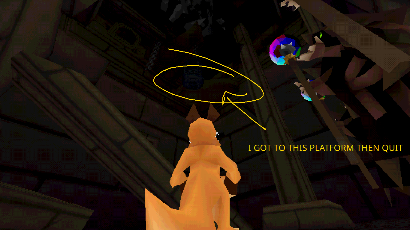
I played for about an hour all without items (see picture of the furthest I got), then read some of the comments that said I could trade the statues for items.  I chose the shoes and, honestly, I played for about 10 more minutes and didn't notice any changes.

I'm guessing you're looking to Jump King as a form of inspiration, which I never played, but does explain why this game is seems hard and punishing--so if you that's what you're going for nailed it.

The movement feels sluggish which I think clashes with the character design (when I see a kangaroo I imagine I shouldn't be this slow).  It'd be nice to be able to turn faster along with the slower speed and it would also be nice if you could buffer the jump input while airborne, which would've definitely helped out whenever I adjusted my position with a series of small-hops.  UPDATE: I've played a little bit more and realized that the shoes let you double jump--I guess make the jump-buffering only happen without the shoes, but now I want faster turn speed more even more.

Both the character design & animations are very charismatic and you did nail the PSX/N64 aesthetic 100%--great job there!

(1 edit)

Twin-stick shooters aren't my cup of tea but I played for about an hour and unlocked the 2nd character but only got about 4-5 stages (excluding the Nexus) deep at most.   But what I did play was solid.  It might be how drop chances are weighted or I  just got unlucky with my relatively few runs but the ballus & ice rune seemed to drop fairly frequently--aside from those two you've got a solid weapon variety & rune variety.  The power-up pricing seems to be just about perfect right & I only really started to have more money than that after I got the compounding-interest bonus. The  spinning reload animation is nice, and the destructible-ish terrain (I'm thinking of walls & pillars in particular)  is also very cool.  One time I destroyed a wall and a bunch of cavernous rooms were revealed--VERY COOL!

Also I'm playing on a POS laptop (think 2011 notebook  gpu) and didn't encounter framerate issues--it was always consistent and no stutters.  So great job optimizing performace!

I really like the targetable & forward facing weapon setup,  but it be nice if the turret weapon was on autofire--especially for autocannon turret since when I tried that out I basically held down LMB the entire time (also the weapon customization system is great).  Really great art--this looks like release quality work.  The enemy design for the even levels is quite clever, in particular the enemies that rotate & enemies whose bullets return before shooting out again!  

I think the difficulty is at a good place for a shmup--they always tend to be challenging.  Plus the regenerating health (btw cool damage & recovery effects on the ship) and slow-mo help a lot.  I'm looking forward to the rest of the game & I hope you keep up the progress!

I had a lot of fun! I had a couple nonstarter runs but then it seems I got really lucky with the starting weapon & options.  Wall jumping is cool & I did use it now and then but I do not understand why some levels have higher gravity than others ヽ(ー_ー )ノ  The music is a banger and could stand to be bit louder.  I beat the Shoggoth, Yellow King, the other King (one with the sword), and Bartolomeo--Bart is especially KINO with his special music.  Pretty cool weapon & build variety, but I wish there was a way to check out what all the bonuses you picked up did on the pause screen because some of them I just grabbed midcombat without thinking.  Maybe even a submenu on the start screen that lists all the ones you've picked up before & details their effects.

The starting level is an absolute VIBE and the skulls are great.  

The crabmech design is solid and great IK!  The scan lines on the ammo counter are also a nice touch.  IDK this is intentional or not (seems not by lack of any vfx) but I was able to "fly" by pressing jump again while airborne.  Given the size of the level it'd also be nice to travel faster--which I did by flying.  As others have said the camera does get a little funky in corners/close to the wall.

I liked the free aim/lock-on options, but it'd be nice QoL improvement if the free aim had a UI reticle of some kind, and I could toggle the lock-on by pressing shift instead of holding it while close to an enemy.

This game is  above criticism.  The car has comedically poor handling, the bed of the truck is hilariously low, the art style is SOUL to the max.  It's all there.  It's perfect.  It's the most faithful portrayal of Australia in any form of media including Mad Max.

Here's the video of my playthrough.  I hope it helps: 

Okay, well if that's how you wanna do it then ya oughtta follow your vision

>What did you do to clip through the wall at the end
My hidden talent that I cannot control.  BSP is fucky that's just how it is.

GOOD GAME.  Music & SFX are on point.  Gameplay is SOLID.  I didn't see the point of focus mode.  My only complaint is the camera zoom as you approach the center is kinda annoying--feels like I lose a lot of stage awareness because of it.  Everyone else is talking about circling being a viable strategy but I think they're missing an important point--just circling will keep you from dying, yes, but it doesn't keep the multiplier high enough to really crack the high scores.  I think I got to the point where I was killing them TOO quickly to maintain a high multiplier at the end--and that's VERY COOL.  Really gets my noggin joggin.  Add in some more enemies and you've got an absolute banger on your hands.

Here's the video of my playthrough (still uploading & processing if you see this right away), I hope it helps!

Fucking godlike.  Comedy gold.  Is /cm/ really just a bunch of fujos???  The UI & art slaps.  I played the windows standalone & the options menu still didn't work for me.  I know the cat fujos are different from the regular fujos but it doesn't really seem like it.  If anything more enemy variety would be nice, but overall a good game that's as fun and breezy as it is funny.  Here's my playthrough, I hope it helps 

This needs work but it's an interesting demo nonetheless.  Movement feels good & I like the camera tilt on strafe.  Nice to see leg-raising crouch-jumping actually being used.  Combat needs attention though.  I don't think combat is hard--towards the end I was plowing through enemies I was struggling with at the beginning--I think how to fight properly is not taught well enough.  Incorporating mouse movement for attacking is interesting but I don't see the purpose.  It seems like a weird layer between wanting to attacking and actually attacking.  And it was initially confusing because the your notes in the cell say to just press/hold LMB to attack.  Maybe limit it to just regular & charged attacks.  I think health bars & damage numbers would help a lot.  Especially the latter just to show how much more effective charged attacks are compared to uncharged ones.  Towards the start of my playthrough when I was struggling in combat I would just mash attack when I should've been charging it.  Finally, I suspect you're using ray/spherecasts to detect if an attack should hit an enemy instead of using attack boxes that mimic the swing & kick--there were a lot of dissatisfying "looks like it should've hit" moments.  Other than that combat is enjoyable but getting to the fun is a matter of teaching the player how to fight properly.  I'd love to see combat refined--not even adding things necessarily--because it has a lot of potential.

Other than that I don't have a lot of thoughts. Trinkets seem cool, I imagine you can get real creative with them. I appreciated the robust options menu, my only criticism here is that button remapping is finnicky at best.  Otherwise it's GREAT.  The map is VERY cool & being able to add your own map-markers is great--really gives me D&D vibes.  Here's a video of my playthrough (I appended a 2nd part to the end of the first), I hope it helps!

Really fun game!  I didn't master all the techniques in the short time I played but there were moments of brilliance when everything came together on my end and I was able to kill everything on screen in moments.  I think you know this already and I can see you put in some work into it but the tutorial is still rather cryptic when it comes to kicks & projectile parries.  It'd be nice if you included slow-mo videos that also displayed inputs to show how things are done properly.  Maybe it'd be worth it to have other tutorial levels just for practicing those techniques forever--but this might just be unnecessary if the upgraded tutorial is good enough.  Also, it'd probably be a good idea to have more feedback so that way it's obvious for the player when you dodge, kick, or parry.  The dodge in particular is hard to tell because the sprite just turns red--bit of hitstop for all of them might be good.  But aside from the tutorial I only have one minor suggestion: it'd be nice if I could toggle the trigger instead of hodling down the entire time!  Other than that no complaints--the art is great and there's a lot of cool details like the pieces of the armor falling & being littered about the stage as the mech takes damage!  Music and sound effects are solid as well, the jump sfx has a nice bassy heft to it, and the parry/kick has a nice pneumatic feel.

Overall, this is really polished and a good game.  I'm excited to get more!  Here's the video of my playthrough, I hope it helps!

Glad it helped!  My specs are as follows:
OS: Windows 10
CPU: Intel i7-4790KI @ 4GHz
RAM: 16GB
GPU:  AMD Radeon RX 6600 XT w/ 8GB VRAM

And I encoded the video with my ML/Video processing GPU so that shouldn't be effecting anything that much (I'm not made of money, it's just my old GTX 970).  Really though, the remark about limiting framerate during the pause menu is that UE disables most actor & component tick functions while the game is paused so the GPU starts rendering frames without the CPU holding it back.

> Here's a little secret: we're tweaking  player gravity and jump distances to help with people jumping off ledges (a scary tweak since we're actually pretty far in level design).

That's a pretty big change--idk how you're calculating movement but you might want to increasing air friction first (that's usually what the complaint about floaty jumps means), or adding a double jump.  You can also try adding "just-in-time" jumps i.e. let the player jump briefly after starting to fall of a ledge.  One of the Dead Cells devs gave a GDC talk where he briefly mentions it (if the timestamp doesn't work it's the "Control tricks" section).  If it works it'll save a bunch of time redesigning the levels!

I like the game even though I'm not good at it, definitely something I'd happily sink the time into playing and learning though!  The tag powers providing both combat & mobility is sick!  I loved launching myself and the AVAF with the blue one.  The pause menu icons are cool, but it'd be nice to have some text appear somewhere on mouseover saying what that button does--I was a little disoriented when I first paused the game to fiddle with my settings.  The default FOV is too low--especially for the combat challenge.  It's probably just a skill issue but I think it's too easy to accidentally yeet oneself off edge of a building without any way to save yourself.  Also, please limit FPS during pause & start menu--I can hear my GPU taking off.  But don't let my nitpicks dismay you--it's real fun!  You two definitely nailed the vibe & gameplay of Jet Set + Mirror's Edge both gameplay, aesthetic, and theming!  I'm looking forward to seeing & playing more!  Here's a video of my playthrough (needs time to process HD version fully), I hope it helps!

This game's vibes are PRISTINE.  The aesthetic, mood, & theme are perfect.  I love how you present the plot without words--The bridge joke is great!  I think you're aware that you need to add all the boilerplate that one expects from a game so I won't bother you with that stuff.  I really didn't see the point of the Move ability--I'm guessing since enemies only attack in a straight line I could use it to dodge attacks--but I had no trouble just bashing my way through each encounter so that's all I did.  But overall, I really found your game quite endearing!  Here's a video of my playthrough (might need some time to process still), I hope it helps!

I had a lot of fun!  The music & aesthetics go together really well with the gameplay to create the boomer shooter experience.  The movement is very agile and feels great, and goes perfectly with the rapid gunfights.  I will say, the putting the red keycard by the death pit was a dick move.  My first run I fell in and then I instinctively avoided the hole the second and had a lot of trouble finding the red keycard.  It might be nice to make items like keycards emit a bit of light because the level is dark.  Here's a video of my playthrough, I hope it helps!  I didn't get the RPG & plasma gun in time to use it in the recording but I did another run through of the level and I used them & really liked them.  The plasma gun stunning for its secondary is intersting & combos great with melee. Also: shotgun?

Oh, you're right.  But still, a back option would be nice, especially for people that are just looking at it for the first time that don't know what's in where.

On mouse & keyboard, the nested radial menus were awkward for me.  It'd be nicer if I could cycle through categories & have a preview of what's available in said category on the screen somewhere and then choose what I want from a single radial menu, instead of having to navigate all the way to whatever it is I want from the root menu.  But if you do stick with the nested radial menus a "back" option would be nice so it's easier to navigate between menus instead of having to restart from root each time I wanted to change categories.

Very promising prototype!  I enjoy how it feels as much a puzzle game as a top-down shooter.  The bouncing fireball mechanics are real cool!  I played around with the level editor for a bit (forgot to record it--sorry!) and it seems feature-rich for a prototype, but could use some work to streamline it (although if you want it accessible for gamepads what you have right now might be the best way to do it).  The art is charming--especially that unlockable character ;)  The enemies seem nicely differentiated, and it seems with how their behaviors mesh together you can create some really challenging rooms!

My only real complaints is that, first, the trigger tiles seemed too big to me.  It's probably just a skill issue but it felt like I triggered them even when I shouldn't.  And second, it does seem like the default walk speed does seem a little slow.

But overall, I had a lotta fun with the demo & I'm looking forward to how the game continues to progress!

I recorded my playthrough, I hope it helps!

Fighting games systems are ambitious and I'm excited to see how this turns out!  I think directional special move inputs is a good idea, makes the special moves nice and straightforward.  Looking at your known bugs & the demo's writeup you know what needs to be implemented, so I'm looking forward to when all those features get added. I was hoping I could plug in my cheatbox and use that instead of keyboard but oh well, maybe in a future build ;)

I've included a video of my playthrough, I hope it helps.  I didn't read through the known bugs before recording, so just ignore me please. 

I'm very impressed with your demo!  I believe you were going for the Megaman Legends look and you nailed it!  The music was good as well!

I only noticed a single bug that effected the demo: sometime the turret would get "stuck" and wouldn't rotate towards where the camera was facing, but other than that everything seemed fine to me.

I only have a couple gameplay suggestion: it'd be nice if you could add a spatial sound-effect to the enemy boats or projectiles, that way the player could keep track of his surroundings without having to pan the camera all over the place (especially since the turret tracks along with the camera).  Also, I think the enemy drops should vanish after an amount of time--if you watch the footage I attached I ended up just going around the perimeter of the maps kiting all the enemies into one big death ball--with the time limit maybe it'd incentivize charging in to get the drops.  Other than that gameplay seems solid to me--I liked the health boats & think they're a cool idea.

Here's my footage & I hope it helps. Took me about halfway through to grok the game but I enjoyed it!

Oh man!  I missed fishing!  Oof!  I'll try out the stuff I missed  Don't feel bad about submitting early, it's real useful getting player feedback right away & we all help catch bugs too ;)

The presentation is certainly unique and charming, and I'm excited to see the rest of the characters & setting get fleshed out eventually.  I'm going to side with the crowd and agree that Enter to pause is just a little too unorthodox.  Also, I flipped the camera a weird angle and had to restart the game to fix it.  Overall a tasty demo, I'm looking forward to future progress!  Here's a video of my playthrough, I hope it helps!

The art is extremely charming, and after a few shaky steps of not knowing anything I think I did not terribly?  I feel like I understood everything except for the zap barriers (the rabbits can just run across them) and gauging what the customers want, at the end I was just handing out rabbits regardless of preference.  Overall, I think I enjoyed the experience of learning how to manage the rabbit shop.  I recorded my playthrough, I hope it helps! 

I liked what I could play a lot, but I encountered what is probably a bug that caused the camera to shake uncontrollably forever.   Throwing the shield to light up different parts of the labyrinth is really cool, and I like the labyrinth itself.  Overall solid demo and I'm excited to see how it progresses.  Here's a video of my playthrough (might need some time to fully process the HD version), I hope it helps!

I really like the combat system a lot & I think the white health mechanic is really cool, so for my upcoming criticisms just keep in mind that overall I like the game.   I like the way it looks a lot as well, the boss arena itself is a visually composed scene and I'm excited to see more areas & characters in the game!  Cool aesthetic overall.

Maybe the dagger should be its own separate button instead of a left control + LMB, since it's awkward to press qucikly press left control while trying to wasd around the boss just for the dagger.


I encountered some difficulty with the options, I tried getting it to not run in full-screen mode but no dice and I also tried adjusting the resolution up from the default 1920x1080 but it still used 1080p (see my attached gameplay footage).

I don't like the stomp move in the demo area at all.  I think the playable space is too small + the playable character too slow to properly avoid it (especially the large stomp) and I think I still got hurt by it even when I tried jumping it.  I do like its visuals a lot however, it's just a pain to play against in the space provided.  Also I'm a little iffy on grabs.  Maybe it's because my resolution got goofed, but it seemed like they were hard to see.

It might just be that I just started playing this game so I'm not used to it but the timing on the boss red attacks felt pretty slow, I've included the footage of my playthrough at the end so you can watch for yourself but I think I missed most of my parries because I was too early.  IDK, you don't have to listen to me cause I'm kinda salty that I didn't beat the boss so, eh.  Still a demo but I'd appreciate future attention to those attack animations--I think some are telegraphed & delivered well, however some are telegraphed well then delivered too slowly.  However, I was mashing pretty hard , I probably would've done much better if I played more respectfully.

Anyway, I did like the gameplay even though it's very unforgiving & I'm a salty loser that didn't beat the boss!  I recorded my playthrough, I hope it helps: 

Yeah, different values different behavior.  That's just how it is.

(1 edit)

I deleted my French comments for this

Well, glad it helped!
Oh and I don't think I was ever lost.  I could tell that the intended path was for me to go to the camp after Adol's (it's quite eyecatching from his hut), and after the camp it's quite natural to go to the pirate cove.  I guess I could've snuck in there instead of paying 300 gold if I got past that first turkey .  I just like exploring a lot, I like the enemies who can just floor you when you go to the wrong area (I might be a masochist as well as an explorer).  It's a nice way to encourage players to go certain directions without forcing them to, and I almost took out a skeleton.

>notice the seems between those quite easily
I didn't notice a thing.  This is just one of the things that are glaringly obvious to you since you made it.  Did you do the vertex painting in UE4?  I can only get it to paint entire faces for me instead of individual vertices, so I can't really use vertex colors for texture blending.

(2 edits)

>Sorry if I did something wrong
No need to apologize for just playing a demo!  Yeah, I gotta add more level elements so that way the flat part before the big stones is not as mind numbingly boring as it currently is.
>Theres not a lot of verticallity to be gained, regardless of what I tried, but maybe I just did it wrong.
You did nothing wrong, unfortunately.  I'm planning on adding boost pads that'll shoot the player up & moving geometry that the player can ride up, but I didn't add them in time for Demo Day.
>peaking over high corners is a nice touch, but it was a bit fiddly to trigger it. 
Yeah, a lotta people are having troubles with this.   I'm gonna be taking a serious look at it. 

And yeah, the grapple has got a lot going on and I don't really teach anyone how to use it--which is a BIG problem & entirely my fault.  I really dropped the ball on teaching all the movement options, I see now that I need to be a lot more thorough in the tutorial section.

Damn,  I'm surprised you got to the very top of the level wihout using the grapple--especially since I made it harder to climb up by just wallrunning compared to the previous versions.  Thanks for the great feedback!  Yeah, I gotta lotta work I need to do on the UI.  I'm definitely planning to let people set their own keybinds with two options for each,  ideally people will set the binding to whatever works for their hands.

>would be nice to hold [R] to respawn instead of the menu option
Oof, spiritually this hurts.  This was towards the bottom of my Demo Day triage list and I didn't get to it ;_;

>hugging a corner and climbing feels like cheating

Tell that to all the people I dunked on in Titanfall by doing exactly that (^:

Thanks, bud!  Yeah, the text is kinda fucky atm, I gotta rebalance all my lighting better in the future.

You CAN actually scale walls by just wallrunning with enough patience, I toned it back a lot from previous versions, but if someone wants to scale a wall that way who am I to stop him?

(5 edits)

This is a really interesting concept: being restricted to healing one party member between fights & having to balance whether you think you're going to need access to that member's ability or are worried about another member dying is a very engaging decision process.  And in combat I liked being able to see who the enemy is attacking, it reminds me of Into the Breach.  It makes combat more into a puzzle & you can decide whether or not you want to use a member's ability in order to maintain his value or not.

I think you know that it needs a lot of development, so I won't nag you too much about the obvious stuff.  But I'd like to point out that using spacebar to advance text, the numpad to assign targets, and finally the mouse to click UI elements is going to be awkward for a guy playing this with just his left hand ;)  Also I'd like to have a bigger & scrollable battlelog, when enemies are KO'd they should disappear from the initiative list, and when enemies are stunned so they're not attacking the lines of who they were planning to attacking should either be removed entirely or faded-out.  And considering that whole combat-as-a-puzzle thing I brought up earlier, I'd like to aim divine protection. There were a couple instances where, after using Flash (very clever name btw), only one of my party members would be attacked, or I'd have the warrior taunt instead of attack in hopes of drawing multiple hits, in these scenarios I would like to aim it at my specific party members instead of just clicking it and it protecting God knows who.

I found a mean bug in my playthrough: if I toggle a member's ability I never regain value I lost after I unselect the ability.  So at the moment if a member's ability is selected frequently (because I'm dumb and I kept on clicking it >_<) value gets rapidly drained.  And I just don't know if the barbarian's cleave actually targeted two enemies whenever I used it.  If it does I'd like to target the other enemy specifically, file this request under the same category as "aiming divine protection".

But yeah, I'm looking forward to how this gets developed further. I say during my playthrough that I think it'd be cool if there were relationships between the other party members--say the warrior & wizard are friends, so if you heal the warrior not only would his value & respect meters go up, but the wizard's meters would go up a bit as well.  Likewise you could have rivalries along with friendships, which would give the opposite effect.  Say the warrior & barbarian are rivals: heal the warrior & the barbarian's value drops loads.  And judging by the campfire scene you seem to be planning on having small vignettes, maybe these could further develop relationships between your party?  Personally, this seems like an addition that could add another layer to the whole "whomstve do I heal?" decision making process that happens before each fight--or I could be dumb as bricks.  Ultimately this seems pretty early on in the development process so take it wherever you want!

Here's the video of my playthrough, I hope it helps!

P.S. Mea culpa, I forgot to scooch my mic up closer to me when I started recording, so the first 3 minutes are quite quiet. 

I'm impressed, I've never played PinkTurtle before and it's got a wealth of content!  The graphics and music are solid aesthetic choices, and judging from the models & textures I saw you're even adhering to the technical restraints of the old hardware too!  From your comments both here and on aggydaggy it seems that you're well aware of what needs work so I won't beat a dead horse.  Gameplaywise it'd be nice if some of the enemies (especially what I think are the weaker ones) telegraph their attacks a little more.  If you watch my playthrough towards the end I was trying to parry a lot of attacks but things like the reedbird's (the turqouise turkey) & lizard's attack just seem to come out real fast.  Also I'd appreciate if I could see what all I have equipped wihtout bringing up the inventory, I'm smoothbrained so I would equip my spells and then when I needed them I'd just end up casting them all to figure out which one was which.  And finally, quicksave & quickload button would be appreciated.

I also encountered the bug osur mentioned, where equipping something (for me it was my melee weapon) locked out the character, inventory, and pause inputs (I didn't try journal).  Also I could duplicate torches, but only one would be the "real" torch that I could pick up and such.

I had a lot of fun stealing the Berserker blade!  I would've stolen it my first try completely cheese-free if I remebered to put away my weapon too, but that was just me being new to the game.  I didn't balance recording volume well so my commentary gets drowned out during the combat music, but I hope the playthrough footage helps nonetheless!