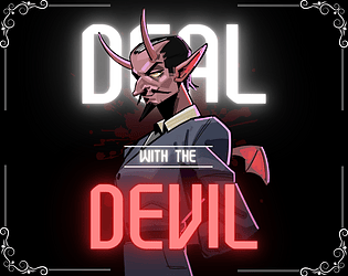
Play Deal with the Devil
Deal with the Devil's itch.io pageResults
| Criteria | Rank | Score* | Raw Score |
| ART / VISUALS | #32 | 4.118 | 4.118 |
| USE OF THEME | #61 | 3.412 | 3.412 |
| BOSS DESIGN | #85 | 3.255 | 3.255 |
| Overall | #93 | 3.222 | 3.222 |
| FUN | #118 | 3.020 | 3.020 |
| SOUNDS / MUSIC | #144 | 2.961 | 2.961 |
| CONTROLS | #206 | 2.569 | 2.569 |
Ranked from 51 ratings. Score is adjusted from raw score by the median number of ratings per game in the jam.
Game's take on the theme
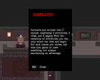
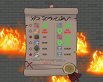
You control a guy who made pacts with demons, exchanging your atributes, items and magic with they to take advantage on battle.
Did your team create the vast majority of art and music during the game jam?
Yes
Did your game use PlusMusic?
No
Did your game use Playroom?
No
Did your game use generative AI art?
No
Leave a comment
Log in with itch.io to leave a comment.




Comments
Good job! Will come and play it more thoroughly, trying to get through a basic test run and at least give it a try! Trying to get to everyone I can!
3.75/5 best of luck!
we lost the majority of our jam ratings if you have a chance to re-save and or re-rate I am making sure to re-rate and review your game a 2nd/3rd time and make sure I gave yours a solid review and or rating! Thanks and sorry for the inconvenience if you read this in time!
Team Dreamysteria!
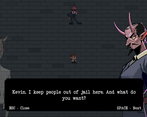
We had a similar contract positive and negative system, i really like how you handle yours, great implementation of the theme! (that devil portrait is really well drawn i just wanted to point that out). I would no doubt play more if you build it out further!
I really like the way teh exchange mechanic was implemented. There were some fights that felt way too tough and then I’d pick the right combination of abilities in the contract (usually the muse) and the fight would get a lot easier, which felt good.
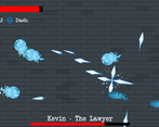
I also liked that some of the choices gave the bosses new attacks. I especially liked the ‘spin’ attack for the 3rd boss with some of the contract options.
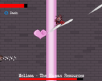
Does the dash give iframes? I wasn’t able to avoid the heart attack on the 3rd boss with the dash; I had to just run away, which made me wonder if I’d been misinterpreting the dash.
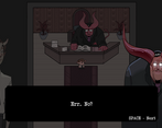
I liked the visual novel-style dialogue in-between too! I got the ‘leave’ ending, it was cool that there was a choice there. Nice job!
Thanks for the review:)
I'm glad you were able to enjoy our game. Currently, dash is just a movement ability. The GHOST item grants immunity to damage for a time. About the endings, there are 4 of them.
its fun, love the storytelling too. bosses is balanced with the exchange. character movement is the only issue i have with this game it slides when i don't want to slide away
Thanks for your review!
Yes, we wanted to have time to polish the move, but it's only on the web version. The download version is much more optimized
Nice job! I love the visuals, only the character movement needs a little more polish, but everything else is really good.
Thanks for the feedback! The movement is slippery only in the web version. We didn't have time to fix it. The download version is much more optimized.
Great game, maybe making so you need to choose a buff/debuff because in the third boss I felt it was esier to just dont pick any, I like how the bosses also get their stats modified and even new attacks, good job!
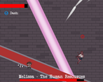
Thanks for your feedback! Yes, we want to change that, but they were things that we would have to tinker with a lot of code to fix (we only have one programmer), but even without the pact, a lot of people took a while to move on from Melissa. You're a gamer yourself.
This game was really nice. I liked the vibe it gave and the contract system was a really nice twist. The bosses had a lot of fun patern but the controls made it hard to dodge sometimes. My problem with the controls is that it feels like the character is moving on a grid. But I have to applaud the look of the game, it has a really charming art style and the music is on point.
Thanks for the feedback :)
We were unable to take care of many details, such as the movement in the web version. The controls are better in the download version.
Loved the story and the gameplay was very fun. I think the vfx could be slightly better to show certain effects, but I loved the gameplay and look of the game.
Thank you so much for the feedback!
Yes, we wish we had paid more attention to some details, but time didn't allow us to do that. But many things, like moving, are better in the download version
Good vibes all round
Thanks for your feedback :)
Very nice visuals, glad to see another character and arena based bullet hell around.
The writing was nice.
The controls felt a bit stiff, and the contracts were a bit confusing when it first popped up, but it's a very nice system that incorporates a lot of mechanical design. Player determined difficulty, build options, and the jam theme, to say the least.
It would have been nice to get some short descriptions on the contract on some of the less obvious items.
Thanks for the feedback :) The tutorial is the papers in the starting lobby. We haven't been able to implement this more visibly in time, but it's something we want to change. Regarding the commands, they are kind of weird only in the web version. The download version is much more optimized
The Devil is a hard being to meet with, many exchanges keep things fresh, and bureaucracy is truly hell. Nice consistent art theme here!
Thanks for the feedback. Yes, the final boss is someone with a full schedule. We try to keep the game consistent more without making it too easy or difficult. It all depends on the pact you choose. Apart from that, each boss has a checkpoint, so it doesn't get massive if you ever die
I like the story, I love the visuals, I love the design of the game. The only missing thing is some sound effects.
Thanks for creating it !
Thanks for your feedback :D Yes, there are a lot of things we want to implement and change in this project yet. Sound effects are one of them.
The gameplay are nice, and I like how you can choose your abilities like a contracts and buff or nerf both you and the boss. The visual looks cool and the music are nice too. The control is a bit slippery but its fine. The last last sequence is also interesting.
Overall, nice game!
Thanks for the feedback, Pete (the janitor) just dropped some soap on the floor which made it slippery, I'm happy that you liked it.
i really like the concept for the exchange mechanic, but i think there is a little bit of a balancing issue, you can basically just pick ice or wind, and it becomes really easy because you can just spam it at the boss. but other than that i really enjoyed the game and i love the art! i also really like the dialog, especially with the devil, i re tried the game a few times to get the different endings!
I'm glad you liked it, I think you just made some good pacts, the game should be easy if you make the right decisions and difficult if you make the wrong ones, it's a good replay factor if you want to beat a boss with more challenge
Great visuals and consistent style/theme! Lots of content for a game jam, great job
Glad you think positive points. Thank you so much for the feedback!
This game is really cool. I love the art and the controls. I also liked your take on the theme. It looks like it took a lot of work to make. Good Job.
Thank you very much :) The controls on the web version are kind of soapy, in case you've had any problems. Glad you liked our project!
Great art style and an excellent interpretation of the exchange theme! I completely missed the notes on my first attempt, so was pretty perplexed by the contract at the start of the battle, though. And the ability to hold down the mouse button to continuous-fire would be greatly appreciated. But overall, great work!
Thanks for the feedback, yes a much more intrusive tutorial could be better, seeing how other games approach the tutorial, more polish on the mouse buttons would be great.
The art is really well done and implemented. The story is charming and I think the implementation of the exchange mechanics has potential with avoiding frustration when retrying a boss fight over and over. That said the bosses are really spongy without changing much about their attack patters (which are interesting BTW) over time. The controls in the overwold are floaty and make moving a little frustrating. I feel that must be a better way to communicate the information than in notes, for instance on the exchange window (where I actually need that info).Overall I feel this is really well done and with a few tweaks it will be ready for prime time as a commercial product. Waiting for your next game, cheers!
Thank you so much for your feedback :) The tutorial pages, we tried to make something less intrusive, but we couldn't implement it in time to make it more visible. We had this problem in the secretariat's dialogues (where if you lose or win a fight, she says something different every time) and something to signal that there are multiple endings (the game has 4 endings, which change according to what you answer). About the move, it's something from the web build, the download version is much more polished.
Really really good art, boss patterns were cool. The controls felt a little slippery to me. Often I would keep moving for a moment after letting go of a direction, made it difficult to precisely dodge attacks. But I had fun, thanks for making!
Pete (the janitor) dropped some soap, sorry for that, happy that you enjoy it
I'm the developer and I think I've done a good job