Play game
Echelons of Loss's itch.io pageResults
| Criteria | Rank | Score* | Raw Score |
| Graphics | #403 | 2.963 | 2.963 |
| Game Design | #442 | 2.741 | 2.741 |
| Innovation | #489 | 2.444 | 2.444 |
| Fun | #513 | 2.444 | 2.444 |
| Theme | #516 | 2.778 | 2.778 |
| Overall | #556 | 2.451 | 2.451 |
| Audio | #749 | 1.333 | 1.333 |
Ranked from 27 ratings. Score is adjusted from raw score by the median number of ratings per game in the jam.
How does your game fit the theme?
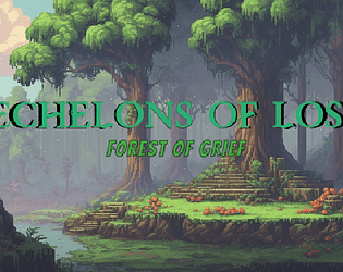
Echelons of Loss is about player "diving deeper" into the stages of grief. "Diving deeper into grief" can be interpreted metaphorically, much like diving deeper into an emotional journey.
Did you write all the code and made all the assets from scratch?
No, assets are from Ninja Adventure - Asset Pack by pixel-boy
and Mystic Woods - 16x16 Pixel Art Asset Pack by Game Endeavor. and the base game was from following the rpg tutorial from Chris' Tutorials
Leave a comment
Log in with itch.io to leave a comment.


Comments
Very interesting game concept, with a really great starting idea (I liked a lot the concept of "forest of grief") but for now a bit too simple. I understood the theme, but it doesn't really fit an action rpg as this in my opinion. If the enemies or challenges could be more "psychological" I think that would align more with the game's vision. The graphics are fine, but sometimes they feel a bit detached from the experience. A style personal to this game would make the difference in my opinion! Obviously a soundtrack would be great too (I understand if you didn't have time to make one for this tho), maybe theming itself around the stage of grief as the player reaches the next level. The concept of the game itself is very interesting, but it's implemented in a way that it blends with other rpgs that have nothing to do about it. Overall, nice job on the idea, the game has potential! :D
Thanks for checking the game out and sharing your feedbacks!
I agree that the game is too simple, I greatly underestimated the workload of building the game.
I guess I should start creating my own asset for practise, so I could better fit the whole theme/game.
The challenges had meaning behind them, but I couldn't think of a better way to express/showcase them. Would try out building more games, so I can have more ideas next time
Thanks!
Hello! It was great to try "Echoes of Loss." It's a really nice debut for a first entry, so congrats on that. If you're open to feedback, here are some suggestions:
- I'd love to see the visuals align more with the theme as I progress through the stages of grief. I've heard that the assets are from a pack, but I still encourage you to experiment with color palettes and background storytelling.
- The character movement feels a bit odd; it gets stuck when colliding with walls, and the last section makes the character much faster. I recommend checking out some YouTube tutorials on how to address these issues. There are plenty of helpful ones available.
- Adding some sound and music could make a significant difference. You might want to take a look at Brackeys' Bosca Ceoil tutorial. It's straightforward, and you can create something quickly.
Overall, it's a really promising submission, and I look forward to seeing more from you in the future!
Thanks for taking time to play and sharing your feedback. Feedbacks are always welcomed and I am very thankful for them.
Will try to work on the visuals more in the future, but I am very bad with that, so I decided to go with an asset pack. Will look into how I can make it better in the future.
The character movement has collision issue which I am can't figure out in time, will spend some time to figure it out, thanks for pointing it out. The movement speed for the last section was on purpose, as the map is a lot bigger than the previous 2 stages, I didn't want people to spend too much time wandering around, so I increased the movement speed, hope it didn't affect gameplay too much.
Will check out the tutorial and definitely will be continuing to make games, looking forward to the next game jam! Cheers!
I wish it had sounds , but good job either way on putting together this little game.
Yes, me too, I wish I had just taken the time to add in some background music and some sound effects. Anyways, thanks for checking out the time and hope you enjoyed it!
Nice idea for the theme, but I agree with the comments of others: you could make the story a bit more clear to emphasize the theme better.
The pace of the movement speed was really good. (I don’t like moving slow through games :) ). As for the combat, I would make it that you can also attack up or down besides only sideways.
Good job in finishing something for this game jam :] Good luck with future games!
Thanks for trying out the game and sharing your feedback! Yes, I agree that the story wasn't enough to enphasize the theme, will work on this next time.
Up/down attack were planned, but there were too much that are not done, so I decided against spending time on it. I do feel giving the 4 direction will make the game a lot better and intuitive. So will try to include this next time. Cheers!
I definitely like 3rd person adventure games, that was nice. As said before it could be a bit more challenging, but movement and all was very good.
Just to warn you, since the slime creature divide endlessly before getting the sword, I ended up creating probably 100 or so entities.. Which can cause some amount of game lag.
Nice job for a game done in a week.
Thanks for playing and sharing your thoughts! I was still unsure about whether to make it more challenging or to focus on the story, but at the end, both side were only half done. Definitely, will have to do better time management next time.
Yes, the infinite slime bug, I wanted to add a cap, but totally forgotten about it. Will look out for such lag causing bug and fix it early next time. Thanks!
Id like the idea, but i think you can improve a lot of things.
The enemies speed is so slow so they r not a threat to the player, and when you take the sword it will be great as a new visual effect to see the difference between.
I like the level design as a first game its a good entry!
Thanks for checking out the game and sharing feedbacks.
I decided to reduce the enemy speed to give the game a slower pace, but I do agree it can be more challenging, maybe with varying speed of different slimes.
New visual effect would be such a good addition. I can't draw though, but I do plan to start trying and learning. Thanks!
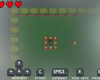
Really creative idea for the theme, although im not entirely sure how it was executed here. but the fog mechanic is really cool, and like LowQualityRobin said, it'd be sick to see it used more in the game :)
Thanks for taking time to review and rating the game! The idea was to dive deeper into different stages of grief, idea was to create a metaphorical representation of the grief process (Feeling confused/anger/lost, etc). But I agree that I didn't executed it properly, thanks for bringing it up. Will continue to work on it and improve, cheers!
I really like the fog mechanic and appreciate the effort you put into finding a creative interpretation of the theme (which is more than I can say for myself). I kinda wish the game focused more on the fog mechanic, since it's something I haven't seen any top-down adventure game do before.
Also, the asset you used for the fog looks like a noise shader, I don't know much about unity's shader system (godot dev here), but there's got to be a way to have it move and overlap with other shaders which would make the effect look really cool.
Thanks for checking out the game and sharing your thoughts! I decided to try out different mechanics for each stage to explore more as it's my first time making a game. Will try to make each stage longer next time.
As the the fog shader, I followed some shader graph tutorials but it was not support for WebGL, so had to do a last minute attempt to re-create the fog. I will explore more features and maybe try out godot in the future. Thanks!
If you try godot, I strongly recommend this tutorial. It alone is what allowed me to participate in the last GMTK game jam after only a week of using the engine.
Also I'll have to look into WebGL's issues with shaders, since that might be an issue for my own projects, so thanks for the warning.
Great work on your first game by the way!
Hi, from the start I knew I didn't like this top-down view game. It's not my thing but that's very personal so didn't gave any minus points for my own genre likings. Back to the game itself... I like the deeper meaning you tried to ut into the game. Not easy to do and didn't see any jam game here yet like this so great innovation points! Great work on creating this in a week.
Thanks for giving it a shot, even though it's not your genre of game. I tried to add some meaning into the game, but didn't have time to polish them. Glad that you liked it. Cheers!
The ventures through the hollows!
Things I enjoyed ✔️
Things I would like to possibly see with your title. 🤷♂️
Overall 📓
Great work on this game! I can tell you put a lot of work in it! If you polish it up a bit I can easily see this game getting lots of downloads! Great work!
Thank you for taking time to review and rating the game! Thanks for all the feedback, will try to include them all in my next game!
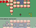
For a first game, it is nice to see hint messages. Movement and combat work well without a bug. I liked the idea of emotional journey. Good job!
Thanks for checking out the game and sharing your thoughts! Glad to know the hint were helpful and not spoiling the gameplay. Thanks!
Good attempt for a first game. From what I can tell, you seems to know what you lack and where you need to improve from the other comments. I think you should focus on polishing what mechanics you want to focus on for future game first. Good luck on your game dev journey
Thanks for playing and sharing your thoughts. Everyone gave very constructive feedbacks, so I plan to really try and improve on my next game. Thanks for the suggestion, will give it a try in my next game! :)
For your first game this is really really good. I like that you even made a few things like e.g. the tree interactable and added some hints. Also the story is nice.
Wished there would be some sound. It's often a simple but effective little addition that increases the whole experience a lot, just as a little tip for future projects.
All in all a short but fun one. Good job, and definitely keep coding :-)
Thanks for taking time to play and writing a feedback. Hope the hints were helpful throughout the gameplay, didn't had any time to get others to do a play test, so I tried to include more hints to help progress.
Yes, leaving sounds to the end seem like a bad idea. Will definitely work on them early in the future.
Will continue to keep creating games and joining game jams. Cheers :)
Love the idea, the game feels very nostalgic.
Thanks for playing! I was going for the nostalgic games that I played in the past, glad you like it.
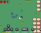
Well done for your first game! Liked the design of the slimes. Being creative with the monsters is always a good idea!
Thanks for taking time out to play and sharing your thoughts. Haha yes, I am quite proud of the slime as well, good to know others liked it too :)
Good idea for a game. bright and interesting)
Thanks for taking time to play and rating it. Cheers!
For your first game, it turned out great! You managed to get animations working well, a tilemap in place and some well placed interactions between entities.
However, and other people probably have pointed this out, there are some things to consider:
- Adding some music and sound effects to the game
- Enabling player to attack in all 4 directions
- The fog needed some work with animation and texture, but the idea is still there
- A more concise story with level building that works with it to bring a cool experience
Nonetheless, great work!
Thanks for taking time to review and leaving a feedback. I definitely have a lot to improve on, will take everyone's feedback into consideration in the future, cheers!
Not that bad, although the game doesn't really feel like it had a direction it wanted to go as it felt like a little bit of a story game, some action elements, and some exploring.
Thanks for trying the game out and the feedback! Will try to decide and expand more on a direction of the game in the future, thanks
Could be fun, but is lacking a lot of things, there's no sound or music, so it feels really empty, you can't attack up and down which is annoying, there's no knockback and camera shake when attacking so it feels really shallow and then I have many problems with the graphics: the just appear, there's no spawning animation, grass and sky have no texture and look really bland, the fog at the start has no animation and looks static, it just cuts off when it gets near the player and looks weird, you should add some blur there, the reading text panel looks weird when it's just a transparent color, maybe it could be a pixel art sign or something, and the tutorial button thingys, have different pixel scale to everything else, so they look weird.
Thanks for taking the time to play and giving your feedback! Yep, I totally forgot about sound or music which is a huge mistake on my part. I will take note on the other feedbacks on camera, graphics and pixel scale in the future, thanks!
Lovely game. I feel I played the game too quick.
One thing I would like to suggest, is to make the different levels represent the stage of grief you experiencing. For example, Depression would be a dark mysterious setting. I think that would be a nice touch. However, for saying it's your first time its a great start and lovely concept keep up the good work. 👍
thanks for taking your time to try it out and the feedback! Will make gameplay longer in the future and try to implement your suggestions, thanks a lot!