Play game
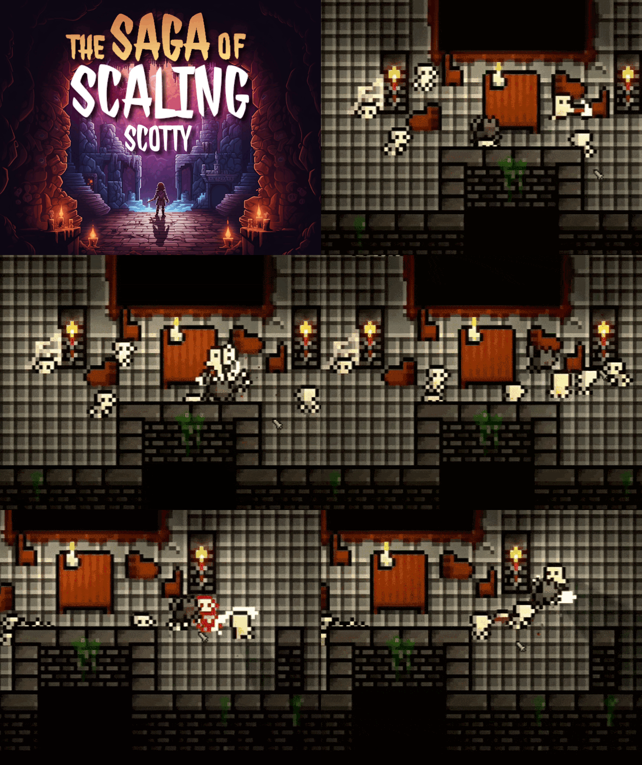
The Saga of Scaling Scotty's itch.io pageResults
| Criteria | Rank | Score* | Raw Score |
| Overall | #49 | 3.774 | 3.774 |
| Gameplay | #54 | 3.631 | 3.631 |
| Theme interpretation | #83 | 3.774 | 3.774 |
| Graphics | #85 | 3.750 | 3.750 |
| Innovation | #169 | 3.024 | 3.024 |
| Audio | #174 | 3.071 | 3.071 |
Ranked from 84 ratings. Score is adjusted from raw score by the median number of ratings per game in the jam.
GitHub repository URL
https://github.com/TheMerphin/GameOff2023
Leave a comment
Log in with itch.io to leave a comment.


Comments
Good Job!
It's a really nice game, very completely.
My only critique is that the hotbox on the sword should match the visuals. But really fun overall and a great game!
Great graphics, unique mechanics. The lighting effects were very cool. Combat didn't feel great. I wish the cool down on changing size was shorter. Overall very well done.
I liked the look and take on the theme. I wish combat had a bit more oomph, but overall, great job.
The atmosphere is good. I think the scene can be darker. It is too easy to just run through most enemies and reach next room. A darker scene would make that much more difficult.
The combat is not rewarding enough, adding hit pause and knock back on hit would improve the combat feeling. It would be nice if enemies drop some potions or other stuffs.
The third weapon is a little weird. Feels like it hit twice but only hit only once. I think it would be better to make the prepare attack animation less impactful.
Thanks for the great feedback! We'll definitely take yours into consideration when continueing the project!
Such a great looking game! The level of polish you were able to achieve in only one month is inspiring and impressive. I like the way you incorporated the theme as well. Nicely done!
Very lovely!
I agree with the others that F feels a little awkward as an "interact" key. For me E would be a little more natural.
I really like this type of games, and I can say it's a lot of fun. The controls feel very good, and the simple pixel art aesthetic suits it perfectly. A very good game ^^
Very smooth, great pixel work. Fun SFX too! Would love to see it where the enemies activate the trap doors as well so I can watch those lil skeletons fall into lava for once instead of me!
LOVE the graphics. Movement is smooth, and SFX are great (the game over laugh is A++). The scale mechanic is cool, and I especially like the tiny guy lol. Everything was pretty intuitive.
Overall, incredible entry!
Wish List:
Combat is a little unforgiving (for me). It's difficult to position for successful hits. Perhaps if the hit check was a smidge larger :)
The choice of "F" key is odd... Typically "E" is the "do stuff" key.
It felt quiet. Even some simple/subtle BGM would have made it less so.
really like the dungeon style , and the mechanic :)
I made it to the end! The slime piles almost killed me because they all spawn on top of each other so they can eat a large chunk of your health bar. Added player and enemy knockback would be a really nice feature. If you are smaller enemies send you flying and vice versa. Neat mechanics and visuals where nice. Sound effects for enemies/player getting hit would be nice. Good work!
Yo the game has a good base and so much potential. Good job!
Nice game, very cool. Congrats.
a fun game with cool level design! i think it would have been interesting if you couldn't see into rooms unless you opened the doors (since i just skipped some that clearly only had enemies), but that's really my only note. really well done!
Glad you enjoyed it! Actually, that was one thing we would have loved to add, but there was simply no time left to do that :/ but definitely in a future update! :D
I really liked your game! Very fun to play! Also I like to think that you recorded some of the sfx yourself
5 stars! You nailed everything on the head here. Great game
a well made dungeon crawler. the combat can use a bit more feedback but thats my only complain
A good, quite difficult game, I liked your interpretation of the theme! Dungeons are fun to explore :) From what was not mentioned here: the description of items is difficult to read due to the size of the text
My first impression was that the banner for this is NUTS. then I got into the game and found that the whole art direction in general was absolutely incredible. Big thumbs up to your artist; they have absolutely NAILED the retro side as well as the itch.io assets!
Unfortunately, when I first got to the scaling part of the tutorial & scaled myself down, I was able to clip through the walls & couldn't get back in (see gif). Annoyingly, it doesn't happen all of the time, so I'm not exactly sure how reproducible that is.
I'll be coming back to this one later in the game to give it more of a playthrough; but I'm really impressed with what I've seen so far!
Glad that you enjoyed it (so far) :D
Also, thanks for the feedback! The scaling part can actually lead to unwanted behaviour of the collision/hitbox, but when testing it we didn't encounter that kind of problem. Anyway I hope that this does not happen in your future playthrough :)
We had a very similar issue in our game (spoiler: you have to scale yourself up/down in a later level). Changing an object's scale messes with the physics engine - ours in Godot, but I remember having a very similar issue with Unity. Animating/tweening the shape of the actual collider rather than the scale of the game object usually makes it behave a little more reasonably!
Will reply once I've had a chance to have a 2nd playthrough :)
Thats actually a good advice, scaling the sprite separately from the collider, in a different manner. Thanks! Also, I wonder, since it seems you've worked with both engines, what's the reason you switched? to godot? Or which engine do you like better, unity or godot?
Worked with Unity for a year, switched to Godot recently because of all the Unity drama.
Godot is much less mature than Unity. That comes with it's own limitations - but also means it is much more streamlined than Unity. I was shocked at how straightforward Godot was compared to Unity in so many aspects - animating, input handling, UI design, particles, etc etc etc. just feel SO much more intuitive than Unity.
I could go on a very extensive list of all the pros and cons switching from Unity to Godot - for me personally, that list has more pros than cons. I wouldn't recommend it for any studio that wants to created polished, triple-A, 3D games (though it is certainly capable of 3D, Unreal just handles this so much better). But outside of that, I would highly recommend at least giving it a go and seeing how you feel about it! :)