Play game
The Saga of Scaling Scotty's itch.io pageResults
| Criteria | Rank | Score* | Raw Score |
| Overall | #49 | 3.774 | 3.774 |
| Gameplay | #54 | 3.631 | 3.631 |
| Theme interpretation | #83 | 3.774 | 3.774 |
| Graphics | #85 | 3.750 | 3.750 |
| Innovation | #169 | 3.024 | 3.024 |
| Audio | #174 | 3.071 | 3.071 |
Ranked from 84 ratings. Score is adjusted from raw score by the median number of ratings per game in the jam.
GitHub repository URL
https://github.com/TheMerphin/GameOff2023
Leave a comment
Log in with itch.io to leave a comment.


Comments
Wow! What a polished and fun time. Very ambitious and fun to play.
I don't have much in the way of the feedback but if you wanted to take the idea further some ranged weapons and other ways to interact with enemies could add a lot of depth.
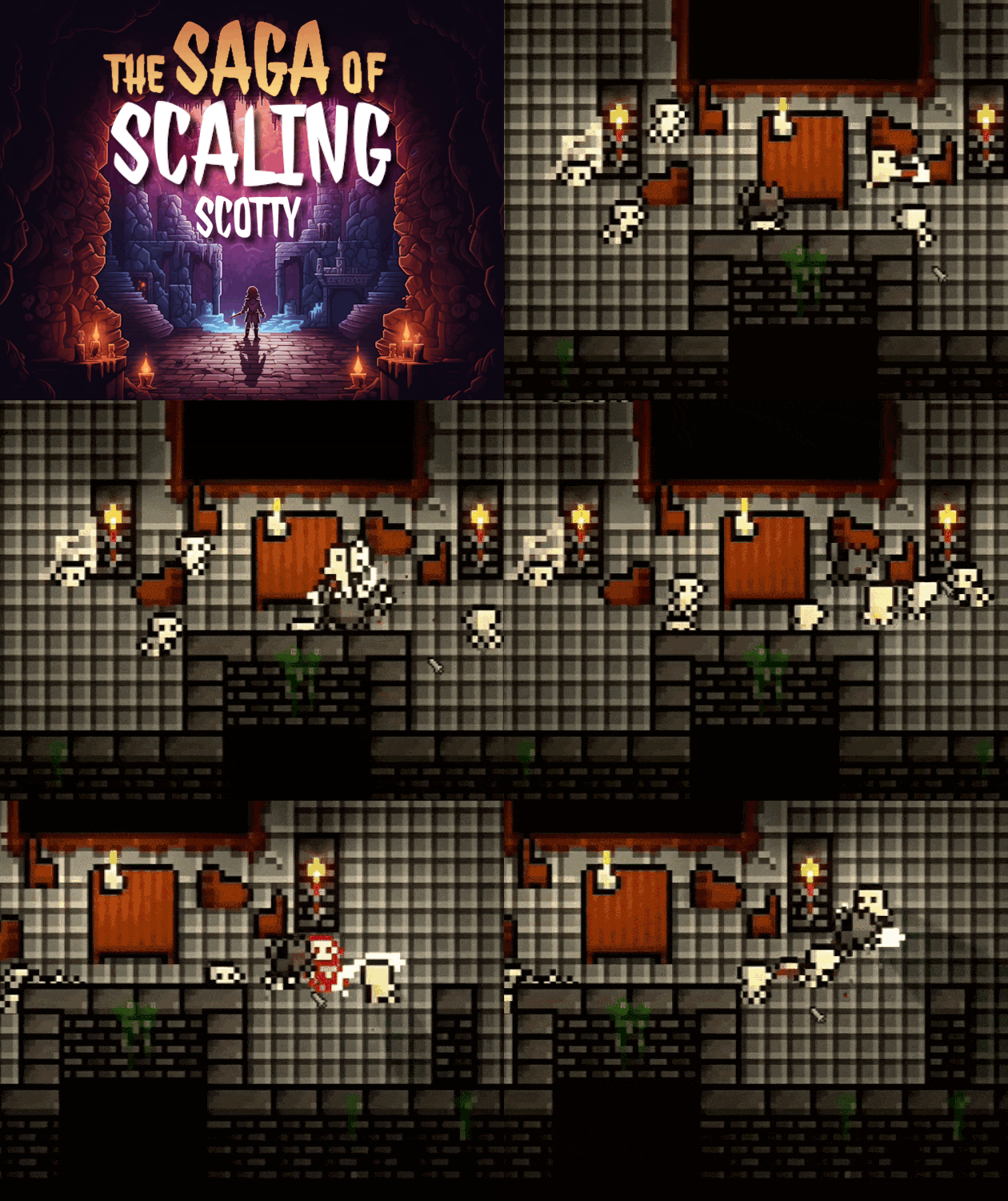
Love your art and the minimalist character design. It took me a little bit to realize that the weapons have a windup before they swing, but I rather liked the windup once I noticed it.
Awesome job!
Thanks for your kind words, glad you enjoyed it :)
Very fun! I really appreciate the variety of weapons, enemies, traps and room layouts. It means you have to adapt and can't use the same strategy everywhere. The game also looks very polished, and it has a very detailed tutorial which explains all of the mechanics.
I think I would enjoy the game even more if there were some special abilities to spice up combat but that's just asking for more content. 😁There's nothing in the game to fix, just to expand it.
Great job! Good luck with your future projects!
Nice. I am a sucker for pixel art so the art style alone bought me in.
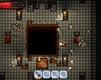
Gameplay wise, it was good. I don't understand what the other 2 slots were for, I am guessing for future items. There should also be some sort of knockback and some other feedback when you hit enemies and when you yourself get hit.
And lastly, it was short. I wanted to play more
We definitely agree with you! Combat is a major thing we'll work on in a future update. And yes, you're right, we build a broad foundation which includes range weapons and special skills. There was just not enough time to integrate them :/ Thanks for playing anyway!
What a great game! This is one of the few that I would actually enjoy playing in my free time. To keep it simple, I'll say I pretty much loved everything, except these little issues: combat was slightly difficult, but not in a hard way, more just awkward to get any attacks in without getting hurt, and it's a very small details but it would feel 10x smoother to have the action button (F) instead be E, having so many used keystrokes all in a line was a bit hand awkward, and shrink being ctrl was also a bit uncomfortable (I'm on Mac, so that could also have made it worse). Buuut those are pointed out because the game itself was a joy to play, well done!
ALSO, thanks for the tutorial tips! So many games here would have been much more enjoyable if they just had some kind of tutorial, so hurrah to you!
Thank you so much for the great feedback, much appreciated :) we'll definitely keep working on it so make sure to follow to not miss out on any updates :)
Diabolical plan! Wahahahahaha…
I like the startscreen art and the maintheme (music) but i'm missing music during gameplay and I got "stuck" with the key system. I got the pinkish and gold key. I used one to open the left bot door and the second one I could not open with other key. Maybe I did something wrong. I did not play the tutorial and therefore I had no idea what the shrinking does or how it aids you.
Still fun to play tbh :)
Thanks for playing! Maybe you should've played the tutorial then :D because it explains the most important features thus how to progress. You should have scaled yourself down to move to a crack in the wall at the upper room in order to open a chest with the blueish key, of with you would get the last key needed to progress :) you can also watch the youtube playthrough in case you wanna see what would've come next. Anyhow, glad that you enjoyed it nonetheless!
Great atmosphere in the game!
I faced a problem while Moving Up and using Ctrl to Scale Down—the game would unexpectedly close. This happened because Ctrl+W is a shortcut for closing the current window.
Luckily, it happened during the tutorial, so I learned to avoid this key combination in further gameplay.
Well done on the scaling mechanics-related gameplay!
i definitely agree! When testing it in unity this wasn't a problem at all. We noticed this the hard way when it was published as web build :D thanks for the feedback, glad you enjoyed it!
Wow this game was great! The way you included the shrinking and growing for the theme reminded me of the minish cap. Also I really like your credits section. You did a great job documenting it! Good job!
This game was so much fun. One of those games I could play for a long time. I really like the hints and tips and tutorial elements as I found I could just enjoy the game without trying to remember any unusual controls. Lots of great attention to detail with the art and environment too. I had trouble maximising the game screen but I think it might just be my browser issue perhaps (Firefox). Oh and I thought the interpretation and integration of the theme into game play was v clever. Well done!
Glad that you enjoyed it! Also, thanks for the great feedback :)
Awesome little game! Really like the simple, yet effective, cohesive art and level design. It was fun to explore! The tutorial is also well-appreciated. Just a few notes:
- Text could get a bit too small sometimes.
- I wish there was some knockback when hitting enemies. I think it would add some oomph visually and it would also reward the player for well-timed hits.
- Just a thought I had while playing: It would be really cool if you could lead enemies into the same traps that can hurt you. I think it would be a nice option to reward clever players and perhaps provide a way to get out of a sticky situation.
All that said, I really enjoyed it! It's a great start, awesome jam entry, and I'd love to see this continued and added to. Great work!
We're happy to hear that you enjoyed it :) Also, thanks for the extensive and great feedback, appreciate it! And I also definitely agree with all of your points, we spent a long time building the base so that when we assembled everything in a first level we've come to notice to late that things like combat can definitely be improved! But we're eager to implement all feedback you guys mentioned and add a few more levels! :)
This game is mad. I think you just have to give the player freedom to change the key/button because as a player without a mouse, I am struggling :)
I like it, I think the mechanics for growing & shrinking are a cool addition to a dungeon crawler! One small bit of feedback - it would be nice if there was hitstop & screenshake effects, both for hitting enemies and for getting hit. It would help make the combat a bit more polished!
Thanks for the great feedback! I definitely agree with you :)
It was great! Sometimes, I didn't hit enemies even when I should (if we consider how the attack sprite looks). But that's the only "bad" thing I noticed
Congrats :)
Awesome graphics and a very fun game, nice job!!
For a Top-Down game I like the Rogue Atmostphere a lot.
We really enjoyed the game. The sound efects are great and the art stile is so cute, we love it
Great tutorial, nice unique weapon anims for each weapon type, and loved the detail of those fantastic portraits on the walls. The masterstroke of the scaling mechanic being both useful for combat and for navigating those pesky traps is a great foundation for the game. Well done, I enjoyed my time with the Scaling Scotty Saga.
Honestly, this gets the a perfect score from me.
It's great fun to play, it's super polished, it looks great, it sounds great, it feels great.
And I love your interpretation of the theme as it makes a ton of sense in this game and it's actually a fun mechanic.
And it seems to have like 20x the scope of my game, which is impressive
(Although, admittedly, I am proud of my insane fun to scope ratio! :D)
I would like the combat to have a bit more feedback / juice.
Thank you! It's great to hear that you enjoyed your time :) also thanks for the great feedback, I definitely agree with you!
Very lovely art style :) I love wandering into these dungeon :)
This is fun! Lovely art style, polished gameplay and hits the theme just right! I'd love to feel a little more of a 'kick' when hits land and some background music would be nice, but outside of that it's really, really good. Would love to see it grow further!