Play game
Death is just the beginning... for those left behind's itch.io pageResults
| Criteria | Rank | Score* | Raw Score |
| Story | #9 | 4.282 | 4.282 |
| Theme | #16 | 4.295 | 4.295 |
| Music | #36 | 3.962 | 3.962 |
| Aesthetics | #107 | 4.000 | 4.000 |
| Mechanics | #229 | 3.308 | 3.308 |
| Sound | #237 | 3.051 | 3.051 |
| Fun | #439 | 2.782 | 2.782 |
Ranked from 78 ratings. Score is adjusted from raw score by the median number of ratings per game in the jam.
How many people worked on this game total?
1
Did you use any existing assets? If so, list them below.
Music from opengameart.org and HR Utilities (made by me)
Link to your source?
https://github.com/NancyJames/deathisjustthebeginning
Leave a comment
Log in with itch.io to leave a comment.



Comments
Thank you for sharing your experience. It must've been hard but releasing it out than keeping it bottled inside is way healthier and better. I hope that doing this project has helped you in some way. I'm sorry for your loss.
Wow that was really deep. Sorry for your loss. This game was very unique and a big twist on the theme and I enjoyed that. Thanks
I'm sorry for your loss! Really great work, with deep meaning and gameplay/mechanics the makes the player feel exactly how you intended. I wish you the best and keep on the good work! :)
This was something... You were able to simulate human feelings in such a touching way. No one should have to live that, but I hope you will feel "better" soon... Take care
This was something... You were able to simulate human feelings in such a touching way. No one should have to live that, but I hope you will feel "better" soon... Take care
Thats deep, shared a tear at the end. I am sorry for your loss. I hope you get to the final stage! Be well.
This game is special. I am sorry, mate. Really. Also this game reminded me to spend more time with still-alive ones.
This game hit very close to home. I think you executed the concept and emotional journey beautifully. Thank you for making this experience. Playing this was an intensely personal and validating experience. Thank you for this.
I just gave you a very high rating I want to see this game do well.
Not in fun though, because of course it is not.
My wife's sister died of lung cancer recently.
Every time I hear the door open for my wife to smoke my heart breaks a little more.
I don't want to be alone either.
Thank you.
I'm so sorry for your loss. I totally understand that feeling. My OH parties and drinks like he's 30 years younger than he is and my parents are in their 70s.
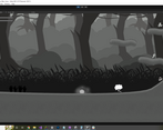
Wow. It's a game of a different kind. The valleys of despair feel very real and and the slog out of it is very well implemented. The mechanic to fall back when you hit a thinking bubble is also very good. I think it hits the feeling of not wanting to think not wanting to hear that could remind you.
Thanks so much for making and submitting this game. I will definitely play it longer in the next days.
I am also sorry to hear about the journey that led you to making a game like this. However, you game definitely bring out the emotions you were aiming for. This is game is very mood and atmospheric. You hit the nail on the mark for what you were going for. Good Job on the Game Jam entry.
I am sorry that you went through what inspired this game.
The game itself is pretty good and definitely insteresting and very much gives the player something to think about, but I think sometimes the mechanics are not clear enough, which takes away from the reflection on the topic and just adds a small layer of frustration at obtuse mechanics. In a similar way, I would probably make the UI a bit more visible and clear.
Wow that's a good concept! Loved it. Maybe the game is a little slow, but well done in any case!
It's sad that this game needs to exist but I'm glad to have played it. It's well made and feels very real. I hope that with this game you have managed express some of your feelings in a form that others can understand and that the process has also been healing for yourself, in some extent at least. All the best to you in the future.
I have listed below some comments about the game, mostly from game design perspective. If some of by suggestions goes against your vision you don't worry about them. These are just my thoughts after all:
Overall: very strong theme and narrative with clever use of game mechanics to deliver the message.
Thank you for such a detailed review!
I had wanted to tweak the physics but that would have meant rebalancing all the levels and I didn't have time for that.
You're the second person to mention not being able to move horizontally after jumping, that's not been my experience of how jumping usually works but admittedly I don't play a lot of platform games because I'm rubbish at them, maybe that's where I'm going wrong! After you mentioned it, I tried it in your game (haven't tried it in any of the other platformers yet) but that was really difficult for me to get the hang of, I found myself using both the arrows keys and WSAD! Just seen you can do it in Tilevania too. Huh.
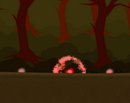
The end of acceptance was definitely not supposed to represent suicide. Originally the "character" was supposed to be surrounded in glowy balls that floated around but there wasn't time.
I do agree that the first level is a real slog, when you've played something a hundred times its hard to gauge whether its the intended level of awful for someone who is only going to play it a couple of times (and each time you start further in, I even made it so that if you ended up there a 4th time, you're basically by the exit, just in case!)
With the dropping platforms, the first one was supposed to drop you on to a platform below it, to introduce the mechanic in a "non fatal" way. I think there's only 1 that is directly over a trap.
I may relook at Regret, you were supposed to head towards the sprigs of Heather (doesn't always work as when it disappears it moves to the next waypoint in the list, regardless of where you go), I did add additional platforms after the original design to put powerups on and that might have messed up the path.
(and to answer your question, no I had not heard of the game Journey, but I will look it up). My original idea (even before this Game Jam theme was announced) was a survival game where the different emotional states were represented by different biomes but firstly there wasn't time for that and I hadn't even conceptualised how that would work when I thought of this idea)
It was really a nice gaming experience and I had fun trying it out :)
Wow, it was a sad game but a original concept! I miss more player speed and maybe maybe he could jump more often. Good work!
Good concept and theming with the different levels.
Thanks for making this and sharing something so personal with the community.
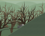
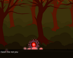
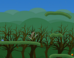
The transition from dark to light was beautiful. Maybe the movement could have been a little faster character movement. A different design could have been preferred as a character. It was nice to change the music when the atmosphere changed.
Originally it was supposed to be a person, not an abstract ball but compromises had to be made. Maybe one day I'll release a remastered version with all the features that didn't make the cut!
Really good use of narrative to drive the mechanics. The hands could be pretty hard to see, though maybe that was intentional. One thing I struggled with was the jumping, like I couldn't jump to the side without already moving in that direction. I'm not suggesting free movement in the air, but it might help to have a few frames of buffer, so if you try to press jump and move at the same time, it will read as a sideways jump even if the sideways button comes in a frame or two late. That said, really good entry and use of the theme.