Play game
Slimeventure's itch.io pageResults
| Criteria | Rank | Score* | Raw Score |
| Creativity | #3108 | 3.105 | 3.105 |
| Overall | #4288 | 2.640 | 2.640 |
| Enjoyment | #4499 | 2.395 | 2.395 |
| Style | #4874 | 2.421 | 2.421 |
Ranked from 38 ratings. Score is adjusted from raw score by the median number of ratings per game in the jam.
How does your game fit the theme?
Players can explore a world, eat and grow. This enables them to take new paths, while others might be impossible to take.
Development Time
96 hours
(Optional) Please credit all assets you've used
see description for full credits
Leave a comment
Log in with itch.io to leave a comment.


Comments
Really unique and creative movement method. I wish there was a little more explanation. You put text further on the level, but nothing at the beginning explaining how the movement worked. Movement seemed inconsistent or finicky at times. I'd love to see this polished up and made into a puzzle platformer of some kind, it has a ton of potential! Really cool!
Thank you for playing and providing us feedback! We thought about creating a whole tutorial level, and we had to keep it simple for the jam, but agreed, this would have been very helpful for people to get started. Something we can improve on for sure!
Cool gravity switching mechanics. hard to learn though
Thank you for playing and leaving a comment! Glad you enjoyed the gravity mechanic!
Very unintuitive and unwieldy controls, but the atmosphere is nice -- with some fixing, this could be very interesting and encourage really going for that other ending!
Thank you for playing and providing feedback! Glad you enjoyed the atmosphere, which was the primary goal we had. The control are quirky on purpose, but we could have done a better job at enabling people to understand them and/or make it easier to use. We will definitely consider improving it!
I reached something marked as a bonus by passing throughs walls different ways and I couldn’t eat it? Then I quit, the controls are very tedious to me, it feels slow and not so compelling, but it might just be me :/ However I kinda feel some potential with the gravity attraction thingy
Thank you for playing and providing feedback! There is a mechanic that prevents you from eating something "too big" for you. That's definitely something we could improve, enabling the player to read more easily if they can eat or not an item. You can find smaller items to eat somewhere for sure. Some items are hidden and are required to be able to eat the bonus. You might be able to find a way to go further down the level and come back, but that was not the intended path.
Gameplay was really interesting, it might have a great potential, maybe the player could have moved a little bit faster, nevertheless it was really pleasing exploring this little world :)
Thank you for playing and leaving feedback! The intention was to provide a "chill experience", we didn't want things to move too fast, but we could have added a "faster" option with shift (running). Something we'll consider for sure. Cheers!
Movement is a little bit weird to get used to. But its a nice idea and I love the simple colour palette. GG!
Thank you for playing and leaving a comment! Cheers!
I think the text should be just in one color, because it's quite hard to read during gameplay. But I had fun playing around with the mechanics as a slime. As dev said that they intended us to exploit the glitches, I just had fun without thinking about the objective at all. Kudos for giving player full creativity on solving. Tutorial page might still be needed for those who want to reach the objective more efficiently though. Good job on finishing the game! :)
Thank you for playing and the feedback!
I don’t think I fully grasped the idea behind the mechanics, and I think that hindered my enjoyment towards it a little bit. But that’s definitely a skill issue, I did like the idea and I think it has potential! If I had to be specific, maybe a tutorial level would be helpful, though of course I understand time in a game jam is quite limited. Good job with your submission!
100% a tutorial space that guides people would have been very useful considering the movement is a bit unusual. Thank you for playing and providing some insights!
Felt a little like Mario Galaxy like changing to the planets gravity. Pretty nice concept. Good job!
Yes! It definitely came up within our discussions! Thank you for playing and leaving a comment!
Love the color palette and the slimy physics !!
Thanks for playing, and for the feedback!
For the palette, we on purposed restricted ourself to 5 colors (but we ended up with around 10 haha). It's one of the first thing we did in term of art. We created the character and the rest afterwards. Glad you liked it!
The whole thing is weird and shows me brand new view of platformers. Thank you for making this game!
Glad you liked it and thanks for playing and the comment!
The movement was really interesting, it almost felt like the actual game was just trying to figure out how to move, which isn't a bad thing, cause its very satisfying once you figure it out. Good Job!
Thanks for playing and your comment! Happy that you liked it! :)
felt really nice to stretch and swing around as a slime! i went around the starting cube a full time before i understood the objective, but honestly that was really nice because the movement felt good.
Yes! We wanted it to be more of an "experience", with an exploration side just to let the player have some kind of objective. We added winning conditions at the very end to motivate some players. Glad you enjoyed it!
We really liked the movement mechanics, and the idea was pretty neat! Nice take on the theme. Keep up the good work!
Glad you liked it! Thank you!
This was really interesting, I'd be really interested in playing a more polished version! I can really see the potential of the movement mechanics and with some tweaking it could enable some really interesting game play. When I started gaining speed to slingshot myself I felt like the game wasn't quite doing what I wanted and I would start growing out from blocks at a different angle that I wanted to go so I think that would be the main thing to focus on. Great work, I had fun!
Thank you for your feedback! I agree, a more polished version would be interesting. I'll definitely see if the team is up for it! Cheers!
I liked the idea and movement mechanics but they were hard to understand. Visuals are enough for a prototype but i think they lack cohesion just so you know. Also i felt like the player is too small compared to the screen size maybe you can test making the sprite larger or zooming in the camera.
Overall a good prototype that needs some tutorials, good job!
Thank you for playing and providing feedback!
Yes i think a visual vector would definitely help understanding the movement. Though first i would try testing making the character's eyes move horizontally depending on direction of the vector and make them squash depending on strength of the vector in order the make the information more diegetic but this is more of a personal preference, also it would require a more zoomed in camera or a bigger sprite for the character to be clear. In any way keep up the good work!
A little confused initially but not for too long! Would have been awesome to have a tutorial but I get with time limits it's hard to justify. I love puzzles that allow the player to create their own solution. Good work :)
We had a small tutorial level planned initially, but we ended up cutting it indeed. I would definitely want to add something at the beginning to "ease" people in.
Thanks for playing and leaving a comment!
Not sure the elasticity always worked like it was supposed to be but I love the idea of the slingshotting. Would like to see where you take it next.
We tried a few things but the team liked it better this way compared to other solutions we tried. At the end of the day, it felt weird, different, and fun enough for us to play around with it for hours haha. Thanks for playing it and leaving a comment!
That's a curious control scheme. I spent quite a bit of time trying to get used to the "elastic" physics of it, but it's an interesting idea.
Curious control scheme indeed! We played around with a few things, and this is what we thought was interesting (even if a bit confusing at first haha). With a bit more time, we could have made a "tutorial" level to really introduce the different way to use it. I played it very differently than others in my team, but both were working. Thanks for playing!
Kind of hard to get the hang of the movement at first but it's actually very fun when you get used to it. Well, done, a little graphics update could make this even more fun!
Thanks for the feedback!
I agree on the graphics update.
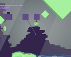
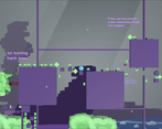
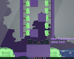
- We tried to restrict ourselves to 64x64 sprites to make sure we finished what we wanted in time for the end of the Game Jam.
- As for the "purple" and "green" boxes, the team really liked the aesthetic of it, so we kept it this way. It does look a bit weird in between the 64x64 sprites and the 3d simple models.
Feel free to let us know if you have some specific aspects you would have improved! Cheers!
Since you were asking for more specific feedback I’d say focus primarily on the movement system which can feel cranky at times but offers a unique experience and could be rendered even more fun than what it currently is. I agreee with the aestethic of green/blue cubes but if you intend to make it a primary feature of your game try to focus your visual design efforts toward it. Overall, I just want to say this was a good idea, well executed within the jam timeframe, and makes me want to try more of a similar experience! Best of luck to you