Play game
Cube Land's itch.io pageResults
| Criteria | Rank | Score* | Raw Score |
| Creativity | #567 | 3.744 | 3.744 |
| Overall | #704 | 3.581 | 3.581 |
| Presentation | #780 | 3.791 | 3.791 |
| Enjoyment | #1203 | 3.209 | 3.209 |
Ranked from 43 ratings. Score is adjusted from raw score by the median number of ratings per game in the jam.
How does your game fit the theme?
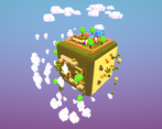
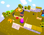
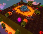
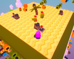
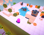
The player lives in a Die shaped world, solving puzzles on each of the Die's faces.
Did your team create the vast majority of the art during the 48 hours?
No
We used pre-existing art
Did your team create the vast majority of the music during the 48 hours?
No
We used pre-existing audio
Leave a comment
Log in with itch.io to leave a comment.



Comments
Loved the art work and vibe this game gives off !! Good work all in all for a 48 hour game jam :D
One of the best presentations so far!!! I'm amazed, wow!
Finished the game and enjoyed it a lot. Puzzles are great, fun to play. The camera felt weird as it could be controlled with the mouse but would often move by itself with no input. The colour filters over the screen made the game harder to see, I was squinting in the volcano area.
The idea is pretty cool) And how you LDesigned your game is really creative too)
But hard to understand what to do after the first level (side) and it's kinda frustrating at first.
I'm impressed this game's graphics are so impressive and high-end that it's actually making my gaming
computer[laptop from 2015] lag.What a special little game! The puzzles are interesting to solve, takes a moment to wrap your head around the whole cube-shaped world, but the satisfaction of breaking that crystal is awesome. Nicely done!
Very creativity! Nice try!
I really liked the level design! The concept is very interesting! I would say that the only problem would be the sensitivity being a bit high, but I managed! Apart from that, great game!
BEST OF LUCK:)
P.S. Check out our game too!
I really enjoy the level design and the idea of walking on the dice is amazing.
The puzzles are really cool and the art and world presentation are really nice! Especially for a 48-hour jam game!
A few people have mentioned the sensitivity as being too high, which I would agree with. The game has quite a striking look though and the movement/camera tracking you around the cube works well.
The art and music are really good and the puzzles look interesting, however I can't do them because my mouse cursor disappears when it's over the game window, and you need the mouse to interact with stuff...
still, on the visual stuff it looks reallyy good!
Hello there. Just to clarify, you don't need the mouse cursor, you just need to stand in front of the object and hold the left mouse button.
The graphics are really nice and I love the small touches like the blur effect when things get in the foreground. The gameplay is quite confusing though. It would be nice if you can tell the player what they need to do from the get go.
Thanks for the rcomment. We hade a tutorial planned, but we ran out of time.
I love the graphics and music!
However, it took me a very long time to realise what to do in the first phase and the camera was too sensitive.
Even thought it had some bugs where I accidentally made an orange pipe stuck inside a green one and unable to relocate or the fact that I somewhat there was no wall collision in one of the ice piles, I still loved the gameplay and thought-thinking puzzles!
Interesting game!
Took me a while to figure out what I am even supposed to do, but once you get it, the puzzles are interesting. It can happen though that a golden pipe gets stuck to a green pipe and then you can't move it anymore : (
Thanks for the bug report, we didn't catch that one
Really impressive given the time frame. Love the aesthetic
Looks great, the concept of the dice world comes across perfectly. I will say though that the controls were a bit funny, but that's probably to be expected with such little time. I had a concept fairly similar, and its cool to see how much more flushed out your world was than mine.
Very cool game! Like most people already said, the art and music is great, and the puzzles are nice. However, I felt like the sensitivity was a little too high, and there were some points throughout where if I tilted the camera far enough the screen would turn a dark red color.
This is a an amazing game! Manged to win.
Everything works when used as intended. It looks great. The puzzle was fun.
The player model was a odd choice.
But there was little polish. It's rather impressive to see the MVP done so succinctly.
How did you guys design and plan this game?
Thanks for the comment.
We were trying to stay on theme without being too obvious, so we wanted to do something like Mario Galaxy on a Die world. At first we were thinking that each face would be a unique environment with a unique gameplay, but it was too much to do considering the deadline. So we changed to puzzles with the same mechanic but are dependent of each other (as the other ideas was a metroidvania).
About the puzzle design, we build the levels in such a manner that the game would finish by itself in the first run and then we scrambled the movable parts around.
At first I wasn't sure what to do but the graphics and music are beautiful and kept me in the game until I understood XD