Play game
Drasilia : ad nihilum's itch.io pageResults
| Criteria | Rank | Score* | Raw Score |
| Presentation | #1 | 4.500 | 4.500 |
| Metroidvania | #3 | 4.600 | 4.600 |
| Overall | #4 | 4.075 | 4.075 |
| Design | #4 | 3.700 | 3.700 |
| Enjoyment | #6 | 3.500 | 3.500 |
Ranked from 20 ratings. Score is adjusted from raw score by the median number of ratings per game in the jam.
Engine
Godot
Team/Developer
Cubellia
External assets
Fonts: Abaddon by nathan scott, Earth Illusion and Golden Apple by Sysl, BitPotion by Joeb Rogers piacevoli by Jeti. Some SFX were made with samples from Splice. Platforming code is a heavily modified version of evpevdev's AssetLib offering.
Leave a comment
Log in with itch.io to leave a comment.


Comments
You have tons of great feedback so I'm not gonna write much. Just want to say that this is amazing artwork for a month-long competition, and I hope you continue working on the game. I look forward to playing a future release!!
Really Loved it! Artstyle was unique & very good
As everyone mentioned jump was a frustrating little thing.
Overall game was cool & totally a Metroidvania fit category game
Thanks, glad you liked it!
I love the atmosphere, and the character design. I wasn't able to get very far, but I'm interested in the creepy world. It reminds me of playing Axiom Verge.
My biggest gripe is the jump arc. There are so many ceiling spikes and spiky blob monsters. I found myself really wanting control over how high I jumped. I wanted to tap the button for a little hop, but instead the character rocketed into the ceiling, then bounced down into an enemy.
I'm planning to come back to this one when I have more time, so congratulations on a compelling opening!
Thanks for playing! I'm glad you liked the world. I'm a big fan of Axiom Verge so that's nice to hear.
The first thing I'm going to adjust post-jam probably will be the minimum jump height, a lot of people are frustrated with it.
I hope you finish it, thanks!
So, I have a few thoughts w/r/t the early parts, since I’m not clear of them yet (and am struggling to clear them):
If I’m going to be asked to jump over an enemy please don’t make that pixel perfect by putting a ceiling right above them. You have a nice big jump arc, I’d love to be able to use it in the early parts. I never got better than a 50/50 there.
If I’m going to be kept from having a weapon early on (which I also did did in my game), please make it so that I can get to a weapon without having to play a big guessing game as to where it is, with enemies I can barely escape.
When you’re designing moving platform sections (I’m thinking of the first room with the red water), I’d love to not have to wait for an enemy to move up for 5 seconds? I think the second platform jump tends to have an enemy right where I need to jump?
Having a fixed jump height really makes it hard to do some of the more precise jumps in that red water room.
Overall, at least the first part of this game feels like progress is measured in Game Overs.
Which is a shame, because there's an *amazing* aesthetic and music going on here, and the game looks like it gets really fun later.So, I got past the first part, I still think what I wrote above applies. The staff is an interesting set of added abilities and such, especially being able to pogo off of parts of the stage. I did hit a softlock, though. I may come back to this later.
Very fair and detailed criticisms, thank you! I think lowering the minimum jump height will address a lot of the issues you presented here, and quite possibly increasing the amount of starting health.
I think my initial thought by placing enemies that can be barely escaped WAS to try to herd the player in the right direction without it being technically impossible, but almost everyone has complained about the difficulty getting to the staff, so I'll definitely find a way to ease that. Only one enemy is supposed to be a complete roadblock, I think the jumping issue makes the other ones feel harder to avoid than they should be.
Where/how did the soft lock happen?
Softlock
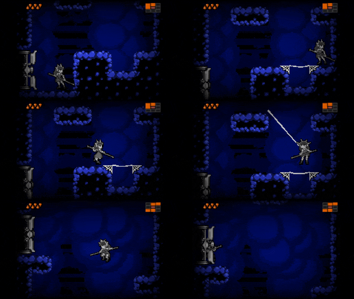
So, the softlock was in a room where you’re supposed to use the web-boot thingies to jump up, the backwards momentum on them got me accidentally stuck under the corners you’re supposed to use.
I was stuck under one corner, then I’d use the backwards momentum to try to get out, and then get stuck under the other corner. It was kinda funny, in a way.
I never did figure out how to get those boots to work on the first time, it was always a bit of a fiddly thing.
Thinking over the early game a bit
So, using enemies to block off paths is totally valid, it’s mostly the dodging difficulty that makes it harder to parse which enemies are meant as blocks, and which are just there to add some challenge. I think the jump height is fine enough for dodging the floor enemies, it mostly becomes an issue when the ceiling is so low that you can’t take advantage of it, and are bonking into the ceiling. Then the jump is a lot more precise, in the sort of way I’d use as more in a secret-hiding troll area, more than the main path. This is probably where the large character against a low resolution probably hurts the most.
As far as having a hard time guessing where the pole is, there’s 5-6 doors between you and the pole, many of which involve likely taking damage the first time you go through them. And the intended path still has enemies and a death pit (because the likelihood that players reach it with more than 2 HP is slim). Like, it’s almost as blocked off as many of the other paths when it comes to “Danger == Dead End”. It’s almost less risky to go to the Blue Realm (and I went there before I got the pole at least once), even though you can’t make much progress once you get there. And then, after all of that, you have to do a dance of tricking an enemy to destroy blocks to let you at a pole, which also risks health. Like, damn, you’ve got yourself a whole mini-dungeon before the player even has a sword.
It’s a lot to expect out of players up front. The sequence could work, if the mechanics and level design were opened up a bit and tuned to be a bit more generous. Like, maybe get rid of the damaging water, and only have one or two spike enemies on the walls? I think with that, and adjustments to low ceilings, having to clear a miniboss without a weapon would be a cool encounter.
In fact, having things be a lot more generous up front gives you a lot of room to tighten them up to ramp up the difficulty later. Early areas staying easy and becoming easier isn’t a bad thing to have in a Metroidvania.
The Legend of Zelda NES starts you off without a sword, but puts it in the first cave you, so that you have to go out of your way to avoid it.
Miscellaneous other thoughts
And, at first, it’s not clear that your door-opening move doesn’t also do at least something damage-wise, I did try to use it to attack enemies a couple of times. (Especially with a player character that looks a bit of a magical girl, what with the crown and such). It’d be kinda cool if you could stun enemies with that move.
Another thing that seems like it’d be handy is to have a bit of a lower hitbox with the pole to make it easier to hit the fishy/spiky enemies? It still felt a bit hard to hit them.
I also think that it’d be awesome to have a variable jump height, so that once the player lets go of the jump button, they go into the fall state, rather than always going as high as possible.
Health pools being red, and danger water also being red felt a bit of a troll, though it did mean that I didn’t die in a place I expected to, so there’s that.
Alternative starting sequence that came to mind, but could be used elsewhere
These are great points, thanks!
Also I gotta say your formatting is very nice, thank you for taking the time to do that. I should probably start doing that myself lol.
I've gotten a lot of reports about the web shoes doing that.😅 I've got some ideas on how to fix it up and also make it feel less fiddly.
It is a shame that the liquids ended up so similar in color, I didn't even think about it until the first playtests. Early in the game I added the red as '''lava''' and was hesitant to deviate too much from the monochromatic color scheme. The idea for orange/gold healing pools came later, and while I did try to distinguish it a bit with glitter, the contrast wasn't great. I think I'll probably change it to green acid or something.
I might be wrong but I think the door-opening move does actually do damage, the hitbox is just so small it's impractical. I was worried the player might try to force their way through the enemy blocks. Making it do a stun is an interesting idea, I'm not sure the best way I could communicate it, but I'll mull it over for sure. I think realistically I would like the player to be able to fight with it if they're skilled enough?
All of your ideas to make the path to the staff easier are great, very simple to implement, I'll give them a shot. (Well, maybe minibosses aren't so easy, but I did want to tackle those anyways!)
The attack is definitely going to change, I think I'm probably going to implement a slash attack with a broader range instead of (or as an alternative to) the poke.
Variable jump height is a must, I agree.
Thanks for the wealth of feedback and ideas!
Well, if you want to block the player in, you can always have more ways that doors lock, so there’s doors that need a lever vs doors that expect a torch to be lit, that sort of thing.
True!
Wow, I don't know how you managed to make something so polished in one month. I'll admit I found it tough as nails and I lost count of how many times I died just trying to get the first item.
You absolutely nailed the aesthetic though, and at first I was convinced I was just playing a Metroid Zero Mission rom hack.
Yeah it definitely seems like I need to make some balancing adjustments in the beginning.
Thanks though! I definitely wanted it to LOOK like it was built on a GBA Metroid engine, lol.
There is a lot of excellent content here. You really nailed the metroidvania genre perfectly in my opinion. The art style was very interesting. I loved the background art but felt some of the foreground animations to be a bit distracting. I think they also really added to the vibe so I don't think it was a bad decision, just something to consider.
My biggest gripe with this game is that I felt that the difficulty floor was a bit too high. I suffered more deaths than I would care to admit trying to fight things I shouldn't or failing to learn my lessons with spikes. Maybe less dangerous hazards or more health or maybe just a starting with slightly easier content might have benefitted my personal tastes better.
The map and door mechanics are obvious highlights. They were awesomely executed and really set the mood.
Really impressive job, with tons of polish. Well done!
Yeah as far as difficulty goes I'm considering lessening the path of resistance to the starting weapon and starting with more health. It's very much a struggle to balance, I think in the later parts of the game if the player has found a lot of health upgrades it becomes a little too easy, I was hoping to prevent that but the early game suffered as a result.
Thanks for the feedback!
Where is the first weapon? That’s the struggle I’m hitting most right now.
I enjoyed the game1 I especially liked how smooth the room transitions were.
Thanks, I'm glad you liked it!
Wow, I really love the art style of your game. Nice job!
Thank you!
It's amazing how it resembles Metroid. Love it even it's a little bit difficult. Good job!
It was definitely a love letter to Metroid ahah. Glad you liked it!
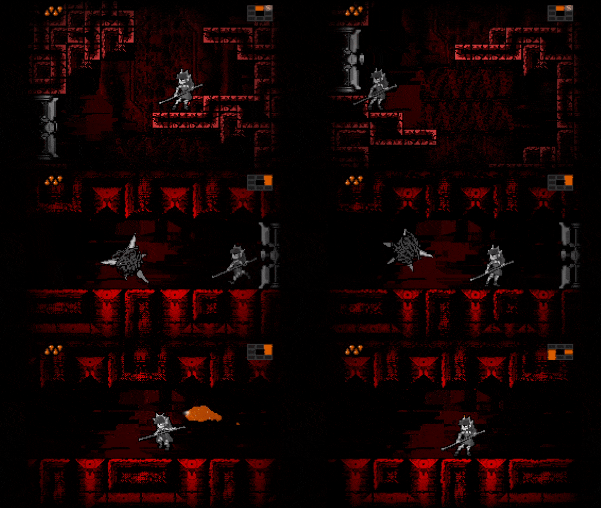
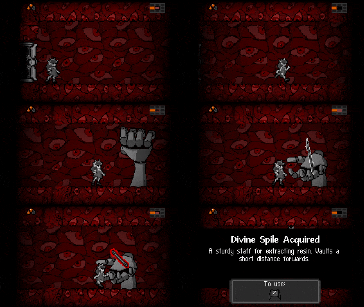
This game is awsesome!! Love the dark backgrounds and the killer music, thw whole game had a great asthetic to it!!! The Eyeball room and tile set were incredible!!!!!
Thank you!!! I'm glad you enjoyed it!!! The eyeballs are my favorite too!!!
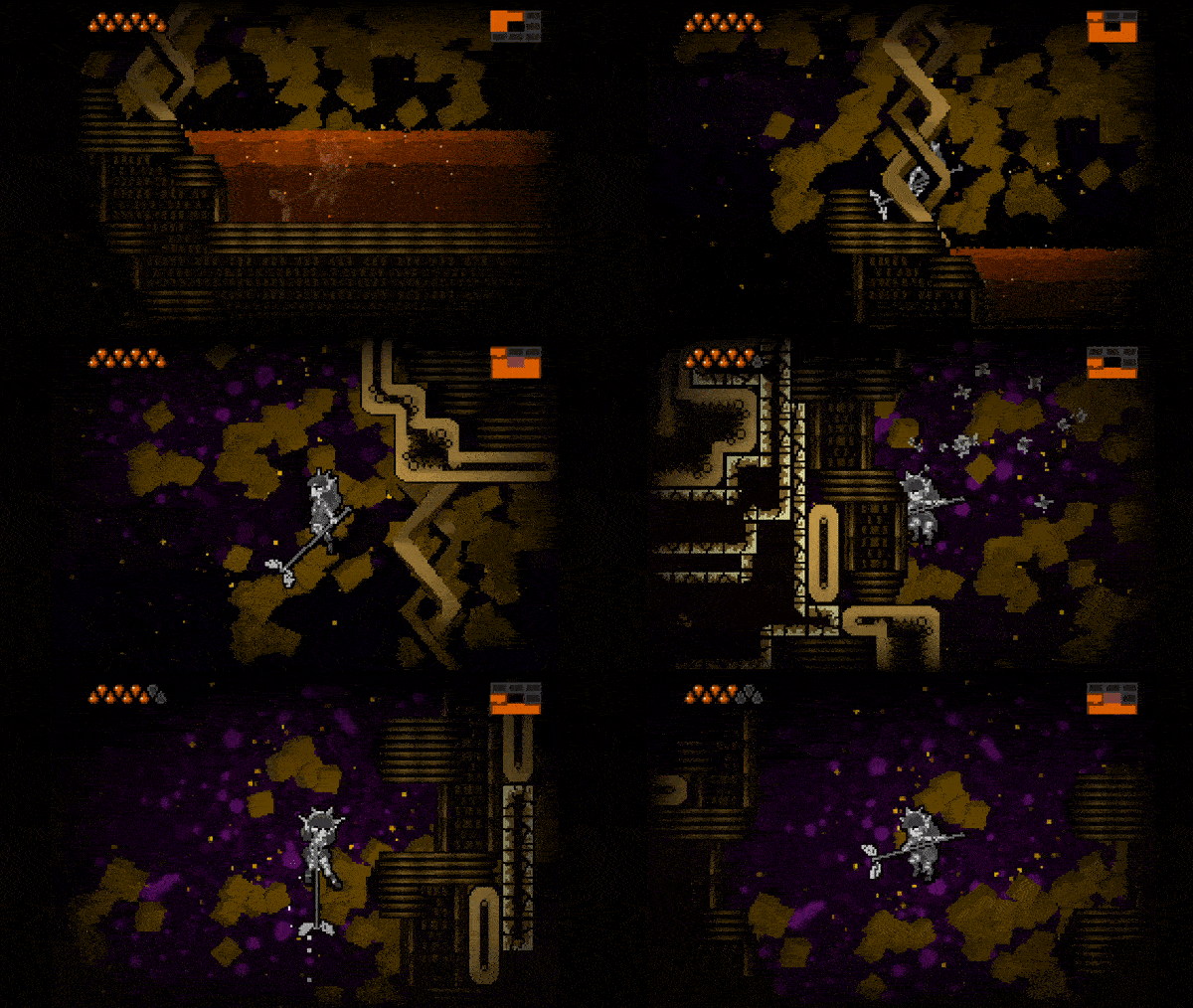
Gorgeous visuals and great atmosphere overall! Can't deny the Super Metroid vibes. Controls were pretty good, the character was too slippery though. I love the unique items too. I'll play more later, but for now I've got to the water section, it seemed to lead nowhere with my upgrades though.
Some remarks:
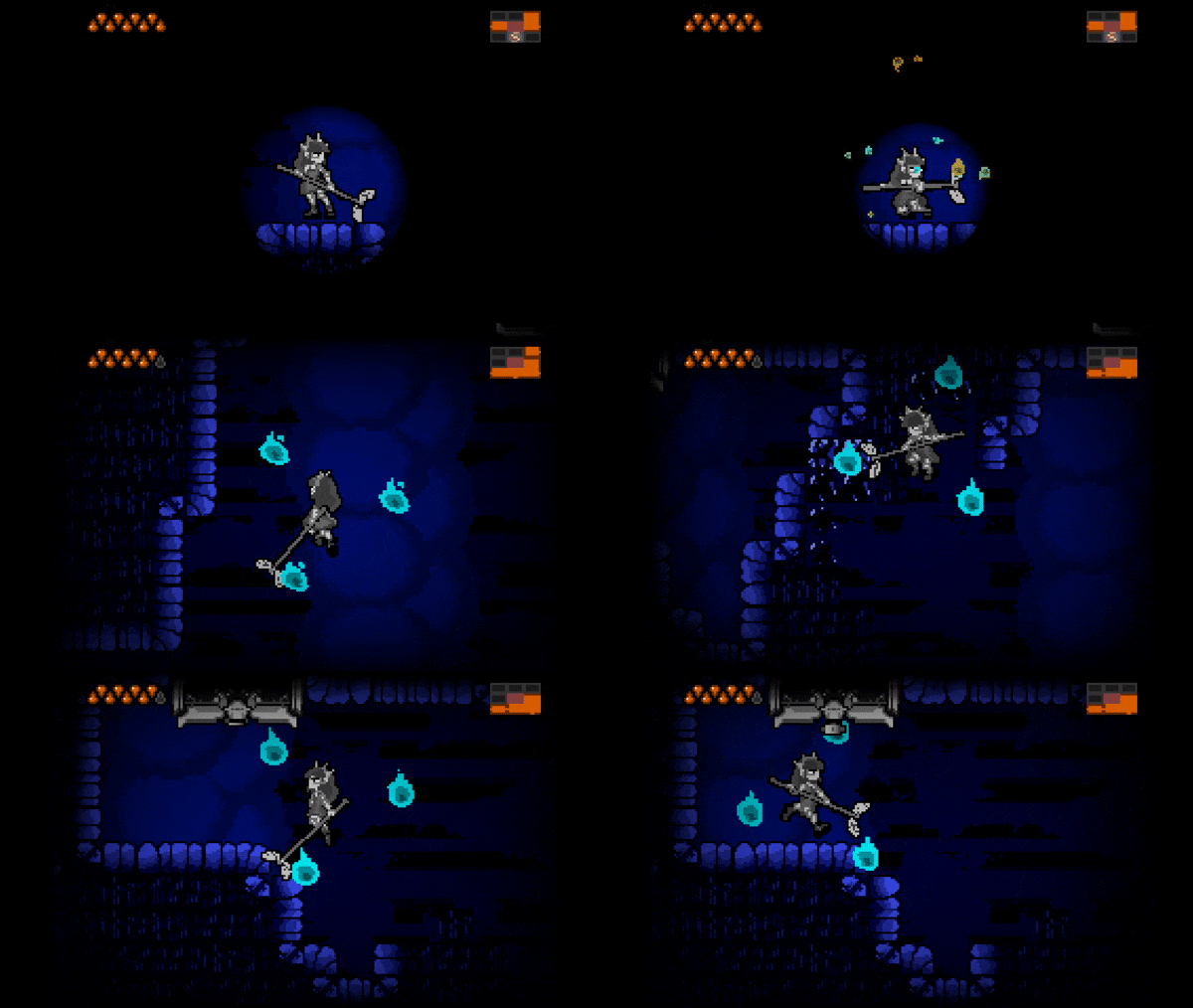
-The breaking platforms broke too fast so that you could walk on them. At the first time I was able to jump over them with the pole but even with that the spikes got me sometimes. The second time there were those blocks the spikes were too close and I had to cross them with web spin backwards, not sure if that was the intended way.
-As said, the view is too close and I had to do leaps of faith several times. The ceiling enemies' attacks were also very hard to dodge.
-Sometimes the map didn't update the rooms.
-It'd be great if saving gave full health, the healing ponds were nice though.
-Maybe a bit obscure that before the web upgrade there was a part where you have to jump on a door, since it doesn't even work if the door is open.
-How to use the web exactly wasn't too clear at first, there was a good room to practice it though.
Absolutely beautiful game and I hope to see more!
Thanks for the warm words!
- The breaking platforms were indeed supposed to gate you from walking over them. The spikes were tricky to adjust, I tried all of moving them higher but then it became possible to get through by breaking the blocks and jumping back up without taking damage... in the end the compromise was a bit tight where you have to vault in just the spot to not take any damage. I might adjust the height on the vault to accommodate that, since I really don't think the player should be punished despite figuring out the intended solution.
There is a second instance of the blocks over a gator pit, that one is indeed supposed to be solved with the web spin; the spikes are there to deter you from trying the vault again. Although if you just got hit with spikes anyways the first time you did vault over that kind of block I could see it being a bit ???
My favorite part of Super Metroid are the bits that you can solve with multiple items, or the ones that you can work your way through with the right technique even if it's not the correct linear path, so I tried to give players multiple options in some cases and force them to use multiple solutions to problems that may seem similar.
- Definitely agree about the field of view
- I am considering saves healing since I think it might be a bit unnecessarily punishing for a player who is stuck at 1 health to be forever stuck like that if they can't find another ampule, especially early on where there are no healing pools. There is also an item later in the game that regenerates at save points so I don't know why I didn't just go for it when I implemented that.
- There are some fundamentally unfortunate problems with the map I'm aware of, thank you for reporting that!
- I hadn't realized that the door isn't climbable if it's open, I'm glad you realized it as the solution, I did think it might be a bit obtuse and I probably will make it a bit more reasonable a climb!
- I'm glad you worked out the web! Other people did have some issues working it out, there are a few steps to it and not all of it is intuitive.
This is valuable feedback, thanks for all the remarks!
Yeah I only got hit by the spikes at the first breaking blocks section, the second was ok. Not sure what the difference is to if there were no breaking blocks at all since you're not supposed to touch them anyway.
Fun fact: if you jump back on the row of breaking platforms right after falling, you can actually get to the color-and-layout-changing-door without any special abilities. There is no point in doing that though, so curious player can get lost even more (as far as I know, you can't progress in blue layout without the pole)
Nice find! You might be the first sequence breaker lol. It might theoretically be possible to clear the blue zone without it, I'm not entirely sure. Would definitely be harder
Same here, I've done that first before obtaining pole.
100% metroidvania! The map is very like metroid's. And great overall quality! The world is large and variable.
The web mechanic is appealing and easy to use. The spile is harder to get used to but works ok making me poking all walls around:)
Some health powerups reappear after reload allowing additional max hp growth.
I reached only two artifacts and unluckily stuck in the wall without possibility to load from save. Previous time I stuck in walls I managed to get out of it thanks to platform with spikes killing me and then loaded from save. Option to load from save from menu would be just lifesaver in such drastic situations.
In some locations I wish I'd have larger field of view and platforms move be better distinguishable. Also in battles it doesn't feel very clear to me when I apply damage and how to avoid being damaged.
Music adds well amout to the overall atmosphere, but after some time it feels too repetitive.
In general, very strong implementation of metroidvania in classics style. Fun to play and close the most to the genre I've reviewed so far.
Thanks for playing!
I thought I squashed the health powerup bug, I'll have to look into that... I don't suppose you can point me towards which ones did or didn't at this point though...
I will definitely include some kind of option to load in the future, I didn't realize how often people were getting stuck :(
Definitely planning to address the off-screen problems. I had hoped the look up mechanic would help mitigate that but it wasn't nearly enough it seems.
Unfortunate the music was repetitive, I tried to include at least 2 songs per zone so I was kind of spread thin in composing work 😰
Thanks for the feedback and screenshot, they help a lot!
This one under water I was able to pick up two times after leaving the level through the door, and coming back
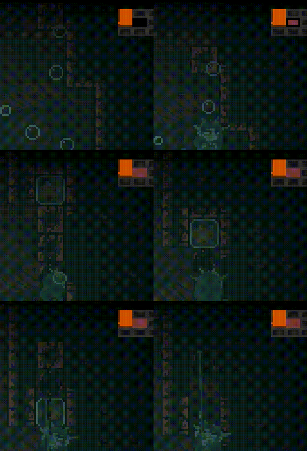
Interesting... thanks for the report!
What I liked
Feedback/Suggestions
Overall, its a very solid, polished entry and can see this being a top 5 entry, if not top 3. Big congrats!
Thanks for the feedback!
I'm glad you noticed the doors lol, I struggled with them for a couple days and STILL didn't get the transition to match, but I'm glad it gave you some ideas!
The map system doesn't use any viewports, I was trying to simulate a super/fusion/zero style map where everything was perfectly gridlocked, and information was stored that displayed where you've been and what's in the room and so on and I couldn't think of a way to do that easily with a traditional minimap method with zoomed out viewporting buuut it may be possible.
I used a tileset that had every possible type of room square (each variation of wall and door position). At the start of a loaded area, there is a massive tilemap that's sized so that one room = one tile. Each room square has an Area2D, and has areas around it that check what the adjacent rooms are and whether there are doors present, allowing them to work out what kind of room tile they are. Then I check the room's position on the tilemap with world_to_map() and set the corresponding tile. Then I shrink that map down and use it for the UI and pause menu.
It's kinda janky and not the most optimal, but it does work pretty well and I can move rooms around at will without thinking too much about it.
I definitely am considering about adjusting the intro difficulty, maybe with more starting health or a bit less resistance to make it to the starting weapon. I really like the idea of starting with nothing and feeling the danger as a result, but it looks like I pushed it to the point where some people don't even have it in them to make it to the first powerup so I think it needs to be addressed for sure.
I'm not sure what you mean by combat spacing. The hitbox of the staff maybe?
I absolutely want to have gamepad support, but alas I don't have a reliable gamepad where I'm staying and this is my first time finishing a game in Godot! I'm sure if I work out how to do it it'll be very simple to implement, I just didn't consider it to be a high enough priority. Definitely something I'd like to be able to just throw in standard. I think it is just occurring to me now that probably all that was needed was to add it in the inputs next to the keys, though I guess I would need to look into how to grab the keys dynamically when displaying what the controls are.
No problem! And yeah, I could tell that it was a little tricky with the doors. Just by playing, it seemed like you had a problem very similar to what I had with the transition from tutorial to house party. I'm assuming you were using an AnimationPlayer to fade in/fade out to accomplish the metroid door effect and to also hide the camera's movement because you? I noticed early on there was a point when leaving one room, the next room is slightly higher and the fade in/out didn't completely hide the camera's movement to the player.
From my very limited knowledge of them, I do know they can be used to accomplish that. I just haven't explored multiple viewports enough to explain how it would work. But your solution sounds much less janky than mine. Except for this time, after I make all the rooms, I use another tilemap to trace over the rooms, use get_used_cells() and create the skeleton of the map that I screenshot in-game. The actual map scene takes that screenshot and I use polygon2ds to manually add details to map. Of course it listens for room transitions sent by Area2Ds and updates the active room, reveals new rooms, etc. But the scene tree basic looks like:
And it continues likes that. So very time consuming and janky. So one of my goals for next year is to make the classic minimap likes yours. Just need to figure it out. As for the combat spacing, yeah I meant the hitboxes. Also, adding gamepad support is the same process of assigning keys in the input map, if you didn't know already. And for a first finished game in Godot, huge congrats.
I had a lot of fun with this! The atmosphere, art direction, and the music made for a very lovecraftian vibe. A critique that is echoed by another comment is that maybe the player is too big? Personally I thought it was pretty difficult, but once I got the staff the experience opened up quite a bit. I especially like the snake monsters that eat the walls, that was a a very good mechanic and it taught me that some walls break haha. One more thing, your main menu super awesome, I love the details.
Thanks, I'm glad you had fun! I hope I can balance it a bit better after the jam. And yeah I think it may benefit from trying to up the resolution some... I had really wanted to stick to the GBA's resolution but I think the character art might have gotten a bit bigger than I originally budgeted for in the quest for clarity 😅
The character is possibly a bit big on the screen and I would love to see the same sprite on a slightly higher resolution game - so you had more screen estate, but that is a minor gripe as the sprite work and presentation is right up there with anything I have seen in this or any other Jam, stunning work!
Thanks for the kind words! I definitely don't disagree with you, I think a lot about widening the screen in retrospect. I really wanted to make it at the GBA's resolution but I was fighting with the size of the clarity of the character's pixel art and I think it grew without me realizing 😅
Atmospheric music and graphics! Also the main menu is amazing.
I gave up, though, when I visited one too many rooms without finding anything but a couple baddies...
Glad you enjoyed the early aesthetics!
It's hard to go anywhere without the first powerup, maybe I should shorten the path of resistance to it...
It's a shame though, I think the abilities later on are pretty cool 😓
The visuals are very appealing, especially the main character has some very nice sprite work! As a bit of advice, I would make the foreground/platforms and the background have a bit more of a tone difference, since they blend a bit into each other in some places.
I only found the vaulting pole, but had to give up as there was no way that I could find to regain lost health and I was running through it on one remaining hit. The spiky floating guy in the transitory room got me, exiting and reentering the room doesn't reset his position so when I reentered I basically spawned on top of him and it killed me, haha
Thanks for the feedback!
Sorry you died like that, in retrospect I wish I had made enemies reset when you re-enter the room. I'll consider adding a healing pool at the first save point as well, since health is sparse early on...
Something else you might want to consider is knocking a hit enemy back so that they don't just power through your hits to get to you anyway, since with this little HP that can be very frustrating when you lose even one point
The enemies actually DO do that 😅

Huh. Maybe I hit them wrong, hahaha. Oh well, my bad then
Pretty meh in regards to gameplay (not bad, just nothing too special), but everything else is just top-notch
Hi, I'm curious how many artifacts you found? I tried my best to come up with unique mechanics but I admit I haven't played much in the genre since childhood, so if they came out derivative I'd like to know.
Glad you enjoyed the rest though!
Oh, sorry for misscomunication (and broken english aswell). What i meant to say is that the game doesn't feels polished enough: main character is pretty sloppy (combining with her height she does not feel good to control) , hitboxes are a bit unforgiving at times, attacking feels wrong (I can't really describe why tho). Regarding metroidvania aspects, they are one of the most unique that I've seen, but I have to admit that I haven't gotten too far to see them all.
Ah. Yeah, I agree, there's a lot of tuning to do! I think one of the first things I'll do post-jam is decrease the minimum jump height, and make a broader swing attack for combat. One of the other things that might be messing with combat is that the attacks only come out when the key is released... which is a side effect of how I implemented the charge move later in the game but I def think I could find a better way for that.
Thanks for the feedback, it helps!
This one is real nice
YOU are real nice
(thank you)