Play game
Aumaton's itch.io pageResults
| Criteria | Rank | Score* | Raw Score |
| Horror | #5 | 3.958 | 3.958 |
| Enjoyment (Best Game) | #21 | 3.667 | 3.667 |
| Sound Design | #27 | 3.583 | 3.583 |
| Aesthetics | #41 | 3.875 | 3.875 |
| Story | #73 | 2.375 | 2.375 |
Ranked from 24 ratings. Score is adjusted from raw score by the median number of ratings per game in the jam.
Leave a comment
Log in with itch.io to leave a comment.


Comments
The final scene had us all jumping out of our seats. Truly excellent experience.
We appreciate the feedback and glad to know the seat lost it’s use by the end!
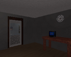
Incredibly tense. I was getting nervous as soon as I saw the mannequins. The aesthetic was outstanding and I love the low poly visuals. The classic art that was pixelated was really fun. I love the way it gets progressively creepier until the game closes itself. Honestly sublime!
I should tell you however, I got the note about activating the hint menu, and I wasn't able to do this without pausing the game too. It didn't effect my enjoyment much, but I thought I should let you know.
We appreciate your feedback and glad to hear you enjoyed it!
As for the note, it was actually a typo that slipped by. It meant to hint that ESC does something and L-Shift does something, but instead it sounded like a hint to press both at the same time. We will avoid that mistake in the future!
Not that scary, only peed my pants.
Shoot, this is unacceptable! I’m going to give those mannequins a stern talking to.
👀
Okay I felt like I was completely at the mercy of the game. And it was a great feeling, stressful and scary. The scenery changes are the ones that scare me the most in horror games. I hated the white character XD the fact that he was looking at me and everything was absolutely creepy.
When the exit disappeared I was like "nope, nope nope no way"
The only thing I would change is the way you interact with objects, especially painting. Because you have to be really close to interact with them to the point where you don't see the whole painting anymore. So you walk close to it, turn around, move, and turn back to check the painting with the text at the same time to appreciate it.
Otherwise I like all the details and possible interactions, the design of the rooms and atmosphere!
We greatly appreciate the input and are happy to hear that our little friends made your trip worth while!
Interacting was definitely a unique challenge given this form of movement, and in trade some things were rather experimental. We will definitely note your suggestion if we approach this style again!
Good ambience and stress moments :) I miss a creepy scary ending but it's ok. Nice 1st person retro style!
Anyway, has the character trained running or something in his life? Walks very slow, and when he runs he's tired in a few seconds (good detail!). If I am in a scary university sure I would run faster XD
Good work!
Oh don’t worry, the character is obviously an Olympic runner! Thank you so much for the feedback, we appreciate it!
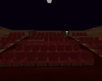
Wow, this is one of the best games of this jam! Really enjoyed the set pieces especially the art room. As someone who hates cheap jump scares, it is really refreshing to see so many different horror set pieces that did not rely on any jump scare. Great work!
We greatly appreciate the feedback! We are happy to hear that things stayed creepy while not relying on jump scares!
Very nice atmosphere! Was spooked at the end XD
Like your pixelated setup (we are trying to use this too, but I think yours looks a little bit finer)
Great sound and smooth controls. THe luck of camera rotation was a bit annoying at first, but then it get me to the atmosphere :-)
Thanks for a great game!
Thank you for your feedback! We agree during design that the camera rotation even annoyed us a bit, however we tried to alter mechanics to fit this style the best we could and glad to hear it succeeded!
Well hey this is about the most well-executed horror bit I've played this jam. Nailed the aesthetic with the audio, too. The camera work around items is cool, neat way to solve the problem without requiring up/down control. But yeah, nice work, tense from start to finish -- I audibly groaned when the entrance went missing haha
I think the thing going on with paintings/floors is z-fighting of some kind? bit annoying but nothing major
Thanks for the input and we appreciate it!
Yes, we can confirm that it is a z-fighting issue caused by the lowered render settings. The z is actually different, but exceptionally close to the wall’s. This means from anywhere except up close you will face z fighting! An issue I will avoid in the future!
oh hm, if it's a z depth precision problem, if you've still got the camera at the default unity far plane of 1000, you could bring that in to something more reasonable and that'd probably fix it -- sorry, my mind appears to still be stuck in "debug unity rendering" mode haha
Great Work! The slow controls add a lot of tension, the minimal sounds are eerie and I like the detail with the paintings changing.
We appreciate the feedback! We are glad to hear all elements made for a tense game!
Really good execution! Keeping things plain and simple with consistent tension without using jumpscares. It would be nice to have a bit of a story touch but regardless of that, I enjoyed it. And of course, DON'T COME BACK :)
We greatly appreciate your feedback and happy to hear that tension was maintained without those cliché jumpscares!
This is awesome!! The awkward controls and slow movement make it way more terrifying
We agree the controls are pretty awkward and glad it worked in our favor! Thank you very much for your feedback!
That was really creepy well done! I would have loved to have more story but that didn't change the fact that I enjoyed the game a lot, the sounds and lighting were really on point, the atmosphere you created really made the game. Overall a great experience!
We greatly appreciate your feedback and are glad to hear the environment had the intended affect!
Pleasure to play.
Thanks! We are glad to have provided it!
you used out of the box idea for this game :)
Thank you, we appreciate your feedback!
Dam that was really well done! :) Especially loved the art room and theatre parts! My only complaint would be the pixels shifting effect on the floor made me a feel a bit dizzy but dizziness be damned I wanted to see this to the end :D
Thank you for your feedback! Never occurred to us to account for that, however you are not the only one to mention something similar! We will be noting that in the future!
I enjoyed it. I especially like that there were no cheap jumpscares even though i expected some =D You kept the tension without wasting it
Good stuff: Environment is very good, especially the theater-thingy scene. Player always knows what to do next, no time wasted on walking around and looking for something new
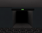
Bad stuff: While the tension was properly kept, the fact that we really have no info on what's going on makes it kinda hard to actually be afraid :p Also, the pixelated style is a bit to much - pixels dance on the screen, especially on the ornated floor on the hall
We appreciate the feedback and will note your comments on story and texturing! As well, we are glad to see that the tension was kept, that was a big concern in our development!
Really great job making a well polished game. The sound design was really well done in bringing you through the narrative without being confused as to where to go next, and having it so you could only use keyboard controls for moving the camera added to the suspense! Really great job! Definitely made me tense exploring in the dark!
We are happy to see that you felt everything worked well together and appreciate the feedback you’ve given us!
I really love the visual style! I think the best part is that you can't really make out what things are in the distance, you can kinda say something looks humanoid but you're not really sure and that uncertainty is really creepy. I think the magic breaks down a bit when you get close to them, they feel too detailed up close. The other problem is that the paintings and posters sort of glitch in and out when you get close or away from them, I'm not sure if it's intentional.
The place feels really liminal and I love that too! I appreciated all the small details you put into the experience.
I have mixed feelings about the camera. I like that you can't rotate up and down freely, it makes you feel clumsy and vulnerable. However you can easily miss some details and it's hard to pull off correctly, in fact you (the developer) had to force the rotation a few times to look at things.
On the audio department I think the game is missing some creepy ambience and more sound effects, in fact the silence would work even better if alternated with ambience.
Overall I really liked this, great job!
We appreciate your comments and will keep them in consideration!
We actually received the same complaint about controls a handful of times from others during playtesting! Many felt a bit complexed by the idea that there was no freedom to look up and down. We did experiment with a bit more freedom to look around, but in the end felt it altered the experience too much from our intended effect. However, we will be noting this, and if we ever choose to develop a similar system in the future will be trying to alter these to feel a bit more natural!
Yes I agree, I just think it's really hard to pull off that kind of camera correctly and you came very close but there's still something off.
very smart use of environment and sound design, great job!
Feedback appreciated! Thanks for the note on environment and sound! Reassuring to know it worked well!
This was amazing! Really creepy! And the setting was fantastic! Great work!
Thanks! We appreciate the feedback and glad you enjoyed the experience!