Very pretty textures by Octoshrimpy, however I wish you animated the liquid textures even the slightest amount yourself, even if they weren't initially made by you (with a dripping noise would've been fantastic). Seeing earie frozen waterfalls really takes away from how nice the vibe of the game was. Other than that I really did quite enjoy the atmosphere. The ambience was great and it was very pretty. Movement was alright but felt a little stiff, but still definitely passable. Levels though were kind of just hold right and jump most of the time, which didn't feel like they fit the platformer type of gameplay I think you were going for. Also, a lot of people have mentioned the background being confusing and I wholeheartedly agree. It's much too vivid of a green outline to not confuse with the main platforms. Otherwise, great game I did enjoy playing it. Good job!
Play Jam Game
Silhouette of The Storm's itch.io pageResults
| Criteria | Rank | Score* | Raw Score |
| Audio | #286 | 3.320 | 3.320 |
| Graphics | #313 | 3.620 | 3.620 |
| Fun | #373 | 3.260 | 3.260 |
| Overall | #430 | 3.187 | 3.187 |
| Game Design | #459 | 3.160 | 3.160 |
| Theme | #475 | 3.120 | 3.120 |
| Innovation | #716 | 2.640 | 2.640 |
Ranked from 50 ratings. Score is adjusted from raw score by the median number of ratings per game in the jam.
How does your game fit the theme?
Saving your lost Pheonix Chick before the raging storm snuffs them out. You play as a traveler racing across the land to try and reach your companion before the rain reaches them.
Did you write all the code and made all the assets from scratch?
I wrote the code myself, with use of tutorials and such. The SFX and background music are royalty-free assets from https://pixabay.com and the stunning block textures are made by Octoshrimpy.
Link: https://octoshrimpy.itch.io/tranquil-tunnels
Comments
Cool visuals and nice mechanics. The game page has the game canvas a little bit too big and requires zooming out, so I would recommend adding a full screen mode. Also the background sometimes gets confused with the walkable platforms, so I would suggest making it more obvious to distinguish what is background and what not. Other than this, really liked the "wind" mechanic, which makes the game quite hard! Good job and good luck ;)
This was a pretty cool game, though sometimes the double jump doesn't want to activate (unless it's just a skill issue from my part). And just small tip, for background visuals, try to make the grass with a less vibrant colour, it could make the player think that it can walked on.
Hopefully you'll also play mine :) https://itch.io/jam/brackeys-12/rate/2973690
I really love the look of this game! The visual style and the color palette are fantastic! Overall, great job!
Both the art and music are excellent; it would be even better if the difficulty of the levels were designed to be a bit lower.
fun game I would recommend you add what is called a coyote jump allowing the player to have a little leeway wen it comes to jumping when running off the edge of the platform right now its so easy to miss a jump from being right off the edge of a platform
This game looks and sounds great! I am pretty bad at a lot of platformers, especially high-gravity or precise ones. The wind pushing you backward was brutal, and trying to stay on a moving platform is a nightmare, so as some others have said a sort of fortified/hunker-down move would be cool.
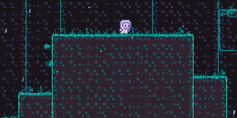
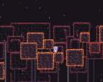
Now if you please consult the image, you will find that the lower right platform is in-fact not real (but most wouldn't know). Perhaps consider increasing contrast between background and foreground elements. That said, the art is beautiful, and I especially liked the trees.
I used Godots tilemaps for the background and foreground I had three one was the physics layer, one was the black background and the other was the background objects, so I just forgot to change to the physics layer when I made that platform(it was supposed to look like the darkened platforms at the back),thanks for your feedback tho :)
Pretty meh platformer. Here's my criticism:
- A BIG ONE: The player automatically moves left constantly (there's no animation; it just slides) and there's no explanation why. Perhaps it's the wind? Or maybe it's a bug?
- Long loading time at the start
- Dash timing level design is kinda annoying
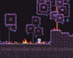
- Double jump instructions are too high for the camera to see until you're in the air, but then there's little reaction time to read it before you fall to your death
- No coyote time
- Font feels out of place with the rest of the art
- It's kinda hard to tell where there's collision
Aight bro, there is an animation for when the player moves the idle will change depending on the wind(1st level there is normal idle, 2nd level the player Is kind of slanted towards the wind to try and combat the wind pushing them backward the slant increases as the wind gets more and more intense). Brudda I don't know what you want me to do about the loading, it could very well just be your internet. I was going to add a hollow knight powerup screen but ran out of time as I wanted there to be a lot more levels. But ye thanks for rating man
Very beautiful and atmospheric, even though you didn't make all the tiles, you've selected some very fitting graphics, that compliment the artstyle.
It's very exciting how the wind keeps picking up, HOWEVER, it's a bit too hard when the dash mechanic is introduced. Maybe somekind of Hunker down move to not be pushed back from the wind while on a moving platform could alleviate it.
Either way. a very difficult, but still pretty game :)
I liked the mechanic of the wind blowing you. I couldn’t beat the level that introduces the air dash unfortunately but I did have fun playing the game
I loved the art in this game, charming pixel art like this is always a win! Also, the platforming was hard, but in a fun way, had me trying it again and again :)
Enjoyable atmosphere. Visuals and sound work nicely together, but would love a bit more contrast. Some text was blurry. Also web version breaks for me, but good experience anyway!
Some coyote time on the jump would be nice but the thing is, that idea may or may not work for this specific game.
The visuals and arrangement of the levels are really good and the effects like wind add a lot of depth to the game.
When it tells you how to double jump, the text is too high out of view of the camera and the instruction cannot be seen without already knowing how to do it, sort of defeating the point of it. Guess it was just intuitive enough anyway even without the instruction.
Other than that I think you did a great job on this game and it's fun to play!
I loved the art for this game. I also liked the sidescrolling mechanic with the wind, it added challenge but not too much challenge. Overall, it was a pretty fun game, I would have kept playing longer if I could after I reached the end fire. Great job to the team!
It's a really aesthetically pleasing game! The controls are pretty responsive, and the art and sound design are integrated quite nicely within the levels to create a very peaceful game.
One quick observation I made is that it can be challenging to decipher which tiles are the floor and which tiles are the backdrop in some locations. It didn't happen too often, but it could definitely help to standardize which ones are which a bit.
Great work!
Loved the creativity! Super cute art as well! https://itch.io/jam/brackeys-12/rate/2973269


Leave a comment
Log in with itch.io to leave a comment.