Play game
Kiwi's Adventure: Dungeon Slider's itch.io pageResults
| Criteria | Rank | Score* | Raw Score |
| Innovation | #17 | 4.067 | 4.067 |
| Graphics | #20 | 4.267 | 4.267 |
| Overall | #46 | 3.778 | 3.778 |
| Theme interpretation | #101 | 3.644 | 3.644 |
| Audio | #120 | 3.311 | 3.311 |
| Gameplay | #141 | 3.267 | 3.267 |
Ranked from 45 ratings. Score is adjusted from raw score by the median number of ratings per game in the jam.
GitHub repository URL
https://github.com/IES-Rafael-Alberti/gameoff2023
Leave a comment
Log in with itch.io to leave a comment.




Comments
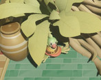
I like your interpretation of the theme and your puzzle design. The design of kiwi is also very cute!
Great work!
Veo que sois de un instituto de Cádiz, así que os comento en español. Vuestro juego es una absoluta locura y nadie diría que lo habéis hecho en un mes. Gráficamente es increíble, los puzzles están muy conseguidos y es muy innovador. De las cosas más chulas que hemos jugado en la Jam. Nuestra artista es de Algeciras y también le ha gustado mucho vuestro juego. Increíble trabajo! Os va a ir muy, muy bien. Ojalá haber estudiado en un instituto que hace cosas tan chulas.
Very fun and original idea. Well polished game. Looks very cute.
Wow! This game is really well polished and has a lot of nice ideas in it. Great job, guys! I have a curiosity: is there any feature that you had to remove because of time constraints or other limitations? I opened a topic on just that: "The Features Cemetery." I would love to have your input )
I don't think we had too much scrapped. There were a few pieces of polish that we wanted to add to better communicate some concepts to players, the most major one being warning people that the starting/balcony cube needs to be upright before returning to it.
Oh! The other big one is that we had an enemy that was similar to a top with blades, that we made for the Egypt area. We never fully implemented it, despite it being very close to completion.
wow, it look so cute! The puzles are great too
Wow! Crazy amount of polish in this for a gamejam game - this looks great! I had trouble getting out of grid mode, which prevented me from getting very far. And was confused when I did get out of grid mode that I had to restart from the beginning. I expected just the room I was in to rotate, not the whole puzzle. Either way, cool concept, super ambitious scope, and slick execution. Hope you can incorporate some of the feedback from the jam to make this even better! Congrats on making an impressive game in a month.
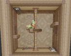
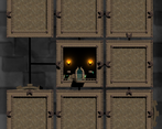
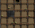
Really cool concept - combining a sliding tile game with a puzzle platformer is a fantastic idea and made exploration of the world really interesting. I like that entering each room reveals its layout on the grid, and the orthographic projection works better than I would have expected for communicating which room each tile represents. Also really liked the various tutorials and hints printed on scene elements in the background, made them mesh with the world really nicely. Super innovative, I dig it!
I think the angle of the camera in each room makes depth perception a bit tough for platforming on some occasions - kept bumping my head on various platforms while trying to figure out how far back Kiwi was; maybe a drop shadow/indicator on the ground would help with that?
The idea alone was super engaging, but the game had a nice layer of polish on top of that - great job!
An interesting sliding block puzzle game. The graphics were very well done. I will mostly comment about the game/puzzle mechanics:
This game is so creative, I love it.
Terrific graphics, great puzzlebox dungeon design like we used to see in Classic Zelda, lots of charm and right on for the theme. I liked gliding around as this little parakeet. Unfortunately, at some point, I got locked into the Grid View and could not get out of it no matter what I tried. Not sure what happened there, I was playing the Web Version. Still, I get it, bugs happen in jam games, a very nice entry nonetheless.
Do you recall if your "balcony/entry" room was properly rotated?
It seems we could have been far more clear about the fact that, unless the balcony room is properly oriented, getting out of gridmode is not posible.
When the jam finishes we will 100% add a little popup warning explaining that whenever someone tries to go back to platforming mode from grid to the full version. (Hope this didn't sour the experience and also thank you very much for the kind comment n-n)
Oh shoot, I think that was probably it. I didn't ding you for it in the rating, things like that happen in jam games, I'm pretty understanding. I'll take another look at a post-jam update. You guys built an impressive, complicated thing for one month's work. :)
This is a really pretty game, and an impressive amount of work for the time! I see three challenges in the game: exploring/platforming, solving a slide puzzle, and solving the puzzle of the dungeon (building the path to the key and then the door). I think if only two of those elements were used I would have enjoyed this more.
Also FYI: when sliding rooms around in the zoomed out view, the controller didn’t let me slide rooms up or down, left and right worked though and sliding up and down worked fine on the keyboard.
Great Job!
Wow, excellent work. Visually, this is spectacular. It's one thing to make nice models and graphics, but you created an adorable character and themed levels. I love the puzzle-on-top-of-another-puzzle design. Reminds me of the last dungeon in Skyward Sword. I'll admit I gave up on the last one when I died and lost my progress :( I'd love to see this expanded, maybe with a couple of easier levels to get a hang of the mechanics. And maybe don't re-hide the rooms when you die! That felt too punishing.
Some minor criticism - I kept getting hit by traps before I saw them. Mostly from walking/ falling through a door and dropping into them. Also, I liked the movement, but had some trouble getting through the doors. Maybe enlarge them and/or remove the ledge around them?
You made an awesome work!! Loved it! Congrats
Thank you so much! It's our first game jam as a group and we worked incredibly hard on it through the entire month. <3
Awesome game! I love the feel of the floaty flying.
Thank you so much! We tried to strike a balance between avoiding the bad type of floaty controls and trying to make it feel like the bird character could casually flutter downward.
I loved the game and the concept. As with many controls, a tutorial would help a lot. Furthermore, the character is a little slow, I believe that if he had more fluid movements the game would be more dynamic. But I think they did a great job
Thank you so much.
As for the controls, I've always been a fan of games that leave you alone in a room where you have to use a mechanic to progress, and all they do is show you the button that lets you use the mechanics that let you progress. (Obviously not all games can use this method, but I think most platformers can since they are fairly common and intuitive.) So we tried to go with the tutorial method where the "hieroglyphics" in the background show you what controls you'll need to exit the room, and then let people make use of them to figure your way out. And then throughout we leave similar hints in the background. We've gotten kind of mixed results on this approach, as some people seem to really like it, while others don't, and then there are some that don't even realize there are instructions in the background, and head straight to the instructions on the itch.io page. Which might be a sign that the concept works, but we just need to make it a bit more obvious for beginning players? Anyways, I'm sure there's something for our team to learn here and bring forward to our later games!
I really liked the look of the this one. The flipping rooms around is a really neat idea. The only issue I have is with the movement. Controlling the character didn't feel great, and I wish I could move just a little bit faster. I'm nit-picking though, great entry!
Thank you so much. We'll take your input on character control into consideration going into the future!
This was such a well thought out game. It's put together really well and hold a theme. The figures and the lighting are great. I struggled with the puzzle a bit. This was a treat.
Thank you! Hopefully it was an enjoyable amount of struggle. <3
Game's pretty fun and visually appealing, everything fits nicely toghether.
I'm not sure if it would be better, but I would experiment with some camera movement smoothing, the position changes are a bit too abrupt.
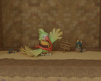
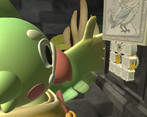
Nice touch adding an animated splash logo in the beginning. The intro of the kiwi setting up the game is also very nice.
Glad you liked our game!
We tried originally working with a following camera but eventually had to change it to the one we have now because of time constraints, we only had one artist and he was already crunching enough to finish everything to ask him to make sure the room transitions lined up properly and there's a lot of "out of bounds" ugly hidden by the camera right now xD
Perhaps after we give it some more time when the jam's over we'll fill in those gaps and try a different camera n-n
(And glad you like the logo, our artist is very happy that someone found it cool.)
I think there is a solid idea here but needs some refinement.
3d movement in cells makes it actually hard to navigate so I would prefer 2d movement there.Cell designs could help the player more if they were done a little better.
I would prefer pressing R does not reset the state or at least give an option there. Sometimes I just use it so see around.
Most importantly showing inside of cells from the start would be much better.
Thank you for your comment, regarding the 3D movement we are aware now that it makes the game a bit hard to play so we will certainly be fixing that after the jam ends.
Regarding the pressing of R resetting Kiwi's position, this is an intended mechanic, as the main difficulty is to be able to properly create a path to both the key and lock in the same go. If we allowed people to just get the key, and then move their starting room next to the lock for example the puzzle aspect of the game would diminish considerably. (Remember that pressing Shift zooms out so that players can have a look at were they are without resetting their position, as explained in level 1 on the grid scene)
And the cells being hidden is done on purpose to entice the players to explore before trying to construct their paths. Though we do understand why this might feel like a bit of a chore if the platforming section and moving between rooms felt a bit annoying.
With the web version, the R key would sometimes not work when I was looking at the grid. I understand that html5 can be very funny sometimes though and I wish I could play the executable version (my windows computer is broken).
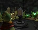
Alright, criticisms aside this game is a vibe. Spooky temple with un music and BIRDS. I like how big the seeds are and in general the idea is amazing. This is a great game in the making.
Thanks a lot for the comment and glad you enjoyed the aesthetic, our artist is delighted to hear this being commented so much!
Also, could you think back to the playthrough and remember if the "entraces" the rooms with the balconies in them. Were properly rotated? R doesn't exit the grid mode unless the entrace is properly rotated cuz Kiwi has to enter through somewhere. (Our fault for nor properly conveying that information in game)
If that wasn't the case though we will try and look for whatever might be causing the issue!