Play game
Skeleton Panic TD's itch.io pageResults
| Criteria | Rank | Score* | Raw Score |
| Fun | #67 | 3.864 | 3.864 |
| Overall | #100 | 3.773 | 3.773 |
| Aesthetics | #100 | 4.091 | 4.091 |
| Theme | #113 | 3.909 | 3.909 |
| Sound | #156 | 3.364 | 3.364 |
| Music | #158 | 3.545 | 3.545 |
| Mechanics | #217 | 3.318 | 3.318 |
| Story | #302 | 2.727 | 2.727 |
Ranked from 22 ratings. Score is adjusted from raw score by the median number of ratings per game in the jam.
How many people worked on this game in total?
3
Did you use any existing assets? If so, list them below.
3D Models from kaylousberg.itch.io, UI from Kenney.nl and sfx from zapsplat
Leave a comment
Log in with itch.io to leave a comment.


Comments
This is a great tower defence game! I really like the intro flyby of the enemy path, and the fixed perspectives in each of the zones is quite novel. It's clear that there was a lot of care put into the background decorations (the holes in the wall in zone 2 are a nice touch!). The gameplay felt balanced, though I think that the first few waves should be a little bit easier; I lost a bunch of lives to the fast skeletons while I was learning how each tower worked. Overall, it's an excellent submission!
Thank you for playing. I agree we could have gone a little easier on the first few rounds. it was a bit difficult to find a good balance.
Enjoyed playing this! I encountered some of the web build issues you mentioned in the later waves, but overall it was really fun. I thought the opening and ending scenes were a great way of adding some depth to the setting! Switching between the separate zones was an interesting mechanic and added another layer to keep track of. I particularly liked how the windows that let you peek from one zone to another tied the different areas together too!
Thanks for playing! Glad you noticed the Windows. There's little things we added which I doubted people would even notice, like when the skeletons die, their eyes go out.
Hey, tried your web build. Ran into some of the issues you have already noted, but I had fun for what it’s worth. I think optimizing your draw calls and effects would be nice for the web build.
I liked the art style. It did get a little annoying to have the sound effects play repeatedly this often, so maybe have an options menu with volume sliders in the future.
Thanks for playing! The sound was pretty horrendous after about wave 5 on the web build for me. I had tried the web version initially and everything worked, but I didn't have the massive waves at the time of testing. When I was balancing, I was playing locally a lot. The night I was posting the game I did all the web testing and found the issues. I think Godot has an option to optimize textures for web and I don't think I checked that box. And I wanted to add the settings for the volume bars, but ran out of time.
Reminded me of dungeon defenders only more stationary like the towers in that game. Quite a fun little game you made. Characters look alot like funko pops.
Thanks for playing! Dungeon Defenders was pretty unique and I was thinking something similar when I first saw the models on itch. I have 62 hours logged in steam on that game haha.
Very cool game!
I'm just gonna highlight some of my thoughts below:
1) I really liked how each type of unit had a unique color for their attack, I felt like that really helped differentiate what was going on especially when the waves got really intense.
2) I know based on the comments that the camera switching has been a little hit or miss with some folks but I actually really liked it! It did take a bit to get used to but I actually enjoyed trying to puzzle out from the top view where I actually was placing units in the 3D world.
3) Really cool music! The sound effects were nice and meaty too!
Excellent job!
Thanks for all the possitive feedback. I appreciate you playing our game.
Really cool. I enjoyed the use of UI and cameras. I think there is more polishing required for optimization, but I found myself enjoying the entire game. Barely survived with 2 hearts left. Thanks for submitting!
Thanks for playing. I'm glad you enjoyed it.
Had some camera glitch where it got all dark. Otherwise super polished and well made. glad to see Godot being used
Thanks for playing. I think that glitch happens a bit in the web version when there's too much going on. If it was the desktop version, then I'm not sure what happened.
I was a little confused at the angle of the placement camera but loved the cutscene and concept! Felt satisfying!
Thanks for playing! Yeah, the reason for that is that if I put the placement camera lifted up from the normal perspective, you'd see the spawning area, plus some of Zone 2. In Zone 2 since it's slightly smaller than Zone 1 you'd see the cemetery and zone 1, so I opted for turning the camera so that you'd only see the zone you were in even though the perspective shift was a bit jarring. I didn't think about placing a 1 directional plane that could have blocked the view until much later and it was too late to go back and change.
Great tower defense game, really liked the challenge in it, i think it got too easy at the end with a little bit of tweaking it will be an awesome game... good job and keep up the good work!
Thanks for playing! I agree after the initial 4 waves or so it gets a bit easy as the enemies start to get a lot more spaced out. We wanted to have the ability to upgrade towers, but ran out of time. With the tower upgrades, the enemies were going to move slower initially and then increase speed and health between waves. Being a jam game, we didn't want to make it too difficult and frustrate anyone.
Solid TD entry! Loved the starting "walk thru path" transition to enemies spawn point. Intuitive controls and optimization (managed to play without a hitch even on my mobile browser).
Always happy to see a fellow Godot Dev! Well done!!
Thanks for playing! I tried it on my phone and the textures didn't load. I didn't try on a tablet or anything, but the game does get laggy on my computer browser so I wasn't planning on really trying to play on my mobile device. ^_^ woo Godot!
The camera perspective just didn't hit me. That aside though, it's certainly interesting to see a variation of tower defense game. Btw the beginning cutscene was epic!
Thanks for playing! I was unsure of the camera perspective and I thought about being able to click on the towers to get their view of the battle, but didn't get a chance to do that. I also thought about putting the camera on the enemies if you wanted to see their view of the battle.
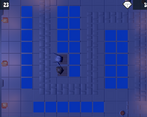
Really liked this! Only issue I had was understanding how placing the units worked, when the camera switched to the top view, I thought I was doing something wrong but I figured it out in the end. Great work :)
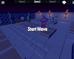
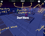
Thanks for playing! I wanted to add a tutorial section, but ran out of time. I added screenshots to the description of the game page so that if people were lost they could check the page and see what's up.
congrats on your submission. Your game is interesting
Thanks for playing!
Love the intro! Very fun game!
Thanks for playing!
Love the intro! Very fun game!
I really like tower defense games so I had a lot of fun with this. Having 3 different zones of the map to switch between made the game feel unique and a bit more involved. Good job! EDIT: Oooh and I really liked your intro cutscene with the dynamic camera!
Thanks for playing! The original plan was to not allow the Zone 2 and Zone 3 to be available until after the first enemy made it through and "open" each zone up to the player at that point. Kind of pause the action and introduce the new section, but time did not permit it.
Good job guys!
Thanks for playing!
The into sequence was awesome, the animations were great and it was a fun tower defense. Having the different perspectives for each zone was an interesting twist as well. Almost died on waves 3-4 then went full spam on the cheap units which helped a lot. Great job!
Thanks for playing!
That intro is great and the game is fun! Just wish I knew more about what the different units did.
Thanks for playing! I tried to put the information on the description of the main page, the only piece I left out was the type of tower that does more damage to the type of unit. But it's pretty much like for like. Mage will do more damage to Mage, Rogue will do more damage to Rogue. The barb does more damage to the minions and does an aoe, so by himself a single barb can take out all of wave 1 except for the rogues that run past him.
Good game. Like the Cinematic :)
Thanks for playing!