Play game
Headless Hunt's itch.io pageResults
| Criteria | Rank | Score* | Raw Score |
| Graphics | #93 | 4.056 | 4.056 |
| Interpretation of the Secondary Theme | #108 | 4.000 | 4.000 |
| Gameboy Soul | #175 | 3.500 | 3.500 |
| Gameplay | #196 | 2.833 | 2.833 |
| Overall | #204 | 3.211 | 3.211 |
| Soundtrack/SFX | #312 | 1.667 | 1.667 |
Ranked from 18 ratings. Score is adjusted from raw score by the median number of ratings per game in the jam.
How does your game meet GBJam's theme?
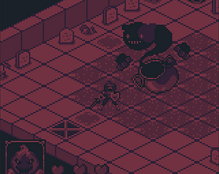
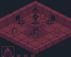
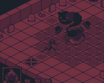
I tried to imagine how would a grid based action rpg would look in a GB and worked on it with my own style in a 160x144 res that sadly I had to upscale later to 640x576 but managed to keep the aspect ratio and square pixels, I choose a dark color palette and Dance Macabre theme mixed with Celtic myth of Dullahan and Crom to fit the secondary theme
Leave a comment
Log in with itch.io to leave a comment.



Comments
Really cool, I haven't seen another turn based like this in the jam yet. It took me a bit to figure out the exact attack range, but the colour palette really helped with the atmosphere. Keep at it, I'd like to see more of this.
Very good. No idea what danse macabre, Gullahan and Crom are (except the Conan reference for the latter), but it seems that the eerie atmosphere has prevailed. Where is the sound though?.. As for gameplay notes, I see them already mentioned, so skipping ;-)
Thanks for your Feedback
I didn’t know about Crom (Crom Dubh, "The Black Crooked One") until I researched about the Dullahan, the Irish fairy version of the Headless Horseman; Essentially, Crom was a Celtic god who demanded head sacrifices, and the Dullahan acted as his reapers.
As E.Howard took a lot of inspiration from the European folklore, I'm quite sure Crom was at least partially inspired by it.
Regarding the sound, I ended up leaving it out. I had the audio system and a BGM, but I didn’t include them in the Jam version because I couldn’t implement a volume control in time, I thought it would be more annoying to have loud audio than none at all.
I enjoyed decimating and collecting heads while serving as the god's hand. Well done given the time constraints.
In terms of aesthetics, I appreciate the choice of the hollow atmosphere, the lifeless desaturated color palette. When it comes to isometric, there are particular challenge for rendering, figuring out the transformation between screen space to world space, depth sorting, but I think 2.5D is really beautiful.
In terms of gameplay, the turn-based combat is a classic, instantly becomes tactical because of action planning, it would be nice if there are:
On the game balance aspect, well, loved the jam balance! We have so much time to do everything by ourselves, we have to make choices.
Oh, maybe you already know this, but I'll leave it here anyway, if you want to delve deeper into the depth: https://www.roguebasin.com
Keep it up with the good work!
Thanks, I appreciate your feedback!
I already started working on some of the things you mentioned, mainly on the visual feedback of attack ranges and the directional commitment but Im also working on the depth sorting as its one of the things I left behind on the Jam that I feel limited the current level design.
Originally, I had included a "Block" action (the animation remains in the Jam version when pressing X), which was also intended to function as a "Wait" action. However, once I added NPCs, I changed the key to interact with them and forgot I could use another key as"Select" or even assign "Start/Enter" for that.
In the long run, I would love to make it more roguelikeish or work on a similar project with fewer Jam constraints and procedural generation elements.
I liked this game! The movement and gameplay remind me of Fire Emblem but if the combat happened on the overworld instead of in a cutscene and that you only play as one character instead of a team. The mechanics took some getting used to, but once I did, I had a fun time slashing enemies and collecting their heads as a bounty. The only significant place where it loses points is the audio, or lack thereof. I feel like this game could be so much better with good music and sound design. Still, it was a pretty enjoyable experience! Great job! :)
Thanks for your feedback
I really like the art style! I had trouble getting very far but it was definitely interesting! Personally I prefer something a little more forgiving, but that's just me. The pixel art characters and isometric level design is really fantastic!
Great work!
Thanks for taking the time to play it, I appreciate your feedback.
It will be probably more forgiving when I get to fix the issues with the player/enemies attacks, I also had a system ready for this version to get two extra Hearts in exchange for some Heads, but I decided to hold it off to get the build ready in time for the Jam.
The art style is pretty awesome! Controls are a bit weird though : it’s hard to correctly orient the character, and to be sure where the attack lands (both mine and those of the enemies). It also took me way too long to find where I needed to be positioned to interact with the tree-like entities ^^”. I had a fun time playing it but could not pass the boss in the cauldron.
Thanks for your feedback
The isometric style is really cool. It has kind of a Dark Souls feel. Movement was intuitive, and there are some good visual cues, but I found it difficult to know when I would land an attack versus when I would be attacked.
Thanks for your feedback
Very cool graphics! The isometric perspective gives it an extra touch, had fun playing it, only thing that could be improved is that sometimes is hard to flip the character's sprite to land the hits, other than that, solid game!
Thanks for your feedback
Looks great! Combat takes a bit of getting used to but once you get the hang of it it's loads of fun :)
Thanks for your feedback
The colour pallet you chose do wonders with the art style. The atmosphere is there! If policed, I am sure this is going to become a really impressive game! Well done!
Thanks for your feedback
The artstyle is very cool and spooky! Really nice for your first isometric game. I feel that with some polish it can become something really interesting and special. Also great palette choice (hehe). We chose the same one for our entry ^^
Great minds think alike ^^
Cool idea and nice art style but I couldn't figure out exactly how the attack worked. I think you need some feedback for which cells are affected by your attacks and how the attacks of the enemies work
Thanks for your feedback, right now the attack area is a circle around the player/enemies which is not great and there are also a few other issues with it that I will need to solve.
Great effort, I like the Idea but I feel it needs a little more polish. Art style is also amazing
I do feel the same, as it was my first time working with an isometric game I runned agains some issues that took me a lot of time to solve so I ended leaving a lot of things partially implemented or incomplete.