Play game
You hungry?'s itch.io pageResults
| Criteria | Rank | Score* | Raw Score |
| Is the art appealing (do you want to spend more time in this world)? | #34 | 3.333 | 3.333 |
| How well was the Theme implemented? | #39 | 3.286 | 3.286 |
| Did you enjoy this entry? | #41 | 2.905 | 2.905 |
| How cohesive is the game art (do all visual elements work well together)? | #43 | 3.524 | 3.524 |
| Overall | #44 | 3.152 | 3.152 |
| Do the animations/effects improve the player experience (game juice!)? | #55 | 2.714 | 2.714 |
Ranked from 21 ratings. Score is adjusted from raw score by the median number of ratings per game in the jam.
Which team were you in and what was the modifier for your team?
Simon CB, Modifier was "More is More"
Which game engine did you use?
Unity
If you are chosen as the wildcard will you continue in the competition?
Heck yes I will!
Leave a comment
Log in with itch.io to leave a comment.


Comments
This was super fun, and I think you fit the theme perfectly, both spectacle and more is more! Love the art style, and the music fits the vibe of the game really well! :)
Cute game! The choice of assets was well suited to the whimsy of the gameplay. I did notice a major bug with the retry option in that I was unable to move my character. I had to just refresh the page and then load from menu instead.
I agree with other commenters that the UI could use another pass. Much of the game also feels superfluous, which really stands out when you have to walk all the way back to the table after trying again. If you continue with this game, it might be a good idea to focus everything on the core gameplay and reinforce that as much as you can.
Best of luck with the round!
An interesting title. It's exactly what it says it is--a game about eating as many hot dogs as possible. It's a neat idea, but a little work could be done to make it feel much better, perhaps like an NPC to compete with? And, as other people have already said, it's definitely easy to cheese. Still, it's a cute game with an interesting premise.
quick search with some screenshots reveals that this is an asset flip and other games use the exact same models. This is frustrating as the main focus of this game is the art and the gameplay is a bit lacking and quite buggy.
The art of this game was really great and the hot dog eating was fun.
Thanks for playing and enjoying eating the hotdogs lol
I'm always impressed by what you can do with 3D in such a short time. And the art style in this hits the mark for me.
I would like to see a little more thought put into the UI. It felt a little rushed. I think someone on a stream mentioned having a crowd gather the more you ate? I like that idea to play up the spectacle more.
Glad to see you got the leaderboard working (though I may have broke it...mwahaha!)
I think i may have broke it a little more... :)
I'm planing on spending more time on my UI skills and the polish. I have a few bugs that need to be ironed out as well but If I make it to the next round these will be improved! And yes!!! I'll definatly be adding that, more people show up as the contest goes on.
Yes the leaderboard is reallllly broken haha
The art is amazing! Glad to have made it on the leaderboard, my technique was to start by filling my stomach with absolutely loads of water and then mash E
Currently you're the first one who found that bug! I was wondering how long it would take someone to figure it out! lol Nice!
Nice work! Lovely lowpoly style, although given the gamepaly I can’t help but feel the mechanic of walking and sprinting around is a bit superfluous. Putting some of that energy into some custom matching UI would help it all mesh together! Watch out for some wordwrapping, but nice work getting a working leaderboard in place.
Yes noted, I'm already planing on spending a lot more time into the UI and to remove the bugs that they currently have. And yea I totally forgot that some people have long names and didnt put enough space for that!
LOVE this art style! Fun and silly little minigame, and I'd for sure play a full game set in this world.
Thank you! If I make it to the next round AND the next theme match up. You'll definitely see more!!
Thought i was smart with my technique and then saw that someone did 700+ score...
At the moment there's a few different ways to cheese it or break the score! Thank you for playing it!
Fun game with great art. The leaderboard is an excellent idea for a jam. The game is quite easy to cheese, though. :P
Bring on the cheese!!!! Yea I need to work on that as in adding in cool downs or limits!
Thanks for taking the time to play!
My arm hurts i was mashing so fast XD but im #1!!! Great idea and environment!
Nooo don't kill your arm lol! Thank you for trying it out and kicking butt to get to the top!
nice cosy stile :)
Thank you! Kind of what I was going for! Just wish I had time to change that feeling when the contest started lol
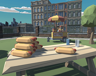
I love the character and world design of the game. It mixed with the music made me feel like I was out having a nice stroll out at the park. I like the concept and the use of the slider to track how much the player has eaten. If I could give any suggestions is to try playing around with different fonts and UI art assets. They could add a lot of pop to future menus and UIs.
I wish i had more time to layout a better map but it was enough for this round. And yes thank you, my UI skills are not the best and need to spend the next weeks on sharpening those skills! I got a tip about having the slider bar have effects if you get too full! I'll be looking into that as well!
Great ambience and the music works really well. I did find the gameplay was quite easy to cheese just by spamming Q and E but I'm not going to complain about getting top of the leaderboard ;)
The cheese is real! haha There's more I wanted to do to stop the cheese however I had a worktrip :(
Thanks for making it to the top!!
Nice music and good job on the first person controller. Movement feels smooth and satisfying.
I will say that some of the UI could have a used a bit more work, but I suppose that's perhaps not too important.
I like hotdogs, so you get bonus stars for that.
Good job!
Agreed, my UI skills are not the best and there are actually a few bugs in it that I plan to iron out!
Really like the ambiance and overall look of the scene. Might've been nice to have a few more animations and effects. Maybe some particle effect of crumbs when the player eats. Nice!
Yes adding more animations and partricle effects are defiantly on my list of things to do!